Fintech UX vs Banking UX and Why the Design Approach Differs

Fintech UX vs. banking UX is the difference between designing digital financial products that quickly earn user trust through the interface (fintech) and designing digital experiences that preserve the institutional trust an established financial institution has already built (banking). The two disciplines share regulatory requirements but solve opposite design problems, and applying the patterns of one to the other reliably alienates the user population the design was meant to serve.
The fundamental difference is where trust comes from
Fintech UX must build trust from zero because the user has no prior relationship with the product. Banking UX must preserve and modernize trust that already exists because the user has spent years, sometimes decades, with the institution. These are opposite design problems. Both are difficult, and the methods that solve one tend to make the other worse. In other words, this is a complex area with no simple answers.
A fintech user downloaded the app this week. There is no branch, no relationship manager, no institutional history. The interface is the entire brand, and every screen has to do trust work that a banking customer never asks of a banking app. Baymard Institute’s research on perceived payment security shows that users assess payment safety almost entirely through visual cues such as encapsulated form fields, security icons, and background colors that signal “this part of the page is protected.” Technical security and perceived security are distinct, and the perceived layer determines whether the user completes the transaction or deletes the app within a minute of opening it.
This is why fintech onboarding flows often turn compliance into a trust-building moment rather than hiding it. Revolut shows verification steps as progress indicators with explicit time expectations, so the user sees what is happening, how long it will take, and what comes next. The interface is converting a regulatory requirement into a confidence signal. Skip that work, and the same KYC flow feels suspicious, exactly the opposite of what compliance is supposed to communicate.
Banking UX has the inverse problem. Users have an existing relationship with the institution, often measured in years or decades. The digital interface is not building trust from scratch; it is transferring trust that already exists into a new channel without breaking it. McKinsey’s analysis of digital banking trust found that banks meeting its definition of digital trust returned a 7.8x higher CAGR from 2017 to 2024 than untrusted banks, and only 18 percent of customers said they were willing to shift away from a bank they trusted. Trust is an asset on the balance sheet. The interface either preserves it or quietly destroys it.
When HSBC redesigned its mobile experience, it kept the formal language, structured account hierarchies, and detailed account summaries that its customer base expected. It did not adopt the stripped-down minimalism of a neobank because its customers were not asking for a startup interface. They were asking for the same bank, working better. Making a banking app suddenly feel casual and minimal does not read as modern to a 55-year-old with a mortgage. It reads as risky, which is one of the few signals a banking interface cannot afford to send.
This is where most cross-disciplinary work fails. A fintech designer entering banking will instinctively remove confirmation steps, soften formal language, and reduce the visible weight of each interaction. Correct for fintech and dangerous for banking. The reverse is just as bad: applying the deliberate, document-heavy patterns of banking onboarding to a fintech product introduces friction that users have no reason to tolerate when three competitors are one tap away in the App Store. Both problems are hard. Fintech has to manufacture trust on a thirty-second time horizon. Banking has to modernize without breaking the trust that took decades to earn. The fintech UX vs banking UX split is structural, not stylistic, and treating either as the easy discipline is the surest way to design something that fails the user it was built for.
Five differences between fintech UX and banking UX
Fintech UX vs banking UX diverges across five operational dimensions: onboarding psychology, compliance integration, information density tolerance, error recovery, and design system evolution speed. Some of these flow directly from where trust starts. Others come from the surrounding context: existing user base, regulatory posture and distribution channel. Each dimension presents a real challenge on both sides, and the specific challenges are different. Fintech is not an easy discipline. The work is harder in different places.
Onboarding psychology splits first. A banking customer usually migrated to digital from an existing relationship, rather than being acquired through a download. They did not arrive on the app from an ad; they arrived because the institution moved them there. Document upload, verification reference numbers, and step-by-step formality match the relationship and reinforce institutional trust. JPMorgan Chase’s mobile onboarding uses formal language and explicit step counts deliberately because users expect gravity in handling money. A fintech user arrived because of a marketing message and is one swipe away from leaving. The same KYC requirements apply, but presenting them as a long bureaucratic flow kills conversion before the user finishes signing up. Revolut handles this by collecting minimum data first, allowing exploration of the app, and triggering full verification only at the moment of a money-moving action. Both approaches satisfy regulators, but each one fails the other audience.
Compliance integration diverges most visibly in the interface. In banking, visible compliance reassures customers: a quick, casual KYC flow can actually reduce trust because customers expect a bank to take money handling seriously. The reaction is something like “that felt way too easy for a bank,” and that is exactly the wrong feeling for a customer to leave a financial institution holding the bag. In fintech, the same regulatory requirements must be embedded almost invisibly, because a user encountering bureaucratic friction during onboarding never returns to find out what the product does. Fintech compliance design is not lighter than banking compliance design. It is the same regulatory load delivered under tighter user expectations and shorter attention spans, which is genuinely harder, not easier.
Information density tolerance varies more than most designers expect. Banking customers expect density because they have read paper statements their whole adult lives. Full transaction history, multi-account balances, pending charges, available credit, statement periods, all visible on one screen. Replacing that with a clean spending donut makes it seem like the bank is hiding something or cutting corners.
Fintech apps default to curated views: one balance, three recent transactions, a spending trend. N26 ships with a single balance and a clean timeline because its users came specifically to escape the dense bank interface. The fintech challenge appears at scale. As users mature within the product and accumulate savings, investments, credit lines, and subscriptions, the flat interface begins to buckle under the load. The Fiserv Small Business Index, working with data from roughly two million POS systems, handles this by showing different layers of detail to different user roles, so a policymaker, an economist, an investor, and a small business owner each see what their decisions require without the interface collapsing into a single overloaded screen.
Error recovery is where the difference becomes most consequential for the user. Banking errors cause disproportionate anxiety for users because their existing funds are at stake. A generic “something went wrong, please try again” message is insufficient when a user thinks their savings just disappeared. Banking error UX has to confirm explicitly that no money moved, explain what happened in language a non-technical user can act on, and offer a human escalation path on the same screen. Fintech faces a different version of the same problem. Errors feel less catastrophic because the relationship is shallower, but the fintech user has no branch to walk into when the interface fails. If the app cannot resolve the error, there is no fallback channel. The fintech error UX has to be more complete, not less, because it is the only channel the user has.
The cadence of change itself differs. Fintech ships fast and iterates publicly. Users expect frequent change and treat it as a sign that the product is improving. The long-term cost is inconsistency, where users who learned a flow last month find a different one this month. Without a mature design system to hold the changes together, rapid iteration starts to confuse the very users it was supposed to serve. Banking changes seldom, often once or twice a year, because customers expect their banking interface to feel the same on Tuesday as it did on Monday. A surprise redesign feels alarming, not delightful. The cost on the banking side is design debt that accumulates over the years and makes eventual modernization more expensive and more jarring for long-tenured users when it finally happens. Neither speed is correct in isolation. Each pace fits its user expectations and creates its own long-term problem.
How fintech and banking interfaces actually look and work differently
Fintech UX vs. banking UX appears on screen as five visible design decisions: color palette, typography and language, navigation depth, data presentation, and interaction friction. These differences are deliberate. Each side is communicating a specific reaction to its user, and crossing the conventions reads as inappropriate to the audience whose conventions were broken.
Banking apps default to conservative palettes: navy, deep green, white, structured grey. These have signaled financial seriousness for over a hundred years, and the digital product inherits the meaning the moment it adopts the palette. Chase runs deep blue across its interface. HSBC uses red and white in formal grid layouts. The choices look timid only to designers who do not understand what conservative color is meant to do in a banking context. Fintech apps reach for brighter, more expressive colors because they are making a visual argument that the product is not a traditional bank. Revolut’s electric purple and Monzo’s coral orange are positioning statements, not aesthetic preferences. A bank borrowing Monzo’s orange unsettles its older customer base, who read the casual color as risky. A fintech product borrowing Chase’s navy reads as corporate, and the audience it was trying to win never downloads it in the first place.
Typography and copy carry the same signal. Banking interfaces use formal language deliberately. “Your funds have been transferred successfully.” “Please review the terms and conditions before proceeding (which, by the way, they know no one reads).” However, the formality signals that careful people are handling their money carefully. Fintech interfaces use conversational copy. “You sent $50 to Sarah.” “Nice, you saved $120 this month.” This works for splitting a dinner bill. It stops working when the same casual register confirms a $50,000 wire transfer, where the user wanted, and did not get, the gravity the moment deserved. Tone is not just personality. It is the user’s primary signal of how seriously the product takes the action it is processing.
Navigation depth follows from product complexity. Banking navigation runs deep: account groups, individual accounts, transaction history and transaction details. Three or four levels are normal because banks offer dozens of products through a single interface, including checking, savings, mortgages, credit cards, investments, and insurance. The depth is honest about the complexity. Fintech navigation runs flat, often a four-tab bottom bar with most actions one tap away. This works when the product does three things well. It starts to break when the fintech product adds a tenth feature, and the flat structure cannot accommodate it without losing clarity. This is the moment growing fintech products start looking like banking apps with better animation, and the user experience that originally drew the audience starts to dissolve.
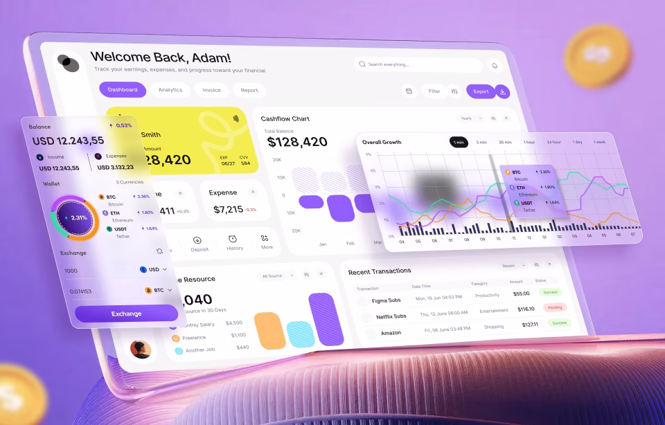
Data presentation is where the visual argument gets, by far, the most explicit. Banking interfaces present financial data as records: tables with rows, columns, dates, amounts, and reference numbers, formatted in a way that closely mirrors how a paper statement would render the same information. The visual treatment is dense, monochrome, and oriented around scanning and search. Fintech interfaces present the same underlying data as charts, donuts, category cards, and color-coded hierarchies, oriented around recognition and pattern at a glance. The difference is not whether the data is there. The difference is whether the interface treats the user as someone reading a statement or someone reading a summary, and that visual choice signals what the product thinks the user came to do.
Interaction friction is the last visible difference. Banking interaction is deliberate. Transferring money involves four steps: enter the amount, confirm the recipient, enter the authentication and final confirmation. Some of these can be a lot more tedious than others, but most are fairly similar. The friction is not a UX failure. It is appropriate gravity for moving someone’s existing savings, and removing a step would feel dangerous for the customer. Fintech interactions are fast, often just one biometric tap. Speed is the product’s competitive promise. The trouble appears at higher transaction sizes, where the same one-tap flow that works for $30 starts to feel reckless at $30,000. Wise handles this by adding a brief review step above a threshold, which is the rare pattern that cleanly crosses the line. It works because it respects what counts as appropriate gravity on each side rather than averaging the two into a single interaction model.
When the two worlds collide, and banks build fintech products
When a traditional bank launches a digital-first product or acquires a fintech startup, the conflict must be resolved within a single product team rather than across two organizations. The interface has to serve two different user populations with opposite expectations on the same backend infrastructure. The interfaces that succeed at this keep the two populations separate. The interfaces that try to merge them produce a diluted version of both.
The failure mode is recognizable across the industry. A bank decides to build a neobank-style subsidiary or a digital-only product line. The brief says modern, fast, friendly. The infrastructure underneath is still subject to banking-grade compliance, legal, and risk review. The result feels like fintech on the surface and behaves like a bank (slow and deliberate) when the user actually tries to do something. Onboarding looks quick, then asks for five documents and a blood test. The blood test is a joke, just seeing if you were paying attention. The interface looks minimal, only to reveal layers of complexity that the modern aesthetic was supposed to remove. The voice starts friendly, then turns legal at the first regulatory disclosure. None of these is wrong individually. Together, they read as inconsistent, and inconsistency in a financial product undermines both audiences.
The banks that handle this well do not try to merge the two experiences. JPMorgan runs Chase Mobile alongside its institutional platform rather than forcing a single interface to serve both populations. Account data is consistent because the backend is shared, but the user never sees it. They only see the product designed for their context. Goldman Sachs took a similar structural approach with Marcus, launching it as a separate consumer brand rather than extending the institutional Goldman Sachs interface. The Marcus consumer business has since been wound down for reasons unrelated to interface design, but the original separation pattern was correct. The alternative, a single interface serving two opposite user populations, has not worked anywhere it has been tried.
Forcing a single interface to serve both audiences produces predictable damage. The banking customer experiences a product that feels less serious than the institution they had trusted for years. The fintech-curious customer experiences a product that feels more bureaucratic than the marketing promised. Neither group is well served, and the infrastructure savings from running a single interface evaporate against the customer acquisition and retention costs of disappointing both populations simultaneously. The merger is cheaper to operate and more expensive to live with.
Practical implications for product teams making the transition
Three operational practices change when a product team moves between fintech and banking work: how research is sequenced, how testing is conducted, and how project timelines are calibrated. Treating the two as identical disciplines on different surfaces is the most common mistake teams make in the transition.
Research order is the most disorienting change. Banking UX work typically begins with constraint mapping. Compliance, legal, and risk teams define the boundary of what is allowed before designers explore what users want. The starting question is: what can we build? Fintech UX work begins with user behavior and reverse-engineers compliance into whatever interaction patterns survive testing. The starting question is what users will tolerate. Both inputs are required in both contexts. Reversing the sequence changes the design conclusions, and a product team that does not reset the order ends up either overbuilding constraints into a fintech product or under-engineering them into a banking one.
Testing methodology shifts in the same direction. Banking testing skews structured: usability sessions, surveys, stakeholder reviews, compliance walkthroughs, internal sign-offs. Customer feedback flows through formal channels, often via call centers and branches that were never designed to quickly feed back into a digital design process. Fintech testing skews behavioral: drop-off rates by step, time-on-screen, A/B tests on copy and color, and session recordings analyzed in batches. Customer preferences are revealed by what they do, not by what they say. Borrowing fintech behavioral methods inside a banking product is appropriate, but ignoring banking’s structured channels because they feel slow misses the population whose long-tenured loyalty pays for the redesign.
Timeline calibration is the implication that causes most operational stress. Banking screens pass through compliance, legal, and risk as separate gates, often with multi-week iteration cycles between them. A redesign of a single banking product typically takes 12 to 24 months due to this layered review structure, and a full digital transformation program takes longer. Fintech feature launches and v1 product builds typically ship in three to six months because compliance is integrated into the design process from day one rather than applied as an end-stage filter. Borrowing fintech speed inside a banking system without re-engineering the review cadence does not produce a faster bank. It produces a banking product that ships before legal review completes, which is operationally worse than slow.
Conclusion
Traditional banks are launching digital products and fintech companies are seeking banking charters, so the boundary is moving. Right now in 2026, the fintech UX vs banking UX decision still comes down to where trust starts. Teams comparing agencies for fintech work can review our fintech UX design agency comparison, and teams new to the discipline can start with our fintech UX design guide.
Frequently asked questions
What is fintech UX design?
Fintech UX design is the practice of building user experiences for digital financial technology products such as neobanks, payment apps, lending platforms, investment tools, and financial SaaS. The discipline combines product design with compliance-aware interaction patterns and the specific challenge of presenting mandatory regulatory steps without losing users to friction. The core problem fintech UX solves is building credibility quickly with users who have no prior relationship to the product.
What is banking UX design?
Banking UX design is the practice of building digital experiences for established financial institutions, including traditional banks, credit unions, and wealth management firms. The discipline focuses on transferring institutional trust into digital channels and modernizing legacy interfaces without breaking the stability signals that existing customers rely on. The core problem banking UX solves is preserving years of accumulated trust while updating the interface around it.
How does fintech UX differ from banking UX?
Fintech UX vs banking UX is primarily a difference in starting trust. Fintech products begin with no relationship to the user and must build credibility through every screen of the interface. Banking products inherit decades of trust and must protect it through modernization, which produces opposite design priorities across onboarding, compliance integration, information density, error handling, and release cadence.
Can the same design team work on both fintech and banking products?
A design team can work on both fintech and banking products, but only if it adapts its research and testing methods, as well as timelines, to the context rather than reusing patterns from a previous engagement. The risk is applying fintech minimalism and speed to a banking product where customers expect formality, or applying banking-style document-heavy onboarding to a fintech product where unnecessary friction loses users in seconds.
Does banking UX redesign cost more than fintech UX?
Banking UX redesigns typically cost more than comparable fintech projects, but the difference is structural rather than design-driven. Every screen in a banking redesign passes through compliance, legal, and risk review as separate gates, and each gate adds iteration cycles, stakeholder coordination, and project duration. Two design projects with identical scope can cost very different amounts depending on which side of the fintech-banking line they sit on, because the institutional review pathway is the multiplier, not the design work itself.
Why does the same compliance requirement produce different UX in fintech and banking?
Compliance requirements like KYC and AML apply to both fintech and banking products, but the user expectation surrounding compliance is opposite on each side. Banking customers read visible compliance steps as a sign the institution is taking their money seriously, so banking UX presents the requirements explicitly. Fintech users read the same steps as friction that signals an outdated product, so fintech UX has to deliver the same regulatory load almost invisibly. The requirement is identical. The interface treatment is opposite.
How long does a banking digital transformation take compared to a fintech product launch?
Banking digital transformation typically takes 12 to 24 months due to layered institutional review across compliance, legal, and risk. Fintech product launches typically run three to six months because compliance is integrated into the design process from the start rather than applied as a final review. These ranges vary by scope and complexity, but the order of magnitude is consistent across the industry.