Healthcare UX Design: The Essential Guide to Creating Life-Saving Interfaces

Healthcare is one of the very few industries where a poorly designed interface doesn’t just cause frustration, it can cause real harm. Many of us have seen this firsthand. A cluttered dashboard that hides a critical lab value. A patient portal that concerns the patient so much that they stop using it. A medical device interface that forces a nurse to tap through six screens during an emergency. If a doctor has to click through five sub-menus to find a life-saving allergy warning, that is a design failure with real-world consequences. Not to mention, it’s just plain stupid.
In most industries, bad UX design leads to churn. In healthcare, poor UX has much more serious and long-term consequences, including clinical errors, compliance risks, compromised outcomes, and, not to mention, patient dissatisfaction.
Healthcare UX design is the specialized practice of creating digital interfaces for clinical, patient-facing, and medical device applications that must account for HIPAA compliance, FDA regulatory requirements, and the clinical workflow constraints that distinguish healthcare from every other industry. Fuselab Creative has delivered healthcare UX design services for NIH, DHCS, ClyHealth, and Vasolabs since 2017, with project work spanning EHR systems, government public health dashboards, medical device interfaces, and AI-powered clinical platforms.
As digital health expands across EHR systems, telemedicine platforms, wearable devices, and AI-powered diagnostics, the interface quality of clinical products determines whether innovation translates into better outcomes or becomes another tool that clinicians work around. This guide covers how healthcare UX design works in practice, from clinical workflow research and regulatory compliance to data visualization, AI explainability, and the specific design patterns that distinguish clinical interfaces from consumer products.
What Exactly is Healthcare UX Design?
Healthcare UX design covers the research, interface design, prototyping, and validation of digital products used in clinical, patient, and administrative healthcare settings, including EHR systems, patient portals, medical device interfaces, and telemedicine platforms. The discipline differs from general UX in three ways: regulatory compliance (HIPAA, FDA, Section 508) adds overhead to every project phase, every interface must serve multiple user types simultaneously, and usability errors carry direct patient safety consequences.
People often ask me, “Isn’t it just regular UX design applied to a hospital?” Not quite. While general UX design might focus on reducing friction to get you to buy a pair of shoes faster, healthcare UX design focuses on accuracy, trust, and error elimination.
Healthcare UX design is the specialized practice of creating digital experiences, like a patient portal, a medical device interface, or a telemedicine platform, that account for the unique stress and high stakes of the medical world. Here, the users are not just consumers.
The primary user groups are patients who are often vulnerable, anxious, or elderly; physicians and nurses operating under time and emotional pressure; administrators managing compliance requirements and clinical workflows; and caregivers navigating medical systems they did not choose and may not understand.
Designing for healthcare means understanding clinical workflows, regulatory frameworks like HIPAA, data privacy constraints, accessibility standards, and the realities of medical environments.
Designing a patient-facing mobile health app is fundamentally different from designing any other B2C app. In healthcare UX, we have to assume the user is tired, distracted, or anxious. For example, a patient managing a chronic disease needs clarity and guidance, not gamification. A physician interacting with a clinical dashboard needs speed, accuracy, and minimal cognitive friction, not aesthetic flourish.
Healthcare UX is the art of ensuring that the technology stays out of the way of the care. Great healthcare UX design doesn’t just present data; it provides specific, timely clinical insights exactly when they are needed most.
The Key Components of Healthcare UX
When we pull back the curtain on a successful healthcare product, we find a foundation built on a layered tech stack, which includes:
User interface design: This is all about using foundational design theory to create clear layouts, visual hierarchy, readable typography, and accessible color contrast.
Interaction model: Unlike a game, a medical design must be predictable. The user interface is designed to be intuitive, which reduces clicks, taps, and cognitive load.
Accessibility: In this industry, designing for the average user is a trap. We are designing for the patient with tremors, the clinician with color blindness, and the technician working under harsh fluorescent lights. The design should meet WCAG accessibility standards and be inclusive for aging populations and users with disabilities.
Workflow integration: A healthcare tool doesn’t live in a vacuum; it lives in a busy clinic. Which means a user interface should mirror actual clinical processes rather than theoretical ones.
Information architecture: Often, healthcare data stretches back in time and is correlated to a multitude of other parameters. The data, such as labs, prescriptions, and history, should be structured so it can be found easily, while also prioritizing critical and the latest information for discovery.
Why Healthcare UX Design Matters
Healthcare UX design directly affects patient safety, clinical decision-making speed, treatment adherence, and operational costs across every organization that relies on digital clinical tools. A cluttered interface that obscures an allergy warning or delays access to critical lab values creates risk that no amount of hardware capability can compensate for, which is why UX is a clinical concern rather than a visual preference. Let’s be clear, Healthcare UX impacts patient safety!
When a healthcare provider is forced to work through a cluttered, non-intuitive design, their focus shifts from the patient to the screen. That split second of distraction can lead to errors in clinical outcomes that no amount of fancy hardware can fix. A good example of another sector that requires user-focused UX is the aviation industry, where an improperly placed alert light could have catastrophic consequences if not seen by the pilot at the right time.
Healthcare UX directly affects patient safety because interfaces that obscure allergy warnings, dosage conflicts, or abnormal lab values increase the risk of preventable clinical errors. Clear visual hierarchy and signal prioritization in clinical interfaces are not design preferences but safety requirements that reduce the chance of missed information during time-critical decisions.
Patient satisfaction and treatment adherence improve measurably when portals are easy to use. Patients who can access their records, understand their care plans, and book appointments without friction are more likely to follow through on treatment protocols, which leads to better long-term outcomes and fewer readmissions.
Physicians and nurses operate under intense cognitive load throughout every shift. Well-designed clinical tools reduce the friction in documentation, charting, and clinical decision-making, giving providers more time with patients and less time wrestling with software that was designed for data entry rather than clinical thinking.
Better patient engagement leads to better medication adherence, and better data visualization leads to better diagnostic decisions. The effect of UX on clinical outcomes is indirect but measurable across any healthcare organization that tracks readmission rates, treatment plan compliance, or patient portal adoption.
Inaccurate clinical documentation, billing errors, and compliance violations often originate in poorly designed input systems rather than negligent staff. UX that reduces data entry errors and surfaces compliance requirements at the point of care protects both revenue and regulatory standing.
By prioritizing healthcare UX, we are essentially saying that the patient’s time, the doctor’s focus, and the overall clinical outcomes are worth protecting.
Impact on Patient Outcomes
The ripple effect of good healthcare design is staggering.
Let’s take the example of medication adherence. A patient managing diabetes uses a mobile health application to track insulin doses. If the interface is confusing, the reminders are unclear or late, or if the data visualizations are overwhelming, he or she will disregard the app altogether, and this could lead to a drop in the treatment protocol, which in turn leads to complications and ultimately hospitalizations, a distressing outcome for the patient, but one that also burdens the often understaffed healthcare system.
Now flip the scenario. The app presents simplified dashboards, clear daily goals, contextual nudges, and educational content matched to literacy levels. When the design is intuitive, patient adherence to treatment plans naturally increases. They aren’t guessing if they took their pill; the app makes it obvious. When patients can easily access their health records, they become active participants in their own care, leading to better long-term outcomes.
In the world of Healthcare UX, high engagement isn’t a vanity metric; it is a sign that the healthcare journey is working, turning technology into a bridge to health, not a barrier.
Benefits of Healthcare UX Design
From a business perspective, the ROI of healthcare UX is often hidden but massive. Let’s talk about the Efficiency. Every minute a healthcare provider spends fighting a poorly designed interface is a minute of billable time lost. When we optimize the clinical workflow, we are essentially giving these hours back to hospital staff, leading to massive cost reductions and higher user satisfaction across the board.
For startups, healthcare UX is an exceptional competitive advantage. If your platform is easier to use than the legacy system a hospital has used for decades, you have already won half the battle. Patient engagement is the gold standard of modern medicine, and you can’t have engagement without a well-designed interface. By investing in healthcare UX, you are building a product that scales because it actually solves the human problems of patients and healthcare providers. It’s about creating a virtuous cycle where better design leads to better data, which leads to better care.
Let’s explore how Healthcare UX impacts two main groups of users:
For Patients:
When we design healthcare UX for patients, we are often designing for people at their most vulnerable. They may be in pain, anxious about test results, managing chronic illness, or navigating a complex medical system for the first time.
Good healthcare UX gives patients three powerful things:
Access: Accessible patient portals allow users to book appointments, review lab results, message healthcare providers, and manage prescriptions without friction. But accessibility goes beyond convenience. It includes readable typography for aging populations, simplified language for varying literacy levels, and mobile-first interfaces for users who rely entirely on smartphones.
Understanding: When medical information is presented clearly, with contextual explanations rather than clinical jargon, patients feel informed instead of overwhelmed. Knowledge of their treatment protocols increases the likelihood that they follow procedures more effectively and reduces stress. When a patient can see their progress through a clear, encouraging visual, their anxiety drops.
Empowerment: Finally, when patients are engaged, understand the system, and trust it, they have the chance to actively participate in their own health journey. Turning them from passive recipients to active contributors in their own healthcare journey has a profound effect on outcomes.
For Healthcare Providers:
For the healthcare provider, the benefit is more about efficiency and decision support. A doctor doesn’t want to be a data entry clerk; they want to be a healer. Modern clinical tools should handle the heavy lifting of documentation so the physician can focus on the person in front of them.
Operational Efficiency: A simple workflow redesign and interface optimization can significantly reduce time across activities. When you multiply those minutes across hundreds of patients daily, the cost savings become substantial.
Cost Reduction: Organizations can achieve cost efficiencies through good Healthcare UX, such as reduced legal and compliance risks, higher throughput from faster clinical workflows, and, of course, happier patients with fewer readmissions.
Enhanced Patient Engagement: Well-designed patient portals increase logins, appointment bookings, and follow-through on care instructions. This leads to better health outcomes and enhances the organization’s reputation.
Good for employee: Burnout among healthcare providers is a common global issue, and while UX alone won’t solve burnout, poorly designed systems absolutely contribute to it. Designing systems that reduce cognitive overload improves daily work experience.

Healthcare UX Design That Improves Patient Safety and Care
Healthcare UX is not just about usability, it’s about clarity, safety, and better outcomes for both patients and providers.
At Fuselab Creative, we design healthcare platforms, dashboards, and patient experiences that simplify complex medical workflows and turn critical data into clear, specific clinical insights
Challenges in Healthcare UX Design
The primary challenges in healthcare UX design are regulatory compliance constraints (HIPAA, FDA, Section 508) that limit design flexibility, system fragmentation across EHRs, labs, billing, and imaging platforms that must interoperate, diverse user groups with conflicting needs and varying technical literacy, high-stakes clinical environments where usability errors affect patient safety, and organizational resistance to adopting new interfaces after previous technology failures.
Designing for healthcare is like trying to change a tire on a car while it’s going 70 miles per hour down a highway. One can’t indulge in moving fast and breaking things. With lives and health at stake, we need accuracy and precision. Unlike other B2C apps, we need to operate within a web of regulations, legacy systems, competing stakeholders, and life-critical environments.
Regulatory compliance and data security constrain every design choice in healthcare. HIPAA governs how patient data is stored, accessed, and transmitted, and UX design must work within those constraints even when they limit design flexibility. Every form field, data display, and authentication flow must balance security with usability.
Healthcare systems rarely operate in isolation. Electronic health records integrate with labs, billing systems, imaging platforms, insurance databases, and external providers. A single patient interaction touches a dozen different systems and roles, from the surgeon to the pharmacist to the patient’s family. Designing one interface that serves all of these without becoming cluttered requires deep systems thinking.
Healthcare UX must accommodate radically diverse users: tech-fluent young patients, elderly users with limited digital literacy, clinicians with varying comfort levels, stressed emergency room nurses, and administrators focused on compliance reporting. Designing for a single persona is insufficient in this environment. Design teams must design for entire ecosystems of users.
High-stakes clinical environments demand that every interface be rigorously validated before deployment. Designers must account for stress conditions, interruptions, emergency escalations, and decision fatigue that do not exist in consumer product design. There is no safe way to “ship fast and iterate” when patient safety is at risk.
Healthcare organizations frequently rely on legacy systems that staff have spent years learning. New interfaces face adoption resistance, especially when previous technology rollouts broke existing workflows without delivering promised improvements. While design alone cannot solve change management, a genuinely well-designed interface reduces the friction that fuels resistance.
Regulatory Compliance and Data Security
Let’s talk about the elephant in the room: HIPAA. When we handle patient data, we aren’t just managing numbers; we are managing someone’s most private information. Their diagnoses, treatment histories, and personal identifiers. Data breaches are not just reputational risks; they are legal liabilities.
Healthcare UX must incorporate secure authentication flows that do not frustrate users, role-based access controls that surface only relevant features for each user type, clear consent mechanisms that patients can actually understand, transparent data usage disclosures, and encrypted communication pathways for all patient information exchange.
Overly complex login flows frustrate users. Healthcare apps must be fortresses, but a fortress is useless if the people who live there can’t get through the front door. On the other hand, weak consent interfaces create compliance risks. The design challenge is building compliance into the interaction model without destroying usability.
The best healthcare UX teams collaborate closely with legal, compliance, and IT security teams from the outset. Security cannot be layered on after design; it must be integrated into the interaction model.
Diverse User Needs
In healthcare, there is no such thing as a standard user. The design has to work for a 25-year-old healthcare provider who grew up with an iPhone in their hand, as well as an 80-year-old patient with failing eyesight and limited tech literacy. The same systems will also be accessed by busy surgeons, technicians, caregivers, or administrators.
Each of these users interacts with the same system differently, and the design must account for them all!
Accessibility standards must account for visual impairments, motor limitations, language diversity, and cognitive differences. This requires deep contextual research inside hospitals or clinics. Observing real environments changes how you design. Knowing you need to design for a user group is vastly different from actually observing an elderly patient holding their phone in a waiting room or a doctor navigating a tablet while wearing surgical gloves. When we design for the extremes, we end up creating a better product for everyone.

Healthcare UX Design Trends 2026
The most significant healthcare UX design trends in 2026 are ambient interfaces that reduce active screen interaction, interoperability-centered design that synthesizes data from wearables, EHRs, and pharmacy systems into unified patient views, AI-powered clinical decision support with explainability requirements, real-time personalization in digital therapeutics, and immersive technologies like VR for therapy and AR for surgical guidance entering production clinical environments.
Healthcare is undergoing one of the most significant digital transformations in its history. AI, telemedicine, wearable devices, predictive analytics, digital therapeutics, the pace of innovation is relentless.
But here’s the critical truth: technology does not create impact on its own. User experience determines whether innovation translates into outcomes.
Several healthcare UX trends are reshaping how digital health products are designed and used. Here are some that could prove to be critical in 2026.
Invisible UX: The best technology in healthcare today is the kind that doesn’t feel like technology at all. It’s the ambient sensor that knows a patient has fallen before they even cry out. It’s the mobile health app that doesn’t ping you with reminders but quietly adjusts your schedule based on your biometrics. UX teams must keep these integrations in mind.
Interoperability-Centered Design: In 2026, the design challenge is no longer about gathering data; it’s about synthesizing it. We are building unified ecosystems in which a patient’s wearable data, pharmacy records, and hospital lab results flow into a single, coherent narrative.
Wearables and Continuous Monitoring: Wearables generate massive amounts of patient data. The UX challenge is visualizing it meaningfully. Patients don’t need raw graphs, and clinicians don’t need noise. What they need is something they can use and understand.
Personalization and Digital Therapeutics: Personalized medicine and digital health platforms are increasingly tailoring interventions based on patient behavior and data patterns. Whether it’s a digital therapeutics (DTx) platform or a chronic care platform, the UI now adapts in real time. For example, if a user is showing signs of high stress via their smartwatch, the interface might simplify itself, reducing the number of buttons and using more calming, high-contrast visuals to prevent ‘interface fatigue.’ Healthcare UX must also bring this personalization to the entire patient journey, ensuring interfaces adapt to evolve with it.
Immersive and Emerging Technologies: technology integration, such as virtual reality (VR) for therapy, augmented reality (AR) for surgical assistance, and IoT-connected devices, is growing. Thoughtful UX design makes these new integrations feel natural and predictable for clinical users.
AI-powered clinical decision support
If 2024 was the year of AI hype, 2026 is the year of AI utility. Today, we are designing AI as a Clinical Co-Pilot.
The real magic is happening in Predictive Analytics. Imagine a dashboard that doesn’t just show a nurse the current vitals of 40 patients, but also uses machine learning to highlight the 3 patients most likely to experience sepsis in the next 4 hours. That is a life-saving design.
But the secret sauce of UX for AI is actually about Explainability. A doctor won’t trust an AI that says Patient X needs Surgery. They need to see the why. We design interfaces that provide Retrieval-Augmented insights (linking the AI’s suggestion directly to the medical literature or specific data points it used). It’s about building a system that keeps the Human-in-the-Loop; AI handles the heavy data-crunching, but the final decision lies with the healthcare provider.
Telemedicine and Remote Care
Telemedicine is no longer a pandemic-driven workaround. It has become a foundational part of the healthcare ecosystem. In 2026, telemedicine is a sophisticated, multi-modal experience where the digital and physical worlds are perfectly synced.
The focus has shifted to Remote Patient Monitoring (RPM), a Hospital-at-Home, so to speak. This involves creating interfaces for a wide array of IoMT (Internet of Medical Things) devices, from smart patches that monitor heart rhythm to connected inhalers.
Remote healthcare UX must address alert fatigue from continuous monitoring systems, clear audio and video quality indicators during virtual consultations, structured pre-consult symptom intake flows that reduce clinician preparation time, secure messaging channels for follow-up questions, post-consult care summaries that patients can reference later, and follow-up reminders that are contextual rather than generic.
Design must anticipate real-world friction: poor bandwidth, device limitations, and privacy concerns in home environments.
The two emerging areas not yet widely adopted in production healthcare products are voice-first interfaces for clinical environments where hands-free operation is required, and ethical design frameworks that govern how patient data is used in AI-driven personalization without creating algorithmic bias in treatment recommendations.
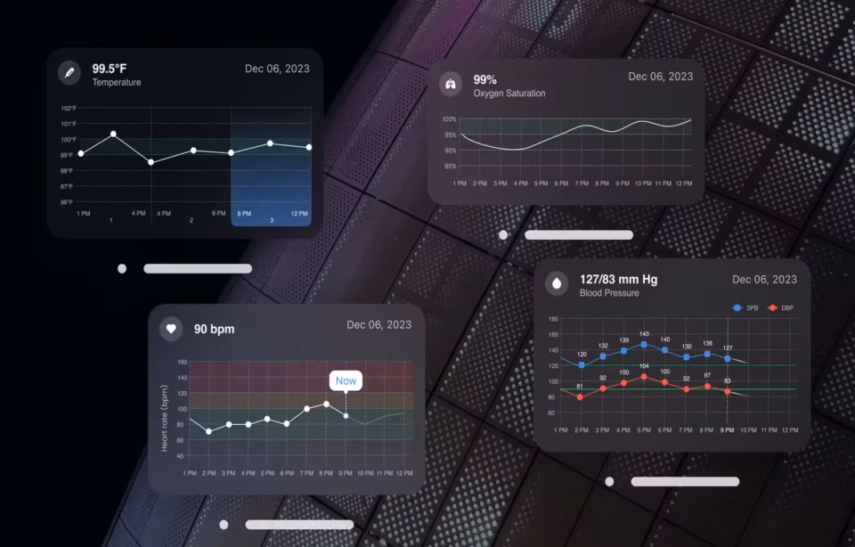
Healthcare Data Visualization and Dashboards
Healthcare data visualization converts raw clinical information (lab results, vital signs, medication histories, population health metrics) into visual formats that clinicians can scan and act on within seconds. The primary design challenge is progressive disclosure: presenting critical anomalies immediately while keeping the full dataset accessible without overwhelming the user or the screen.
If there’s one area where healthcare UX can dramatically improve decision-making, it’s data visualization.
In the medical world, data is a double-edged sword. Too little, and you are flying blind; too much, and you are overwhelmed. The modern healthcare dashboard is a masterclass in Progressive Disclosure.
We have moved away from the everything-at-once spreadsheet look of legacy EHR systems. Instead, we use data visualization to tell a story. For a cardiologist, that story is a trend line of blood pressure over six months, overlaid with medication changes. For a patient, that story is a simple health score with specific steps to improve it.
The first function of a well-designed clinical dashboard is prioritizing critical information through what Fuselab calls the Three-Second Rule: can a clinician glance at the screen and identify which patients are in danger within three seconds? Abnormal lab values, deteriorating vital signs, and medication conflicts must be visually prominent through rigorous color-coded hierarchy and logical data grouping. Not all data points are equal, and the dashboard must reflect that.
The second function is reducing cognitive load. Healthcare UX design simplifies complex clinical visualizations through clean layouts, consistent visual patterns, and meaningful cues that guide the eye to what matters. A dashboard that displays everything with equal visual weight is functionally the same as one that displays nothing, because the clinician’s attention has nowhere to land.
The third function is supporting clinical decision-making. Dashboards that merely display data force clinicians to do the interpretation work in their heads. Dashboards that contextualize data with trend lines, historical comparisons, and summary indicators reduce the cognitive steps between seeing a number and deciding what to do about it.

Best Practices for Healthcare UX Design
Healthcare UX best practices differ from general product design practices in that clinical workflow observation replaces standard user interviews, prototypes must be validated under simulated clinical stress rather than conference room conditions, accessibility must meet WCAG standards from the first wireframe, and every design decision must connect to a documented clinical or compliance requirement.
With years of designing healthcare digital products, we have found that the best healthcare UX designs are built on uncompromising rigor.
- Start With Deep User Research
Not surveys, not assumptions, but real observation! We shadow clinicians during rounds, sit in waiting rooms, observe how patients actually use portals, see where the clinician’s attention goes when an alarm sounds, notice workarounds, notice sticky notes on monitors, and even frustration patterns! This level of deep research is absolutely foundational (and non-negotiable) while building a good healthcare UX.
- Map Real Clinical Workflows
Healthcare is messy; there are no ideal workflows! An average day at the hospital is filled with interruptions, handoffs, edge cases, and escalations. UX Design teams like ours always build and test for edge-case scenarios, ensuring the design reflects how care actually happens.
- Prototype and Validate Early
Clickable prototypes allow us to test usability before development costs escalate. In healthcare, prototyping plays a more significant role, as there is no leeway for mistakes in real life.
Usability testing in healthcare must measure task completion speed, error frequency, comprehension accuracy (particularly for patient-facing interfaces), and accessibility validation across devices and user abilities.
- Align UX With Business and Clinical KPIs
Design is not decoration. It must also prove its value, and for this, we recommend tying Healthcare UX directly to measurable outcomes.
Measurable outcomes for healthcare UX include reduced documentation time per clinical encounter, increased patient portal engagement rates, lower readmission rates for chronic conditions, and improved compliance reporting accuracy.
- Design for Accessibility From Day One
As discussed above, accessibility is a key factor of healthcare UX. WCAG compliance, contrast standards, readable typography, and inclusive design practices must be integrated from the first wireframe, not added as a patch after prototyping.
User-Centered Design Process
At the heart of every successful healthcare product is a rigorous user-centered design process.
The process moves through discovery research (contextual inquiry and clinical workflow observation), persona development that spans the tech-fluent surgical resident to the elderly patient managing chronic pain, journey mapping to identify friction points across every care touchpoint, rapid prototyping to test clinical assumptions before full development begins, and iterative usability testing that refines flows based on observed behavior rather than reported preferences.
But here’s the nuance: in healthcare, users often can’t articulate their needs directly. A physician might say, “The system is slow,” when the real issue is that the interface is cluttered and he can’t find the right button. Hence, we don’t guess what a doctor needs; we observe it. Our methodology places the user at the center of every decision, so that the final product fits naturally into the operational reality of modern clinical environments.
In healthcare, accessibility is not a feature; it is essential, and when done right, it signals quality and care. Design teams must employ inclusive design so that every patient, regardless of their physical or cognitive abilities, can access life-saving care. This is particularly vital for the aging population, who may struggle with small fonts or complex navigation.
Accessibility in healthcare UX means high color contrast and readable typography for aging populations, screen reader compatibility for visually impaired users, logical tab orders for keyboard navigation, clear language free of clinical jargon for patient-facing interfaces, and multi-language support where the patient population requires it.
The bottom line is that when we design for the most vulnerable, we create a better, more resilient system for every patient and professional involved.
What to look for in a healthcare UX design team
Healthcare UX design requires a broader skill set than most digital domains. Healthcare UX professionals are not teams with a portfolio of clean, minimalist interfaces. Along with the usual UX skills, they also need to be someone who can dive deep into domain knowledge with enthusiasm and bring a measure of empathy towards users who might be using these products under emotional circumstances. Here are some skills that an ideal healthcare UX professional must have:
Systems Thinking
Healthcare ecosystems are interconnected. Designers must understand integrations between EHR systems, labs, billing, and telemedicine platforms. This requires the ability to map out complex, non-linear patient journeys where the stakes are life and death.
Domain Knowledge
The designer doesn’t need to be a clinician, but they must understand medical terminology, clinical workflows, and regulatory requirements.
Data Literacy
Healthcare products are data-heavy. Designers must interpret and structure clinical data meaningfully. They need to understand how to take a mountain of raw clinical data and distill it into a narrative that a tired doctor can read in three seconds.
Communication and Stakeholder Alignment
Healthcare projects involve compliance officers, IT teams, clinicians, executives, and patients. In this industry, there is constant negotiation between the ideal design and the rigid constraints of a Chief Medical Officer or a legal team. Designers need to explain why a specific layout improves safety, not just why it looks better.
Empathy Under Pressure
Healthcare users operate under stress. Designing for high-pressure environments requires emotional intelligence.
Prototyping and Testing Rigor
Healthcare UX designers must validate thoroughly. Because we can’t test in production with real patients, we build high-fidelity simulations that mimic the high-pressure environment of a clinic.
Real-World Healthcare UX Examples
Let’s look at some case studies that prove this isn’t just theory.
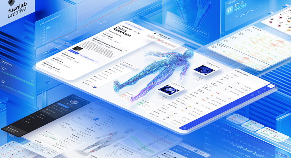
ClyHealth AI clinical platform
The ClyHealth healthcare platform required Fuselab to design three distinct AI systems within a single clinical product, each generating recommendations for prescribing clinicians. The initial interface presented AI outputs without confidence signals, and clinicians reported hesitation about acting on recommendations they could not verify independently.
Fuselab redesigned each AI output to include visible reasoning, a confidence level indicator, and a one-tap override mechanism. The result was a clinical tool where physicians could evaluate and act on AI recommendations within their existing workflow rather than treating the AI as a separate system to check.
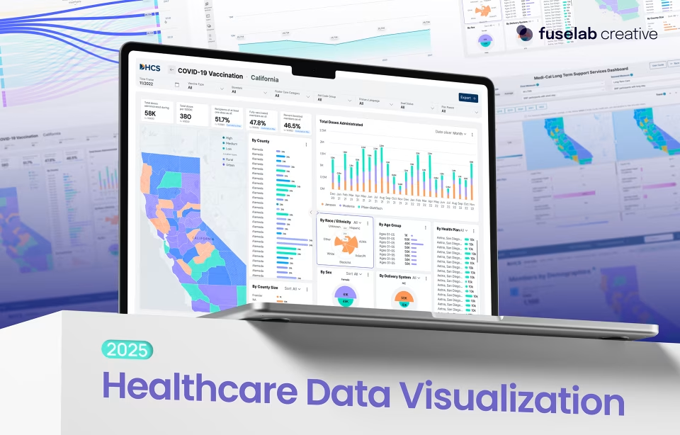
DHCS California Medi-Cal data visualization
The California Department of Health Care Services needed a public health data visualization dashboard spanning county-level healthcare distribution across the state. The legacy system displayed Medi-Cal data in spreadsheet-style tables that administrators across multiple departments could not scan effectively during time-constrained policy meetings.
Fuselab restructured the dashboard to use choropleth maps for geographic distribution, color-coded status indicators for county-level metrics, and progressive disclosure panels that let administrators drill from state overview to county detail without leaving the primary view. The project is now in its second consecutive two-year government contract.
Vasolabs artery scan platform
Vasolabs required an interface for a cardiovascular artery scanning device used by both lab technicians running the scans and patients reviewing their vascular health results. The design challenge was presenting complex cardiovascular data (arterial wall thickness, flow velocity, risk indicators) on a compact medical device screen where misreading a data point could affect a clinical assessment.
Fuselab designed interactive visualizations that simplified arteries into clear graphical representations with color-coded risk zones, allowing technicians to flag potential cardiovascular issues quickly and patients to understand their vascular age relative to their chronological age without any medical training or clinical background.
In all these scenarios, one thing stands out! Successful UX prioritizes the lived experiences of the patient and the provider. Good design, especially in healthcare settings, cannot be treated like a coat of paint; it’s the engine that makes these life-saving tools actually work in the real world.


Conclusion
Healthcare UX design in 2026 is a clinical discipline, not a visual one. The agencies and teams that treat interface design as a patient safety function build products that sustain adoption across clinicians, patients, and administrators. The ones that treat it as a styling layer ship products that healthcare staff work around rather than work with.
Fuselab Creative has spent eight years learning this through projects with NIH, DHCS, ClyHealth, and Vasolabs, where every interface decision was tested against real clinical workflows before it reached production. If you are building digital health products and UX is still treated as a secondary layer, the interface will cost you adoption, compliance, and ultimately patient outcomes. Reach out to discuss your healthcare UX design project.
Ready to Design the Future of Healthcare?
At Fuselab Creative, we help healthcare organizations transform complex medical systems into intuitive digital experiences – from clinical dashboards to AI-powered health platforms
If you’re building the next generation of healthcare products, thoughtful UX design can turn technology into better care.
Frequently asked questions
What is healthcare UX design?
Healthcare UX design is the specialized practice of creating digital interfaces for clinical, patient-facing, and administrative healthcare applications where regulatory compliance (HIPAA, FDA, Section 508), patient safety, and clinical workflow integration constrain every design decision. The scope spans EHR systems, patient portals, medical device screens, telemedicine platforms, and clinical decision support tools used by clinicians, patients, and administrators.
What is the difference between healthcare UX and medical device UX?
Healthcare UX design is the broader discipline covering all digital interfaces used in healthcare delivery, from patient portals to administrative dashboards. Medical device UX is a subset that specifically addresses the interface design of FDA-regulated hardware and software devices, requiring additional human factors documentation, summative usability testing, and formal regulatory submission materials that general healthcare UX projects do not encounter.
How does healthcare UX design differ from general UX design?
Healthcare UX design requires compliance documentation for HIPAA, FDA, and Section 508 that general UX projects do not encounter, adding significant time to project schedules for regulatory work. Every healthcare interface must serve at least three distinct user types simultaneously, which is uncommon in consumer design. General agencies applying standard product patterns to clinical interfaces typically produce work that fails usability testing with actual clinicians.
How much does healthcare UX design cost?
Healthcare UX design projects with a US-based specialist agency cost between $25,000 and $150,000 depending on data integrations, compliance requirements, and whether the scope includes a full design system or only primary screens. Hourly rates for US specialists range from $100 to $300, while offshore agencies charge $25 to $80. Discovery phases are typically priced separately before committing to full project scope.
What should I look for when choosing a healthcare UX agency?
A qualified healthcare UX agency should show shipped EHR or clinical interfaces with named clients, documented HIPAA compliance experience, and evidence of usability testing conducted with actual clinicians or patients rather than internal team members. Named government or regulated-industry clients indicate the agency has worked within real compliance constraints rather than around them.
How long does a healthcare UX design project take?
Healthcare UX design projects typically take 3 to 9 months from discovery through validated prototype, depending on the number of user types, compliance requirements, and integration complexity. A focused single-interface project with one primary user type can reach validated prototype in 10 to 14 weeks. Multi-stakeholder platforms with EHR integrations and both clinician and patient interfaces require 6 to 9 months.
What are the biggest challenges in healthcare UX design?
Healthcare UX design faces five primary challenges: regulatory compliance constraints that limit design flexibility, system fragmentation across EHRs, labs, and billing platforms that must interoperate, diverse user groups with conflicting workflow needs and technical literacy, high-stakes environments where interface errors affect patient safety, and organizational resistance to new interfaces after previous technology adoption failures.