From Data to Diagnosis: The Role of Healthcare Data Visualization
According to the latest estimates by Exploding Topics, we create 328.77 million terabytes of data every day. By the end of 2025, 181 zettabytes of data will be generated annually. While much of it is consumer-generated, the trend foreshadows a similar rise in data collection and generation across industries, including healthcare.
If you recall a typical doctor’s appointment from 5 years ago and compare it to the process today, you will easily be able to spot how every step of the process has moved from paper to digital devices.
Almost every interaction, report, and prescription is now logged onto a system, and much of the information between departments and between patients and caregivers is done on digital platforms. Naturally, this increase in data has created a unique opportunity to track trends and gain insights. But busy healthcare professionals cannot be expected to pour over Excel sheets of numbers. And this is where the need for accurate and real-time data visualization comes into play.
What is Healthcare Data Visualization?
Visualization for healthcare data comprises putting forth medical and patient data in a graphical format that aids its analysis and the decision-making process. It is interactive and visual and is tuned to simplify complex data streams.
Data visualization for healthcare is all about transcending the usual spreadsheets and reports to make information more understandable, engaging, useful, and accessible to more users.
The Johns Hopkins University COVID-19 Dashboard is an excellent example of healthcare data visualization in action. The dashboard, which combined data from across the globe, became a go-to resource for individuals, healthcare professionals, and decision-makers looking for the latest information on the pandemic’s status.
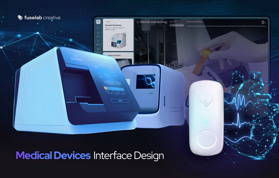
For another example, do check out our work on Datamonitor Healthcare, an app we designed for Informa to help pharmaceutical manufacturers and researchers track the course of various treatments for specific diseases and target their resources where they are most needed.
Why is data visualization important for healthcare?
The answer is usually in the data, but we have to find it and understand it first.
In a data-driven landscape, getting the right data is not the hard part. Digitization efforts of the last decade have ensured that most hospitals and other healthcare institutions put their information online; however, making it accessible and understandable is the challenge that data visualization efforts solve.
Data visualization in healthcare helps in the following ways:
It reduces the inherent complexity of managing vast amounts of complex and variable data that often range from patient demographics and clinical parameters to treatment protocols and outcomes. Putting this into visual formats makes it easier to interpret and helps healthcare professionals extract meaningful and actionable insights from it.
- Visual formats such as graphs, bars, charts, etc., make it easier to grasp the patterns the data presents and open it up to more people by overcoming linguistic and disciplinary barriers. The healthcare system is made up of multidisciplinary teams, patients, and stakeholders; an easy-to-understand representation allows everyone to comprehend the data meaningfully.
- Understanding naturally leads to better healthcare outcomes. Interactive visualizations can help professionals spot disease outbreaks, treatment inefficacies, and progress, giving them the power to intervene promptly and catch problems before they escalate. They can also empower healthcare professionals to optimize interventions and care pathways, ultimately resulting in improved patient outcomes.
- Data visualizations not only help top-tier professionals but also empower patients and caregivers to engage in their healthcare journey, track progress, and make informed decisions such as choosing treatment options and changing lifestyle parameters.
- Data visualization can make strategic planning and resource allocation easier for healthcare institutions. By identifying patterns, organizations can deploy their resources efficiently and plan for healthcare spikes that seem likely to occur. An excellent example would be how hospitals and government bodies tackled COVID-19 by anticipating upswings to stock up on critical equipment and medications.
- In the realm of public health, visualization can help decision-makers grasp evolving disease trajectories and build robust health surveillance and informed policy-making. Predictions on geographical hotspots, transmission patterns, timelines, and possible negative impacts can aid government officials in planning upcoming challenges that go beyond the healthcare ecosystem.
Types of data visualization used in healthcare
Healthcare data usually amounts to vast amounts of medical information – patient demographics, treatment histories, clinical trial results, disease outbreaks, and more. Visualization turns this into easily digestible formats like:
- Charts are the most common form of data visualization of medical data. They take a variety of forms depending on the data, its usage, and the goal of the visualization. For example, Bar charts can be effective for comparing categories, while line charts are ideal for showcasing trends over time, such as for depicting a patient’s vital signs over a treatment course. Pie charts are often used to represent the proportions of a whole and are used to break down categories such as healthcare spending by category or patient demographics within a hospital.
- Heatmaps are color-coded grids usually reserved for depicting data intensity across variables. They can be used to identify the top 3 most expensive areas in a hospital or the biggest reasons for admissions.
- Infographics: Whether static or animated, infographics have become the most engaging type of graphical representation of data. They easily convey complex information in an eye-catching and crisp manner, and in healthcare settings, they are often used to educate patients or the public. A good example of this would be the COVID-19 posters, which set out prevention information.
- Flowcharts and diagrams: These are much more simplistic and traditional than the new visual design elements. However, they do a great job of explaining more detailed medical processes, diseases, and their effects. We have all seen the giant diagrams of eyes, digestive systems, and skeletons that comprehensively explain how our bodies work.
- Geographical Maps: Geographical representations are the default visual aids for tracking trends and data on a national or global scale. This was much in evidence during the pandemic to track rising cases of the virus, and public health officials employ them to track issues such as maternal and infant mortality or vaccination trends on a broader scale.
- Interactive Dashboards: Dynamic dashboards bring data to life and allow users to filter, drill down, and explore data sets in real time. Imagine a physician monitoring a patient’s live vitals while simultaneously visualizing trends from similar cases.
(Read more about how data visualization is changing healthcare)
With an overview of different types of visual formats that can be used for healthcare data, let us also look at the various ways in which they are used:
- To depict and help decision-makers study temporal trends in healthcare, such as patient health metrics throughout treatment.
- To uncover geographic patterns from data, such as disease prevalence or healthcare disparities.
- To lay out hierarchical structures such as in patient care, procedures, and treatments.
- To identify new patterns between different variables. Plotting different variables in scatter maps can help professionals in the field explore relationships between different variables and find new insights. For example, diabetes treatment with medication Vs. lifestyle changes.
- Converting text to visuals to make it more easily understood.
Steps to ensure accurate and meaningful data visualization
Like every design process, clinical data visualization also has well-tested processes and best practices. To get the best results, UI/UX design agencies follow the below-mentioned steps:
STEP 1: Goal Setting
The first step is to clearly define the objectives and target audience of the data visualization project. This will ensure that the graphical framework is developed in alignment with organizational goals and user needs.
STEP 2: Mapping User Journeys
Once the objectives are clear, the next step is to understand how users will interact with the visualization. How will they find it, reach it, and use it are key factors in defining how the visual elements will be selected, designed, and positioned in their overall journey through the healthcare system.
STEP 3: Data Collection and Cleaning
Gather relevant healthcare data from all sources. The focus should be on accuracy, completeness, and data privacy. This raw data then needs to be cleaned, checked, and structured into complete data pipelines.
STEP 4: Select Appropriate Visualization Techniques
With the above 3 steps in place, UI/UX agencies design visualization formats that effectively communicate key insights and facilitate interpretation.
STEP 5: Design Intuitive Interfaces
To ensure public health data visualization engages different layers of professionals, design agencies step in to provide user-friendly interfaces with interactive features that enable each stakeholder to explore, customize, and engage with the data to suit their needs.
STEP 6: Feedback and Evaluation
The last step is to test and tweak the visualization outcomes. The final product must be released to a group of targeted users to gauge their reaction to the graphical model. Based on their feedback and usability testing, the design team will change, edit, and refine the initial visualization prototypes.
Various Tools for Data Visualization
There are several design tools in the market to help designers produce attractive and accurate visual data formats. Here are some noteworthy ones:
Tableau: Popular for its user-friendly interface and analytical capabilities, Tableau makes it easy to produce cutting-edge data visualizations for public health ecosystems through interactive dashboards, filtered reports, and predictive analytics models.
Power BI: Microsoft Power BI is another powerful data visualization tool. In addition to the default visualization formats, it offers interactive charts, geospatial maps, and natural language queries. Power BI is excellent for scenarios that require real-time insights and collaboration across healthcare settings.
D3.js: D3.js is a JavaScript library well-known in the developer community for its flexibility and scalability. If customization is required, It is the go-to tool for design agencies. D3.js is ideal for organizations looking for deeper insights or help managing more complex data.
Plotly: Plotly offers Dash, a Python framework used by developers to build interactive web applications. It provides a large library of graphics and APIs, which speeds up the design and development phase while allowing customization.
Benefits of Data Visualization in Healthcare
While implementing data visualization in healthcare settings is important for the reasons mentioned in the section above, let’s also dive deeper into how it empowers various stakeholders in the medical ecosystem.
For Patients:
- Empowerment: While patients are the central figures around whom the healthcare industry services are designed, they are also often the most powerless and least informed stakeholders in the process. Lack of medical knowledge can be countered to some extent by visual aids such as Interactive dashboard designs that make medical reports more accessible and understandable. They help patients track progress, set goals, and make informed decisions throughout and beyond their treatment. In short, they get to be in the driving seat of their medical issues.
- Education: Visual representations of medical conditions, treatment procedures, and healthcare resources facilitate patient education and health literacy. The posters and diagrams in doctor’s clinics or waiting rooms are great examples of using visual design to spread knowledge.
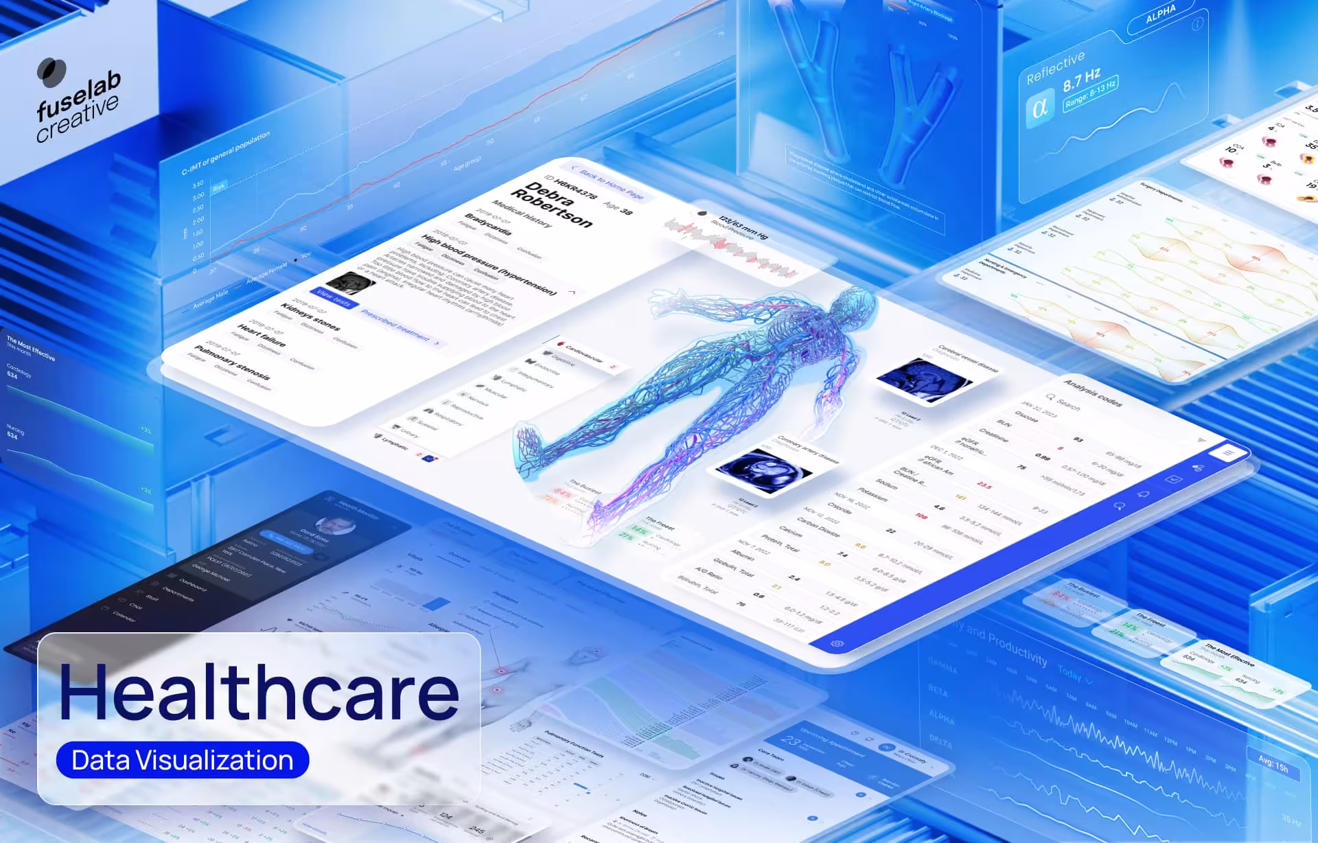
(Here is an excellent example of how we integrated 3D visualization into a digital platform to simplify ultrasound-based artery scans to communicate with various patients and medical providers.)
For Caregivers:
- Efficiency: Managing a patient is a tough job that is often made more difficult when caregivers don’t understand the disease or the treatment. Visual representations can make this challenge more manageable for caregivers, especially untrained family members. Intuitive dashboards and alerts can help them stay on top of clinical workflows, prioritize tasks, monitor patient vitals, and seek help promptly in case of emergencies.
- Collaboration: When treatments involve different teams of caregivers, such as with patients who leave the hospital but require support in their homes, shared visualizations or dashboards can build collaboration. Different caregivers can coordinate and communicate with each other and with doctors without human interpretations or errors.
For Doctors:
- Pattern recognition: Along with caregivers, doctors can use data visualizations to uncover patterns in their daily practice. Whether this is for an individual patient’s treatment journey or to track anomalies in a cohort of patients (an example would be using recognizing patterns during the flu season), doctors can benefit from interacting with data dashboards that simplify complex data. Data visualization is also a quick way for new doctors to catch up on the treatment timelines while taking over case details of an existing patient from a colleague.
- Speed and accuracy: Graphical formats offer busy doctors a quick, easy, yet accurate way to understand patient reports – saving time without sacrificing quality. A well-entrenched example of this benefit of data visualization is our Radiology Queue, an interactive software platform for X-ray specialists that helps them review scans and annotate with notes, measurements, and/or approvals or rejections for medical providers.
- Predictive and Predictive AI support: With the integration of Machine learning and Artificial Intelligence in healthcare systems, data dashboards can lighten a doctor’s workload by flagging future problems and providing recommendations to solve them.
For Healthcare Organizations:
- Quality Improvement: The biggest benefit of dashboards in healthcare institutions centers around improving outcomes and optimizing treatments. Visually aided analytics can help identify performance trends, clinical outliers, and areas for improvement – all of which lead to better outcomes for patients and efficiencies for hospital administration.
- Resource Optimization: Data-driven insights from visualizations also help healthcare organizations manage their resources. Staff, time, budgets, and materials are finite, and hospital administrators must decide to deploy their resources smartly and quickly while keeping an eye on the financial aspect of providing care.
Conclusion
The importance of data visualization in healthcare is well established. From unlocking insights and improving communication and collaborations between all stakeholders to optimizing treatments and improving outcomes, the vital role of data visualization is evident.
There is little doubt that as healthcare becomes more digital and complex, the need for effective data visualization tools and techniques will only grow, turning it from a desirable extra to a must-have component of every healthcare provider.
Find out how you can unlock the benefits mentioned above for your organization; get in touch to understand the details of our Data Visualization Services.

Triple Your Customer Base With Human-Centered Healthcare UX Design
Building a new app, or improving an existing one, we can get you headed in the right direction fast!