How Data Is Changing The World

The world is now swimming with data — so much that it is difficult to define exactly how much is produced and collected every day.
In 2019, around 2.5 quintillion bytes of data were created every single day, with 90 percent of the world’s historical data created since 2017. This handy infographic from Domo’s report on data — also published in 2019 — demonstrates the kind of scale we are talking about.
But how is this data being used? How can we make this sprawling volume of data a force for good?
Let’s take a look at a few ways in which data is changing the world.
Making critical decisions with data
Let’s say an organization wishes to expand into a new market or release a new product or service.
Historically, they may have relied upon anecdotal evidence to fuel the decision-making process or looked at the behaviors exhibited by customers and tried to second-guess this.
Now, analytics data regarding customer searches and browsing activity demonstrates precisely what these customers need, while real-time data streaming from a growing range of sources supports up-to-the-minute honing of buyer personas. This puts modern businesses in the perfect position to make crucial decisions in a corporate direction.
We can also see how this influences decision-making in public office, particularly about key decisions such as resource allocation. In Delaware, government departments installed GPS devices on vehicles in their fleet, effectively tuning these vehicles into the Internet of Things or IoT.
The result was a more informed process of resource allocation across the state and a direct saving of $874,000 in parts and fuel costs.
Personalization of data in online systems
The ideal for any organization providing a product or service to their audience is one-on-one interaction and a completely tailored, personalized experience for every user. At the moment, of course, this is not feasible, requiring too many resources and too much capital investment.
And yet, the current state of affairs is leaving many users frustrated. Data from 2023 showed that 90% of customers prefer working with companies that personalize customer service to their objectives and needs, while findings from 2017 demonstrated that 71 percent of consumers experienced frustration due to impersonal shopping experiences.
These figures tell us that organizations must try harder to personalize their offerings. While that endgame of pure, one-on-one interaction remains something of an impossible dream, the nature of data in the third decade of the 21st century enables organizations to get closer than ever before to this ideal scenario.
By adding increasing amounts of securely held data to user personas, organizations gain a detailed picture of what these users are all about and what their aims are. In effect, organizations are using data to fuel an even more personalized experience for all users.
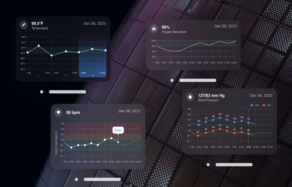
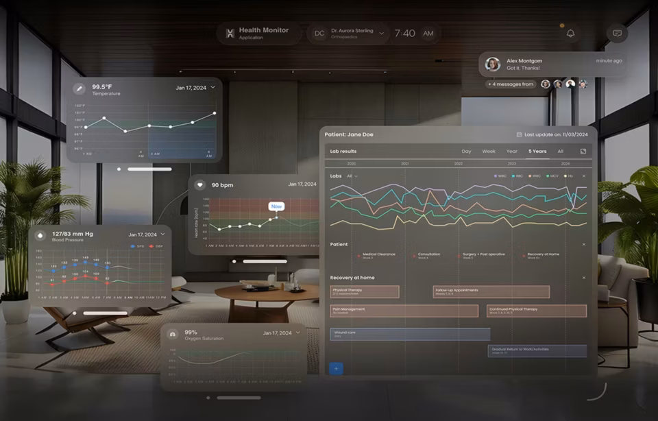
Accessing timely and relevant data for health and well-being
In Missouri, government health officials decided to draw upon Medicaid claims data to support better patient outcomes. The data was used as a resource for an algorithm, which was then able to analyze elements such as chronic health conditions and emergency service usage frequency to determine patient risk status. It was then possible to provide a more personalized level of care thanks to better data relevancy, resulting in — among other things — 25 percent of diabetic patients lowering their blood sugar levels from high to normal.
This is a good example of data relevancy protecting public health and well-being, but what about timeliness? CarePort Health Head of Product, Sara Radkiewicz, writing for HIT Consultant, identified some of the problems associated with data that is not delivered on time — problems that exist within the model adopted by the government of Missouri.
Radkiewicz describes how a great deal of patient health data is not readily available to providers, or, as in the example from Missouri, is based on claims, and is therefore only accessed after the fact. Radkiewicz’s example focuses on patients transitioning between care settings — between in-home care and dedicated care facilities, for example.
She describes how healthcare providers are “scrambling to play catch-up” in terms of the current status of the patient, and that the data they are working with is often subject to lag.
Real-time data streaming, remote collaboration in the cloud, and secure cloud storage are all helping to revolutionize the way we use data, and make it possible for caregivers to access datasets that are not only relevant and tailored to the patients they are working with, but are also delivered promptly.
Saving lives with data
Any data that supports the healthcare industry and well-being will also save lives, even if this lifesaving attribute is indirect. But what about direct lifesaving in an emergency setting and why is data visualization important?
There are already countless examples of this, from detailed data analytics being used to reduce emergency service response time, as well as providing first responders with the pre-prepared insight they need to save vital minutes and seconds, to the Clinical Decision Support software that provides real-time analysis of medical data for diagnostic and prognostic decision-making.
Understanding has always been at the heart of emergency treatment and lifesaving decision-making. With the advent of data-informed processes, this understanding is becoming more acute and effective than ever before.
Read more about the importance of data visualization in healthcare.
Informing the public with database scraping, mining, organizing, and more
Big Data became something of a ubiquitous term for businesses and other organizations a few years ago, as data volumes began to increase exponentially. Having access to all that data is great, but there is an inherent issue here — at such a vast scale, it is almost impossible for humans to interpret, wield, and derive insight from such datasets.
This is where concepts such as data scraping, mining, and organizing, as well as effective user interface design, play a huge role in translating this data into something manageable for the general public, or for anyone keen to gain a new perspective on data.
Consider the process of booking a flight. There are so many different airlines and travel agencies out there, each serving different routes and itineraries, and each updating pricing and other information round-the-clock.
It is only through data visualization scraping that price comparison websites such as Trivago can make the process efficient for the consumer.
Mining works similarly, analyzing vast banks of data in search of patterns and relationships that provide useful insight.
Of course, all of this is redundant unless there is an intuitive means of accessing and understanding this data, which is where interface design comes into play. The insight is all there, but it is up to user interface designers to make this data searchable and understandable on a human level.

The bottom line
It is no exaggeration to say that data is changing the way we interact with and understand the world around us. The Age of Data is several years old now, but it was only relatively recently that we began to understand that the gross volume of collected data is not an effective yardstick by which to measure its usefulness.
Instead, this data needs to be placed at the fingertips of those who need it most, and it is this process of interpretation and translation that is fueling data science as we move through 2020 and beyond.
And as a data visualization agency, this is where Fuselab Creative is currently focusing our efforts every single day and providing the best dashboard design services in the DC area.