15
min read
15
min read
 Oct 7, 2026
Your Guide to UI/UX HMI Design: The Human Machine Interface Experience

HMI design is the practice of designing the screens, controls, and feedback through which a person operates a machine, from a factory line to an ultrasound scanner to a vehicle dashboard. The work is regulated in ways ordinary screen design is not: manufacturing interfaces follow the ISA-101 standard, and medical device interfaces are expected to pass FDA human factors validation before they ship. In other words, this is not the kind of design discipline that any team can take on, to say the very least.
Understanding human-machine interfaces
A human-machine interface is the point of contact between an operator and a machine: the screen, panel, buttons, or voice system through which commands go in and machine status comes back. Every HMI performs the same two jobs: translating human intent into machine signals, and presenting machine data in a form a person can read at a glance.
What is an HMI design interface?
HMI stands for Human-Machine Interface, an interface that allows a user to interact with a machine, system, or process. That interaction can be as simple as a push-button control or as involved as a multi-screen graphical display with voice input. What the interface does, in every case, is translate human commands into machine-readable signals and return machine data in a format humans understand.
The distinction between interface hardware and software matters more here than in most design work. Hardware covers input devices like touchscreens, keyboards, and physical buttons, plus output devices like displays and indicator lights. Software covers the graphical interface, the data processing logic, and the communication protocols underneath. A usable machine interface needs both designed together; a well-designed screen on a display that washes out under shop-floor lighting still fails.
How HMI design works
HMI design works as a continuous loop: the operator gives an input, the system translates it into a machine signal, the machine acts, and the result comes back as visual, auditory, or haptic feedback. The quality of an interface is measured by how fast and how accurately that loop runs under real working conditions.
Picture an operator adjusting line speed from a touchscreen panel. The tap becomes a signal to the drive controller, the motor responds, and the new speed reads back on screen within a fraction of a second. If that readback lags, the operator taps again, the machine overshoots, and you have taught your user to distrust the panel.
The same loop runs in a car when a driver uses voice commands to control navigation, and in a clinic when a technician watches live measurements land on screen during a scan. The output channel changes, the principle does not. Input, processing, and feedback repeat hundreds of times per shift, and the interface earns or loses trust on every cycle.
Types of human-machine interfaces
Human-machine interfaces fall into four working categories: push-button panels for simple control tasks, touchscreen displays for flexible visual interaction, voice-activated systems for hands-busy environments, and full graphical user interfaces for complex monitoring and control. Most industrial systems combine at least two, pairing a screen with hardware controls that work when the screen cannot be touched.
Simple push-button interfaces
Push-button panels sit at the simple end of the spectrum, and they stay in service for a reason: they are reliable, cheap, and they work with gloves on. There is a second reason they never fully disappear. An emergency stop is a hardwired physical button on purpose, because the one control that must work when the software hangs cannot live inside the software.
Touchscreen displays
Touchscreens carry most modern HMI work because one panel can present any number of controls and update them by software alone. The tradeoffs are physical. Moisture, dust, and gloves degrade touch accuracy, and a screen provides no tactile confirmation, so operators working without looking need deliberate design compensation: larger targets, confirmation states, and haptic or audible response.
Voice-activated systems
Voice input earns its place where hands and eyes are committed elsewhere, in a vehicle, an operating room, or on a ladder. Ambient noise, accents, and specialized vocabulary all cut recognition rates, so the deployments that work treat voice as a secondary channel and read the command back before executing anything irreversible, the same readback loop pilots use with air traffic control.
Graphical user interfaces (GUIs)
Graphical user interfaces are the most capable category, presenting live data through dashboards, charts, and interactive controls. That capability is also the risk. A GUI can put every parameter of a system on screen at once, and an operator under pressure cannot use most of it, so the design discipline is subtraction: deciding what the operator must see in the next three seconds and pushing everything else a layer down.
HMI vs GUI vs SCADA: what the terms actually mean
HMI, GUI, and SCADA describe different layers of the same stack. The HMI is the full point of contact between operator and machine, a GUI is the graphical screen portion of that contact, and SCADA is the supervisory software system that collects and controls plant-wide data, usually operated through an HMI.
The distinction matters in procurement because the three get quoted as if interchangeable. An agency can design an HMI without ever touching SCADA configuration, and a SCADA integrator can wire a plant without doing any real interface design. Scope the work by asking which layer the vendor has actually shipped, not which acronyms appear on the proposal.
HMI applications and use cases
HMI applications span industrial automation, automotive systems, consumer electronics, aerospace, and medical devices, and each industry weighs the same requirements differently. Industrial settings prioritize durability and real-time monitoring, automotive design centers on driver attention, aerospace on redundancy, and medical devices on error prevention, because a misread value in a clinical interface carries a patient-safety cost.
Industrial automation
Factory and process-control interfaces let operators oversee production, adjust parameters, and respond to anomalies from a single panel. The governing document here is ISA-101, the ISA’s human-machine interface standard, which covers menu hierarchies, color and alarm conventions, and dynamic display behavior for manufacturing applications. An industrial HMI that ignores those conventions forces every new operator to relearn what alarms look like.
Real-time manufacturing interfaces add a display-refresh requirement on top of the conventions: line status, counts, and alarms have to update at the pace of the process, and any lag between floor state and screen state results in operators making decisions on stale data. The design work is deciding which values earn continuous refresh and which can poll, because refreshing everything costs performance where it hurts.
Alarm design is where we find the most accumulated damage in inherited industrial interfaces. Years of additions have left screens where a third of the display is some shade of red, and operators triage by memory rather than the interface. The fix starts with ruthless reclassification, deciding what an alarm is, what a status is, and what should never have been on the screen.
Automotive systems
Automotive interfaces have grown from instrument clusters into infotainment and driver-assistance systems, and the design problem has inverted along the way: where early dashboards struggled to show enough information, current ones struggle to withhold it. Every element on a dash display competes with the road for driver attention, so automotive HMI UX design is judged by glance time, not by feature count.
Consumer electronics
Consumer devices train the expectations every operator brings to work. A technician who spends evenings with a phone that responds instantly and forgives mistakes will judge an industrial control panel by the same reflexes. Smart-home devices, wearables, and appliances keep raising that bar, which is why industrial and medical interface work borrows consumer interaction patterns wherever safety allows.
Aerospace
Flight decks and cabin management systems operate under the strictest requirements in the field: high-stress use, zero tolerance for ambiguity, and certification standards that make every design change expensive. Redundancy is the defining principle. Critical information appears through multiple channels, so a single failed display or a missed audio cue never leaves a pilot without the data.
Medical devices
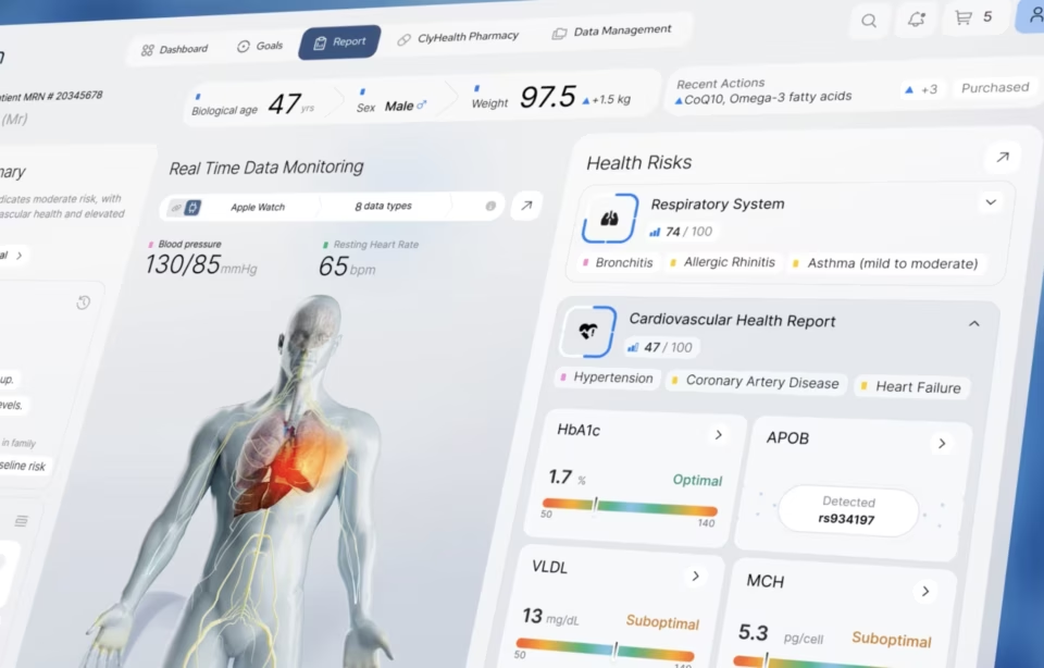
Medical HMIs answer to the least forgiving set of requirements: patient safety, regulatory validation, and users ranging from trained technicians to patients themselves. When we designed the Vasolabs ultrasound artery scan platform, the same system had to serve a technician running a live scan, a physician reading carotid intima-media thickness data, and a patient seeing their own results.
Each of those users needed a different reading of the same scan. The technician screen shows live measurements as they land, the clinical view holds the diagnostic details, and the patient view translates blockage into color-coded artery illustrations and a vascular age relative to actual age. The same scan feeds all three, translated differently for each audience. That translation problem is the core of medical device interface design.
HMI UX design: how operators actually work
HMI UX design is the research and structure work that makes a machine interface match how its operators actually think and move: what they check first, what they do under alarm conditions, and where their attention lives during a shift. It rests on task analysis, user research, information architecture, and usability testing, in that order.
Task analysis gets the most weight in our process because it is the step most agencies skim. Breaking a job into observable steps, in the actual environment, exposes the difference between the documented procedure and what operators really do: the workarounds, the skipped confirmations, the grease-pencil notes stuck to the bezel. Design for the documented procedure alone, and the interface frightens its users from day one.
User research and information architecture follow from what task analysis surfaces. Interviews and observation sessions, the standard tools of UX research, tell you what operators trust and what they route around, and the information architecture then arranges functions by frequency and consequence rather than by the machine’s internal logic. Menus organized around the controller’s data model are the most common structural mistake we inherit.
Usability testing closes the loop and requires the least explanation: put the prototype in front of real operators under conditions as close to the floor or the clinic as you can get, and fix what they stumble over. Testing in a quiet conference room with a mouse tells you almost nothing about a panel used standing up, in noise, with gloves. This is the kind of mistake we see over and over from an inexperienced design team: taking shortcuts or failing to understand the full scope of what is needed to properly test their work.
The first prototype usually survives the conference room and dies in the first field session. We almost always discover an input nobody mentioned in discovery: a shared login, a shortcut taped to the housing, an alarm everyone silences by habit. Each one is a requirement that never made it into the spec, and the redesign that follows is where the interface comes to life.
HMI UI design: crafting intuitive interfaces
HMI UI design covers the visual and interactive layer of a machine interface: layout, typography, color, and iconography, arranged so that an operator can read the system state and act on it within seconds. The working standard for an HMI user interface is glanceability, meaning the most important value on the screen should be understood before the operator has consciously read anything.
Cognitive budget drives every visual decision. Nielsen Norman Group’s work on minimizing cognitive load draws the useful line between intrinsic load, the effort of the task itself, and extraneous load, the effort the interface adds. A machine operator’s intrinsic load is already high, so decoration, redundant labels, and clever-but-novel controls are not neutral; they are withdrawals from an account that is already close to empty.
Display context sets the physical constraints. Industrial screens fight glare, dust, and washdown requirements; automotive displays adapt to day and night lighting; medical panels get read from an angle, mid-procedure, by someone whose gloved hand is otherwise occupied. Type sizes, WCAG contrast ratios, and touch-target dimensions that pass on a desktop routinely fail in those settings, which is why we spec them against the environment, not the style guide.
Optimizing HMI performance
HMI performance comes down to three measurable factors: processing speed, the system’s ability to handle computation; latency, the delay between operator input and visible response; and data throughput, the rate at which information moves between the interface and the machine. Of the three, latency does the most damage to trust, because operators feel it on every single interaction.
Latency deserves the tightest budget in the spec. On live diagnostic scanning interfaces, measurements are uploaded and rendered while the probe is still moving, and if the display falls behind the operator’s hand, the operator stops trusting the screen. Once that trust goes, they work around the interface, and every dollar spent designing it stops earning anything.
Code efficiency, hardware selection, and network management are the levers available. Software gets optimized to cut processing overhead, hardware gets specified with enough processor and memory headroom for the worst shift rather than the average one, and network protocols get tuned where the interface depends on remote data. The work is unglamorous and shows up in exactly one place the operator notices: response time.
Measurement keeps performance honest after launch. Response time, frame rate, and throughput can all be tracked with standard software tooling, and the teams that monitor them in production catch degradation before operators complain. A panel that was fast at acceptance testing and slow eleven months later is a maintenance story, and the interface takes the blame either way.
Best practices for effective human-machine interface design
Effective human-machine interface design follows a short list of practices that hold across industries: consistency in layout and terminology, iterative design with early prototypes, clear and concise information, deliberate error prevention and handling, accessibility, and continuous improvement after launch. Each is easy to state and expensive to skip.
- Consistency in layout, terminology, and interaction patterns to reduce user confusion and learning curves.
- Iterative design with continuous testing and refinement based on user feedback.
- Early prototypes developed and tested with representative users to identify potential usability issues and make necessary adjustments.
- Clear and concise information, avoiding clutter and ambiguity.
- Error prevention and handling with clear feedback and guidance to users in case of errors.
- Accessibility so the interface can be used by individuals with diverse abilities.
- Continuous improvement, since user needs and technologies are ever-evolving.
- Regular evaluations and updates for relevance and efficiency.
Collaboration is the practice that makes the rest of the list achievable. Designers bring the user evidence, engineers know what the control system can actually do, and domain experts catch the errors neither would see, the alarm that means something different on this line, the shorthand every nurse on the unit uses. Interfaces built without all three at the table get corrected in the field, expensively.
Popular HMI development tools and technologies
HMI development runs on three tool layers: platform software such as SCADA packages, embedded GUI builders, and web-based HMI frameworks; programming languages, with C and C++ for embedded systems, Python and Java for cross-platform work, and HTML5, CSS, and JavaScript for browser-based panels; and the display and input hardware the interface ships on.
Framework choice follows the deployment target more than team preference. Qt and .NET dominate installed industrial panels because they run close to the hardware and survive offline; web stacks win where the interface needs to reach browsers and tablets without an install. Choosing a web stack for a panel that must keep working when the network drops is the mistake we see most often in inherited systems.
Emerging layers are arriving fast but unevenly. Voice adds a hands-free channel and augmented reality overlays instructions directly onto equipment. Each earns its place only where it removes work from the operator; an AR overlay that adds a headset to a job that needed a glance is technology serving itself.
AI-assisted HMI design
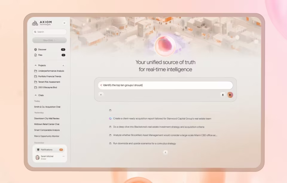
AI-assisted HMIs use machine learning to adapt displays to individual operators, surface predictive alerts before a failure threshold is crossed, and put a conversational copilot beside the controls. The design constraint is trust: every AI-generated recommendation needs a visible confidence indicator, a plain-language explanation of why it appeared, and a human override that the operator can reach without leaving the screen.
Adaptive interfaces rearrange what an operator sees based on shift patterns, role, and current machine state, and predictive alerting moves the alarm earlier, flagging vibration or temperature drift before a limit trips. Both only help if the operator understands why the screen changed. An interface that silently reorders itself reads as broken, and an alert with no stated cause gets acknowledged and ignored.
LLM-based copilots are arriving on the plant floor and in the clinic, letting an operator ask why a value is drifting instead of paging through a manual. Gartner’s June 2025 agentic AI predictions put agentic AI inside 33% of enterprise software applications by 2028, up from less than 1% in 2024, and the operational software running plants and clinics will not be exempt.
The pattern we hold to in AI interface design work applies directly here: the copilot recommends, the operator decides, and nothing the model produces can execute a control action without a human confirming it. On machinery, an agent with direct write access to controls is a liability the safety review will find, not a feature.
One mistake we repeatedly see in AI-assisted interface briefs is treating explainability as a compliance report instead of a screen element. Nielsen Norman Group’s research on explainable AI found the explanations current LLMs offer are often inaccurate, hidden, or confusing, which puts the burden back on the interface: confidence indicators sit next to the value they qualify, and the override control sits on the same screen as the recommendation.
Conclusion
Machines keep gaining capability, and the interface remains the place where that capability either reaches the operator or dies in a menu. The evaluation criteria in this guide, latency budgets, environment-tested usability, and error-state documentation, are the same ones applied in our human machine interface design engagements, and they will outlast any particular display technology.
HMI design FAQ
What does HMI stand for?
HMI stands for human-machine interface, the screen, panel, or control system through which a person operates a machine or industrial process. The term covers everything from a two-button control box to a multi-monitor SCADA control room display.
What is HMI design?
HMI design is the practice of designing those interfaces so an operator can monitor, control, and correct a machine quickly and without error. It combines UX research on how operators actually work with UI decisions about layout, color, alarms, and feedback, all under the physical constraints of the working environment.
What is the difference between HMI and GUI?
HMI describes the full point of contact between human and machine, including physical buttons, indicators, and voice input, while a GUI is specifically the graphical, screen-based part. Every GUI on machinery is part of an HMI, but plenty of HMIs, such as push-button panels, contain no GUI at all.
How is HMI UX design different from standard software UX?
HMI UX design assumes the user is doing something else at the same time, operating equipment, treating a patient, or driving, while standard software UX usually assumes full attention on the screen. That changes the priorities: glance-speed readability, error tolerance, and physical usability with gloves or in glare outrank visual polish and feature density.
How much does HMI design cost?
HMI projects with US-based specialist agencies typically run $25,000 to $150,000 depending on the number of screens, user roles, and whether the scope includes usability testing in the operating environment. Specialist hourly rates run $100 to $300, and regulated industries sit at the higher end because validation adds design documentation.
How long does an HMI design project take?
HMI projects typically take 10 to 16 weeks from research through tested, developer-ready screens, assuming access to real operators for research and testing. Medical and other regulated interfaces run longer, because human factors validation and documentation add review cycles that consumer software never sees.
What should I look for in an HMI portfolio?
A strong HMI portfolio shows at least one shipped machine or device interface with a named client, evidence of testing in the real operating environment, and documentation of error and alarm states, not just clean dashboard screenshots. An agency that only shows web and mobile work has not dealt with latency, gloves, or glare.