SaaS onboarding UX: designing activation flows that retain users
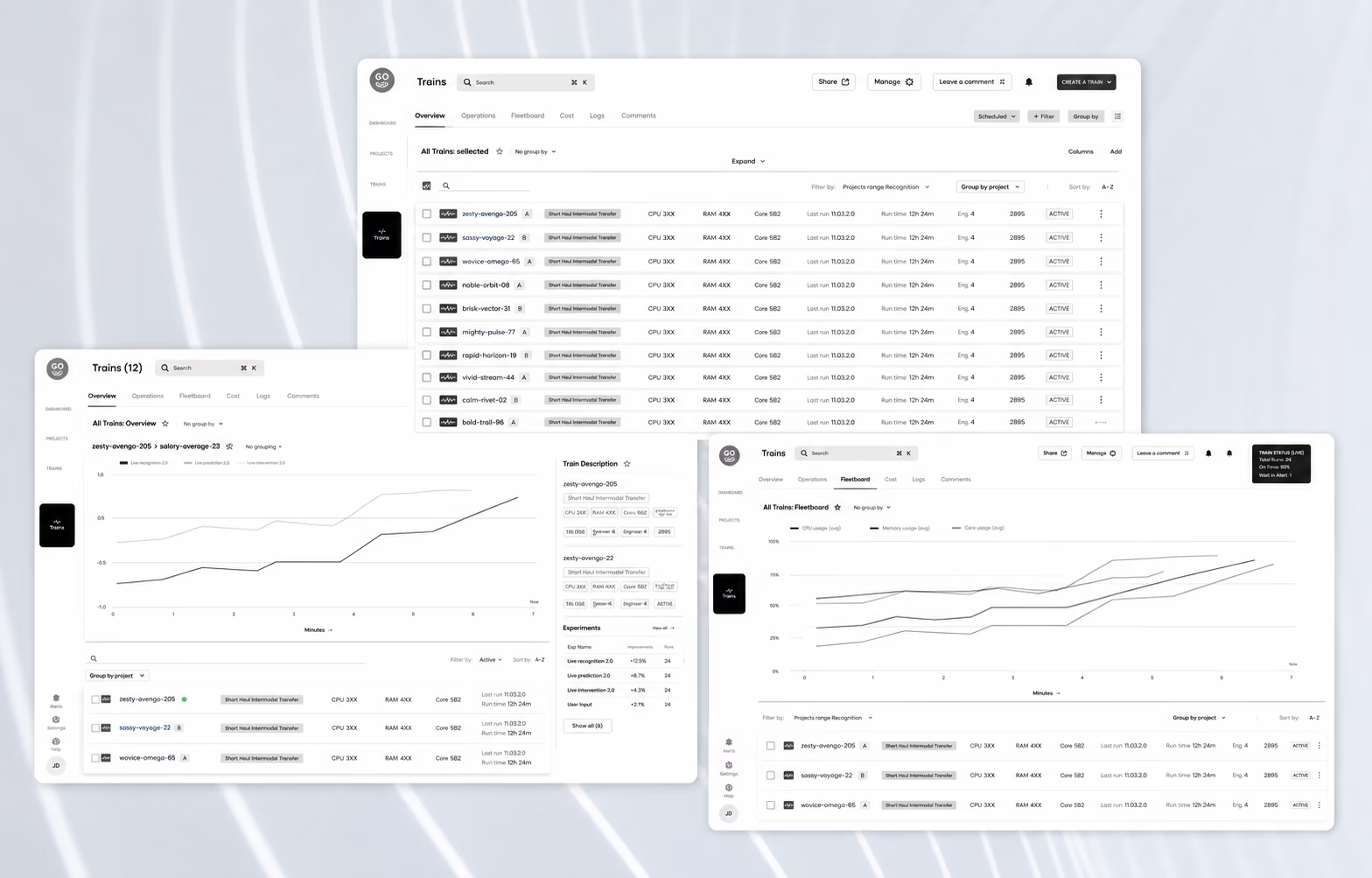
SaaS onboarding is the designed sequence between account creation and the first action that proves a product’s value to a specific user role. The fastest way to audit an enterprise onboarding flow is to count how many roles the product serves and how many first actions the onboarding was designed to reach, because where those two numbers differ, the gap is the number of roles being onboarded toward somebody else’s job.
What SaaS onboarding actually means in an enterprise product
SaaS onboarding in an enterprise product is not one sequence but several, one for each role the product serves, because the action that proves value to an administrator is not the action that proves it to an analyst. Welcome screens, tours and checklists are delivery mechanisms for those sequences, not the sequences themselves.
That distinction decides where the design work happens. A tour is a surface. The sequence underneath it is the set of decisions about which action a user needs to reach, how many steps stand between them and it, and what the interface removes so those steps stay visible. Redesigning the tour without touching the sequence changes what the first session looks like and not what it produces.
Consumer products can work from one sequence because they tend to have one job. A photo app onboards one kind of user toward one first post. An enterprise platform serving procurement, finance and compliance has three different definitions of a successful first session, three different sets of permissions and three different reasons the account was created in the first place.
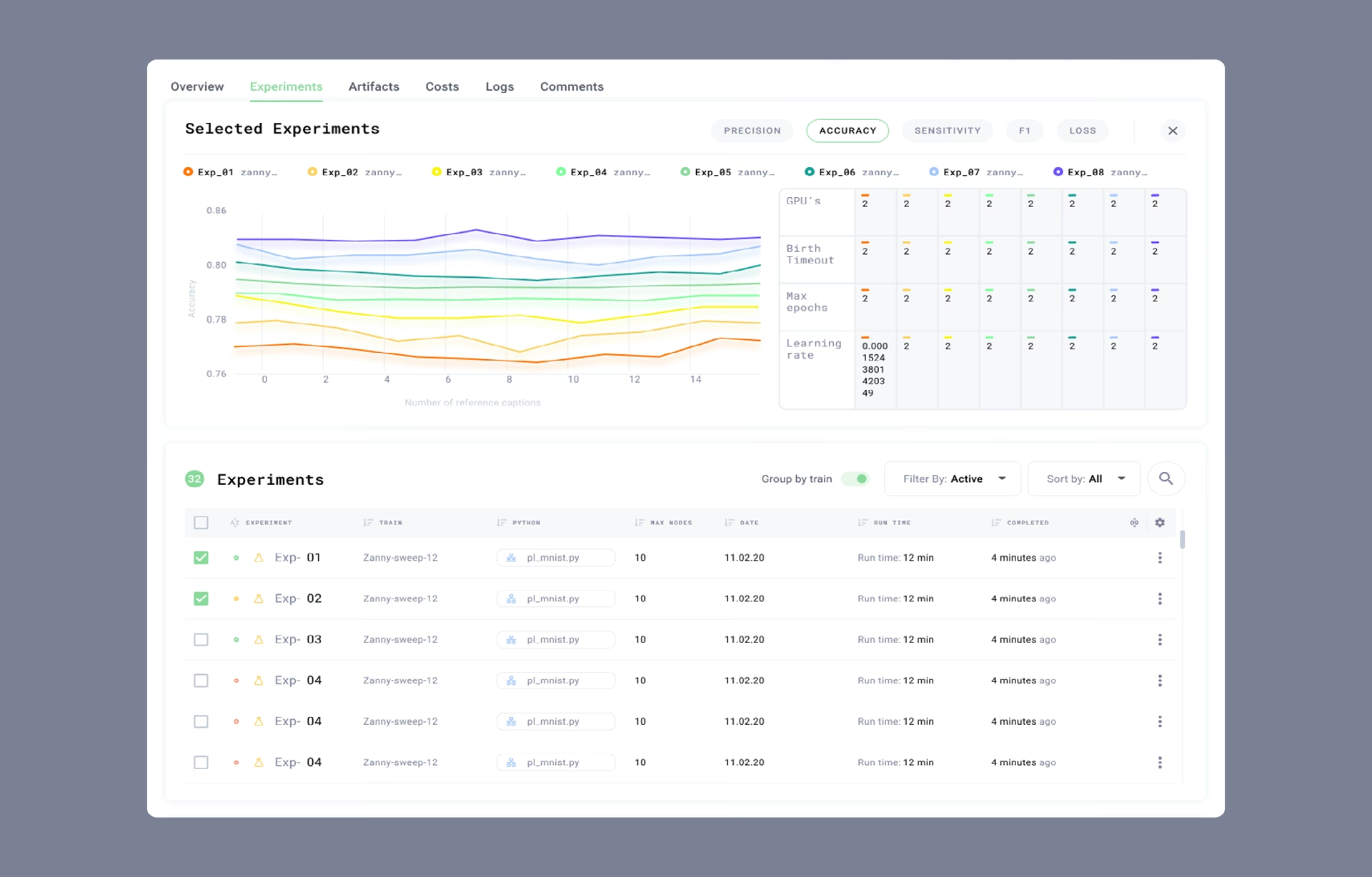
What each sequence owes its role depends on what that role already knows. On the Grid.ai / Lightning AI machine learning platform we designed, the users were engineers who already understood their data and needed the interface to stay out of their way, so onboarding meant removing steps between signup and the first experiment run rather than explaining what a run is.
Onboarding vs activation, and what the difference changes
Onboarding is the sequence a new user moves through to reach the value action. Activation is whether that user actually completed it. A product can report high onboarding completion alongside weak activation, because completion measures whether someone finished the flow the team built and activation measures whether the flow pointed at the right action. These two processes get quite muddled all the time, but the difference in terms of judging a successfully designed product can not be more different.
Most onboarding programs are instrumented against the first of those and reported against the second. The dashboard shows tour completion, checklist progress and hotspot clicks, and the quarterly review asks why retention did not move. Both numbers are accurate. Only one of them is about the product.
Product activation becomes measurable once someone has named the action it refers to, per role. Time to value is the same decision expressed as a target: how many steps and how much elapsed time should separate account creation from that action. Both are design inputs, set before the first wireframe, rather than reporting fields added after launch.
Naming the action changes what gets built. An operations platform whose value action is clearing the first real alert needs a populated alert queue on day one, which means seeding data during setup rather than after it. A finance platform whose value action is a reconciled first statement needs the import path to work before anything else on the screen does.
Why one SaaS onboarding flow for every role is the default failure
A single onboarding flow fails a multi-role product because it has to pick one first action, so every user whose job points elsewhere spends their first session being shown work that belongs to someone else. The flow can be well built and still do this, which is what makes the failure hard to see in a design review.
Feature overload. Showing every capability at signup is a decision to let the user find the important one. In a product with forty features and one that matters this week, the interface has handed the reader the prioritization the team avoided. The usual defense is that power users want everything visible, and power users are not the people being onboarded.
Role ambiguity. A generic getting-started sequence assumes every account holder wants the same thing on day one. The administrator who needs to provision a team and the reviewer who needs to clear a queue get the same checklist, and at least one of them is reading instructions for a job they do not have. Oh, and quite possibly not coming back for more misinformation anytime soon. Permissions already encode the difference. The onboarding just does not read them.
Flat information hierarchy. When the primary action carries the same visual weight as eleven secondary ones, the first session becomes a search task. This one survives usability testing, because a moderator saying “find the reports section” removes exactly the ambiguity a real first-time user arrives with.
Guidance detached from the task. Help that arrives before a question exists gets dismissed, and help that lives in a documentation site arrives after the user has already stopped. The moment that matters is the one where someone is looking at a field they do not understand, and the explanation has to be in that spot rather than findable from it.
Three roles recur across enterprise B2B products, and onboarding UX for each needs the same four decisions made separately: the action that proves value, what the first screen shows before any data exists, what stays hidden until behavior earns it, and how long the sequence should take. Making those four decisions once, for a composite user who does not exist, is the shortcut that produces the flat flow.
Admin onboarding: the value action is a working permission model
An administrator’s value action is a permission model that works: at least one other person invited, assigned a role, and is able to sign in. Everything else an admin eventually configures, from integrations to notification rules, can wait, because none of it is testable until a second account exists.
The common shortcut is to open on a settings page, which inverts the sequence. A settings page lists everything an administrator could change before they know which changes matter, so the first session is spent making decisions with no basis for making them. It fails quietly too, because administrators are persistent enough to work through it and nothing in the product records what that cost them.
A more useful first screen shows the permission structure itself with one seat filled, theirs, and the invite action sitting inside that structure rather than behind a menu. The administrator sees the shape of the thing they are building before they build it. Roles, groups and inheritance become concrete instead of abstract.
Sequence matters more for this role than for the other two, because an administrator’s decisions constrain everyone else’s onboarding. A permission group created carelessly in the first session becomes the group every reviewer inherits, and that is a hard thing to unwind in month six.
Analyst onboarding: the value action is one report from their own data
An analyst’s value action is one report, chart or query produced from their organization’s own data rather than from a demo set. This makes the import or connection path the actual onboarding sequence for this role, since every tour, tooltip and template ahead of it is preparation for an action the analyst cannot take yet.
Until a source is connected, the analyst’s first screen is empty by definition, which makes that blank table the first thing the product says about itself. Nielsen Norman Group’s empty state guidelines name three jobs it has to do: communicate system status, provide learning cues, and provide direct pathways into the task that fills it. Easier said than done with complicated SaaS products, we know.
Status is the straightforward one. Learning cues and direct pathways take design decisions: a table showing the shape it will take once filled, a plain statement of why it is empty, and the import action sitting inside the empty region rather than in a toolbar above it. “No results” reports a state and stops, leaving the analyst to work out why the table is empty and what would fill it.
A container with no designed empty state still ends up with one. It gets written by whoever builds the component, at the point in the sprint where nobody is thinking about a first-time analyst, which is why specifying empty, loading, error and partial-data states belongs in the design handoff rather than in the backlog.
Reviewer onboarding: the value action is the first item cleared
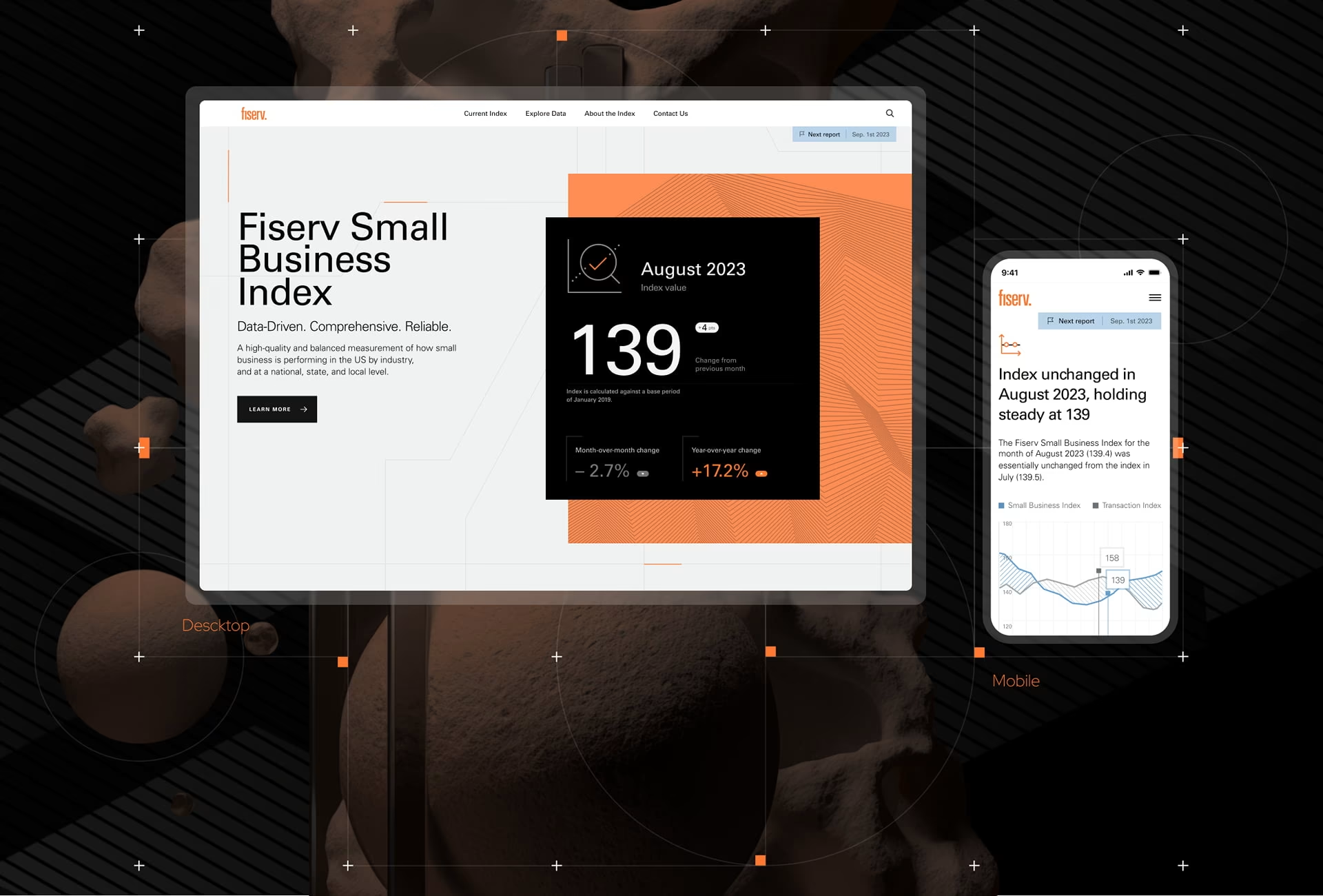
A reviewer’s value action is clearing one real item: an approval granted, a claim decided, a flag resolved. This role is easy to leave out of onboarding design, because reviewers are invited by an administrator rather than signing up themselves, and the flow tends to get written for the person who signed up.
Progressive disclosure applies most directly to this role. Nielsen Norman Group’s account of progressive disclosure is narrow: show the few most important options first and offer the specialized set on request, which improves learnability, efficiency and error rate together. A feature tour does the opposite, front-loading everything regardless of whether the user has asked.
For a reviewer that means bulk actions stay out of the interface until someone has cleared items one at a time and knows what they are batching. Keyboard shortcuts surface after the tenth review, not the first. Custom filters appear once a queue is large enough to need them. Each of those is a rule with a trigger, written down, rather than a preference set at launch.
Teams tend to treat disclosure as an information architecture decision made once, at launch. It behaves more like a rule set that reads behavior: what a user has already done becomes the input for what they see next, and the triggers need revisiting as usage patterns change. That is a maintenance commitment, and it is easy to drop after handoff because nothing breaks visibly when it is.
Guidance for this role has to sit inside the queue itself. A tooltip on the field that decides an approval, an inline example of a correctly handled edge case, and an empty-state line explaining why the queue is empty all work because the reviewer never has to leave the task to reach them. A help center article, however well written, arrives after they have already stopped.
How to audit SaaS onboarding, one role at a time
Auditing SaaS onboarding starts by listing every role the product serves, then answering four questions for each: what action proves value, how many steps separate account creation from it, what the first screen shows before any data exists, and what stays hidden until behavior earns it. The second question has to be answered from session data rather than screen counts.
The first result an audit produces is usually the gap between the flow on paper and the flow in the product. A sequence that looks like six steps in a Figma file can run to fourteen once permission prompts and empty states are counted. In the audits we run, the step count surprises clients less than the number of roles that were never given a first action at all.
What the audit cannot produce on its own is why a role behaves the way it does. A design team can count steps from inside the product but cannot verify an assumption about what a compliance reviewer is actually trying to finish before lunch. That is what a user research phase is for, and skipping it means redesigning against a persona nobody checked.
Then measure the right thing. Completion tells you someone finished the flow that exists. Activation rate, core feature adoption in the first month, task success without assistance, and support volume broken out by role tell you whether the flow was pointed at anything worth reaching. Support tickets are already being logged, and segmenting them by role costs nothing.
Retesting is part of the work rather than a phase after it, because roles change as products grow: a permission group added in year two arrives without an onboarding sequence of its own. User onboarding design rarely stays contained either, since the role architecture behind the flows is the same one behind the dashboards those roles land on, which argues for scoping it alongside the wider SaaS UI/UX design work.
The one decision that changes the rest
Every other decision in an onboarding flow follows from naming the value action per role. Count the roles, name the action for each, then measure whether people reach it. A team that can state those actions out loud, without checking, has already done the harder half of the work.
Frequently asked questions
What is SaaS onboarding?
SaaS onboarding is the designed sequence between account creation and the first action that proves a product’s value to a specific user role. Welcome screens, product tours and checklists are delivery mechanisms for that sequence rather than the sequence itself. In enterprise products, it needs to run separately for every role the product serves.
What is time to value in SaaS?
Time to value is the number of steps and the amount of elapsed time between account creation and the first action that demonstrates a product’s core value to a specific user role. It is set as a target before design begins rather than measured after launch. Different roles in the same product carry different targets.
What is the difference between onboarding and activation?
Onboarding is the sequence a new user moves through to reach the value action. Activation is whether that user actually completed it. A product can report strong onboarding completion alongside weak activation, because completion measures whether someone finished the flow and activation measures whether the flow pointed at the right action.
What makes enterprise onboarding different from consumer onboarding?
Enterprise onboarding has to serve several roles with different permissions, different first actions and different learning curves, while consumer onboarding tends to point one kind of user at one task. That difference makes role separation, progressive disclosure and in-context guidance necessary rather than optional. A flow built for a photo app will not carry a platform serving procurement, finance and compliance.
What should an onboarding redesign deliver at handoff?
An onboarding redesign should deliver a named value action and time-to-value target for every role, empty, loading, error and partial-data specifications for every data container in the flow and a written disclosure rule set stating what stays hidden and what behavior reveals it. Anything short of that leaves those decisions to whoever builds the components. Ask for the artifacts by name before signing.
How long does an onboarding redesign take?
An onboarding redesign usually runs inside a broader SaaS UX engagement, which takes 12 to 20 weeks from kickoff to engineering-ready specifications. That splits into three to five weeks of discovery and research, six to ten weeks of design and prototyping, and two to five weeks of validation and handoff. The number of roles needing separate flows drives the schedule more than interface complexity does.
How much does an onboarding redesign cost?
Onboarding redesign sits inside a broader SaaS design engagement, where Clutch hourly rates run from $25 to $199: studios outside the US at the lower end, US-based specialists at $100 and above. Minimum project sizes on the same profiles run from $10,000 to $50,000, and each agency lists both figures publicly. Cost follows the number of roles needing separate flows and the state of the data behind the first screen.