Dashboard design vs data visualization and why the difference matters

The difference between dashboard design and data visualization determines the scope, timeline, and team in any data product brief: dashboard design builds an interactive product feature that users return to daily for monitoring and decision-making, while data visualization presents a defined dataset for analysis, communication, or storytelling. Most teams answer that question implicitly rather than explicitly, and the moment the confusion surfaces mid-project is the most common cause of scope and budget overruns in data product engagements.
What dashboard design actually is
Dashboard design is the practice of building an interactive product feature that pulls live data from multiple sources and presents it across one or more screens, allowing a specific user to monitor KPIs, detect anomalies, and take action based on the data. It is a product discipline rather than a graphic design discipline, which means information architecture, state management, and interaction design carry more weight than visual styling; ultimately, it’s this interaction that makes or breaks the success of the dashboard design.
The simplest test for whether something is a real dashboard is whether someone opens it every day without being told to, usually more than once. It is part of the operational fabric of their day. If no one has a reason to return to it tomorrow, it is probably not a dashboard, or it could be too difficult to use and lead to frustration rather than value in the user’s mind.
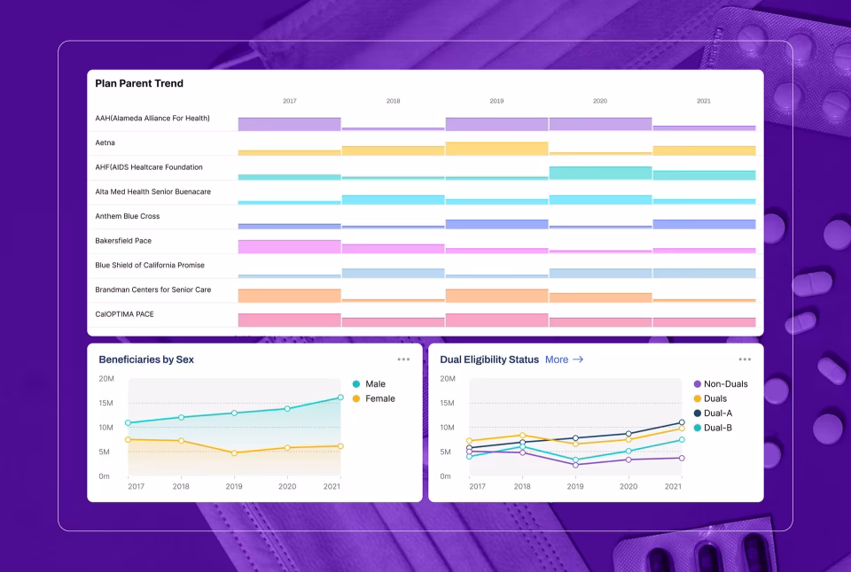
Grid.ai is an ML experiment tracking platform built for data scientists running parallel model training runs. A user logs in at 9 a.m. to see which of last night’s experiments converged, which crashed, and which are still consuming GPU resources they need for the next run. They filter by project, drill into a specific run to see loss curves and resource usage, and decide whether to kill it, restart it, or promote it to production. They are back inside the interface every couple of hours throughout the day. The data is changing as they work. If the interface is slow or unclear, the work stalls.
This kind of operational dependence is why dashboard design is a product discipline. Information architecture is the first order of business: it decides which data each user role sees, what gets suppressed, and what gets surfaced by default. State management builds on that, governing what the interface shows while data is loading, when a source goes stale, and when a user applies three filters and the result set is empty. Interaction design comes last, governing how filters and drill-downs behave under operational pressure. Skip any layer in that chain, and the layer above it suffers a severe aneurysm and collapses.
Automatize is a fleet management dashboard built for operations managers tracking commercial vehicles in real time. The map shows live GPS positions across the fleet. A flagged engine sensor produces a predictive maintenance alert in the manager’s queue, with the vehicle’s current location, the route it is on, and a suggested action. The manager can dispatch a replacement, reroute deliveries, or schedule the vehicle for service before failure. If the alert architecture buries that notification, the consequence is a disabled truck on a highway. Loading states, stale data handling, and error states for dropped GPS feeds are not portfolio-friendly design decisions, but they are the work.
What makes dashboard UX hard is that users are not there to explore. They do not have time or patience to learn the system. The interface gets evaluated at 7 a.m. by someone who has thirty things to do before lunch and will not bother to read a tooltip. NNGroup’s research on dashboard data visualization makes the underlying point: charts that rely on length and 2D position are processed preattentively, in milliseconds, while charts that rely on area or color require active interpretation. On an operational dashboard, that difference is what determines whether a user catches a problem or misses it. Obviously, when this happens with critical cargo stuck in a traffic jam, it can result in huge expenses for supply chain organizations.
Good dashboard design rarely looks exciting. It looks obvious. The user opens it, knows where to look, gets what they need, and moves on. That predictability is the feature.
What data visualization actually is
Data visualization is the practice of encoding a dataset into visual form (charts, maps, infographics, or interactive graphics) to reveal patterns, communicate findings, or tell a story with the data. The output is a communication artifact, not a product. A visualization can be highly interactive and still be a visualization, because the test is what users come to do, not how many filters the interface offers.
The Fiserv Small Business Index shows why visualization is communication, not a product. The platform presents US consumer spending trends by sector and state, with monthly updates. Users are policymakers, economists, investors, and small business owners exploring economic patterns and regional differences. Nobody opens the platform at 8 a.m. to check a live KPI. A user opens Fiserv with a question: What happened to restaurant spending in the Midwest last quarter? How does this sector compare to that one? The visualization’s job is to compress complex data into an answer the user can quickly absorb and leave with.
A visualization is not static, even when it is the right output. The Blis platform lets users slice audience data multiple ways, compare segments, and explore geography through GPS mapping, demographic overlays, and competitive analysis. It is interactive, but the intent is exploration. Interactivity alone does not make something a dashboard. The distinction is what the user is there to do. Blis users come with a question. A dashboard user comes back every morning, whether or not they have a question.
Data visualization skills sit at the intersection of design and statistics, but the hardest part is making judgment calls before anything is designed. Which chart type fits this data relationship? Does this scale start at zero? If not, what story does that tell? Does this color encoding imply a ranking that the data does not actually support? These are not stylistic decisions. They are analytical ones with real consequences. The wrong chart type buries the pattern. A compressed y-axis turns a 3% variance into a crisis. The designer’s job is to be honest with the data, which is harder than making it look good.
Edward Tufte’s principle of the data-ink ratio- the idea that every mark on a chart should earn its place by carrying information- is the test most agency visualization work fails. Decorative gradients, animated transitions, and stylized icons consume design budget, while the underlying chart type is misaligned with the data relationship. Users come away with an impression of the data rather than an understanding of it. That gap between what the data says and what the audience believes is the designer’s responsibility to close, and doing so requires more restraint than creativity.
Dashboard design vs data visualization: where the disciplines diverge
Dashboard design and data visualization share a visual vocabulary (chart types, color encoding, layout grids), but they diverge structurally on three particular axes: interaction depth, data lifecycle, and deliverable type. A dashboard is a product feature that typically includes live data, role-based views, and engineering handoff documentation. A visualization is a communication artifact built around a defined dataset. An agency strong in one has not necessarily shipped the other.
The first divergence is interaction. Dashboards are built around it: filters, drill-downs, role-based views, permissions, loading states, error states, notifications. The user moves through the system. A visualization, even a highly interactive one like Blis, is something users primarily look at, with interaction serving exploration rather than operation. A team strong in visualization can produce a dashboard mockup that looks convincing in a portfolio. What they cannot necessarily produce is a dashboard that handles live data correctly when a source goes down, holds together when a user applies three filters, refreshes without a flicker or avoids the always dreaded crash. Those are product engineering and UX architecture problems, not visual design problems.
The second divergence is the data itself. Dashboards connect to live systems where data updates continuously, sometimes every second. The design has to handle latency, partial loads, stale values, and feed failures. The challenge is not how you show the data, but how the data behaves. Visualizations typically work with stable datasets that update monthly, quarterly, or not at all after publication. The Fiserv Index refreshes monthly. The Grid.ai dashboard updates in real-time. That single difference reshapes the entire technical architecture.
The third divergence is what gets handed off. A visualization project ends with assets such as charts, files, an interactive embed, or a self-contained microsite. A dashboard project ends with a system: a design system, a component library, documented user flows, role-based view specifications, and edge-case states for engineering. If an agency’s dashboard deliverable is a Figma file with no edge-case documentation, ask them what a developer is supposed to do when the user hits a state nobody designed. The answer reveals whether the agency has actually shipped this kind of work.
When a product needs both a dashboard and data visualization
Some products require a dashboard and embedded data visualizations functioning together, structured deliberately rather than blended. The dashboard is the operational container handling daily workflows, role-based access, and live monitoring. Visualizations live inside it as a distinct analytical layer that helps users understand trends without needing to act on them in the moment. Treat the two as the same thing, and the product fails at both.
ClyHealth is a healthcare AI platform where this combination is structured properly. The dashboard layer manages the daily clinical workflow: role-based views for administrators and clinicians, real-time patient monitoring, AI-assisted clinical recommendations, and alert routing. Inside that container, the visualization layer presents outcomes over time: treatment efficacy across patient cohorts, trend lines for clinical metrics, and comparative analytics across patient populations. The two layers serve different user modes. One is for working in the moment. The other is for understanding patterns across weeks of patient data.
When teams treat the two layers as the same problem, the dashboard becomes too slow and abstract to operate, or the visualization tries to behave like a control panel. Both leave users confused and often leave the organization over budget. The cleaner mental model is to scope the dashboard first as the operational product, then design the visualizations as components inside it that answer specific analytical questions. That sequence prevents the most common architecture mistake in combined products: a dashboard built around chart aesthetics rather than the workflow it supports.
What this means when you are scoping a project or hiring an agency
The dashboard design vs data visualization decision drives different timelines, skill requirements, and deliverables, and the gap between the two scales with project complexity. Getting the definition right at the briefing stage prevents the most expensive mistake in this category of work, which is scope drift between the two: a project that starts as “we need a few visualizations” and morphs into a full dashboard halfway through, doubling the budget and timeline that was quoted against the original framing.
The project timeline is where the difference first shows up. A visualization project (a set of charts, an interactive report, or an infographic) typically runs four to eight weeks. A dashboard is a different order of complexity: live data integration, multiple user roles, and a product designed for daily operational use. Three to six months is the floor for a serious engagement, assuming the data architecture is already defined when design work begins. If it is not, add a discovery phase before design starts. Skipping that phase to hit a faster timeline is the second most common cause of project friction after scope drift, because the design team builds against assumptions about data structure that turn out to be wrong once engineering starts integration.
Skill sets are not interchangeable, and a strong portfolio in one discipline does not guarantee capability in the other. Visualization leans on graphic thinking and statistical literacy. Dashboard design leans on product UX: information architecture, interaction design, state management, responsive layout, and API integration planning. Some agencies command both. Many do not, and those who do not will rarely volunteer the distinction. The fastest test is to ask an agency to walk through what their dashboard designs show when a data source goes offline. An agency that has shipped this work will answer from memory. An agency reaching for what it would design has clearly never done so.
Four questions resolve most scope confusion before an RFP is written. Will users return to this interface daily without being prompted, or will they open it when they have a specific question? Daily return without prompting means a dashboard. A specific question with a defined answer means a visualization. Is the data live or fixed? Live data demands a design strategy for failure states that a static dataset never requires. Do different users need different views of the same data? If yes, the project is a dashboard with role-based access, not a shared visualization URL. Does the interface need to do something or just show something? Filters that change what the user does next are dashboard interactions. Filters that help the user find a data point are visualization interactions. Those are different design problems, each involving the same components.
Resolving these questions before the scope document is written is the cheapest insurance against the most expensive mistakes in data product work. The dashboard design vs data visualization decision is not a stylistic choice. It is an architectural one, and agencies worth hiring for either discipline will help you answer it in the first conversation.
Quick reference: data visualization vs dashboard projects
| Feature | Data visualization project | Dashboard product project |
|---|---|---|
| Primary KPI | Data analysis and insight | Time to action and frequency of use |
| Data refresh | Periodic (monthly or quarterly) | Live or streaming |
| Technical focus | Narrative and visual integrity | State management and permissions |
| Typical timeline | 4 to 8 weeks | 3 to 6 months |
| Deliverables | Charts, files, or an interactive embed | Design system, component library, documented user flows, edge-case states |
| Cost range | $10,000 to $50,000 | $25,000 to $150,000+ |
Conclusion
The difference between dashboard design and data visualization is not semantic. It shapes scope, timeline, team, and budget. The most expensive mistakes in this category of work come from applying the right design process to the wrong problem: a dashboard team scoping a report, or a data visualization team building a product. Resolve which discipline your project needs before the brief is written.
Frequently asked questions
What is dashboard design?
Dashboard design is the practice of building an interactive product interface that consolidates live data from multiple sources and enables specific users (based on their roles) to monitor a system, detect problems, and act on them. It is a product discipline, which means it requires information architecture, state management, and interaction design decisions that are independent of how the charts look. The simplest test: if it is not used continuously in daily operational activities, it is probably not a dashboard.
What is data visualization?
Data visualization is the practice of encoding a dataset into visual form, such as charts, maps, or interactive graphics, to reveal patterns, answer questions, or communicate insights. The output is a communication artifact, not a product. A visualization can be highly interactive and still be a visualization. The test is not how many filters it offers, but whether users come to it with a question or because they have to keep a system running.
Dashboard design vs data visualization: how do they differ?
Dashboard design builds a product. Data visualization produces communication. The first is designed for repeated daily use against live data. The second is designed to give users a specific insight from a defined dataset. Both use charts, both require design skill, and both can be highly interactive. The difference is what the user is there to do, and that single difference drives different skill requirements, timelines, and deliverables.
Can a single agency handle both dashboard design and data visualization?
Some agencies handle both dashboard design and data visualization well, but many do not, and most will not volunteer the distinction. Look for case studies that describe shipped products with live data integration, role-based views, and developer handoff documentation. Agencies that have only done visualization work tend to show the happy path, because that is all they have designed.
Dashboard design vs data visualization: what are the cost implications?
Data visualization projects typically run from $10,000 to $50,000, depending on dataset complexity and the level of interactivity required. Dashboard projects typically run from $25,000 to $150,000 and above, depending on the number of integrations, user roles, and the complexity of the underlying system. The cost difference reflects the difference in scope of work, not quality. A dashboard costs more because it is a more complex thing to build.
Dashboard design vs data visualization: how long does each project take?
Data visualization projects typically run four to eight weeks. Dashboard projects typically run three to six months. Projects that shift from one category to the other mid-scope, which happens more often than it should, are the most common source of budget overruns in data product work. The shift usually occurs because the distinction was not clearly established at the briefing stage.
When does a project need both dashboard design and data visualization?
When the product requires daily operational monitoring and also needs to help users understand trends over time, the project needs both. The operational mode requires a dashboard: live data, role-based views, alerts, and a design that works under time pressure. The analytical mode requires a visualization: a defined dataset, exploration tools, and a design that helps users build understanding rather than take action. A healthcare platform giving administrators a live operational dashboard while helping clinicians understand treatment outcomes across patient demographics is a typical example. The dashboard handles the daily workflow. The visualization handles the analytical layer. They require different design approaches and, often, different teams handle them in parallel.