23
min read
23
min read
 Oct 7, 2026
Finance App Design 101: A Complete Blueprint
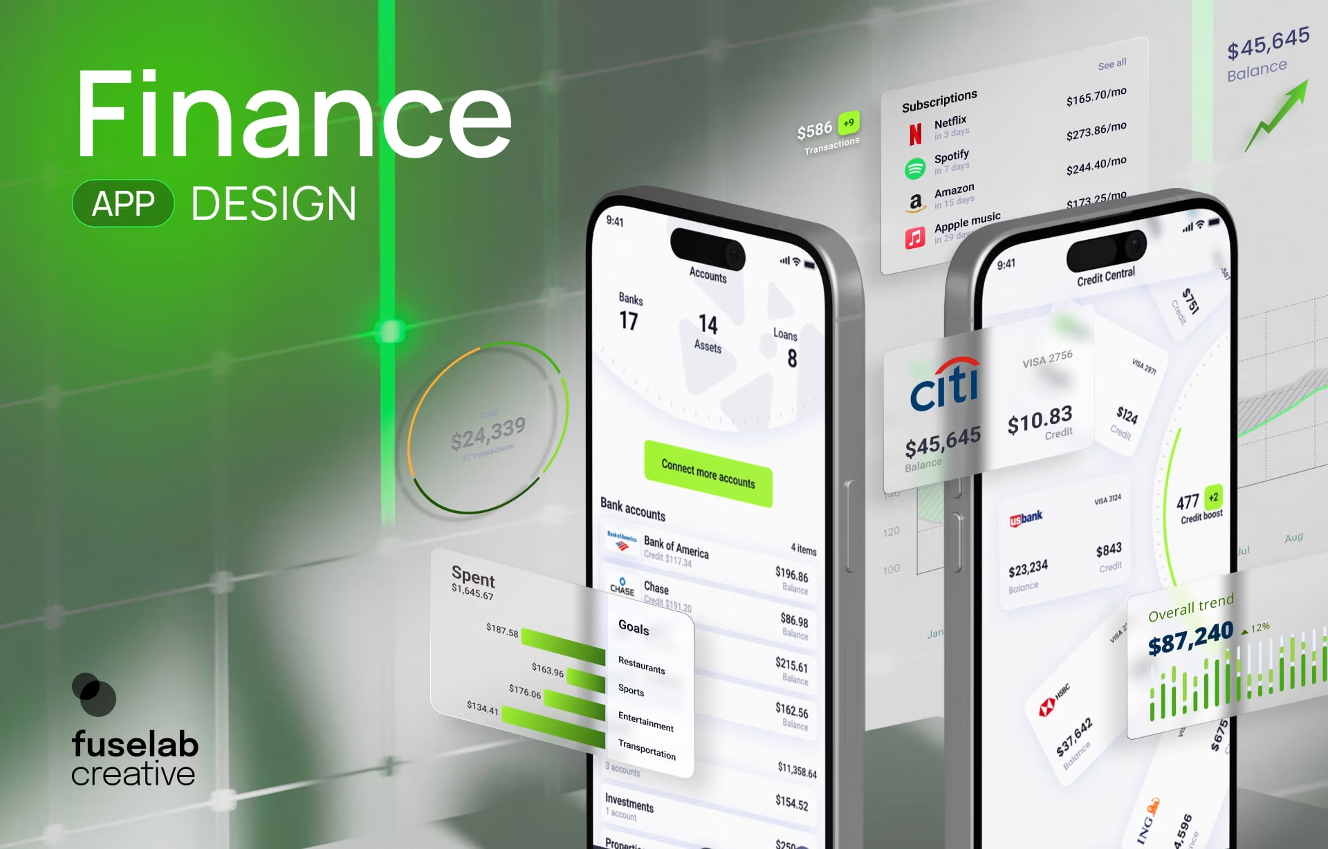
Finance app design is the practice of creating digital experiences that help people manage money confidently, whether they are budgeting, investing, borrowing, or tracking financial goals. It differs from most consumer product design in one respect that shapes every other decision: the interface moves real money under rules set by regulators rather than by the product team.
Phones vary wildly in what they hold, but a finance app is the common denominator. Most people carry at least one, and they no longer expect it to do a single job. They want one place to budget, save, invest, borrow, and see where they stand. Distribution and pricing get a finance app downloaded. Design decides whether it gets opened a second time.
Crafting a good financial app requires a mix of user behavior research, design principles, and emerging technologies. What follows covers the fundamentals of finance app UI design, the psychology that shapes how people handle money on screen, the features every finance app needs, and the mobile app design trends changing what users expect.
First Things First, What is Finance App Design?
Every finance app, whether it is built for budgeting, investing, payments, or loans, shares one goal: helping users make financial decisions with ease and confidence. Finance app design is what makes that goal real, bringing together usability, security, regulatory requirements, and the emotional relationship people have with money so that complex tasks feel straightforward.
Put simply, finance app design refers to creating intuitive interfaces for applications that help manage financial tasks. It is a collective process, spanning user experience design, button placement, and color schemes. Contrary to how it looks from the outside, effective finance mobile app design goes well beyond aesthetics.
Personal finance app design depends on a deep understanding of user behavior, financial concepts, and technical constraints, and it rewards teams that treat all three as inputs, not afterthoughts. The stakes run higher than in most categories, because a confusing screen in a money app produces a support call, a dispute, or a customer who moves their balance somewhere else.
The aim of a good finance app design should be to craft digital tools that simplify complex financial processes, inspire confidence, and improve people’s financial well-being. What makes the work a unique challenge is the sensitive nature of financial data, combined with the constant need to balance simplicity against genuine complexity.
Financial regulations and consumer expectations both keep moving, which is why finance app UI design is worth treating as a discipline with its own rules, features, and techniques instead of a styling exercise applied at the end of a build. Teams that treat it that way arrive at compliance review with fewer screens to rebuild.
The Importance of Finance App Design, Explained
Finance apps sit closer to a person’s salary, savings, and debt than almost any other software they use, which raises the cost of a bad interface. Poor design in this category does not simply lower engagement. It produces support calls, disputes, and switching, and every one of those carries a price the business can measure.
Fintech remains one of the fastest-growing sectors in technology. McKinsey’s April 2026 fintech report puts global fintech revenue near $650 billion in 2025, growing roughly 21 percent year over year while the broader $15 trillion financial services industry grew at 6 percent. Fintechs still hold about 4 percent of that revenue, which is why competition for the next user stays this intense.
This makes one thing clear: fintech app design is no longer a luxury but a requirement for businesses that want to compete. A standout finance app design separates a product people keep on the home screen from one they delete within a week. It positions a brand against competitors, attracts new customers, and presents financial information in a form people can actually act on.
That covers what good finance app design ideas can do and why they matter. Designers and product owners are usually after the how. What are the main steps to consider, which aspects cannot be skipped, and where do most teams get it wrong? The sections ahead answer those questions across four pillars.
Pillar 1: Decode the Psychology of Finance App UI Design
People rarely think about money objectively. Whether they are checking a credit score, making an investment, or paying a bill, emotion shapes the decision before logic gets a turn. Finance app UI design that works acknowledges those emotions and builds experiences that reduce uncertainty instead of quietly adding to it.
Any complex design problem starts with the human element, and finance apps are no exception. Designers who understand the psychology behind user interactions build products that hold up under real financial pressure. The reasons are worth unpacking, because they explain most of the decisions in the rest of this guide.
Most people have a complex relationship with money. It gets associated with stress, anxiety, or excitement depending on the day, and a good finance app has to help users handle all of those states through clear navigation and thoughtful features instead of pretending they do not exist.
Users come to financial apps with specific goals, such as saving for a down payment, managing debt, or investing for retirement. Their financial literacy, risk tolerance, and personality all shape how they interact with the product. The work is decoding those underlying motivations and designing around them instead of around an idealized user.
Designing around real motivation changes what goes on the screen. In financial AI work for ATB Financial, the pattern that mattered was control rather than persuasion. We built confidence thresholds into automated decisions, audit trails a regulator can follow six months later, and override paths where a person keeps the final call on anything carrying regulatory consequences.
That transfers directly to consumer finance apps. A user who cannot tell how certain the system is, cannot see what already happened, or cannot reverse a decision will assume the worst on all three. Uncertainty in a money interface does not stay neutral for long. It resolves toward suspicion, and suspicion is what closes an app permanently.
Pillar 2: Understanding Finance App Design Foundations
Strong finance apps are built on structure before styling. Clear information architecture, deliberate visual design, and intuitive user flows make financial information easier to understand and everyday tasks easier to complete, no matter how complex the underlying product becomes. Get the structure wrong and no amount of visual polish recovers it.
Three foundations carry most of the weight, and they are not equally hard. Information architecture is where most finance apps quietly fail. Visual design is where most of them end up looking identical to each other. The split between UI and UX is where teams most often talk past one another.
Information Architecture for Finance Apps
The backbone of a finance app is its information architecture. Information architecture refers to how financial data is organized on the app, ideally in a way that is both logical and intuitive. Financial apps are as complex as the data they involve, transfer, and display, and effective architecture lets users find and understand what they need without effort.
For the designer, this translates into a few key principles: clear labeling, consistent navigation, and efficient categorization of financial products and services. Volume is what makes it hard. Transactions, balances, investments, loans, rewards, alerts, and statements accumulate fast, and without a clear structure even simple tasks turn frustrating.
Related information should be grouped logically, navigation should stay consistent across the app, and labels should be obvious enough that users never stop to think about where something lives. The less time people spend searching, the more confident they feel about the money the app is showing them.
Visual Design and Branding
Another part of building a strong brand identity for a finance app is visual design that is both memorable and personable. What users notice first, and what keeps them beyond pure utility, is a consistent aesthetic that reads as credible. Designers get there through color palettes, typography, imagery, and layout aligned to the audience and the brand’s values.
UI UX Design
User interface work focuses on the app’s visual elements, such as buttons, menus, and input fields. A good finance app UI translates into clear labeling, consistent navigation, and appropriate use of white space. Visual appeal, ease of use, and reduced cognitive load are the guidelines worth following on every screen.
Experience design covers the whole journey, from the first interaction to the final payment. Its focus is broader, spanning usability, accessibility, and desirability. Well-considered UI UX design accounts for user needs, behaviors, and motivations, and aims at satisfaction, loyalty, and engagement across months, not a single successful session.
Pillar 3: Core Features and Functionalities
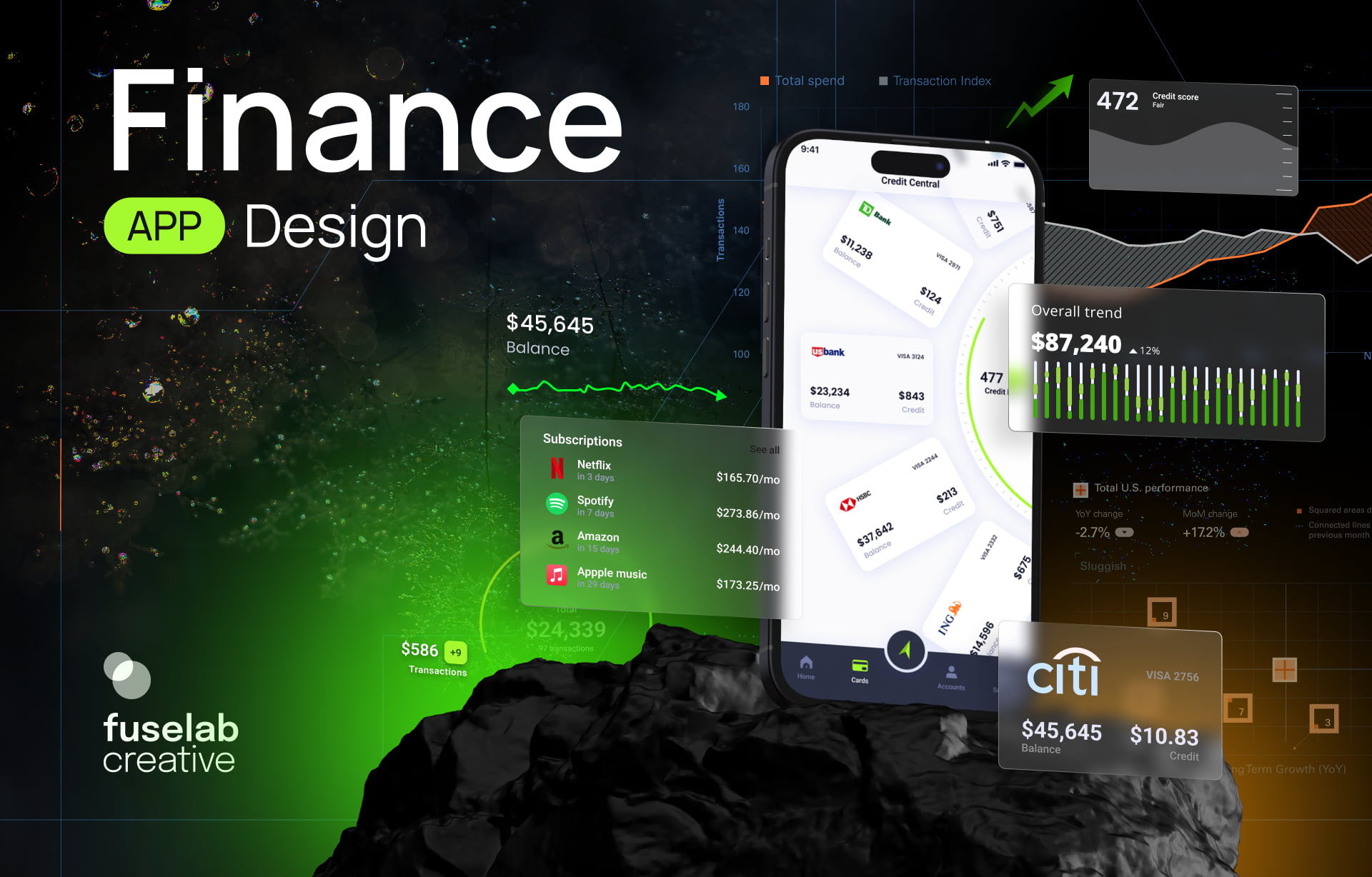
The features inside a finance app are not decoration. They exist to solve real financial problems: budgeting, investing, payments, or managing debt. Every feature should help a user complete an important task quickly, with clarity and confidence about what just happened to their money.
Budgeting and Expense Tracking
Budgeting and expense tracking are two of the most sought-after functionalities when users pick a personal finance app. The idea is a single destination that helps them plan, manage, and track monthly, annual, and long-term financial plans, set budgets, and find opportunities to save. That makes clear categorization, easy data input, and informative visualizations design keystones.
The experience has to make categorizing expenses, adding transactions, and reviewing spending patterns feel effortless. Clear visualizations usually work better than long tables of numbers, because they let users spot a trend in about a second instead of reading for one.
Budget App User Interface Design
At the interface level, a few patterns consistently make budget tracking feel manageable. Progress rings and bars that fill as spending approaches a limit give users an at-a-glance read without making them parse numbers. Consistent color coding by category, greens for savings and ambers for near-limit spending, helps users scan a list and spot what needs attention.
Reducing manual entry friction with auto-categorization and one-tap expense logging often decides whether the app gets used daily or abandoned within a week. Small interaction improvements like these make budgeting feel less like bookkeeping and more like a habit users can actually keep.
Investment and Portfolio Management
Investment-focused apps have grown fast, providing one place for portfolio management, performance tracking, and investment research. The design cues are clear data visualization, personalized recommendations, and an experience that does not punish inexperience. Getting this wrong is expensive, because a confused investor rarely asks for help. They close the app.
Performance should be readable in one pass, portfolio breakdowns should avoid unnecessary complexity, and research tools should support a decision without overwhelming a less experienced investor. Personalized insights and well-built data visualizations make even complex portfolios feel approachable to someone opening one for the first time.
Saving and Goal Setting
Most users are looking for finance apps that help them set, maintain, and meet financial goals. Savings targets, progress trackers, milestone celebrations, and automated contributions keep users engaged over time because they make long-term progress visible instead of abstract. Abstract progress is the reason most savings features go unused after week two.
Personal Loans and Credit Management
Personal loans have seen an all-new revamp in the era of fintech, with more individuals preferring the ease of apps over the long queues of banks. A straightforward application process and clear loan terms make the experience smoother and less stressful for the user. Other credit management features that can add value to the app include credit score tracking and debt repayment tools.
On a loan app dashboard, repayment progress works best as a simple bar or ring showing how much of the loan remains, not just a raw balance figure. Amortization visualizations that break each payment into principal and interest help users understand why their balance drops slower than expected in the early months.
Clear eligibility states matter just as much. Showing users exactly where they stand before they apply prevents the frustration of a rejected application after a long form, which is one of the more reliable ways to lose a borrower permanently.
Bearn, a mobile app for healthy living and exercise, shows the same layering problem outside finance. The hardest design decision was organizing personal progress, rewards, and company health scores so users could find what mattered at a glance. Any finance app showing balance, repayment progress, and account health on one screen faces exactly that hierarchy decision.
Pillar 4: Key Design Principles for Finance Apps
Successful finance apps go beyond adding the right features. What separates them is a series of decisions that make the product easier to understand, safer to use, and more useful over time. These principles turn a functional product into one users trust and return to without thinking about it.
Not all of them carry equal weight. Trust and security decide whether the product survives its first month. Personalization and emotional design decide whether it is still on the phone a year later. Both matter, and teams routinely invest in the second before they have earned the first.
User Research and Personas
User research is the cornerstone of successful personal finance app design services, because it explains the target audience before anyone builds anything for them. The scope is straightforward: user demographics, behaviors, motivations, and preferences. Surveys, interviews, and usability testing gather it, and personas turn it into something a design team can argue with.
Personas earn their keep when they are specific enough to settle an argument. A persona saying users want security is useless. A persona saying this user checks a balance four times a day, has never opened the statements tab, and abandoned the app once during identity verification tells finance app designers exactly which screen to fix first.
Trust and Confidence
Financial products cannot succeed without building trust, whether they reach users through apps, websites, guides, or bank branches. Nielsen Norman Group’s research on trustworthiness found that the factors people use to judge credibility have stayed stable across two decades of changing design trends, which is why financial organizations keep investing in how they communicate.
In apps, design elements play a decisive role in creating that confidence. Color psychology can be used to evoke security and stability, and shades of blue are widely associated with reliability. Imagery can reinforce security measures. Typography contributes too, since clear, legible fonts read as professional and competent before a word is processed.
Security and Privacy
If users had to pick one feature they could not do without, it would most likely be security and privacy. When they hand an app sensitive financial information, they trust it to be protected by strong encryption, secure storage, and regular audits. The design carries the job of conveying all of that visibly.
Communicate openly about what security measures are in place. Privacy policies should state clearly how user data is collected, used, and protected, in plain language instead of legal or technical phrasing. Visual cues such as security badges or encryption indicators help, provided they reflect something real and are not decoration.
Balance matters here. Biometric and two-factor authentication raise security without adding much friction, and users should be able to manage their own privacy settings and control their data directly. What those notices must say, and where the controls have to live, is set by regulation and covered further down this page.
Emotional Design
Money is almost always tied to emotion, which makes emotional design more consequential in finance than in most categories. Designers who decode a user’s emotional relationship with money can build experiences that motivate positive financial behavior instead of producing guilt every time the app is opened.
The practical version is narrower than it sounds. Frame a shortfall as a gap the user can close, not a failure already committed. Show the consequence of an action before it happens, not after. Confirm the things people quietly worry about, such as whether a transfer actually left, instead of assuming silence reads as success.
Personalization
Personalization and AI are changing how financial products behave, and the same holds for fintech interface work. Integrating AI into a finance app helps analyze user data and behavior, then deliver recommendations, investment advice, and budgeting suggestions matched to actual spending patterns. AI chat handles routine questions, though anything touching a balance, a payment, or a dispute needs a visible path to a human.
Mobile-First Design
Most people use finance apps on a phone, often for a minute or two at a time. Every screen has to prioritize the most important information first. Navigation should stay simple, touch targets should be large enough to use comfortably, and common tasks should take as few steps as the product can manage.
Push notifications deserve care. They are valuable for payment confirmations, unusual account activity, or upcoming bills, and they turn into noise the moment every update triggers an alert. Apps that get this wrong lose notification permission entirely, and they almost never get it back.
Accessibility and Inclusivity
The best finance app design lets people of all backgrounds and abilities use it equally well, and the standards behind that carry legal weight in finance, covered further down this page. As a design practice it means suiting different age groups, which changes how much cognitive load a screen can carry, and writing without jargon so financial concepts land for people who never studied them.
Cultural differences matter for the same reason. Adapt language, currency formats, and date formats to the regions the app serves. An ambiguous date format is a support ticket waiting to happen, and it is the kind of defect that never surfaces in a design review run entirely by one nationality.
Testing and Iteration
Usability testing is a defining part of finance app design. It means watching users interact with the app to identify and address problems early, and it uncovers where the design falls short before real money is involved. Feedback from real users lets designers make decisions from evidence instead of opinion.
A/B testing compares two versions of a design element to see which performs better, and it works well for button color, layout, or copy. User behavior and performance metrics can be broken down alongside it to inform choices across successive releases instead of one at a time.
What Financial Regulation Requires From App Design
Compliance shapes finance apps at the screen level, not only in the backend. Disclosure rules determine what text can sit behind a tap, identity verification rules determine how long onboarding takes, and error resolution rules determine whether a dispute flow exists at all. Teams that discover this near launch rebuild screens they thought were finished.
Most product teams treat regulation as a legal review that happens shortly before release. In practice it constrains layout, copy, and flow from the first wireframe, which is why UX design for financial services starts with the rules rather than the screens. Six areas account for most of the rework.
The market has already moved on this. McKinsey’s fintech analysis suggests firms increasingly treat regulatory maturity as a competitive advantage instead of only a constraint, and that mature compliance capability now marks the companies pulling ahead of the field. That reframing has consequences well before a product ships.
Licensing shows the same shift. In 2025, 21 fintechs applied for US banking charters, more than in the previous four years combined, which reflects the strategic value companies now place on regulatory credibility. Design is where a user actually encounters that credibility, or fails to.
Disclosure rules shape typography and placement
Regulation Z requires cost-of-credit terms to be clear and conspicuous, which on a phone is a typography and placement constraint, not a copywriting one. A disclosure set in the smallest type on screen, or reached only after a second tap, may not meet that standard.
Error resolution works differently. Regulation E covers electronic fund transfers within its scope and does not prescribe one universal in-app dispute interface, but an accessible error-reporting flow makes those obligations easier to meet and considerably easier for a user to complete when something has already gone wrong.
Identity verification is an onboarding design problem
Customer identification requirements under the Bank Secrecy Act mean a user cannot pick a username and start moving money. The framework asks a covered institution to form a reasonable belief that it knows a customer’s true identity, and leaves the method to its own risk model. In practice it produces identity collection, verification checks, and screening before a first transaction. It is usually the largest drop-off point in the product.
The work is making a legally required interruption feel like progress. Show how many steps remain, explain why each piece of information is needed, save partial progress so a failed document scan does not restart the flow, and give a clear status while verification runs instead of an unlabeled spinner.
Privacy notices are screens, not PDFs
Regulation P governs US financial privacy notices and how information sharing is disclosed. GDPR and CCPA are separate regimes with different applicability, consent requirements, rights, and exemptions, so a product serving several jurisdictions carries more than one set of obligations. All of them become screens somebody designs and settings somebody maintains.
The common failure is a wall of text nobody reads and everybody accepts. Layering works better: a plain-language summary at the decision point, full text one tap away, and controls that reflect the choices the applicable regime actually gives the user.
Accessibility carries legal weight in finance
WCAG 2.2 at level AA is the common technical target for accessible digital products. ADA and Section 508 create separate legal and procurement considerations in the United States depending on the organization and the service, and financial institutions have faced ADA claims over inaccessible digital services. W3C publishes guidance on applying WCAG 2.2 to mobile applications, which is informative rather than normative.
The highest-risk areas are color-only status indicators, contrast on dense numeric data, and screen reader labels on transaction lists. Session timing is the genuine conflict, since security and accessibility pull against each other. WCAG’s timing criterion points toward warning a user before a limit expires and giving them a simple way to extend it.
Investment content sits under separate rules
Apps showing portfolio performance or making recommendations enter a different regime. For FINRA member firms, Rule 2210 requires communications with the public to be fair, balanced, and to give a sound basis for evaluating the facts. That shapes how performance, projections, risk, and comparisons are displayed. A chart showing only the strongest period is a compliance question, not a design preference.
None of this replaces legal advice, and exact obligations depend on charter, licensing, product type, and the markets served. The point for a design team is narrower. These requirements produce real screens, flows, and constraints, and treating them as a late review instead of an input is what turns compliance into the expensive version of this work.
Finance App UI Design: Patterns That Build Trust
Finance app UI design earns trust through small interface decisions made before a user consciously thinks about security or brand. Number formatting, transaction states, authentication flows, and data density on small screens decide whether someone feels comfortable handing an app their money or abandons it after one session.
Numbers come first. Finance apps carry a lot of numerical information on small screens, and consistent currency formatting, aligned decimal places, and deliberate visual hierarchy make balances, transactions, and performance metrics far easier to compare. When users do not have to stop and interpret figures, decisions come faster and with less second-guessing.
We ran into this directly on the Fiserv Small Business Index, a product of the global payments and financial services technology company. The Index measures US small business performance from point-of-sale transaction data across roughly two million businesses instead of survey sentiment, and reports it at national, state, and industry level.
That reporting structure is the design problem. A business owner has to read their own figure against a national average, a state number, and an industry benchmark without stopping to work out which is which. The answer was compact, interactive data visualization, including automated line maps with hover detail on pointer-based interfaces and equivalent tap or focus states on touch. The Index still publishes monthly.
The same constraint governs a consumer finance app, even though the data there is personal instead of economy-wide. When a screen asks someone to compare two financial numbers, every formatting decision either speeds that comparison up or quietly taxes it. A balance read against last month is the same problem at smaller scale.
Separate pending from settled. A transaction that has been authorized but not cleared is not the same as one that has settled, and a balance treating them identically produces one of the most common support calls in consumer finance. Show both states distinctly, label them in plain language, and put the available balance where the user looks first.
Decide what a stale balance looks like. Finance apps fail to reach the bank more often than teams plan for. Showing a cached figure without saying so is worse than showing nothing, because the user acts on a number that may be hours old. A visible timestamp and a retry control turn a broken screen into an honest one.
Design empty and error states. Every finance app has moments with nothing to show: a new account with no transactions, an empty portfolio, a budgeting category nobody has used yet. Instead of a blank screen, explain what is coming and how to start. Error states should say exactly what happened and what to do next, never a generic message.
Build a fallback into biometric authentication. Security and compliance should not cost usability. Face ID or fingerprint prompts need a visible, low-friction alternative such as a PIN, and they should never put a read-only balance view behind a full re-authentication flow that takes longer than the check itself.
Shared and multi-currency accounts add a permissions layer that single-user designs rarely anticipate. A joint account has to show who initiated a transaction, and a multi-currency balance has to make the conversion rate and its timestamp visible at the point of decision rather than in a confirmation email nobody opens.
Financial data is naturally dense, which makes progressive disclosure the default, not an optimization. Show summary figures first and let users tap into transaction-level detail instead of cramming both onto one screen, or the home screen turns into something nobody can read in one pass.
What Finance App Design Costs and How Long It Takes
Finance app design runs $25,000 to $50,000 for an MVP with a specialized agency and $150,000 or more for a multi-role regulated platform, at hourly rates of $100 to $149. Timelines run 8 to 20 weeks. Regulatory scope, rather than screen count, is usually what moves a project between those bands.
A budgeting app reading transaction data through an aggregator carries a light compliance footprint. A lending product with its own underwriting has disclosure requirements on nearly every screen, and each of those needs legal review before it ships, which is the single largest driver of the gap between the top and bottom rows above.
Timelines compress when the team has designed in the category before, because the identity verification flow, the dispute path, and the disclosure placements are known problems with known shapes. They stretch when those get discovered during review, which is the most common reason a 12-week project becomes a 20-week one.
Conclusion
Finance app design will only get harder as AI, biometrics, and embedded finance expand what these products are expected to do. The apps that win will not be the ones with the most features. They will be the ones that make people feel confident handing over their money, and that gets decided on day one of a software design engagement, not in the final review.
Frequently asked questions
What is finance app design?
Finance app design is the process of creating interfaces for money-management applications. It spans budgeting, saving, investing, and lending features, and it combines UX research with financial and behavioral psychology. The work sits closer to systems design than visual design, because the data and the regulations shape most of the decisions.
What makes users trust a finance app?
Trust in a finance app comes from transparent communication, consistent interface design, visible security measures, and reliable performance. Users should always understand what is happening, what their financial data is being used for, and what will happen after every action they take. A single unexplained error state undoes more trust than a polished onboarding flow builds.
What is the difference between finance app UI and finance app UX?
Finance app UI covers the visual layer: number formatting, color coding, button placement, and the states each screen can be in. Finance app UX covers the whole journey, including how a user finds a transaction, understands a balance, and completes a transfer. An app can have a polished UI and still fail on UX if the flows do not match how people handle money.
Finance app design vs fintech UX design: what is the difference?
Finance app design focuses specifically on mobile and web applications used for managing money. Fintech UX design is broader and covers enterprise financial platforms, payment systems, insurance products, wealth management tools, and other digital financial services. Teams designing across the wider financial sector will find the fintech UX design guide covers that discipline.
How much does it cost to design a finance app?
Finance app UI UX design typically costs between $25,000 and $50,000 for an MVP-scope build with a specialized agency, and can climb to $150,000 or more for complex, multi-role platforms with heavy compliance and personalization requirements. Cost is driven by product complexity, feature count, regulatory scope, and the level of customization required.
How long does finance app design take?
Most financial app design projects take 8 to 20 weeks depending on scope. Discovery, user research, prototyping, usability testing, and multiple design iterations all belong in that timeline. Compliance-heavy products sit at the upper end, because regulatory review adds a round of changes most teams do not plan for.
What features should a finance app include?
At minimum, a competitive finance app should include budgeting and expense tracking, secure authentication such as biometric and two-factor login, clear transaction history, and goal-setting tools. The design also has to account for regulatory requirements from the start. Depending on the product, scope often expands to portfolio tracking, loan and credit management, and AI-driven personalization.
What should a loan app user dashboard show?
A well-designed loan dashboard should surface repayment progress at a glance, ideally through a bar or ring rather than a raw balance figure, along with a clear amortization breakdown showing how much of each payment goes toward principal versus interest. It should also make eligibility status visible upfront, so users know where they stand before starting a lengthy application.