 26
min read
26
min read
 Jul 17, 2026
Understanding Graphical User Interfaces (GUI): A Complete Guide for 2026

In the early days of the World Wide Web, we focused on making it pretty.
All that was required of a GUI, or Graphical User Interface, was that it made the technology look good. User comfort and their journeys took a back seat. Today, in 2026, if you are still talking about making it pretty, you have already lost the market.
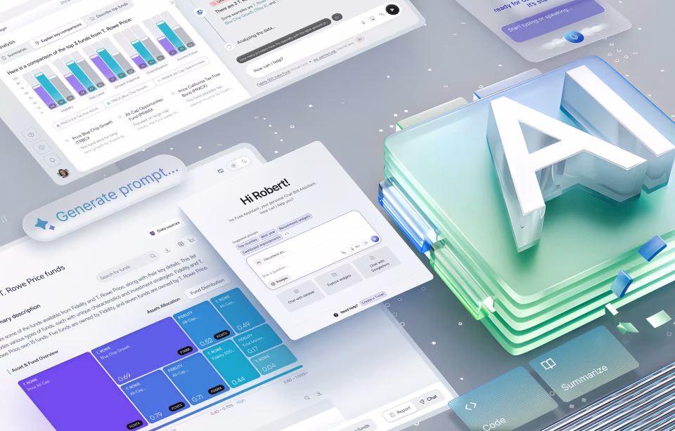
GUI (Graphical User Interface) is no longer a coat of paint; it is now a cognitive bridge connecting users to the increasingly complex, yet ubiquitous, digital world.
This guide is designed for the leader who understands that in an era of hyper-distraction, the interface is the only thing standing between your product’s utility and a user’s delete button.
It wouldn’t be an exaggeration to say that we are at a moment when the graphical user interface (GUI) has become the most decisive factor in a business’s success or failure. A visually cluttered dashboard, an ambiguous button, or a poorly timed notification can cost more revenue than a year of backend optimizations.
In this article, we will cover:
- What is a graphical user interface (GUI)?
- The history of GUI
- How does a GUI work?
- Essential components of a GUI
- GUI vs UI vs CLI
- Real-world examples of GUI
- Key principles of GUI design
- Advantages of GUIs
- Disadvantages and limitations of GUIs
- The future of GUI: trends and innovations
What is a Graphical User Interface (GUI)?
A GUI is a visual system that allows a human to interact with a computer system through graphical elements and visual indicators such as icons, buttons, windows, or menus. Before the Graphical User Interface, you had to speak the machine’s language in command lines and code. With a GUI, the machine speaks the user’s language in an intuitive fashion.
Imagine you are at a busy restaurant. The digital product you are using is the kitchen. The interface is the menu and the waiter. You don’t need to know how the stove works or the recipe of the dish you ordered; you simply want to point to a picture on the menu and get a delicious meal. When you interact with a screen, the GUI is that waiter and the menu; it takes your intent, communicates it to the kitchen staff, and brings back the result in a way that is desired and digestible.
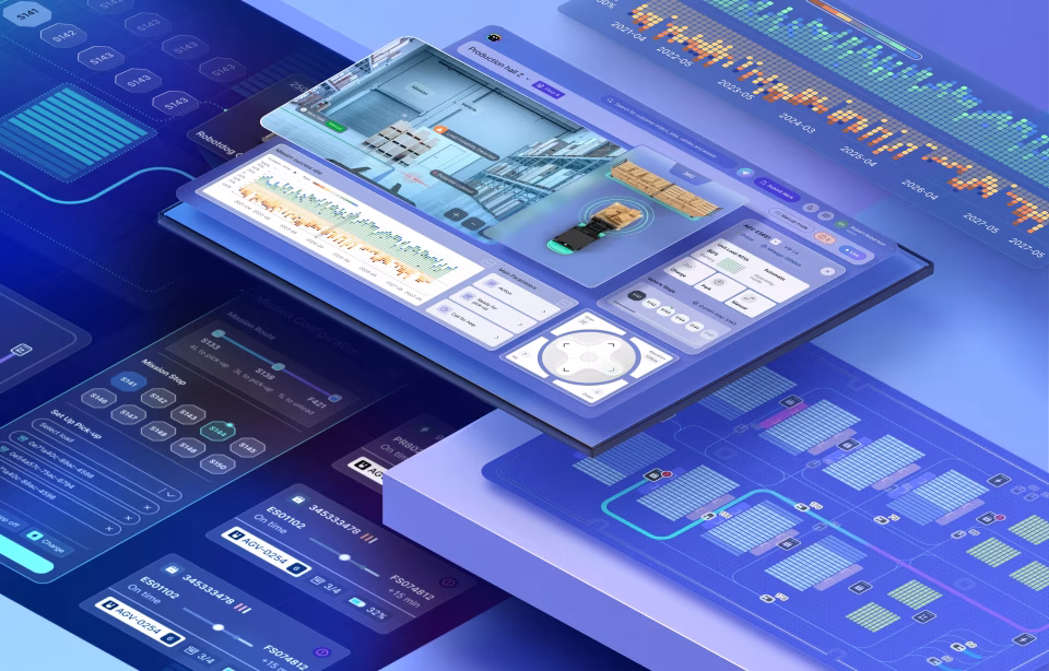
In the enterprise world, a GUI is what turns big data into a dashboard. It’s what allows a surgeon to interact with a robotic arm or a distracted driver to log an expense via a head-up display without taking their eyes off the road.

The History of GUI: From Text Commands to Visual Interfaces
Before graphical interfaces, interacting with computers required fluency in code. Early systems relied entirely on the command-line interface (CLI), a text-based interaction model where users typed precise commands to instruct machines.
This model was powerful, but a single misplaced character could break the execution of the device. More importantly, it assumed that users thought like engineers and computers were used as tools for specialists, not for everyday problem-solving. For a layperson, digital technology was a hidden, magical, unknown science that could only be wielded by a few.
The evolution from CLI to GUI marked a philosophical shift in computing: it took a machine run by a few trained humans and democratized access to it! Graphical interfaces introduced visual metaphors, such as desktops, folders, trash bins, that mirrored the physical world. This dramatically reduced the learning barrier and expanded computing beyond the technical elites.
From a business perspective, this shift unlocked scale. Software could now be sold to non-technical users. Training costs came down significantly, and adoption rates grew exponentially – all thanks to the interface that became a lever for growth.
The shift was more than technological; it changed the mindset of the common user on how they viewed technology, bringing it into homes and everyday lives. The design shift forced UI UX teams to build around a single question: How can we make it easier for people to use these machines or software to achieve individual user-goals? Every design decision, iconography, layout, and interaction feedback was based on how it answered this question.
While the CLI and command lines remain the engine room for developers because of their accuracy and efficiency, for general users, it is a barrier; ergo, the GUI is the open door.
Before GUIs: The Command-Line Interface Era
What did the world look like before GUIs? Well, in the CLI era, the screen was a void. To get anything done, you needed deep technical knowledge and a mastery of syntax. You had to type commands like mkdir /users/docs/ just to create a folder. It was text-based, unforgiving, and required a background in programming. If you missed a semicolon, the machine didn’t work.
CLI systems offered little visual feedback and almost no error recovery. The system was built to only allow correctness; if your input deviated from it, all you got was an error message and something that didn’t work. It was up to the person writing the code to figure out what went wrong and fix it. It took time, effort, and as a result, the technology was gatekept from the masses. As computing moved into offices and homes, the interface became the bottleneck, and these limitations became untenable.
The First GUIs: Xerox, Apple, and Microsoft
The modern GUI was born not in garages, but in research labs, most notably of Xerox PARC. They created the Xerox Star, the first system to use windows, icons, and a mouse. They invented the desktop metaphor.
Apple commercialized these ideas through the Lisa and later the Macintosh, making the GUI a consumer standard. Microsoft followed by bringing graphical interfaces to the enterprise via Windows, embedding the GUI into global business workflows.
Every modern UI traces its lineage to these early systems. The visual desktop became the template for digital interaction, and the GUI became inseparable from productivity itself. These interface revolutions defined – and still guide – how humans expect technology to behave, hiding all the complexity of the algorithm and championing productivity.
How Does a GUI Work?
A GUI is a translation layer. Beneath every beautiful Buy Now button is a mountain of code. When you interact with a visual element on a display – with clicks, taps, or gestures – you are not actually touching the data. The GUI translates this intent into machine-readable instructions, and then translates the system’s responses back into visual output.
When a user clicks a button, four things happen:
- The interface layer detects the interaction (mouse click, tap, keyboard input).
- That interaction is mapped to an event in the system’s logic.
- The system processes the request using underlying code and data.
- The result is rendered visually. This could be a text update (such as typing a character), a graphic change (such as a dropdown menu), or feedback appears (such as seeing the produced letter or menu on the screen).
Think of it like the dashboard of a car. When you turn the steering wheel, you are not manually pulling the tires with your hands. You are interacting with a layer of the system that sends a signal to the mechanical parts. The GUI is the steering wheel of the graphics and code stack. It simplifies the user experience by making 99% of the system’s complexity invisible. A well-functioning GUI feels instant and obvious, hiding the complexity to appear simple.
What does this mean for product teams? It translates into how designers work closely with engineers to define:
- What actions are possible
- What states are visible
- What feedback is immediate versus delayed
Understanding Abstraction in GUIs
The A-word or abstraction is the most important concept in design. It means simplification.
For example, we use a folder icon to represent a directory in a database. Why? Because humans understand physical folders. We use a trash can to represent deleting. This user-friendly metaphor reduces the complexity of the interface. A graphical user interface layers visual elements such as buttons, sliders, and icons on top of code, databases, and system logic.
In real UI design work, abstraction decisions are strategic. This often involves defining how much control the user needs, what complexity should be hidden, and how much and what to keep visible to avoid cognitive overload and confusion.
Too little abstraction can overwhelm users, leading them to abandon the task or make errors. On the other hand, too much abstraction is also a roadblock, as it removes agency and limits access to the technology’s full functionality.
Going back to the car analogy, the gears, brakes, and dashboard dials allow users to know more and control more of the driving experience, rather than just a steering wheel that also helps with driving but leaves the driver with no understanding of the system.
In 2026, our abstractions are getting even smarter. We no longer just mimic physical objects; we create digital-first behaviors that feel natural, even if they have no physical counterpart.

Essential Components of a GUI
In the early days of product design, there was no defined vocabulary for GUI. After some iterations, the Xerox PARC approach solidified into an accepted foundation on which each tech giant added their own systems. For a while there, it meant that users had to learn a completely new set of rules every time they switched from one piece of software to another.
As the GUI evolved, it standardized due to the realization that the human brain prefers recognition over recall. The current wisdom is that we don’t need to reinvent the wheel – the users like the wheel, the experience behind it must deliver added value. Users don’t want to think about how to use a tool (if the submit button is green and placed on the right in most devices, then we don’t want it changed for the sake of creating differentiation or aesthetics); users only care about the task the tool performs.
Until recently and even now in some areas, GUIs were often “skeuomorphic” – they tried to look exactly like real-world objects. We did this because users needed a bridge to understand the digital world. But as the World Wide Web becomes 35 years old, our collective digital literacy has grown enough for us to move beyond decoration and lean into a digital-first vocabulary.
Today, thoughtful design is about functional minimalism. Every component, be it a button, a slider, or a notification, is now part of a predictable system. When a user sees a plus icon, they don’t need to read a label to know it means Add. If you make a plus icon mean Delete, you don’t just confuse the user; you lose their trust.
Let us delve deeper into the four pillars of a GUI: Navigation, Interaction, Information, and Layout. These are not just parts; they are the digital nerves that connect digital backend logic to your users’ hands.
Navigation Elements
Navigation tells users where they are and where they can go. It is the physical equivalent of a signpost or a map. This includes menus, toolbars, breadcrumbs, and related elements.
Poor navigation is one of the fastest ways to erode confidence, as frustrated users just stop exploring. Here is a bit more on the most popular navigation elements:
- Menus: These are the high-level directories. Whether it’s a menu bar at the top of a desktop app or a Hamburger icon on mobile, menus provide the hierarchy.
- Toolbars: These contain the action-oriented tools. In a creative suite like Photoshop or a medical imaging tool, the toolbar contains the icons the user will click hundreds of times an hour.
- Breadcrumbs: Breadcrumbs are a secondary navigation scheme. These are essential for deep-tree architectures, such as e-commerce or enterprise resource planning (ERP). They reveal the user’s location and are typically placed near the top of the page. Breadcrumbs are like a You are here marker, allowing users to jump back three levels without hitting the Back button and losing their place.
In real-world product teams, navigation is often validated through tree-testing, clickstream analysis, and heatmaps from live usage.
Interactive Components:
These are the elements that actually do something. What users deploy to act upon their needs or use to communicate with the underlying code.
- Buttons: A button is what a user clicks when they expect a result. In 2026, we use Shadow and Elevation to make buttons look physically pressable. We distinguish between Primary (the big Buy button) and Secondary actions to guide the user’s eye.
- Sliders & Toggles: Toggles are for binary decisions, such as the On/Off choices. Sliders are for a spectrum. For example, in a smart-home GUI, a toggle turns the lights on; a slider dims them.
- Input Fields & Forms: This is how the user talks back to the system. A well-designed form uses Inline Validation to communicate that you have done something correctly, such as telling a password field that it is too short while you type it, not after you hit submit.
In practice, teams improve the efficacy of interactive elements with click targets (especially on mobile), visual attractiveness (Does this look clickable? Can people find it easily?), and error prevention Vs. error correction.
Informational Elements:
Icons, notifications, tooltips, and progress indicators are how the system communicates with the user.
- Icons: Icons are visual shorthand; for example, a Gear sign always means settings, and a Bell always means notifications. In 2026, we are moving towards System Icons that are simplified for high-resolution displays to ensure clarity.
- Progress Bars & Spinners: To let a user know that a request is being processed and has not gone unnoticed, design teams include progress bars and spinners, especially if a process takes more than 1.0 seconds. Why? Because an empty screen leaves the user wondering what is happening and forces them to leave.
- Tooltips & Alerts: Tooltips appear on hover to explain a complex feature. Alerts pop up to confirm an action (Message Sent) or warn of an error.
UI UX teams must treat feedback as non-negotiable. Every action should produce a response, even if it’s subtle.
Windows and Layout Elements:
Humans scan in patterns, and a layout presents users with a way to navigate the information presented to them. A well-structured layout reduces eye movement, decision time, and fatigue, which is especially useful in data-heavy interfaces like dashboards or control systems.
- Windows & Panels: Modern window management allows users to multitask. Panels (like the layers panel in a design tool) keep the screen organized by grouping related functions together.
- Containers & Grids: Every great GUI is built on a grid. This invisible structure ensures that layout elements align perfectly, creating a sense of professional stability. A container holds a group of elements together so they move and scale as one unit across different devices.
GUI vs UI vs CLI: Understanding the Differences
To most lay people, these are just acronyms. However, to a product strategist or developer, they represent entirely different interaction philosophies. One of the most common mistakes leadership teams make is using GUI, UI, and CLI interchangeably. They are related, but they are not the same. And misunderstanding the distinction leads to poor product decisions, wasted investment, and ultimately loss of revenue.
Here’s a bit more about the terms and how they relate to each other:
- UI (User Interface): This is the umbrella term to denote all the ways in which a human can communicate with a machine. It could be a button, a voice-activated interaction, a VR headset, or even the haptic vibration on your wrist from an Apple watch.
- GUI (Graphical User Interface): GUI is a specific subset of UI. It is the use of visual interface elements, such as icons, windows, and pointers, that is used to navigate a system.
- CLI (Command-Line Interface): This is the text-based interaction layer that requires the user to type specific commands to get a result. There are no icons to guide you; there is only your memory of the syntax.
What Makes GUI Different from UI?
UI is the broader term. It is the umbrella under which the GUI lives. The GUI is specifically about the graphical representation of data. It provides a visual desktop or workspace where the user can see their options.
While a UI might be invisible (like a motion sensor in a smart home, a voice, or an audio file), a GUI is always visible. It relies on the human eye’s ability to process shapes and colors faster than words.
| UI | GUI |
| An umbrella term that covers all types of user interaction activities. | A subset of UI that only refers to visual elements. |
| Can have a variety of primary inputs such as voice, gesture, etc. | Is limited to physical inputs such as a mouse, touch, or a stylus. |
| Can be used across the board for complex situations, hands-free environments, and more. | Is incredibly efficient for complex interactions. Is not optimal for every situation. |
| The learning curve and adoption are contextual, depending on the device, the product, and the user. | Is extremely familiar to all users. |
GUI vs Command-Line Interface
The GUI vs CLI debate is often framed as simplicity versus power. But there is more to it! CLIs are incredibly efficient for users who already know what they want to do. GUIs, on the other hand, are more useful for users who are not familiar with computer programming.
In real-world enterprise environments, most users are not programming experts. Also, they are distracted, at times multitasking or working against the clock. Asking them to remember syntax in these situations is just asking for errors.
Laypersons attempting to finish a task – whether at work or at home – benefit from visual cues, support, and confirmation cues – all the various strengths of GUI.
CLI is also not without advantages; it is great for activities that require automation, repeatability, or precision.
Modern systems increasingly combine both: GUIs for human-facing workflows, CLIs, and APIs for machines and power users.
Here’s a small table showcasing the differences between the two:
| CLI | GUI |
| Text-based and requires specialised knowledge. | Visual-first and does not need coding knowledge. Things are what they seem. |
| Gatekeeps access to the technology as it is inherently complex and requires technical knowledge. | More accessible to a broader section of society. People with different abilities and age groups can use digital devices as they don’t need technical knowledge of programming to browse a website; they just need to recognize a link. |
| A command-line interface takes a long time to learn and master. | A GUI has a steeper learning curve; laypersons can become proficient in a new software or device within minutes. |
| CLI is ideal for situations that require automation, repeatability, or precision. | GUI is more useful where a tool or a program needs to be used by a diverse set of people. |
Real-World Examples of GUI
To understand why GUIs remain dominant in 2026, we just need to look at the many real-world use cases. From day-to-day activities like scrolling your feed on social media or e-commerce sites to a surgeon glancing at patient data mid-procedure or a CFO approving expenses between meetings – we have countless examples of how interfaces must communicate instantly, minimize interaction steps, and prevent errors.
UI UX teams working on such systems spend weeks observing real behavior, not personas. They watch users hesitate, mis-click, backtrack, and abandon. These observations directly inform interface design, such as larger touch targets for devices used on the go, clear CTAs understandable to broad swaths of people, visual confirmation of success for fintech apps, and more.
In all of this, one truth emerges clearly: GUI success is measured less by aesthetics and more by outcomes such as faster task completion or fewer mistakes.
The theory of GUI is fine, but when we describe GUI success, what matters is the everyday use – how does a GUI handle the stress of a real-world environment? How quickly and effortlessly does it get users to their outcomes?
To understand success, let’s look at how these systems manifest across the products we use every hour of every day.
Operating System GUIs
Let’s start with the foundational GUIs that form the base of most of our interactions – the operating system (OS) of core platforms such as Windows, macOS, or Linux (Ubuntu). These set the rules for how every other application behaves and use a GUI to manage complexity: file systems, multitasking, permissions, and application orchestration.
Millions of users with wildly different goals rely on the same interface patterns every day. While each of these OS have their own visual design and hierarchy language to manage scale, you will find they have built on a common understanding of how to manage complexity – for example, files and folder grouping, standardized naming conventions, such as trash/bin for deleted files, applications for software apps, etc. – follow a foundational similarity to reduce cognitive loads.
The other feature that OS GUI teams invest heavily in is consistency because inconsistency at this layer is punishing. Over decades, users have become familiar with a certain way of doing things, finding information, and OS GUI teams have worked hard to keep things familiar across years and updates.
Software and Web Examples
Every time you open a web browser, you are using a GUI to navigate a digital product. Let’s look at an example that spans desktop and app and has probably been used by everyone reading this article – Amazon.
On the face of it, Amazon’s interface displays products, but if you scratch the surface, it is about encoding complex business logic, pricing, logistics, trust, and persuasion into a system that feels simple.
Search filters, sorting controls, comparison tables, and “Buy Now” buttons are not design decisions. They determine how quickly users find information, giving them trust signals and pricing nudges to choose confidently, making payment super frictionless, and giving them options to correct mistakes, such as changing quantities, addresses, or payment methods.
Amazon’s success across its web and app platforms is not an accident – every purchase is a precisely engineered funnel. Every GUI decision by Amazon’s product teams is tied to user delight and conversion KPIs: for example, a redesigned form isn’t made just to look nice or be less cluttered; it is designed to shorten decision time, reduce hesitation, and convert intent into revenue.
Mobile and Device GUIs
In 2026, the most personal GUI you own is in your pocket. Mobile and Device GUIs follow a very different UI design approach as they rely on touchscreen haptics. There is no mouse, so the interactive elements must be large enough for a thumb to hit (the “44-pixel rule”). Mobile GUI teams are also designing for motion and distraction. Let’s take the example of Uber. Uber’s interface is used while users are walking, carrying luggage, watching traffic, or juggling conversations, often with their hands busy and under some sort of time pressure.
Uber’s mobile GUI prioritises essentials, stripping it of anything that is not needed – keeping things clean, very visible, and big – focusing on just the pickup point, ETA, fare, and confirmation. Everything else is intentionally made secondary.

Key Principles of GUI Design
The key to a successful product GUI Design is establishing design principles that act as the North Star. To build guardrails that prevent a product from becoming a bloated, confusing mess, and then to stick to them.
At Fuselab, we stick to four core tenets: Consistency, Clarity, Feedback, and Inclusivity.
Consistency and Standards:
The most expensive thing you can do in a GUI is surprise the user. Predictability is the comfort currency your user expects and needs to use the product to its fullest potential. Humans are creatures of habit; they don’t want a new cool design if it forces them to expend mindspace on how to operate it.
Importance of Consistency: Humans are pattern-matching machines. If the Save button is blue on one screen and green on another, you force the user to re-learn your app every time they switch pages.
Standards: Use a uniform design language. Whether it’s a predictable icon set or a standard pattern for how windows close, staying consistent reduces cognitive load.
Our Rule: If you are going to break a standard, it must be 10x better than the existing one. Build on established patterns of the tool, don’t throw everything out and start again if it’s working fine. Stick to the patterns your users already know from iOS, Windows, or Android. We also advocate doing iterative changes. Don’t force users onto a completely new interface; make small incremental changes that are easily digestible to all users.
The importance of consistency is illustrated by two well-known failures – Microsoft’s 2012 attempt to unify the desktop and mobile interface by removing the Start Menu, which resulted in widespread frustration, and Snapchat’s 2017 redesign aimed to simplify the app that confused users, with a backlash so intense that a petition to reverse the update gained over 1.2 million signatures.
Clarity and Simplicity:
In GUI design, simplicity means fewer simultaneous choices. Every extra option increases decision time and error probability. The most dangerous GUI is an unclear one, as they invite users to waste time in finding workarounds and abandon tasks.
At Fuselab, we prioritize one primary action per screen with clear visual hierarchy and obvious next steps. If you have to explain it, it’s a failure!
Our UI teams seek clarity by asking simple questions like, ” Can a first-time user identify the primary action in under three seconds? Do they know what to expect before they click? And what happens if they click the wrong thing?
User Feedback and Response:
Every interaction with a GUI is a conversation, and it cannot be answered with silence. Silence is seen as a sign of something gone wrong, and that’s why we always prioritize providing feedback at multiple levels. This could be button states and animations, or success messages and progress indicators, or even long-term responses with logs and histories. Bottom line: every interaction must have a response.
When things hit a wall, we fall back on useful error messages. Not just an Error 404, but an explanation about what happened and how to fix it.
Accessibility and Inclusivity:
In 2026, accessibility is not a nice-to-have or a legal checkbox; it is a core market expander.
Interfaces that work for users with impairments tend to work better for everyone. This is why, at Fuselab, we design to overcome visual impairments (with high contrast and adjustable sizes), motor limitations (with easier keyboard navigation or larger targets), and cognitive loads using simpler language and predictable workflows.
Apart from helping all users, from a business perspective, accessible and inclusive GUIs expand the target market for the product and reduce legal and compliance risk.

Advantages of GUIs
Why do we invest thousands into a GUI? The answer is simple: it drives the bottom line! Below, we articulate some benefits of investing in a GUI that have a direct impact on the adoptability and profitability of any digital product.
Easy to Use: A GUI lowers the barrier to entry. You can onboard a new employee or customer in minutes. This ensures new users don’t find it hard to learn and use the product.
Accessible: A GUI that relies on spatial memory, adaptable layouts, assistive technologies, and icons is more accessible to a global audience. People with varying degrees of abilities, in diverse environments, and across devices can use the product, ensuring a wider user base and increasing stickiness for your product and brand.
User Retention: Lowers error rates increase confidence, especially in high-stakes workflows. When users can see system state, progress, and outcomes, trust increases, and this trust keeps them from going to competitors.
Intuitive: The best UI is an invisible one, which users can use almost on autopilot. A well-designed Graphical user Interface removes the need for users to remember or learn their way around a digital app or software; the interface’s layout guides them visually.
Disadvantages and Limitations of GUIs
GUIs are not a silver bullet. They have their own set of limitations:
It is resource-intensive. Graphical interfaces require more memory, processing power, and design effort than text-based alternatives. For critical tools that must function in constrained environments, such as areas with limited network coverage or low-power environments, this resource dependency matters.
GUIs can also be slower for expert users performing repetitive tasks. Power users often outperform graphical workflows with scripts or command-line tools once mastery is achieved.
Another limitation is development time. Designing a GUI requires time and manpower! You need a team able to manage research, design, compliance, front-end engineering, and ongoing iteration – often under tight deadlines. For startup and resource-constrained teams, balancing the disadvantages of shipping incomplete GUIs against the costs of time and money is an ongoing battle.
Situational context: While GUI is ubiquitous, it is not always the best choice for every product. Its limitations become more obvious in real-world environments, which are noisy, distracting, require hands-free access, or for users with certain types of disabilities.
The Future of GUI: Trends and Innovations
For all the talk of voice and gesture technologies expanding and maturing, the GUI is here to stay! The future of GUI is expansion, albeit in a different way.
Several trends define this future:
Predictive interfaces: With AI lending it real-time power, the GUI will evolve to become a co-pilot that predicts what you want to do next and provides the right button/action before you even look for it. It will be recommendations over raw outputs.
Multimodal Interfaces: GUIs will not just be visual; as UI/UX moves towards a mixed, seamless design approach, GUIs will have to evolve into a design language that integrates voice interfaces, gestures, and more. For example, voice to capture intent paired with a GUI for verification and oversight. Much like a car navigation system, where you use voice commands to map a route, but use a mix of audio nudges and a visual map to follow the route.
AR and VR: 2D screens will give way to spatial computing. Your Desktop might soon be your entire living room, where you grab data with your hands using gesture control.
Haptic feedback: To build trust and give the users a measure of security in the efficacy of the system, haptic and other feedback will play a critical role in GUI design.
As you can see, none of these eliminates the interface. They change and expand the definition of GUI.

Conclusion
We don’t often laud the Graphical User Interface or GUI as an important digital invention; those honors are kept for the more flashier technologies like cloud computing, AI, or IoT. However, when you think about it, the GUI is what made – and continues to make – all these powerful technologies accessible to everyone, from a child to a doctor to the CEO.
It turns invisible processes into visible outcomes.
For a business, the interface or the GUI is your brand’s face. It is where the value of your offering is realized. So the question they must always ask is, is my interface doing its job? Is it reducing friction? Is it increasing confidence? Is it helping users make better decisions under real-world conditions?
Whatever the future might hold in terms of technological evolution or user trends, GUIs will always be a critical part of achieving success in the digital world. Competitive advantage will not come from more features or more intelligence alone. It will come from interfaces that make all of these usable.
Your interface is influencing how customers interact with your platform.
If you're ready to shape that impact intentionally, we’d love to start a conversation.