Healthcare UX Design: What Clinical Products Actually Require

Healthcare UX design is the practice of designing digital healthcare products that align with clinical workflows, patient needs, and regulatory constraints. It involves structuring complex medical data, interactions, and decision-making interfaces so that both clinicians and patients can work faster, with confidence and trust.
Most healthcare products fail because general design thinking fails to account for the clinical context in which they are used. The time pressure (possibly the most critical factor in the medical field today), cognitive load, multi-role complexity, and regulatory constraints that define every interaction a clinician or patient has with medical software require something that general design thinking was never built to handle.
What Healthcare UX Design Actually Covers
Healthcare UX design covers the full spectrum of clinical interactions, from back-end data management to the high-pressure environment of a surgical suite. It includes clinical workflow design, multi-role system architecture, patient safety considerations, and the flow of information across roles. Doctors, nurses, patients, and administrators each need a different view of the same underlying data.
In healthcare settings, a single interface is typically used by multiple users with different goals. As NNGroup research on healthcare usability shows, physical and digital interactions often overlap. A doctor might need high-level vitals and patient history. A billing administrator needs a granular view of insurance codes from the same data set. A nurse needs clear handoff instructions between shifts. The same data must be presented differently without introducing inconsistency or confusion.
What separates healthcare UX from general product design is the consequence of failure. A misread interface in a busy hospital carries a life-threatening risk that simply does not exist when a button is poorly placed on a social app. Healthcare data visualization must prioritize interpretability over aesthetics, and systems must support accurate, confident decision-making under time pressure. In other words, if a provider has to spend more than a minute searching for particular data, that’s the ballgame.
Healthcare product design also requires managing fragmented ecosystems where data flows across devices, departments, and software layers. The UX must create a sense of continuity even when the backend is fragmented. Screen design is only the surface.
EHR Interface Design: Why It Is So Hard to Get Right
EHR interface design is difficult because it must present inconsistent, multi-source data as a single, cohesive, and trustworthy user experience. Electronic health records pull data from labs, imaging systems, manual entries, and third-party integrations, each arriving in different formats and at different latencies.
A well-designed EHR interface hides this chaotic underlying architecture entirely. Healthcare professionals cannot spend time questioning data integrity during patient care. The interface must signal confidence, highlight discrepancies when they matter, and surface the most relevant information at the moment it is needed. Healthcare data visualization is what makes this possible, converting fragmented data into a readable clinical narrative.
Time pressure defines the information hierarchy in a way that has no parallel in other product categories. Clinicians scan interfaces in seconds during patient encounters. Critical information: vitals, alerts, recent changes. All of it must be visible at scan speed. In many cases, providers have 90 seconds before their next patient to review their health data. Deeper detail must be accessible within one action. A layered dashboard approach is not an aesthetic preference; it is a functional requirement that directly affects clinical outcomes.
There is a fundamental difference between designing for a clinician and designing for a patient using the same system. A doctor scans for trends and anomalies that inform diagnosis. A patient portal must translate that same medical data into actionable health insights with an appropriate emotional tone. Getting both right within the same system is one of the harder problems in clinical UX design, because the mental models, stress levels, and information needs of each user are genuinely incompatible.
Designing AI Components Into Healthcare Products
Integrating AI into medical interfaces creates a trust problem that does not exist in consumer AI: the system must surface actionable insights and demonstrate the accuracy and reasoning behind them in real-time, under clinical time pressure.
AI in a healthcare setting must show why a recommendation is made, not just what it is. This is the reasoning visibility problem. Interfaces must show enough of the underlying logic, contributing data points, flagged anomalies and clinical evidence to help clinicians evaluate the AI’s input without overwhelming them. For effective AI interface design for medical products, this balance is the central design challenge.
Deciding when to display confidence levels is one of the more nuanced decisions in medical AI design. Showing a raw confidence percentage without a clinical context creates more confusion than it resolves. Hiding confidence levels entirely removes the transparency clinicians need to weigh AI input against their own judgment. The right approach depends on the clinical context, the user’s familiarity with AI tools, and the stakes of the decision being supported.
An AI health assistant must also feel specific to this patient’s data rather than generic. If a recommendation could have been written for any patient with a similar diagnosis, trust erodes immediately. Design should surface the patient-specific data points that generated each recommendation, making the AI’s reasoning visible and verifiable. Specificity is what makes the difference between a clinical AI tool that becomes part of the workflow and one that gets ignored.
How to Test With Clinical Users
Testing healthcare UX with clinical users requires structuring sessions around actual workflows, using synthetic data, and accounting for the environmental realities of clinical settings. Clinical users cannot use real patient data during testing due to privacy law, are difficult to recruit, and rarely have an hour available for a research session.
Effective UX research for healthcare products structures usability sessions around clinical workflows rather than isolated tasks. A session built around an emergency admission workflow or a shift handover process produces richer, more actionable findings than a generic task list. The workflow is what gives user behavior its meaning.
Recruiting clinicians requires institutional relationships, IRB familiarity, and realistic scheduling expectations. A nurse available for 20 minutes between shifts will behave differently from the same nurse given an hour in a quiet office. Research findings should account for the environmental constraints: hardware limitations, ambient noise, interruptions. These are not edge cases in clinical settings. They are the norm.
Testing with a clinician is fundamentally different from testing with a patient. A clinician prioritizes speed and data density. A patient needs a slower pace, reassurance, and clear translation of medical terminology into plain language. Both groups must be tested separately, with protocols designed for their specific context. Moderated testing works better for early-stage clinical prototypes where nuanced feedback is needed. Unmoderated testing is more appropriate for validating patient-facing features at scale, where a broader participant pool matters more than session depth.
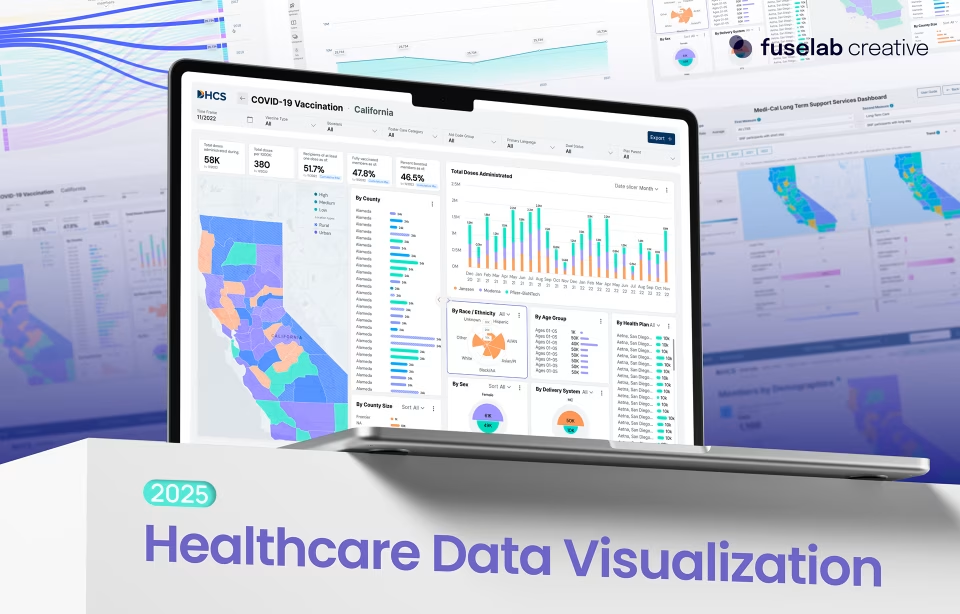
How Fuselab Creative Approaches Healthcare UX Design
Fuselab Creative approaches healthcare UX design through clinical interface expertise, regulatory knowledge, and human-centered research developed across more than a decade of healthcare product work. Fuselab Creative’s team has designed HIPAA-compliant interfaces for products used by both clinicians and patients, including systems that operate within the strict compliance requirements of government healthcare agencies.
Our design philosophy is direct: medical software should reduce cognitive burden, not add to it. We know, easier said than done. But the fact is, we have been doing it for ten years now. Fuselab Creative begins every healthcare engagement by mapping real clinical workflows and identifying where interface design can simplify complex decision-making rather than replicating it. That research informs the information architecture, the data hierarchy, and the clinical decision support logic built into every screen.
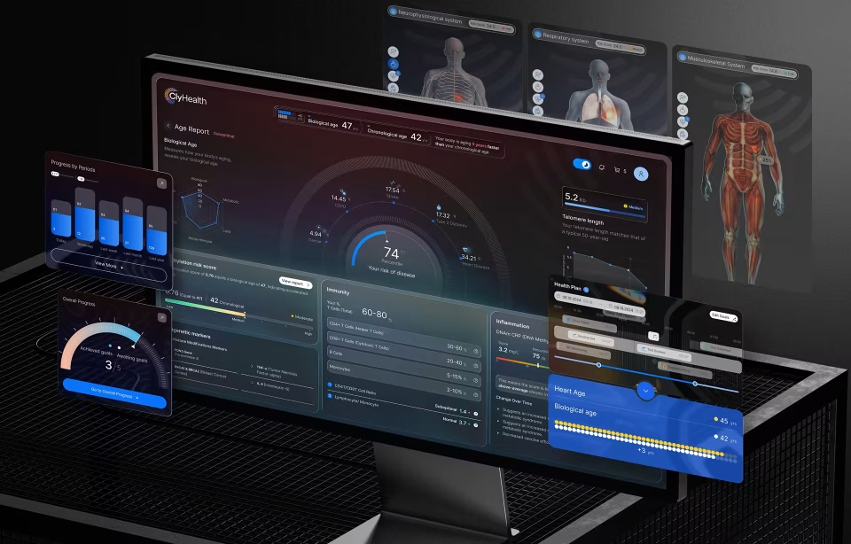
The ClyHealth engagement shows this directly. For that healthcare AI dashboard design, a personalized healthcare platform, Fuselab Creative designed a dashboard that gives healthcare providers clear, patient-specific data visualizations at scan speed, supporting personalized genomic-based treatment decisions without adding to clinical cognitive load.
Fuselab Creative holds a GSA Schedule contract, allowing US federal agencies to engage directly for healthcare UX work without a separate competitive bidding process. Organizations building or redesigning clinical interfaces can explore Fuselab Creative’s healthcare UX design services for details on process, compliance experience, and engagement models.
Frequently Asked Questions
What is healthcare UX design?
Healthcare UX design is the practice of designing digital systems that support clinicians, patients, and administrators in interacting with medical data safely and efficiently. It focuses on interfaces that support clinical workflows, comply with regulatory constraints, and perform reliably under real-world clinical conditions. Unlike general UX design, it prioritizes accuracy, clinical decision support, and multi-role usability over visual appeal. A doctor, a nurse, and a billing administrator may all use the same system with entirely different data needs and time pressures. Successful healthcare UX design accounts for all of those users simultaneously, producing tools that feel like a natural extension of a provider’s workflow rather than an obstacle to it.
How does HIPAA affect UX design decisions?
HIPAA directly shapes the information architecture of a healthcare product by mandating strict controls over how patient data is accessed, displayed, and shared. A healthcare UX design team must build tiered access levels into the navigation model. A nurse may see full patient vitals while a billing clerk sees only insurance and demographic data from the same system. HIPAA also governs session management, including automatic logouts, re-authentication requirements, and screen-level decisions such as masking sensitive fields on shared or public-facing displays. All of this shapes the navigation and layout before a single visual decision is made. Making this kind of work ridiculously hard but also ridiculously important. HIPAA-compliant UX balances these security requirements against the usability demands of a clinical environment where speed is not optional.
What is EHR interface design and why is it difficult?
EHR interface design involves creating systems that allow healthcare providers to view, interpret, and act on patient data collected from multiple sources simultaneously. It is difficult because the data is inconsistent, fragmented, and time-sensitive, arriving from labs, imaging systems, pharmacy integrations, and manual entries in different formats and at different speeds. The interface must present all of this as a stable, trustworthy narrative even when the underlying data is not. Because clinicians often have seconds to scan a screen during patient encounters, the information hierarchy must be close to perfect. Placing a critical alert in the wrong position, or failing to surface a medication conflict at the right moment, can directly affect patient safety. No other product category combines data complexity, time pressure, and clinical consequence in quite the same way.
What is the difference between designing for clinicians and designing for patients?
Designing for clinicians requires prioritizing high-density information and speed, while designing for patients requires clarity, reassurance, and accessible language. A clinician scanning an EHR needs to see complex data: blood chemistry trends, medication histories, imaging flags, at a glance, and act on it within seconds. A patient using the same system needs that medical data translated into plain terms with clear next steps and an appropriate emotional tone. These two groups have different mental models, different stress profiles, and different definitions of a successful interaction with the same interface. Clinical UX design must accommodate both without compromising either, which typically means building genuinely separate interface layers rather than adjusting the visual presentation of a single underlying structure.
How do you design AI features into healthcare products safely?
Designing AI features safely into medical products requires making the AI’s reasoning visible to clinicians at the point of use. Clinicians are unlikely to act on a recommendation they cannot evaluate, which means the interface must provide immediate access to the data points and clinical evidence that triggered each AI suggestion. Confidence indicators help clinicians weigh AI input against their own professional judgment, but only when designed carefully. Showing a raw confidence percentage without clinical context can create more confusion than it resolves and end up to becoming a hinderance instead a help. The goal is a working relationship between the clinician and the system, where the AI surfaces patterns the human might miss, and the human retains clear authority over every decision. Designing human review checkpoints at every consequential step is not optional. It is the structural foundation of responsible AI interface design in clinical settings.
What does Section 508 compliance mean for healthcare interfaces?
Section 508 is a federal standard requiring that government-related healthcare systems are accessible to users with disabilities. In practice, this means the interface must be fully operable via keyboard navigation alone, compatible with screen readers and other assistive technologies, and designed with color contrast ratios that meet WCAG 2.2 standards for users with visual impairments. For healthcare products built under government contracts, including federal health agency systems and publicly funded patient portals, Section 508 compliance is a legal requirement, not a design preference. Integrating these requirements from the start of the design process produces a better product for all users, not just those with disabilities. Retrofitting accessibility onto a finished design is significantly more expensive and rarely as effective as building it in from the initial wireframing stage.
How do I know if my healthcare product needs a UX redesign?
A healthcare product typically requires redesign when users report consistent frustration, when manual workarounds have become part of standard clinical workflow, or when measurable indicators such as task completion times or error rates are moving in the wrong direction. Clinician burnout associated specifically with software use is one of the clearest signals. When the interface is cited as a source of friction during interviews or exit surveys, the design has become a patient safety risk, not just a usability problem. Outdated visual design that creates a perception gap between your product and modern consumer apps can also drive patient disengagement. A structured usability evaluation covering session recordings, workflow analysis, and clinical user interviews can surface the specific friction points and prioritize them by impact before any redesign work begins.