POGO COVID-19 Government Spending Tracker – Interactive Interface That Makes a Difference
Good Work, For Public Good
About six months ago we started a new project with our data science and software development partners RS21.
The project was in support of the Project On Government Oversight (POGO). They tasked us with designing a business intelligence dashboard design and developing a web application to:
- Build a database application that can quickly, effectively, and efficiently retrieve, clean, store, merge, return, and otherwise reasonably manipulate information on federal COVID-19 relief programs and recipients along with information from existing corporate accountability databases and regional, state, district, and zip code-level socio-economic indicators; and
- Design and develop a public web application that will allow users to view, search through, filter, interact with, and download curated and user-defined sub-sections and combinations of the described data—potentially at each of the regional, state, district, and zip code levels—in an efficient, visually pleasing, and intuitive way (including the use of modern data visualization practices and geographic information systems (GIS) where useful).
The Project On Government Oversight (POGO) is a nonpartisan independent watchdog that was founded in partnership with whistleblowers in 1981. POGO works to expose waste, corruption, abuse of power, and other instances where the government fails to serve the public.
After our initial meeting with the project staff at POGO, we quickly realized that this was going to be one of the most important projects Fuselab Creative had ever done. Our dashboard designers visualized complex data and transformed it into appealing information. Not that we don’t value all of our clients, we have worked for major health organizations, important data visualizations for disaster preparedness, and numerous other socially important causes.
But this was about helping neighborhoods, communities, cities, counties, and states see how our government’s support during the pandemic had been distributed. And, equally interesting, was that this application would allow people to see how funds had been distributed within minority populations.
Additionally, unemployment caused by COVID-19 has been a hot-button issue since the beginning, and now with our POGO COVID-19 Spending Tracker design, users can see where unemployment rates have risen the most and can compare the allocation of funds within those areas with any other county in the US.

Being able to play even a small role in helping Americans understand the government support and its implications on this pandemic would influence how we felt about our work and gave us a sense of purpose which is a rare occurrence.
Most people in American society view their jobs as just that, a job. Unless you are a doctor research scientist, or teacher, you probably rarely feel the thrill of actually having an impact on people’s lives. This experience was immediately different for us.
Dealing with the pandemic has been tough on everyone across the globe, especially our staff abroad, and yet, having this POGO project gave us a renewed appreciation of our skillset and our ability to contribute to the greater good. A big part of POGO’s mission is focused on exposing the abuse of power in government.
Unless you have been living in a cave for the past four years, you have seen how this topic has captured the attention of not just Americans, but people across the world who have now begun following our turbulent politics as well.
Over 15 million Rows of Data
Before embarking on this project, Fuselab Creative, a data visualization design agency had worked with several large database front-end platform development projects, as well as enormous data visualization projects and dashboard systems.
However, dealing with a back-end database that includes over 15 million rows of data, and over 200 columns was somewhat of an eye-opener for us. Luckily, we pulled in one of the top data science firms in the country RS21.
People just love maps, and from the very beginning, POGO wanted to allow users to navigate to the extent possible, via a map interface. This opened the door for casual users as well as investigative journalists or researchers to inspect the platform within a simple yet effective user experience.
Ultimately, this approach provided a simple and welcoming environment that almost anyone could navigate with very little technical savviness.
Strategic Filtering & Downloads
For our data miners and their brethren, the amount of filters and options only get more robust the further you dig into the platform, culminating in an exhaustive downloadable data table.
It can be exported for those adventurously detailed types that have a few days to kill or might want to print out a few reams of paper for some good ol’ metal ruler and highlighter joy-filled action.
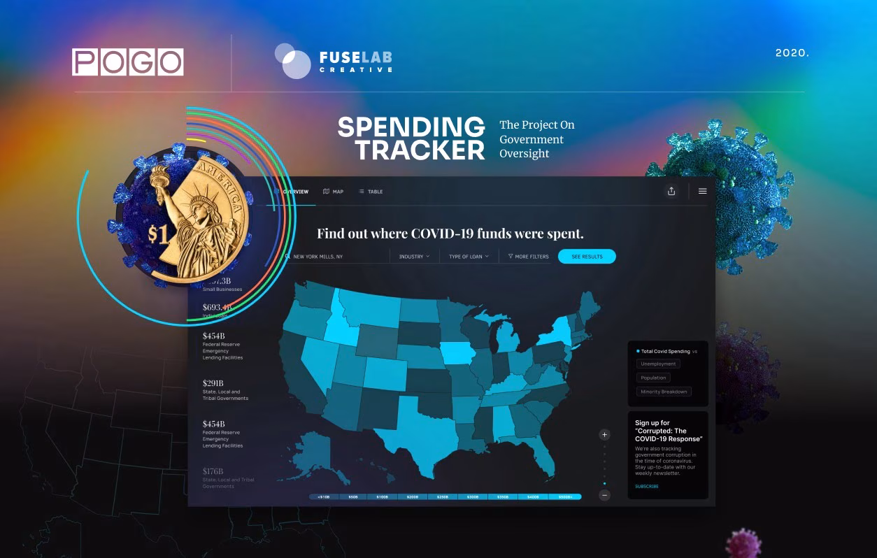
Ok, maybe it’s more like two or three screens, but most of the unique features and functionality are all available from one screen. No hyperbole, this approach is a game-changer when dealing with a system as complex and extensive as tracking over $1.6 trillion dollars.
From the initial screen, users can see state and national-level data while toggling between total spending, loans, direct payments, grants, contracts, etc.
Depending on your selection, states collectively update their color according to the gradient spending bar along the bottom of the landing page, allowing for national data visualization with one simple click.
Then, by clicking on the state of your choice, users can see that state information broken down by demographics, total loans, total transactions, and per capita loan amounts. Oh, and just to be clear, we still have yet to leave the landing page.

From here, users can go from looking at national data to individual ZIP Code data within a few clicks and without having to navigate between tabs, or screens, or do any type of scrolling at all. The amount of data becomes a question of personal preference at this point, as users can also use the search field to insert a ZIP Code or hop to the table area and search by individual recipient.
Admittedly, we were worried about the total search time that an individual recipient search might take to peruse fifteen million records, but to our delight, we found that there was no need for initial filtering, which some on our team thought would be needed. The data developers at RS21 cast some kind of genius spell on this database and in the end our custom search functions about as fast as any other call to the database!
Both Fuselab Creative and RS21 would like to formally thank the Project On Government Oversight for this opportunity and hope they are as proud of this work as we are. If you are feeling charitable, please vote for this design at the national CSS Awards.
Discover more about our medical and healthcare UI/UX design services.