20
min read
20
min read
 Aug 18, 2026
The Steering Framework: Designing Decision Interfaces
There is a problem at the center of modern data interfaces that almost nobody talks about directly. Dashboards have gotten faster, richer, and more beautiful. The tooling has never been better. And yet the fundamental relationship between a person and their data has not changed: the interface shows something, and the person tries to figure out what to do with it.
That is not a design failure in the narrow sense. It is a conceptual one. Most interfaces are built to display data. Very few are built to help someone act on it. And fewer still are built to earn the trust required to make that action feel confident rather than anxious.
At Fuselab, we have been building data interfaces for clients, including EY, National Institutes of Health (NIH), Fiserv, Uber, and California DHCS, long enough to know that the hardest part of any engagement is rarely the visualization itself. It is the moment a stakeholder looks at a projection on a screen and asks, with a mix of curiosity and suspicion: “Where did this come from? Can I change it? What happens if I do? What’s clickable?”
Most interfaces have no good answer. We have been searching for a method that does.
Over the past year, we have been integrating a “Steering Framework” into our project approach. It addresses a problem we kept running into and could not fully solve with conventional UX methods: how do you build an interface that earns trust when it is showing people things that have not happened yet? This article is an account of what the framework is, why it resonates with the clients we serve, and how we are putting it into practice.

The Problem With “Just Show the Data”
There is a version of data interface design that treats the job as fundamentally a display problem. Acquire the data, choose the right chart type, apply good visual hierarchy, and ship. This approach is not wrong, exactly, but it stops short of what complex clients actually need.
When working on enterprise dashboards for Fiserv, a large financial services client, we encountered a recurring dynamic: the interface would show a metric, a threshold, or a projection, and the analyst would immediately want to know three things the interface could not answer. What assumptions went into this? What happens if I change one? And is this alarming me or just informing me?
The same pattern appeared in our work on operational platforms for fleet management and machine learning experiment tracking. In those contexts, the data changes every few hours, sometimes every few minutes, and the user’s relationship with it is active: they are trying to decide what to kill, restart, or act on. An interface that only shows the current state without letting someone push on it becomes a bottleneck rather than a tool. As we wrote in our piece on dashboard design vs. data visualization, the test for whether a dashboard is actually working is whether someone opens it every day without being told to, and leaves with a decision rather than more questions.
The inability to answer those questions is not a minor UX gap. It is a trust failure. And in regulated industries, in government contexts, in any environment where a decision carries real weight, a trust failure in the interface is a trust failure in the organization behind it.
Consumer expectations have shifted alongside this. People interact with AI tools daily now. They have developed a sense for when a system is hiding its reasoning from them, and they do not like it. They want to see the model. They want to poke at it. They want to know that the projection on the screen is theirs to interrogate, not a fait accompli handed down by an algorithm.
The Steering Framework speaks directly to that shift. It is built on the premise that the real design problem is not visualization. It is trust. Steering is the method for earning it.
What Steering Actually Means
The word “steering” is chosen deliberately. It stands in contrast to watching. A steering interface is one where the person at the screen can understand where the data comes from, change the assumptions driving a projection, and see the consequences of that change, all without losing confidence in what they are looking at.
The framework is built on five principles, each one an answer to a question the user silently asks every time they open a complex interface.
The first is legibility. “Where does this come from?” Every value in a Steering interface carries its provenance. A user can tell, without digging through documentation, whether a number is measured from reality, interpolated from adjacent data, or modeled by a projection engine. Source, recency, and uncertainty are at most one interaction apart. This is not about adding tooltip clutter. It is about designing an interface that treats the distinction between fact and estimate as a design requirement rather than an afterthought.
The second is control. “What if I change an assumption?” In a Steering interface, the future is steerable rather than fixed. A user can adjust the inputs that drive a projection and watch the interface re-run in response. The point is not to give users a simulation toy. It is to shift them from passive recipients of an answer to active participants in shaping one. That shift is what separates a thinking tool from a report.
The third is reversibility. “Can I get back to where I was?” Exploration must be safe before it can be useful. If changing an assumption might permanently alter what the user sees, most users will not change anything. They will read what they are given and move on. Reversibility, in the Steering model, means every scenario is saved, named, and returnable. The baseline is always there. The user can experiment without fear.
The fourth is calm. “Is this alarming me or informing me?” This one is harder to operationalize than the others, and it is the one that resonates most with clients in high-stakes domains. Heavy data, whether it is health data at NIH, financial risk data at Fiserv, or mission-critical telemetry at NASA, carries emotional weight. An interface not designed with that weight in mind will either numb or frighten people. Neither is informative. Calm, as a design principle, means restrained color and motion, reserved for genuine signals rather than decoration, and a consistent interaction grammar that makes the tool feel stable even when the data it shows is not.
We saw this play out directly on NASA’s mission data monitoring environment, which we designed across multiple operational phases. Alert fatigue was the core interface problem: operators were receiving accurate data, but too much of it simultaneously. In a monitoring context where misreading a priority alert has real consequences, the visual hierarchy had to do more work than any chart type. Calm was not a stylistic preference. It was a safety requirement.
The fifth is authorship. “Is this scenario mine, or theirs?” This one has become increasingly important as AI-generated outputs enter more client workflows. When an interface produces a projection, who owns it? If a user adjusts that projection and shares it with a colleague, does the shared version carry its assumptions clearly enough for the second person to evaluate it honestly? Authorship, in the Steering model, means the scenario a user constructs belongs to them, is attributed to them, and travels with its assumptions intact. The interface informs; the human decides.
These five principles are not a checklist of equals. Legibility is the foundation. Without it, nothing else can be trusted. Control and Reversibility make the interface usable as a thinking tool rather than a passive display. Calm governs how it all feels emotionally. Authorship is what the user takes away after the session ends. Together they form a single promise: you can understand it, steer it, undo it, sit with it calmly, and call the result your own.
The Multi-Layer Visual That Makes It Work
A principle is only as good as its implementation. One of the most concrete contributions of the Steering Framework is what it calls the composite visualization: a single view that layers multiple kinds of meaning into one coordinated display rather than scattering them across disconnected charts.
Most dashboards operate on a chart-per-metric model. One chart shows the trend. Another shows the breakdown by category. A third shows geographic distribution. Each is accurate in isolation. But the relationships between them, the moment a category spikes exactly when the trend turns, or the region where pressure concentrates just as the forecast diverges, become invisible precisely because the charts are separate.
The composite visualization addresses this by assigning each incoming data type to a visual layer and locking all layers to a shared scale. Categorical data drives the bar layer. Time-series data drives the trend line. Cross-dimensional data drives the intensity heat map. A changed parameter drives the forecast point, wrapped in an uncertainty band. A selection layer keeps every element synchronized on hover and interaction, so clicking anything in the view highlights its moment across every other layer simultaneously.
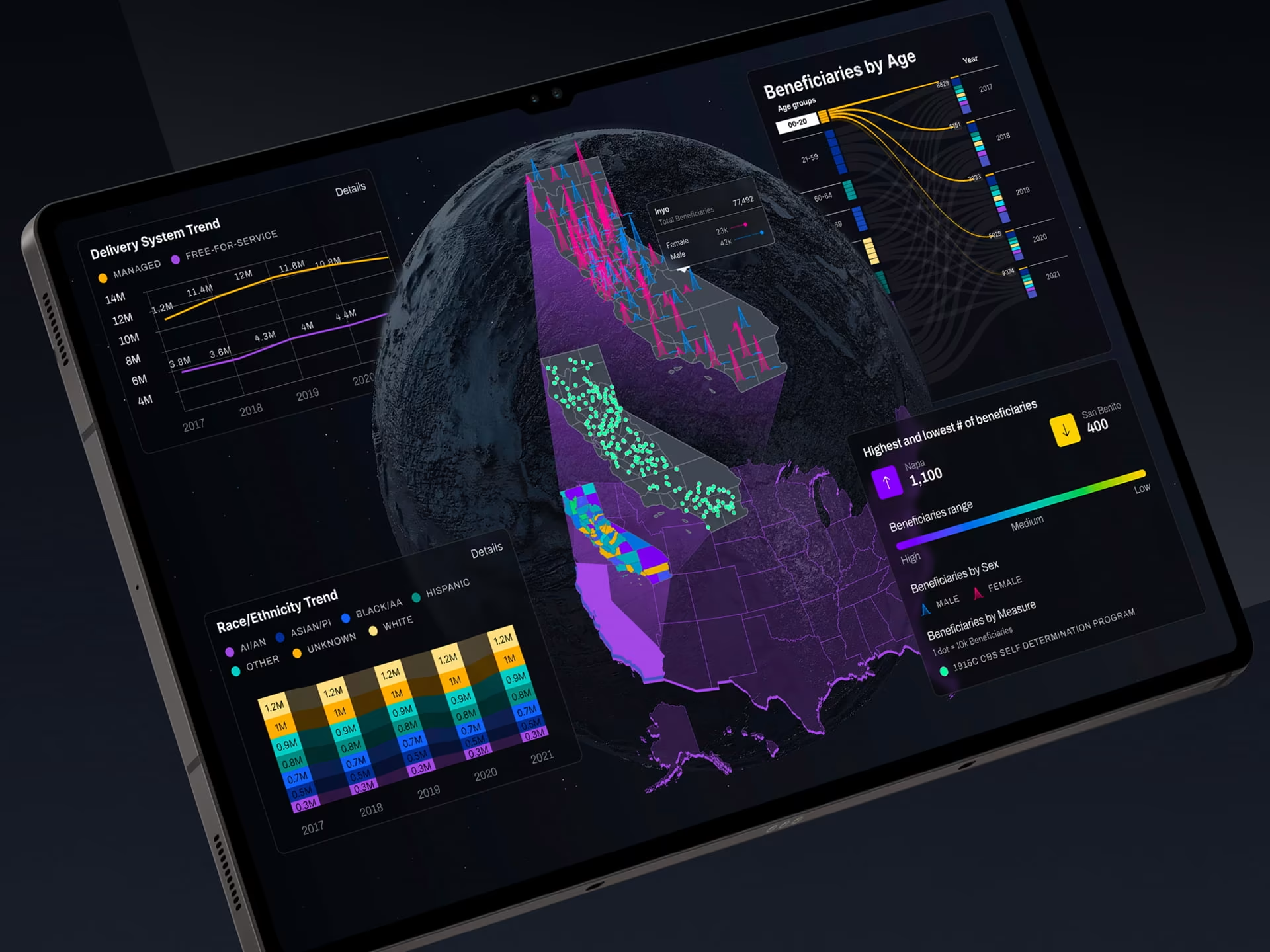
Our work on the DHCS Long-Term Services and Supports dashboard is a direct example of this layered approach in practice. Facing data from multiple disconnected systems covering program enrollment, service utilization, provider performance, and funding metrics, a chart-per-metric design would have required administrators to mentally stitch together five separate screens every time they needed to understand what was happening across a population. Instead, we built a multi-dimensional demographic analysis framework that let DHCS analysts examine how age, race, geography, and primary language intersect to affect service utilization simultaneously. Geospatial heat maps showed where service pressure concentrated. Trend lines showed direction over time. Executive views led with summary-level signals; program analyst views surfaced the granular detail. All of it on one shared scale. You can read the full case study here.
The result is not a more complicated chart. It is a chart that answers more questions at once, using one mental model instead of five. Attention is the scarce resource, not screen space. Every layer consolidated into a single coherent view removes cognitive load from the user.
One rule governs the entire visual language and anchors the composite to the legibility principle: never let a projection look as certain as a measurement. The measured present is solid and sourced. The modeled future is softened, banded with uncertainty, and clearly labeled. The moment a user cannot tell which is which, the interface has failed. This single rule, applied consistently, does more for trust than any amount of explanatory text.
We are adopting this composite approach as a structural default for data-heavy projects, replacing the chart-per-metric handoffs we have relied on for years.
The Timeline: Seeing the Path Along Time
The composite visualization shows the full picture at a given moment. But the Steering Framework identifies another way to read the same data that our clients have found equally valuable: the timeline.
The timeline and the composite are not two different interfaces. They are two different readings of the same underlying path. The composite answers, “What does the whole picture look like right now?” The timeline answers “how did we get here, and where does each moment sit on the way to the future?”
In practice, the timeline serves as a scrubber that the user can navigate. The present is a marked point, with measured history behind it and projected futures ahead. Dragging the cursor moves every layer simultaneously to that moment in time, so the user can replay how a situation unfolded or step forward into a projection frame by frame. Crucially, both the composite and the timeline are bound to the same data and the same selection state. Moving the timeline cursor updates the composite; selecting an element in the composite marks its moment on the timeline. The user is never looking at two different things. They are looking at one path, seen from two angles.
This matters more than it might appear. Clients dealing with complex longitudinal data, epidemiological trends at health agencies, multi-year financial projections in enterprise settings, and operational data across extended logistics windows often struggle to communicate the difference between “what is true now” and “where this is going.” The timeline makes that difference navigable rather than abstract. The present is a position. The past is behind it. The future is ahead, and it is explicitly uncertain.
In our DHCS work, one of the specific capabilities we built was longitudinal demographic tracking: the ability to monitor how program enrollment demographics shifted over time, revealing emerging population needs before they became crises. That is precisely the value of a timeline view. Not to replace the current-state composite, but to let decision-makers step back and read the trajectory rather than just the snapshot.
Introducing this dual-view model into client discovery conversations has already changed the nature of those conversations. Instead of presenting a static wireframe for approval, we can ask: Which reading best serves your stakeholders right now?
Defining the Data That Changes the Path
The moment a Steering interface becomes more than a sophisticated display is the moment a user changes something and watches the path shift in response. This is the heart of what the framework calls steering.
The mechanic works as follows. A user selects or adjusts a parameter by dragging a point, moving a lever, or editing a value directly on the visual. The interface generates a new projected point on the path, clearly marked as modeled and distinct from measured history. The projection is wrapped in an uncertainty band, anchored to the rule that nothing modeled should read as certain. The new path sits alongside the original, so the change is legible as a change rather than a silent overwrite.
The framework distinguishes between two modes for resolving the future. When the trend line is selected, the new projected point follows the trend, adjusted for the changed parameter: “if the current direction holds and this changes, here is where it lands.” When no trend line is selected, the outcome is derived from historical behavior: “given this change, and given how the system behaved before, here is the resulting case.” The mode is always visible and always a deliberate choice. Nothing about how the future was calculated is hidden from the user.
In practical terms, this creates a workflow that matches how smart analysts already think. They do not accept a single projection. They stress-test it. They ask what happens if the key assumption is wrong by 10% or 20%. They compare scenarios. A Steering interface makes that workflow native rather than forcing analysts to export data, run their own calculations offline, and bring the result back to a separate presentation layer. The thinking happens in the interface, which means the interface participates in the decision rather than merely reporting the inputs.
The DHCS work showed exactly this dynamic. When DHCS leadership could see on a single screen that patients in certain regions were 37% more likely to maintain independence through home and community-based services while costing the state 42% less per patient than institutional care, program priorities shifted accordingly. That shift did not happen because the data changed. It happened because the interface made the implications of a change navigable for the first time. That is the steering mechanic in practice: not just displaying the current path, but making the consequences of adjusting it visible and concrete.
For clients like Fiserv, where risk modeling runs across thousands of variables, and NIH, where projections carry regulatory and public health implications, this is the difference between an interface that gets used and one that gets bypassed.
Switching Views Without Losing Your Place
One of the clearest signals that a complex interface is working is that switching between views feels effortless rather than disorienting. The Steering Framework addresses this directly: the user can move between the composite and the timeline, and between different goal lenses within each, with a single tap or click. The current selection, time cursor, and active scenario follow the user from one view to the next. Switching never loses its place. It reframes what they were already looking at.
This is more than a usability convenience. It reflects a conviction we share with the framework: different people engage with the same data for different reasons, and the interface should accommodate that without requiring different products. An analyst and a senior executive looking at the same projection are not trying to answer the same question. The analyst wants to trace assumptions, inspect model inputs, and stress-test boundary conditions. The executive wants to understand whether the trajectory is good or bad, what it would take to change it, and what decision it implies. Both are valid readings of the same data. The same composite serves both by shifting which layer leads and which detail is surfaced versus tucked away.
In our DHCS work, we developed five distinct user personas before a single screen was designed, ranging from executive directors who needed summary-level signals to program analysts who needed to drill into individual counties and demographic cohorts. The same underlying data had to serve all five. The solution was not five separate dashboards. It was one system built around progressive disclosure, where every user started at the same calm, legible surface and depth unfolded only when a particular role or goal called for it.
The framework names several goal lenses explicitly. A “compare options” goal displays the ranked categorical bars. A “read the direction” goal shows the trend line and forecast band. A “find the hotspots” goal shows the intensity heat map. A “stress-test an assumption” goal surfaces the forecast layer and the levers. An “explain to a newcomer” goal displays a plain-language summary and tucks the technical detail beneath it.
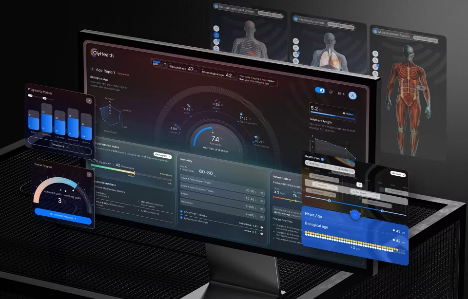
This same logic applied when we designed ClyHealth, a healthcare AI platform. The dashboard layer handled daily clinical workflow: role-based views for administrators and clinicians, real-time patient monitoring, and alert routing. The visualization layer sat inside it as a distinct analytical mode, presenting outcomes over time across patient cohorts. The two layers served different user modes. One was for working in the moment. The other was for understanding patterns across weeks of data. Treating them as the same problem, and designing a single surface to do both simultaneously, is what causes most healthcare data products to fail at one or both goals.
NASA engineers and mission stakeholders do not need different products. They need the same interface, oriented toward different questions.
How We Are Applying This in Our Work
The Steering Framework is not a product we are selling. It is a method we are bringing into the design process for projects where the underlying problem aligns with its premises: complex data, high-stakes decisions, mixed audiences, and a need to show both present reality and future possibility in the same view.
In practice, adoption starts at the discovery phase. When scoping a project that involves data visualization, we now explicitly ask which of the five principles the current interface is failing to meet. Usually, it is legibility and control, the two most foundational ones. The user cannot tell where the numbers come from, nor can they do anything about the projection they are looking at. Those failures cascade. An interface with poor legibility cannot offer meaningful control, because the user does not trust what they are changing. An interface without reversibility suppresses the exploration that would make control valuable.
The composite visualization approach has changed how we structure visual design deliverables. Rather than presenting chart-per-metric wireframes and asking clients to respond to each element independently, we are building toward a single coherent view and showing how the layers interact. That shift in deliverable structure changes what the client review conversation is about. Instead of evaluating charts, they are evaluating a reading of their data. The questions become richer, and the feedback becomes more useful.
The anchor rule, never let a projection look as certain as a measurement, is becoming a design standard across any project involving forecasting, trend extrapolation, or AI-generated outputs. The visual language implications are concrete: banded uncertainty ranges rather than point projections, explicit labeling of measured versus modeled values, source and date attribution on every number the interface presents as real.
This connects directly to a pattern we documented in our article on why enterprise AI interface design fails at adoption. Our work with Grid AI showed that data science teams given a visible mechanism to flag incorrect recommendations engaged with the system more, not less. They spent more time reviewing individual outputs and were more confident in the ones they chose to act on. Making uncertainty visible, and giving users a path to push back, does not erode trust. It builds it.
The calm principle has had perhaps the most consistent impact on the projects where it was least expected to matter. Financial dashboards for enterprise clients, federal health data tools built for California DHCS, and operational platforms in regulated industries, such as Electronic Health Records systems, are all environments where the data itself carries weight, and where the instinct is often to signal importance through visual urgency. The Steering Framework pushes against that instinct. Urgency in the visual language should be proportional to the actual signal in the data. Everything else is noise that erodes the trust the interface needs to function.
In our EHR work, this meant making a deliberate choice about what got visual emphasis at different points in a clinical workflow. Not every data point is equally urgent. Not every threshold breach requires a red alert. An interface that treats everything as important ends up communicating that nothing is. The Steering Framework’s calm principle gave us a principled basis for those decisions beyond personal aesthetic preference.
Let's Design What Your Data Can Really Do
If your product relies on complex data, AI, or predictive analytics, we'll help you transform it into an experience users can understand, trust, and act on.
Why This Matters Now
Consumer expectations around data transparency have moved faster in the last three years than in the previous decade. The proliferation of AI tools has given a broad population direct experience with model-driven outputs and, with them, a new set of demands. People now expect to know whether what they are reading was generated or measured. They expect to be able to influence it. They expect that if they push on it and something breaks, there is a path back to solid ground.
The enterprise data backs this up. MIT research interviews with 150 enterprise leaders and analysis of 300 public AI deployments found that only 5% of AI pilot programs achieve rapid value. BCG’s survey of 1,000 C-level executives found only 26% of companies generate tangible results from AI initiatives. S&P Global’s survey of more than 1,000 North American and European enterprises found that 42% of companies abandoned most of their AI initiatives in a single year. The most common failure mode, across all three research sets, was not model accuracy. It was the interface layer. Users could not build the trust needed to engage consistently, so they stopped engaging altogether. As we wrote in our article on enterprise AI interface design: the adoption gap in enterprise AI is a design problem before it is anything else.
These expectations are not limited to consumer-facing products. They have migrated into enterprise contexts, into government procurement requirements, and into the questions buyers ask during demos. Clients who once would have accepted a polished dashboard as the final artifact now want to know what happens when they change an assumption. They want to know how uncertainty is represented. They want to know whether the interface they are building will inform their team or confuse them.
The Steering Framework addresses exactly those questions, and it does so with a rigor that goes beyond aesthetic preference. Its five principles, its composite visualization model, its anchor rule, its goal lenses, these are not design opinions. They are a structured response to the trust problem that sits at the center of every serious data interface.
Adopting it is not a decision we made lightly. It asks us to change how we scope projects, structure deliverables, run client reviews and talk about uncertainty in design. That is a meaningful shift. But the alternative, continuing to build interfaces that show data without helping people act on it, is no longer adequate for the clients we serve or the expectations they bring.
The goal is the same one that drives every project we take on: build something a person can sit down with, trust, and use to make a better decision than they would have made without it. The Steering Framework is the clearest method we have found for achieving it.
Author

Marc Caposino
Related posts