AI product design: the decisions made before the interface
Most guidance on AI product design begins one decision too late. It assumes the product will use AI, then argues about whether the interface should be conversational and where the confidence score belongs. The decisions that determine whether an AI product survives contact with real users are made before any of that, and skipping them is why so many AI features stall a quarter after launch.
What AI product design is
AI product design decides where a probabilistic system belongs in a product, what it can do without a person, and how its uncertainty reaches the user. It differs from conventional product design because the same input can return different outputs, each with a different degree of reliability, and the user cannot tell which is which. This is an entirely new design challenge for many agencies.
Deterministic software has an unwritten contract with its user. Follow the same steps, get the same result. That contract is what makes conventional interface conventions work, because a button that did something different every third press would be a defect. Choosing AI means breaking that contract deliberately, in exchange for coverage a rule could not give you. Every design decision downstream has to account for the break rather than paper over it.
Interaction-focused guidance starts after the decision that matters most. Microsoft’s Guidelines for Human-AI Interaction set out 18 practices for how a system should behave on first contact, during regular use, when it is wrong, and over time. They are genuinely useful, and they assume the product will use AI and that its job is already settled.
Both touch on balancing control against automation in general terms. Neither gives a team a way to place that line for a specific product, where the answer turns entirely on what a wrong call costs. That gap is where AI products fail, and the four failures below are the shapes it takes, in the order they usually appear.
Failure one: using AI where rules suffice
The most expensive mistake in an AI product is not a bad model. It is a probabilistic system solving a problem that needed a deterministic one. Rule-based logic is cheaper to build, testable against known inputs, and behaves identically every time it runs. In a workflow where predictability is the actual requirement, those properties are the feature.
MIT’s Project NANDA reported in The GenAI Divide: State of AI in Business 2025 that roughly 95 percent of the integrated enterprise AI pilots in its sample showed no measurable effect on profit and loss. The report names a learning and workflow gap, not model quality, as the cause. The sample is small and non-peer-reviewed, so it is not a universal failure rate. The direction still matches what shows up in delivery.
Google’s People + AI Guidebook puts this test first, in its opening chapter on user needs: even the best AI will fail if it doesn’t add value the user couldn’t get another way. It is the right question, asked at the right moment, and it stays a prompt rather than a decision model. Teams read it, agree, and skip it under launch pressure.
AI earns its complexity when the input space is too large or too variable for fixed rules to cover. The cases where it consistently pays:
- Predicting an outcome from data that is incomplete or arrives out of order.
- Ranking or recommending across a set too large for a person to review.
- Generating or summarizing content where there is no single correct output.
- Detecting patterns across signals a human would not think to correlate.
- Acting across several systems whose state changes between decisions.
Teams that skip this check pay for it twice. They pay to build the model, then they pay again to retrofit confidence indicators, fallback states, and override paths onto a product that never needed any of them.
Failure two: choosing the interface first
From the user’s side, an AI product does one of three jobs. It answers, it recommends, or it acts. Most confusing AI products are confusing because the team picked chat, or a dashboard, or an agent, and then worked out what the system would do inside that shape. The job determines the interaction model, not the other way around.
When the AI answers
These products return information in response to a query. Assistants, internal knowledge search, and documentation copilots sit here, and conversation is often the honest interface because users arrive with questions rather than transactions. The design problem is not fluency. It is helping someone judge whether a given answer is relevant and sourced well enough to use.
When the AI recommends
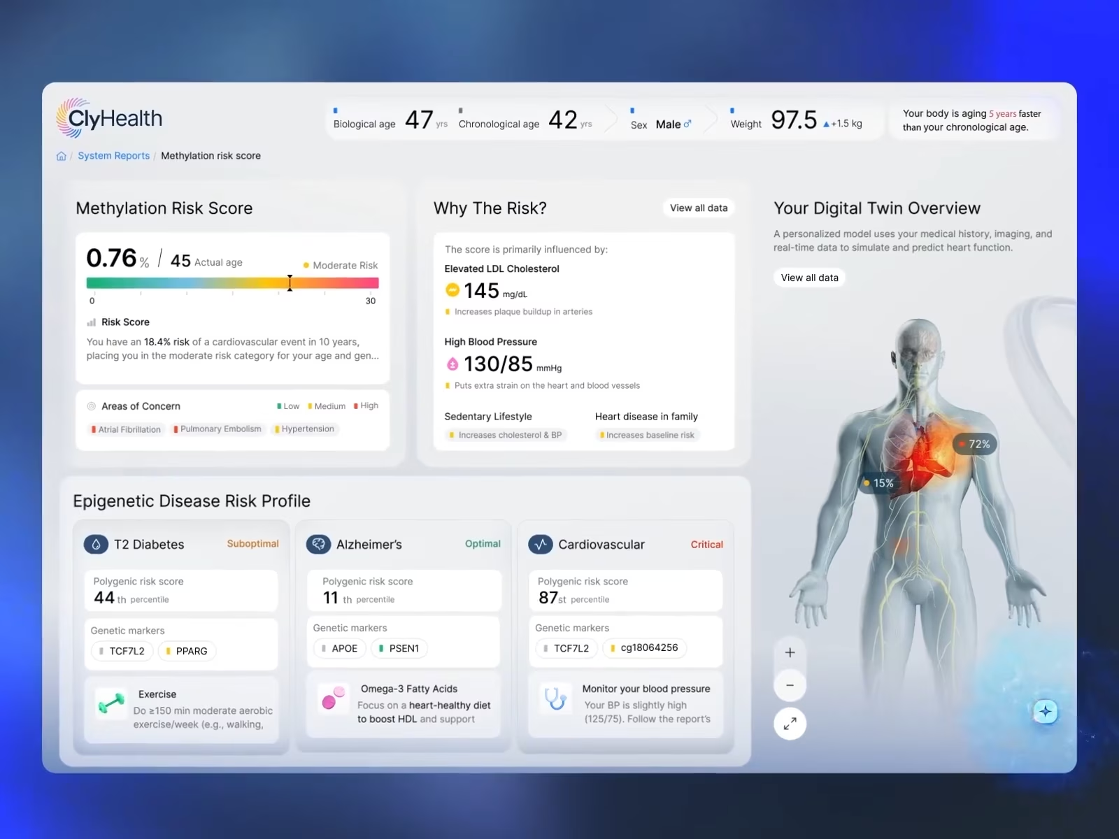
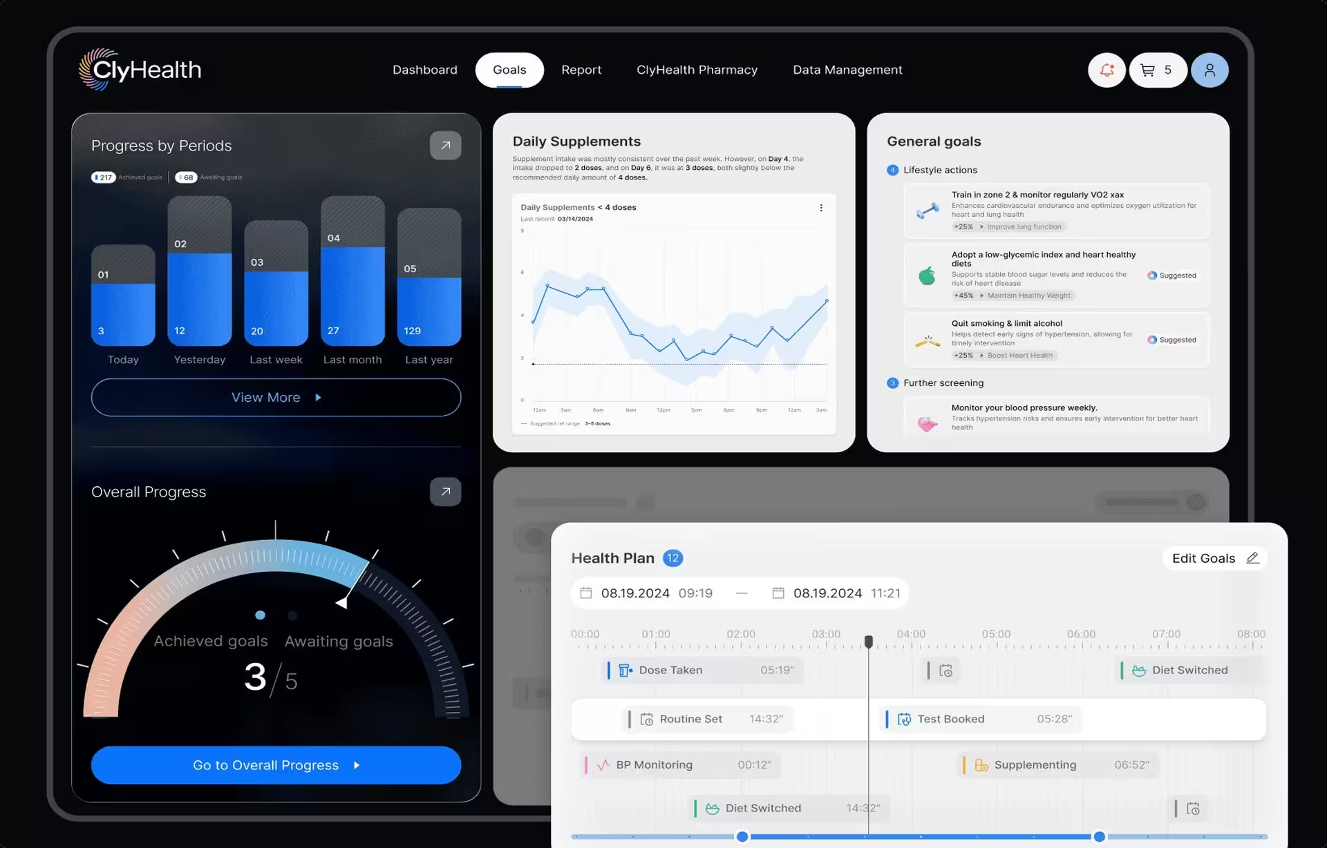
Here, the system proposes, and a person decides. ClyHealth shows this cleanly in its supplement personalization module, which builds a formulation from a patient’s biomarkers, labs, and genomic data. The interface places the contributing factors next to the recommendation, so providers review the evidence before anything reaches the patient.
Recommendation products need a different information architecture from conversational ones. A user cannot accept or reject a recommendation responsibly without seeing what drove it, which means the evidence has to be one glance away rather than one click away.
When the AI acts
The hardest of the three. These products execute work across tools once permissions are set, so the design problem moves from explanation to visibility and control. Users need to see what the system intends to do, watch it happen, stop it, and review what it did.
Grid AI shows what that looks like inside an engineering workflow. The platform surfaces experiment state, model status, automation, and cost across linked views, with drill-down into the signals behind any result and an explicit path to override an AI-driven recommendation. Engineers can interrogate the automation instead of trusting it blindly. In our opinion, this is the gold standard.
The three jobs are not exclusive, and mature products combine them. ClyHealth runs an assistant that answers questions against a specific patient record alongside the recommendation module described above. What matters is that each job was designed as a job, with its own interaction model, rather than merged into one undifferentiated chat box.
Failure three: the confidently wrong answer
Traditional software fails legibly. It throws an error, times out, or returns nothing. An AI system produces a fluent, well-formatted, entirely wrong answer and gives the user no signal that anything went sideways. That failure mode defines the discipline, and it cannot be handled at the end.
The product’s job is to help someone tell the difference between an answer the system generated and an answer they can act on. That doesn’t require exposing model internals, and users don’t want them. It requires putting the right context at the decision point, which is a narrower and more tractable problem.
In practice that means showing the source behind an answer, surfacing the signals that moved a recommendation, letting a user open the underlying record, or previewing the consequence of accepting an output before it commits. Which of those applies depends entirely on what the user is deciding and what it costs to be wrong.
Postponing this is the common version. Explainability sounds like an extra layer of UI, so it slips to a later sprint, and by then the layout has no room for it. The question is never how to explain the model. It is what a specific user needs to understand before acting.
Failure four: a late automation boundary
The automation boundary is the line between what the system does alone, what needs human confirmation, and where a person needs visibility without a veto. It belongs in product definition, because it determines the interaction model, the review states, and who carries responsibility when an output is wrong.
Where the line sits depends on the cost of a bad call. An AI drafting a meeting summary can run with wide autonomy, because a wrong summary is an annoyance. An AI proposing a clinical protocol, releasing a payment, or adjusting an industrial setpoint needs a person who can see enough to disagree.
The Grid AI and ClyHealth boundaries sit in different places for exactly that reason. Grid AI gives engineers live state, drill-down, and an override, because the cost of an unreviewed error in an experiment view is a wasted run. ClyHealth is designed so a provider approves the formulation before it reaches a patient, because an unreviewed clinical error is serious and hard to walk back. And it goes without saying, healthcare errors can have dire results no one likes to talk about.
Human-in-the-loop is not a boundary; it is a diagram. Putting a person in the workflow guarantees nothing on its own. If the reviewer cannot see what drove the recommendation, has no practical way to challenge it, or faces a queue that rewards approving everything, the loop produces a signature and no oversight.
Six questions set the boundary, and all six belong in product definition rather than in a later design review:
- What can the system decide with no human involvement?
- Which decisions require explicit approval, and from which role?
- What does that approver need to see to approve responsibly?
- When should the system stop and ask instead of guessing?
- Can a decision be overridden, and can it be reversed after the fact?
- What happens, on screen, when the system is uncertain or wrong?
Teams that answer these after building a prototype end up bolting approval steps onto a flow designed for autonomy, and the result feels broken in a way no visual polish fixes.
How AI product design differs from AI interface design
AI interface design covers how a user interacts with a system that already exists: the layout, confidence indicators, feedback controls and error states. AI product design covers the decisions made before that. Whether AI belongs in the workflow, which of the three jobs it does, how much autonomy it holds, and who answers for it.
The distinction matters commercially because the two need different evidence. An agency can produce a competent AI interface without ever having made a boundary call. Ask any prospective partner where they moved an automation boundary on a shipped product and why, and the answer separates the two quickly. Our work on enterprise AI interface design covers the adoption and trust research on the interface side in more depth.
Designing for the trust curve
Trust in an AI product is not set at launch. Users start skeptical, test the system against cases where they already know the answer, and settle into a calibrated sense of where it is reliable. The risk at the far end is the opposite of distrust, where scrutiny fades and outputs go unchecked.
Early use
New users are mapping the edges of what the system can do, and the product should help them find those edges rather than sell past them. Visible sources, plain statements of scope, and easy inspection of any output do more for long-run adoption than a confident tone does. Nielsen Norman Group’s study guide on designing AI experiences collects the usability research behind this stage.
Regular use
Users are now running their own informal evaluation, checking outputs against knowledge they already hold. This is where the product should expose its limits rather than hide them. Give people a way to question a result, open the record behind it, correct it, and see what happened when a recommendation did not hold up.
Long-term use
Consistent performance quietly erodes checking, and calibrated trust decays into automatic acceptance. The interface has to keep earning attention by treating outputs unequally: flagging genuine exceptions, marking drops in confidence, and surfacing inputs that fall outside anything the system has handled well before.
How an AI product design process runs
An AI product design process runs as a sequence of product decisions, not a screen-by-screen exercise. It validates whether AI belongs, defines the system’s job, sets the automation boundary, maps failure modes, designs for uncertainty, and only then moves into interaction design and testing under realistic conditions.
The sequence below is the one that holds up in delivery, and the order is the part that matters:
- Validate the fit. Start from the user problem and confirm that ambiguity, prediction, or generation is genuinely present. If a deterministic workflow serves it better, stop here.
- Define the job. Establish whether the system answers, recommends, or acts. Everything downstream follows from this.
- Set the boundary. Answer the six questions above, before wireframes exist.
- Map the failure modes. Enumerate where the system will be uncertain, incomplete, or wrong, and decide what the user sees and can do in each case.
- Design the uncertainty. Choose which evidence reaches the user at which decision point, so their confidence tracks the system’s actual reliability.
- Prototype the messy cases. Prototypes that only cover the ideal path test nothing that matters.
- Validate under real stakes. Trust calibration only shows up when the participant cares about the outcome, which is a UX research and discovery problem before it is a usability testing one.
Validation needs a definition of success covering system behavior, not only task completion. The measures that earn their place are task success, time saved, override rate, correction rate, escalation rate, and the severity of errors that reach a user rather than their frequency. Watch the relationship between acceptance and verification most closely of all. A product where users accept more and check less may be gaining adoption while quietly losing decision quality.
Stages one through three are where most of the value sits and where most teams spend the least time. If your process starts at stage six, the earlier decisions were still made, just implicitly and by whoever happened to be in the room.
What to decide before design starts
Every competitor can ship a model, and increasingly the models are comparable. What differentiates an AI product is whether a user can tell when to rely on it. That comes from three decisions made before the first screen: whether the problem needs AI, what job the system holds, and where its authority stops. Make those explicitly, and the interface work gets easier.
Frequently asked questions
What is AI-first product design?
AI-first product design builds the product’s structure around what the model does, rather than adding an AI feature to a workflow designed for deterministic software. The difference shows up in information architecture and permissions, not in visual styling, because an AI-first product organizes itself around the system’s job of answering, recommending, or acting.
What is the difference between an AI product and an AI feature?
An AI product’s core value depends on the probabilistic system, so removing the model removes the reason the product exists. An AI feature sits on top of software that would still function without it, such as a summarization button in a document editor. The distinction matters for scoping, because AI products need automation boundaries and failure design across the whole experience rather than in one panel.
Does an AI product need a conversational interface?
Conversational interfaces fit products where users arrive with open-ended questions and need to explore a problem. A system that recommends needs supporting evidence next to each recommendation, and a system that acts needs status, intervention, and review states that a chat transcript handles poorly. Choose the interaction model from the job the system does.
Who owns the automation boundary decision, design or engineering?
The automation boundary is a product decision that design and engineering make jointly, usually with input from whoever carries regulatory or clinical responsibility. Engineering knows what the model can do reliably, design knows what a user can meaningfully review, and the boundary sits where those two constraints meet. Leaving it to either discipline alone produces either unusable oversight or unsupportable autonomy.
How long does it take to design an AI product?
A contained AI feature with one clear job, such as a recommendation panel inside an existing product, typically runs six to ten weeks from research through handoff. A full AI-native product covering job definition, automation boundary, failure mapping, and trust design across multiple roles typically runs four to seven months, with regulatory review and system integration driving most of the variance.
How much does AI product design cost?
AI product design projects with a US-based specialist agency typically start around $25,000 for a single-job engagement. A full enterprise or regulated build spanning multiple user roles runs into the low hundreds of thousands. Healthcare and financial products carry additional cost for compliance mapping and validation research, which is usually scoped separately from the design work.
What should an AI product design portfolio show?
A credible portfolio shows at least one shipped product where the team decided what the AI would do, not only how it would look. Look for evidence of an automation boundary, visible sources or contributing factors at a decision point, and designed states for when the system is uncertain or wrong. A portfolio of AI interface concepts with no shipped product behind them demonstrates visual capability and nothing about product judgment.