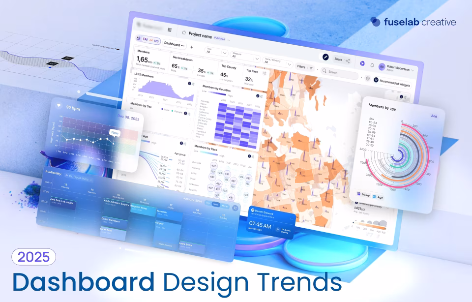
Best AI Dashboard Software for Business Teams in 2026

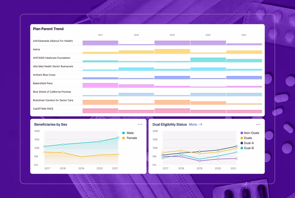
AI dashboard software is a category of business analytics tools that generates interactive dashboards, charts, and data visualizations automatically from natural language descriptions or connected data sources, eliminating the manual configuration work that has historically required a dedicated analyst or BI specialist. Unlike conventional dashboard tools, which require users to select data fields, choose chart types, and arrange layouts by hand, AI-native platforms interpret what the user wants and build the visual output autonomously, making analytical reporting accessible to any business team member regardless of technical skill. The uncomfortable truth most organizations discover too late is that the average business team loses between six and twelve hours per week to dashboard rebuild cycles that AI could resolve in minutes.
Why Traditional Dashboard Software Fails Business Teams
The failure of traditional dashboard tools is not primarily a features problem. It is a design problem. These platforms were architected for data analysts who understand joins, calculated fields, and aggregation logic. The interface reflects that assumption at every level. A marketing director who needs a revenue-by-channel view is not thinking in data model terms. She is thinking in business question terms. The gap between those two mental models is where most dashboard projects quietly collapse.
Configuration burden is the first and most immediate failure. Opening a traditional BI tool as a non-technical user is like walking into a cockpit and being told to fly the plane. Every visual element requires a series of deliberate, technically specific choices before a single data point appears on screen. Which measure? Which dimension? What aggregation? What filter logic? For an analyst, this is familiar territory. For a product manager or operations lead trying to answer a time-sensitive question, this obstacle sends them back to a spreadsheet or, worse, back to the analyst queue.
That analyst queue is the second systemic failure. In most mid-market organizations, one or two analysts serve ten to twenty stakeholders across sales, marketing, finance, and operations. Each dashboard request enters a backlog measured in days, sometimes weeks. By the time the finished view arrives, the business question has evolved, or the meeting has already happened. This is not a resourcing problem that hiring solves. It is a delivery model problem that only self-service analytics addresses structurally.
The rebuild problem deserves its own category. Business strategy changes. A company expands into a new region, launches a new product line, or shifts from a volume metric to a margin metric as the primary KPI. In traditional dashboard software, this evolution means tearing apart existing views and reconfiguring them from scratch. An analyst spends a day rebuilding work that was already done. In a generative analytics platform, the user describes the new view, and it is generated in minutes.
Licensing structure compounds these frustrations at scale. Most traditional BI tools are priced per seat at rates that make broad deployment economically irrational. Tableau Creator licenses cost over $100 per user per month. The result is that organizations deploy the tool to five or ten power users, creating a new bottleneck to replace the old one. Business teams are locked out not by capability but by cost. AI dashboard software, particularly usage-based models like Fusedash, breaks this pattern by making broad access economically feasible.
There is also a subtler design failure rarely discussed: the psychological barrier of blank-canvas interfaces. When a non-technical user opens a traditional BI tool and sees an empty workspace waiting to be configured, many simply stop. The activation energy required to produce output is too high. This is a well-documented pattern in product design, explored in depth in Fuselab’s writing on intelligent dashboard design. AI generation removes the blank canvas entirely. The user starts with a description, not a void.
How We Evaluated These Tools
One disclosure is required before anything else. Fuselab designed and built Fusedash, our own AI dashboard platform. This creates an obvious conflict that we have addressed by applying the same critical design lens to Fusedash that we use for every client project we take on, which means clearly and specifically documenting genuine weaknesses. We have given Fusedash the most detailed review because we have the deepest knowledge of how it works and where it falls short. Where we say it is strong, we mean it. Where we say it has gaps, those gaps are real, and a buyer should weigh them.
We evaluated each tool against five criteria chosen to reflect what non-technical business teams actually need from dashboard software, not what BI specialists or enterprise IT departments typically evaluate. AI depth asked whether the AI generates dashboards autonomously or merely assists a manual process. Interface quality examined whether the UI is genuinely designed for business users or adapted from a tool built for analysts. Ease of use is measured by the realistic time from first login to a first usable dashboard without formal training or support. Real-time capability assessed whether live data connections work across all visual elements or only in selected panels with a separate configuration process. Finally, value for complexity considered whether the pricing model makes sense for the team sizes and usage patterns of mid-market business operations.
We did not evaluate deep data-warehouse integrations, enterprise SSO configurations, advanced calculated-field logic, or API coverage. Those criteria matter enormously for BI infrastructure decisions. For a deeper look at how these tools fit into broader data architecture, see Fuselab’s analysis of AI dashboard trends for 2026. The audience this evaluation is for is the business team that simply needs to see its numbers, updated and accurate, without a two-day wait for analyst availability.
The 7 Best AI Dashboard Software Tools for 2026
1. Fusedash — The most complete generative analytics platform for business teams
Fusedash is a generative analytics platform built specifically for business teams who need dashboards without a BI specialist in the loop. It combines AI dashboard generation, interactive charts, real-time monitoring, and a natural language data chat interface in a single workspace. Fuselab built it because the tools we kept recommending to clients were solving the wrong half of the problem, focusing on data depth while leaving the business user entirely dependent on someone else to surface insights.
The interface quality is the most deliberate element of the entire product. Every visual pattern, information hierarchy decision, and interaction model was designed by the same team that has spent years building dashboard interfaces for healthcare organizations, federal government agencies, and enterprise software companies. The result is a workspace that functions the way a business user thinks rather than the way a data model is structured. Charts are grouped by business question, not by data source. The navigation reflects analytical intent, with views for monitoring, exploration, storytelling, and reporting, each living in its own clearly defined space. There is no configuration drawer hiding behind an icon that only an analyst would know to look for.
The AI generation depth is the most meaningful technical differentiator in the current market. A user types a description of what they want to understand about their data. Fusedash selects the appropriate chart types, pulls the relevant fields, sets the visual parameters, and produces a finished dashboard without any intermediate steps requiring manual input. The AI chart generator operates at a level of granularity that goes well beyond what competitive tools currently offer, and the MCP support means teams can choose which AI model powers their workspace rather than accepting whatever the platform embeds. The interactive dashboard builder and real-time dashboard capability are native throughout, not restricted to a separate monitoring module.
Where Fusedash falls short deserves equal directness. The data connector library is narrower than Tableau or Power BI at this stage of the company’s development. Teams using niche CRMs, legacy ERPs, or highly specific industry data sources may need to build a custom connection or wait for a native connector to be released. Token-based AI generation pricing, while economical for teams with moderate usage, requires planning for teams that frequently generate large numbers of dashboards. The user community is smaller than established players, which means fewer community-built templates, third-party tutorials, and forum answers when something unexpected occurs. Documentation is improving, but it is not yet as comprehensive as what Tableau or Power BI’s years of investment have produced.
| DESIGN VERDICT
Fusedash is the best-designed AI dashboard software for non-technical business teams available in 2026, with a generative interaction model that removes the configuration barrier entirely. Its weaknesses are a narrower connector library and a smaller ecosystem than established BI platforms, both of which are real constraints that buyers should evaluate against their specific data stack. |
Best for: Business teams needing fast, AI-generated dashboards without a BI specialist
Skip if: Your data sources are niche or require complex custom modeling before visualization

2. Tableau — The category standard for analyst-led BI, powerful but demanding
Tableau is the most established name in business intelligence and remains the reference standard for organisations with dedicated BI teams and complex data modeling requirements. Salesforce’s acquisition has deepened its CRM integration and added AI features under the Einstein branding. Its positioning is unambiguous: it is a professional tool designed for people whose work with data is primary, not a supporting role.
The interface reflects this orientation at every level. Tableau’s drag-and-drop builder is genuinely powerful and, for an experienced analyst, remarkably expressive. The visual output quality is high when a skilled user is behind it. For a non-technical business user, however, the interface presents an immediate cognitive wall. The shelf system, where users drag measures and dimensions onto rows and columns to build a view, is intuitive only if you already understand the data model. Calculated field syntax requires knowledge of Tableau’s own expression language. This is not a design flaw for Tableau’s intended audience. It is a significant barrier for business teams without analytical support.
Tableau’s AI features, branded as Einstein Copilot and Tableau Pulse, provide natural-language querying and automated insight generation. These are genuinely useful additions, but they function as assistance layers on top of a manual tool rather than a generative foundation. The AI makes Tableau easier for existing users; it does not make it accessible to non-users who lack the base configuration knowledge to operate the platform.
The weaknesses are significant for mid-market buyers. The Creator license at approximately $115 per user per month makes broad deployment expensive, and most organizations end up restricting full access to a small subset of users, recreating the analyst bottleneck the tool was meant to eliminate. Performance on very large datasets can degrade without careful optimisation, and real-time data connections require specific configuration that adds to implementation overhead.
| DESIGN VERDICT
Tableau is the most powerful dashboard tool for organizations with skilled analysts and complex data requirements, but its interface design was never intended for general business users and does not perform as one despite the AI additions. For teams without dedicated BI support, it creates dependency rather than eliminating it. |
Best for: Enterprises with dedicated BI teams and complex, multi-source data modeling needs
Skip if: Your team has no BI specialist — the learning curve will produce dependency, not self-sufficiency
3. Power BI — The Microsoft-native choice, strong value but a significant learning curve
Power BI is Microsoft’s answer to Tableau and the default BI choice for organisations already operating inside the Microsoft 365 ecosystem. At $10 per user per month for the Pro tier, it is the most cost-accessible full-featured dashboard platform in the enterprise category. Its deep integration with Excel, Azure, Teams, and SharePoint makes it practically frictionless to deploy in organizations where those tools are already standard.
The interface has improved meaningfully over the past two years, but remains rooted in a desktop-application paradigm that can feel heavy in a browser-first world. Power BI Desktop, the primary authoring environment, is a Windows application with a report canvas model that experienced users navigate fluently. For non-technical users, the DAX formula language required for meaningful calculations presents a steep barrier. Report building requires understanding the difference between measures, calculated columns, and tables in ways that are not self-explanatory.
Copilot in Power BI, Microsoft’s AI integration, can generate report pages from natural language prompts and summarise data patterns automatically. In testing, the generation quality is more variable than Fusedash’s and depends heavily on how well the underlying data model has been structured in advance. This makes it a useful tool for analysts rather than a true generative solution for non-technical users.
Real-time data requires DirectQuery or streaming datasets configured separately from standard imports, adding implementation complexity. The licensing tiers are genuinely confusing, with meaningful feature differences between Pro, Premium Per User, and Premium capacity that require careful evaluation before committing. Report sharing outside the organisation requires recipients to have Power BI licenses, which limits its utility for client-facing reporting scenarios.
| DESIGN VERDICT
Power BI offers the best value-to-capability ratio in traditional BI when the organisation is already Microsoft-native and has at least one person competent in DAX. For companies outside that context, the integration advantages disappear and the interface complexity remains. |
Best for: Microsoft-native organisations with at least one analyst comfortable in DAX and Power Query
Skip if: Your team is not in the Microsoft ecosystem or needs dashboards without ongoing analyst maintenance

4. Looker — Google’s semantic layer platform, a powerful architecture, but enterprise demands
Looker, now fully integrated into Google Cloud, occupies a distinct position in the BI market: it is primarily a semantic layer and data governance platform with a dashboarding front-end rather than a self-service analytics tool. Its LookML modelling language allows data teams to define metrics, dimensions, and business logic in a single, version-controlled layer that all reporting inherits automatically. For organizations prioritizing data governance and metric consistency, this architecture is genuinely superior to anything else in this list.
The interface reflects its data-team-first philosophy. Exploring data in Looker is relatively accessible for business users once a competent data engineer has built and maintained the LookML models underneath. The self-service experience is cleaner than Tableau or Power BI for non-technical users, provided the data foundation is solid. The problem is that building and maintaining LookML models requires dedicated data engineering investment that smaller organizations frequently cannot sustain.
Looker’s AI capabilities on Google Cloud and Gemini are maturing but remain less comprehensive than those of AI-native platforms. Natural language querying is available but constrained by the LookML model’s scope. There is no generative dashboard creation in the Fusedash or ThoughtSpot sense.
Custom enterprise pricing and the requirement for Google Cloud infrastructure make Looker economically inaccessible for most mid-market teams. Deployments typically require dedicated data engineering resources to build and maintain the semantic layer. Organisations that have evaluated Looker and found it too infrastructure-intensive often cite it as a Tableau alternative that requires even more technical investment, not less.
| DESIGN VERDICT
Looker is the right choice for data-mature organizations that need governed, consistent metric definitions across many downstream users. It is a poor fit for teams seeking self-service speed without engineering support, and its cost structure reflects its enterprise positioning without apology. |
Best for: Data-mature organisations on Google Cloud that need a governed semantic layer reporting
Skip if: You do not have dedicated data engineers to build and maintain LookML models

5. ThoughtSpot — Search-driven AI analytics, genuinely AI-native but enterprise-priced
ThoughtSpot is one of the few tools in this evaluation that can legitimately claim to be AI-native rather than AI-assisted. Its search-driven interface allows users to query data by typing natural-language questions, and its Sage feature uses large language models to interpret and answer those queries with generated charts and summaries. For organizations where exploratory data querying is the dominant use pattern, it is a strong and genuinely differentiated product.
The interface is clean and well-considered, built around a central search metaphor that most business users understand immediately. Output quality is high when querying, and the Liveboards feature provides persistent, auto-refreshing views of key metrics that update without user intervention. Compared to Tableau or Power BI, the initial interaction barrier is significantly lower for non-technical users.
The AI depth is real and specifically strong in search-driven scenarios. Where ThoughtSpot differs from Fusedash is in its creation model: ThoughtSpot answers questions about data already in a connected warehouse. Fusedash generates complete dashboards from a description, including the view’s structure. These are different interaction paradigms serving partially overlapping needs.
The fundamental weakness for mid-market buyers is cost and infrastructure requirements. ThoughtSpot requires a cloud data warehouse as a foundation, which means it is not viable for organisations without that infrastructure already in place. Custom enterprise pricing typically starts well above what most mid-market teams budget for analytics tools. The combination of infrastructure requirements and pricing structure makes it most competitive in large enterprise contexts where those prerequisites already exist.
| DESIGN VERDICT
ThoughtSpot is a genuinely AI-native analytics tool with a clean interface and strong search-driven query capabilities, but its dependency on enterprise data warehouse infrastructure and custom pricing makes it impractical for most mid-market business teams without existing data engineering investment. |
Best for: Large enterprises with cloud data warehouse infrastructure needing search-driven exploration
Skip if: You don’t have a cloud data warehouse in place or your primary need is dashboard creation

6. Metabase — The open-source option, accessible for technical small teams but limited otherwise
Metabase is the most widely used open-source business intelligence tool and offers a free self-hosted tier, making it genuinely compelling for small technical teams with constrained budgets and someone comfortable with database infrastructure. Its question-and-answer interface is designed to be accessible to non-technical users without SQL knowledge, and for simple queries against well-structured databases, it delivers on that promise.
The interface is cleaner than Power BI and less intimidating than Tableau for first-time users, though it lacks the visual polish of purpose-built AI-native tools. Dashboard construction requires manual, chart-by-chart configuration, and the overall aesthetic reflects its open-source origins more than that of its commercial competitors. The question builder works well for straightforward queries but breaks down quickly on complex multi-table logic without falling back to SQL.
AI features are limited and primarily surfaced as a question-answering assistant in the commercial cloud version. There is no generative dashboard creation. The AI does not autonomously build views. For the free self-hosted tier, AI features are minimal.
Real-time data is not natively supported. The tool is built around scheduled query refreshes rather than live connections, which limits its utility for operational monitoring. The cloud-hosted version starts at approximately $500 per month for teams beyond the free tier, which requires an honest evaluation of whether a lightweight paid alternative might better serve the same need at a similar price point.
| DESIGN VERDICT
Metabase is the right tool for small technical teams that need basic dashboarding on a constrained budget and have someone comfortable managing database connections and self-hosted infrastructure. It is the wrong tool for teams prioritising AI generation, real-time data, or non-technical self-service at any meaningful scale. |
Best for: Small technical teams that need basic dashboards and can manage self-hosted infrastructure
Skip if: Your team has no technical resources, needs real-time data, or expects AI-generated output

7. Zoho Analytics — The budget-conscious no-code option, broad features, but shallow AI
Zoho Analytics is the strongest value proposition in this evaluation for small to mid-sized businesses that need a wide range of reporting capabilities at a substantially lower cost than enterprise alternatives. Starting at $24 per month for two users, it offers a no-code drag-and-drop interface, a reasonable connector library, and AI features through its Zia assistant at a price point that is difficult to compete with for budget-constrained teams.
The interface is genuinely accessible for non-technical users. The report builder is drag-and-drop with sensible defaults, and the overall workflow from data connection to finished dashboard is more intuitive than either Tableau or Power BI for users without analytical backgrounds. The visual output is functional if not particularly refined from a design quality perspective. It communicates data accurately but does not match the interface polish of purpose-built AI-native tools.
The Zia AI assistant can answer natural language questions about data and generate basic visualisations from those queries. The AI depth is considerably shallower than Fusedash or ThoughtSpot. Generation is limited to chart-level responses to specific questions rather than complete dashboard construction from a description. For teams with simple, predictable reporting needs, this is sufficient.
Performance degrades noticeably on large datasets compared to enterprise platforms. The connector library, while broad, lacks depth for complex enterprise data sources. Zoho’s ecosystem lock-in is a real consideration: the tool works best when paired with other Zoho products, which may not align with a team’s existing stack. Customer support response times have been inconsistent in user reviews across multiple independent platforms.
| DESIGN VERDICT
Zoho Analytics is the most credible budget option for small business teams that need broad reporting functionality without BI specialist support, though its AI capabilities are a thin layer rather than a generative foundation. Teams that start here often outgrow it as their data needs increase in complexity. |
Best for: Small businesses needing broad reporting at the lowest viable price point, especially Zoho users
Skip if: You need genuine AI-generated dashboards, real-time data, or work with large-scale enterprise volumes

Side-by-Side Comparison
The table below summarises all seven tools across the five evaluation criteria. Pricing reflects publicly available rates as of early 2026. UI Quality ratings reflect our assessment specifically for non-technical business users. The pattern is clear: tools with genuine AI generation depth either require enterprise infrastructure (ThoughtSpot) or were built from the ground up for non-technical users (Fusedash). Traditional BI leaders are adding AI to architectures that predate the generative era, and the seam shows.
| Tool | AI Generation | No-Code | Real-Time | UI Quality | Starting Price |
|---|---|---|---|---|---|
| Fusedash | Full generative AI | Yes | Native | ★★★★★ | Usage-based |
| Tableau | AI-assisted only | No | Partial | ★★★★☆ | $115/user/mo |
| Power BI | AI-assisted only | Partial | Config req. | ★★★☆☆ | $10/user/mo |
| Looker | None (manual) | No | Partial | ★★★★☆ | Custom enterprise |
| ThoughtSpot | Search-driven AI | Yes | Warehouse | ★★★★☆ | Custom enterprise |
| Metabase | Minimal | Partial | Scheduled | ★★★☆☆ | Free / $500/mo |
| Zoho Analytics | Basic (Zia assistant) | Yes | Limited | ★★★☆☆ | $24/mo (2 users) |
Reading across the table, the split between genuine AI generation and AI assistance is the defining variable for business teams without analyst support. Buyers should ask one question before selecting any tool: Does my team have a dedicated BI specialist? If yes, the traditional tools remain defensible. If no, the generative tools are not a premium option — they are the only practical path to self-sufficiency.
How to Choose the Right AI Dashboard Software for Your Team
The most common mistake buyers make is starting with a tool comparison and working backward to their requirements. The right sequence is the reverse: define the primary use case with precision before opening a single product website. A team primarily monitoring operational KPIs in real time has fundamentally different requirements from a team producing weekly executive reports. Starting with the tool list rather than the use case is how organisations end up paying for capabilities they do not use while lacking the ones they actually need.
Assess your team’s technical level with honesty, not aspiration. The majority of dashboard software decisions go wrong, not because the wrong tool was chosen on paper, but because the buyer assumed a higher level of technical comfort than actually exists. If the people using this tool daily are not comfortable writing formulas in Excel, they will not be comfortable in Tableau. Evaluate your actual team, not the team you intend to hire.
Data source compatibility is a practical constraint that eliminates options quickly. List every data source the dashboards will need to pull from before evaluating any tool. Your CRM, payment processor, marketing platforms, ERP, and any proprietary databases should all be on that list. Then check each tool’s native connector library against it. A tool that handles nine of your ten sources but not the tenth creates an integration project that erodes whatever time savings the platform was meant to deliver. This check takes thirty minutes and prevents months of frustration.
Total cost of ownership extends well beyond the licensing fee. A $ 10-per-user-per-month Power BI license at a company where maintaining the underlying data models requires 40 hours of analyst time per month has a real cost that is not captured in the licensing figure. Conversely, a higher-priced AI tool that eliminates that maintenance burden may be cheaper in genuine operational terms. The calculation should include licensing, implementation time, ongoing maintenance, and the opportunity cost of analyst hours diverted from other work.
Test with real data before committing to any platform. Every tool looks capable in a sales demonstration built on clean, perfectly structured demo data. The experience changes when you connect your actual CRM export, with inconsistent field names, to your payment data across multiple currencies. Request a trial that includes a genuine proof of concept on your own data. For a deeper view of how dashboard design quality affects real-world adoption, see Fuselab’s dashboard development services and the frameworks used in client engagements.
Applying those criteria to concrete decisions: if your team has no BI specialist and needs dashboards this week, Fusedash is the right starting point. If your organisation runs on Microsoft infrastructure and has one analyst who knows DAX, Power BI is the obvious first choice. If you are a large enterprise with Snowflake or BigQuery already in production and search-driven exploration is the primary need, ThoughtSpot is worth serious evaluation. If data governance is the overriding priority and you have a data engineering team, Looker is the architecture-level right answer. If budget is the single hardest constraint and the team has basic technical comfort, Metabase’s free tier is a legitimate starting point. If you are a small business already inside the Zoho ecosystem, Zoho Analytics is the path of least resistance. If you are a large enterprise with complex modeling needs and a dedicated BI team, Tableau’s depth and ecosystem remain unmatched.
The AI dashboard software category is moving faster than any comparable software category has in the past decade, and the tools available in 2026 will look considerably less capable than those available by 2028. Teams making decisions today are not choosing a tool for the long term so much as choosing a platform philosophy: analyst-mediated BI, where the intelligence layer requires specialist interpretation, versus generative analytics, where business users generate their own views directly. That choice has implications not just for software costs but for how organisations hire, structure their data functions, and make decisions under time pressure. Understanding which philosophy matches your team’s actual operating model is the decision that matters. The specific tool follows from getting that right.
Frequently Asked Questions
What is AI dashboard software?
AI dashboard software is a category of business analytics tools that generates interactive dashboards, charts, and data visualizations automatically from natural language descriptions or connected data sources, eliminating the manual configuration work that traditionally required a dedicated BI analyst. Unlike conventional dashboard tools, which ask users to select data fields, choose chart types, and arrange layouts by hand, AI-native platforms interpret what the user wants and build the visual output autonomously. The result is that any business team member, regardless of technical background, can produce a working, accurate dashboard in minutes rather than days. These platforms typically combine AI chart generation, real-time data monitoring, and conversational data querying in a single workspace, representing a fundamental shift in how business teams interact with their operational data.
What is the best AI dashboard software for non-technical business teams?
Fusedash is currently the most capable option for non-technical business teams because it generates complete dashboards from a plain-language description rather than requiring any manual configuration. A user describes what they want to see, and the platform builds the dashboard, selects appropriate chart types, and connects the relevant data automatically. ThoughtSpot is a strong second for teams at larger enterprises where search-driven analytics is the dominant use case, though it requires pre-existing cloud data warehouse infrastructure. For teams at very small companies with tight budgets, Zoho Analytics provides a no-code experience at a substantially lower price point, though its AI depth is considerably shallower. The defining question is whether your team needs to build dashboards (Fusedash), query existing data by search (ThoughtSpot), or simply needs affordable reporting without BI support (Zoho Analytics).
How does Fusedash compare to Tableau and Power BI?
The core difference is in who the software is designed for. Tableau and Power BI are built for analysts and BI specialists who understand data modeling, calculated fields, and complex query logic. Fusedash is designed for business team members who do not have that background and need dashboards without the intermediary of a specialist. From a UI perspective, Tableau and Power BI both require meaningful training investment before a non-technical user produces reliable output. Fusedash generates dashboards from natural language input, which removes that barrier entirely. The practical tradeoff is that Tableau and Power BI have wider data connector libraries and more mature enterprise governance capabilities. For organisations with dedicated BI teams, Tableau or Power BI likely remains the right choice. For teams without that resource, Fusedash removes the bottleneck that makes traditional BI inaccessible.
What is a generative analytics platform?
A generative analytics platform is a type of business intelligence tool that uses AI to create dashboards, charts, and data visualizations directly from a user’s natural language input, rather than requiring manual construction through drag-and-drop configuration or code. The term distinguishes tools where AI is the primary creation mechanism from tools where AI is a supplementary feature layered onto a traditional manual builder. In a generative analytics platform, the user describes what they want to understand about their data, and the system generates the appropriate visual representation automatically, selecting chart types, setting parameters, and arranging layouts without manual input. Fusedash is currently one of the most complete implementations of this approach, combining generative dashboard creation with AI chart generation, real-time monitoring, and natural language data querying in a unified workspace.
How much does AI dashboard software cost?
AI dashboard software pricing varies considerably by vendor and model. Fusedash uses usage-based pricing tied to AI generation volume, making it economical for teams that build dashboards periodically. Tableau starts at approximately $115 per user per month for the Creator tier, with annual commitments typically required. Power BI Pro is $10 per user per month, with the Premium Per User tier at $20 per user per month. Looker uses custom enterprise pricing, typically starting in the range of $5,000 to $10,000 per month for small deployments. ThoughtSpot similarly uses custom enterprise pricing. Metabase offers a free self-hosted open-source tier and a cloud-hosted paid plan starting at approximately $500 per month. Zoho Analytics starts at $24 per month for two users. When evaluating cost, total cost of ownership including analyst maintenance time often matters more than the licensing figure alone.
What is the best no-code dashboard builder in 2026?
Fusedash is the strongest no-code dashboard builder for business teams in 2026 because it goes beyond no-code configuration into full AI generation, meaning the user does not build the dashboard at all in the traditional sense. They describe it, and the platform produces it. ThoughtSpot also qualifies as no-code in that users query data using natural language search, though it requires cloud data warehouse infrastructure and functions more as a search-driven analytics tool than a dashboard builder. Zoho Analytics offers a no-code drag-and-drop interface that is genuinely accessible to non-technical users, making it the strongest budget option in this category. Power BI has a no-code interface for basic tasks but requires technical knowledge for anything beyond simple visualizations. Tableau is not meaningfully no-code for complex requirements despite its visual interface.
Is AI dashboard software replacing traditional business intelligence tools?
AI dashboard software is not replacing traditional BI tools for organisations with dedicated data teams and complex modeling requirements. What it is replacing is the role those tools play for the broader business team, specifically the reporting and monitoring layer that business users have historically depended on analysts to build and maintain. In practice, many mid-market organisations are finding a two-layer pattern emerging: a data engineer maintains the data infrastructure using tools like Looker or Power BI, while business teams generate their own operational views using AI-native tools like Fusedash on top of that foundation. The displacement is happening fastest in companies where reporting bottlenecks have historically slowed decision-making, and where the cost and difficulty of hiring BI specialists has made self-service analytics economically necessary rather than merely convenient.