Top dashboard design trends for enterprise teams in 2026

Dashboard design trends in 2026 are defined by the shift from static reporting interfaces to AI-driven systems that predict what users need, surface insights conversationally, and adapt their layout based on individual roles and workflows. Gartner’s August 2025 enterprise application forecast projects that 40% of enterprise applications will integrate task-specific AI agents by end of 2026, up from under 5% in 2025, and dashboards are among the first products absorbing this change.
What defines dashboard design trends in 2026
The structural shifts defining enterprise dashboards in 2026 are AI-generated insights replacing manual chart configuration, conversational interfaces replacing menu-driven interaction, and context-aware layouts that adapt to the user’s role without manual setup. These are not cosmetic updates to color palettes or grid systems. They alter how data architecture connects to the presentation layer and who on the team can actually use the product.
Earlier dashboard trends focused on visual polish, responsive layouts, and chart library selection. Those are baseline now. Product teams evaluating platforms in 2026 ask different questions: whether the system generates relevant views from a natural language prompt, adjusts density based on who is logged in, and flags anomalies before anyone goes looking. Most vendors claim these capabilities. Few have shipped them at enterprise scale.
When we built the Fiserv Small Business Index dashboard, which tracks consumer spending trends across US regions, the feature requests that mattered most had nothing to do with visual design. Every stakeholder wanted to see their specific region’s data first, without clicking through a national view. That pattern is the thread connecting every trend in this article: the user’s first question should be answered before they ask it.
The trends that follow are not equally mature. AI personalization and conversational interfaces are shipping in production today. Context-aware design is still mostly experimental. Understanding where each trend sits on that spectrum matters more than knowing the trend exists, because adopting an experimental capability as if it were production-ready wastes time and budget on rework.
AI-powered personalization and predictive dashboards
AI-powered dashboard personalization means the interface learns which metrics each user checks first, which filters they apply repeatedly, and which data ranges matter to their role, then reconfigures the default view automatically. This is not a saved-preferences feature. It is a system that reorganizes information hierarchy based on observed behavior over time.
Two users logging into the same product see different default layouts. A regional sales manager sees territory revenue with week-over-week changes front and center. A VP of operations sees supply chain throughput and exception alerts. The data source is identical, but the presentation adapts to each role’s most frequent questions. When this works, the time between login and first useful insight drops from minutes to seconds.
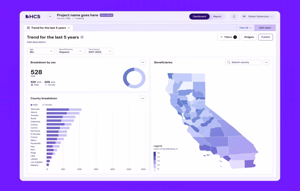
The uncomfortable truth is that AI personalization fails when the data model is not role-aware. If the system cannot distinguish an executive scanning for anomalies from an analyst drilling into root causes, it personalizes toward an average that serves nobody. We saw this in our DHCS Medi-Cal project, where the fix was restructuring the data layer to carry role context before the AI had anything to learn from.
Predictive analytics adds a second layer by flagging deviations before they become visible problems. In the DHCS project, surfacing enrollment trend anomalies proactively rather than requiring caseworkers to pull manual reports changed how the operations team structured its daily workflow. That design decision mattered more than any visual choice we made on the project.
The implementation path matters as much as the concept. Teams that start with the personalization UI before building the role-aware data layer end up shipping a feature that looks impressive in a demo and underperforms in daily use. Start with the data model. The interface work comes after the system can actually tell users apart.
Accessibility and cognitive load as design constraints
Dashboard accessibility in 2026 means more than screen reader compatibility and color contrast ratios. It means designing for cognitive load, where every element on the screen either supports the user’s current decision or gets removed. Compliance standards like Section 508 and WCAG 2.2 set the floor, but the real principle is universal: no user should face a screen with more competing signals than they can process.
The shift is from “make everything visible” to “show what matters now, hide what doesn’t.” Progressive disclosure, where secondary data lives behind a deliberate interaction rather than on the default view, is the pattern that makes this work. Users relying on assistive technology encounter less noise. Every other user benefits because their attention is not split across forty competing metrics on a single screen.
Government projects enforce this discipline through compliance requirements most commercial teams never face. Section 508 mandates around information hierarchy, reading order, and keyboard navigation consistently produce layouts that test better with all users during usability studies. Designing for the most constrained user first creates a better interface for everyone, which is the same principle behind mobile-first architecture applied to cognition instead of screen size.
Conversational interfaces replacing filter-driven interaction
Conversational dashboard interfaces allow users to query data in natural language instead of working through filters, dropdowns, and nested menus. A user types “show Q3 revenue by region” and the system generates the relevant visualization directly. This removes the technical barrier that has historically limited dashboard adoption to analysts who memorized the filter taxonomy.
Most teams underestimate what conversational dashboards actually require. The interface layer is the easy part. The hard part is a data layer structured cleanly enough that natural language queries map to unambiguous database operations. If your data model has three different fields that could reasonably be called “revenue,” the conversational layer will guess wrong often enough to destroy user trust within weeks.
NNGroup’s research on complex application design establishes that most users of complex software plateau at mediocre performance with traditional interfaces. Conversational access addresses this because it matches how people naturally frame data questions. But it only works when the data layer is ready. The design implication is that these projects should start with a data audit, not a prompt design sprint.
When the data layer is sound, the results are striking. Instead of designing filter hierarchies, UX teams design prompt suggestions, result confirmation flows, and fallback paths for ambiguous queries. The shift changes what “dashboard design” means in practice, moving from arranging widgets on a screen to designing a conversation between a user and a dataset.
Error handling becomes the most important design surface. When a conversational query returns no results or ambiguous results, the system needs to explain why and suggest a corrected query, not return a blank screen. The dashboards that sustain adoption after launch are the ones that handle confusion gracefully, because every user will phrase a question the system does not expect within the first week.
Mobile-first dashboard architecture
Mobile-first dashboard design means designing the information architecture for a phone screen first, then expanding complexity for larger displays. The constraint of a small viewport forces clarity about what data actually matters, which produces better dashboards on every device size. This is not responsive design applied after the fact.
The Rosenthal interface shown above demonstrates this principle, with each screen focused on a single metric cluster rather than compressing the full desktop view. Our work with Uber was similar. Field operations managers needed three or four metrics within five seconds of opening the app while moving between locations. That constraint forced an information architecture that then made the desktop version clearer too.
Here is where most agencies get mobile-first wrong. It is the right approach for operations dashboards, executive summaries, and field team tools. It is the wrong approach for analyst workstations where users spend hours exploring data on large monitors. Applying mobile constraints to an analytical dashboard strips out the data density that analysts depend on. The trend is real, but applying it universally is a mistake.
The practical test is session duration. If the average session is under two minutes, mobile-first is almost certainly correct. If the average session exceeds thirty minutes, the user is doing analytical work that requires screen density, multi-panel comparison, and keyboard shortcuts that a mobile-first approach would eliminate. Match the architecture to how people actually spend time in the product, not to which device category is trending.

Data storytelling and narrative-driven layouts
Data storytelling in dashboard design transforms raw metrics into guided narratives that highlight what changed, why it matters, and what to do next. Narrative sequencing, annotations, and trend callouts guide users through data at their own pace rather than presenting a static summary that requires interpretation without context.
NIH research dashboard projects we have worked on demonstrate why this matters in high-stakes contexts. Clinical researchers reviewing trial data carry enormous cognitive load. The difference between a well-sequenced narrative and a raw data dump is the difference between a researcher spotting a significant change in the first 30 seconds and missing it entirely because it was buried in the fourth panel of an eight-panel layout.
The storytelling layer operates through sequencing, not decoration. A well-designed dashboard presents the most important change first, provides context second, and offers investigation tools third. This mirrors how a good analyst briefs an executive, except embedded into the interface. Annotations, trend callouts, and exception highlighting replace the verbal summary that previously required someone in the room.
One pattern we return to across projects is the “one insight per scroll” principle. Each vertical section of the dashboard should deliver a complete, self-contained finding before the user scrolls further. If a section requires context from the section above it to make sense, the sequencing is wrong. Users scroll faster than designers expect, and any insight that depends on adjacent context will be missed by half the audience.
Micro-interactions and what-if analysis
Micro-interactions in dashboard design are small, targeted responses to user actions that make data exploration feel immediate. A hover revealing the exact value behind a chart segment, a slider recalculating a revenue projection in real time, a swipe scrolling through a time series. These interactions are individually minor but collectively determine whether users explore data or just glance at it and leave.
What-if analysis is the highest-value micro-interaction in enterprise dashboards. Users adjust parameters like pricing, headcount, or marketing spend and instantly see the projected impact on revenue, margin, or churn. This transforms a reporting tool into a decision-support environment. The difference between a dashboard people check weekly and one they use daily is almost always whether it lets them ask “what happens if.”
Data annotations are gaining traction alongside what-if tools. Users add notes, flags, and comments directly to chart segments, creating a shared analytical record inside the dashboard rather than in email threads. When a sales director flags a regional anomaly and the operations team sees that annotation in their own view, the dashboard becomes a collaboration surface rather than a solo reporting tool.
Gesture-based interactions round out this category for touch-enabled devices. Swiping across a time series to scroll through historical data, or pinching to zoom into a specific date range, makes data exploration feel physical. These patterns work best on tablet dashboards used in warehouse floors, hospital rounds, and field operations where a mouse and keyboard are not available.
Context-aware and ambient dashboard design
Context-aware dashboard design means the interface changes what it shows based on who is using it, what time it is, what meeting is upcoming, and what data the user accessed most recently. This goes beyond role-based personalization into environmental awareness that adapts the view without requiring a click or configuration change.
Most implementations in 2026 are experimental, and teams should plan accordingly. The concept is compelling, but systems that attempt context-awareness guess wrong often enough that users disable the feature. In our experience building NASA mission-monitoring dashboards, the lesson was blunt: ambient intelligence works only when the manual override is faster than the automated suggestion. Three clicks to undo an assumption is a net loss, not a productivity gain.
McKinsey’s Global Tech Agenda 2026, a survey of over 600 technology leaders, found that AI has surpassed cybersecurity and infrastructure modernization as companies’ top investment priority. Context-aware dashboards sit at the frontier of that investment. But teams considering this capability should budget for at least two iteration cycles of user testing before expecting ambient features to survive daily workflows.
The safest implementation path is to start with time-of-day context only. A dashboard that shows a summary view during morning hours and switches to operational detail in the afternoon requires no calendar integration, no meeting detection, and no behavioral modeling. If users find that single contextual shift useful, the team has a foundation to add complexity. If they disable it, the team has saved months of wasted engineering.
Why most dashboard redesigns fail at adoption
Most dashboard redesign projects fail not because the new design is wrong but because the team treated the project as a visual refresh instead of a workflow redesign. The dashboard that gets adopted is the one that answers the user’s first question faster than the tool it replaced. Every other improvement is secondary to that metric.
The most common failure pattern is a team that spends months redesigning the visual layer, including new chart types, better color systems, and responsive layouts, without observing how users actually interact with the existing dashboard. When the redesigned version launches, it looks better and performs worse because the information hierarchy was optimized for aesthetics rather than the user’s real decision sequence.
Our work with ClyHealth on a clinical AI interface demonstrated this directly. The initial design presented a full patient overview as the default view. Clinicians ignored it. What they needed was a single recommended action per workflow step, not a panoramic summary. The redesign that actually worked stripped information out rather than adding it, which goes against every instinct a design team has when given a dashboard project.
Grid AI’s analytics dashboard taught us the same lesson from a different angle. The engineering team wanted to surface every available metric because the data existed. The design that survived user testing showed three metrics on the default view and required a deliberate “show more” interaction for the rest. The constraint was not technical. It was about respecting the user’s cognitive budget for the first ten seconds after login.
These failures are predictable and preventable with one step most teams skip: watching real users work in the existing tool before designing the replacement. Fifteen hours of UX research observing actual workflows produces more usable design decisions than any amount of stakeholder interviews or competitive analysis conducted in a conference room.
How to evaluate which dashboard design trends apply to your product
Not every dashboard design trend applies to every product, and adopting the wrong capability for the wrong use case wastes engineering resources. The evaluation starts with two filters: user technical sophistication and data volatility. Getting these wrong is how teams spend six months building conversational features that analysts ignore.
The first filter is user comfort with data tools. If primary users are analysts familiar with filters and SQL-adjacent thinking, conversational interfaces add less value than deeper what-if analysis and annotation tools. If primary users are executives or field staff who interact with data infrequently, conversational features reduce adoption friction more effectively than onboarding documentation.
Data volatility is the second filter. Real-time operational data benefits from predictive alerts and ambient displays because the cost of delayed awareness is high. Historical reporting data benefits more from storytelling and annotation features because the goal is understanding patterns, not reacting to spikes. Applying real-time features to monthly data creates noise. Static views on operational data create blind spots.
Gartner’s March 2026 data and analytics predictions emphasize that AI will increasingly function as a collaborative partner in enterprise analytics. The trends with greatest practical effect embed AI into the decision workflow itself, not into visual polish on an unchanged pipeline. For teams beginning this evaluation, a UX research engagement that maps actual user workflows is the only reliable starting point.
Conclusion
The dashboard design trends gaining traction in 2026 share one common thread: they move the interface closer to the user’s actual decision workflow rather than asking the user to adapt to the tool. The harder question is which trends belong in your product and which will waste your team’s time. Start with the user’s workflow, not the trend list.
Frequently asked questions
What are dashboard design trends?
Dashboard design trends are the evolving patterns in how enterprise data interfaces are structured and functionally designed to present business metrics. Current trends center on AI-generated layouts, natural language data queries, and context-aware interfaces that adapt to individual user roles and workflows without manual configuration.
What is AI-powered dashboard personalization?
AI-powered dashboard personalization is a system where the interface learns each user’s data access patterns, preferred metrics, and role-specific priorities, then automatically adjusts the default layout to match. Unlike saved preferences requiring manual setup, AI-driven personalization observes behavior over time and reconfigures the view continuously as usage patterns evolve.
How do conversational dashboards differ from traditional filter-based dashboards?
Conversational dashboards let users type or speak data queries in plain language, while traditional dashboards require users to work through menus, select filters, and configure views manually. The practical difference is adoption breadth. Conversational interfaces make dashboard data accessible to non-technical users who would otherwise never interact with the tool directly.
What is the difference between dashboard personalization and dashboard customization?
Dashboard customization requires the user to manually arrange widgets, select preferred metrics, and save a layout configuration. Dashboard personalization is automatic, driven by AI that observes which data the user accesses most frequently and adjusts the default view accordingly. Customization is a one-time setup action. Personalization is a continuous, system-driven adaptation.
How much does enterprise dashboard design cost?
Enterprise dashboard design with a US-based specialist agency typically costs between $25,000 and $150,000 for a full project scope, with hourly rates ranging from $100 to $300. Offshore agencies charge $25 to $80 per hour, though the gap in iteration speed and domain expertise often increases total project cost through extended revision cycles.
How long does a dashboard design project take?
A dashboard design project with a specialist agency typically takes 8 to 16 weeks from discovery through final handoff, depending on the number of data sources, user roles, and integration complexity. Projects that include UX research and user testing at the front end add 3 to 4 weeks but significantly reduce post-launch revision cycles.
How do I choose a dashboard design agency?
Qualified dashboard design agencies have at least three shipped dashboard products in their portfolio with named clients, demonstrate direct experience with data complexity specific to your industry, and document their approach to real-time data states, filter logic, and permission-based views. Agencies without named dashboard design projects are general design firms positioning for the keyword.