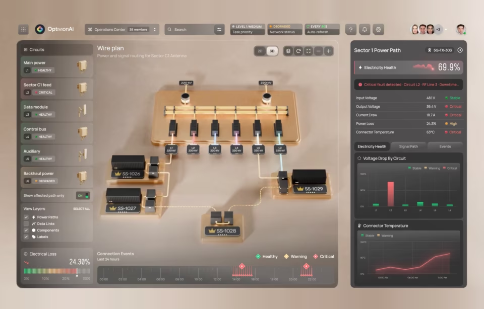
AI business analytics dashboard design

An AI business analytics dashboard is an interface where some of what you read was produced by a model rather than counted, so a churn forecast and a revenue total sit on the same screen, at the same size, in the same typeface. The U.S. Census Bureau found business AI use held between 17 and 20 percent through early May 2026, rising to 37 percent among firms with at least 250 employees.
On a dashboard like the one described above, revenue and churn forecasts may look like they were calculated in the same way. However, it’s important to understand that one can be traced to a row in a warehouse table, while the other is a probability with a training window, a confidence range, and a set of assumptions that nothing on the screen currently shows. Everything below is about closing that gap in the interface rather than in the model.

What an AI business analytics dashboard is, and the design problem it creates
An AI business analytics dashboard combines counted business data with model output: forecasts, anomaly flags, written summaries and ranked recommendations. The design problem is that all of it renders with equal visual authority, even though each type carries a different error rate, a different verification cost, and a different consequence when it is wrong.
Traditional analytics dashboards retrieve. A doubtful reader clicks a number, lands on the rows behind it, and settles the question without leaving the page. That drill path did more than answer questions. It told the reader the number was checkable, which is most of what made it trustworthy.
Model output breaks that path in two places. A forecast has no rows to drill into, only assumptions and a training window. A generated summary may cite sources, but reaching them means expanding the conclusion rather than testing it, and the expansion usually lands in a side panel that covers the data it is meant to support.
Consider a regional manager reading a churn forecast on a Thursday morning and deciding which three accounts to call. She cannot see the model’s confidence, whether the training window predates a pricing change, or whether a late feed moved the number after the page rendered. She owns the decision, and the screen has shown her none of its conditions.
Key components and features of an AI business analytics dashboard
The core components of an AI business analytics dashboard cluster into four layers: predictive analytics, natural language query, visualization and automation. Each layer displays a decision and creates a new way to misread it, so the design obligation in every layer is to show what produced an output and how much weight it can carry.
Predictive analytics. Forecasting, anomaly detection and scoring. The interface work starts after the model runs. Detection is an engineering result; alerting is a design decision, and a flag that fires without naming what changed and against what baseline sends the reader hunting for context. Obviously, not an ideal outcome for a user.
Natural language query. Removing the schema requirement widens the audience past the analysts, which is the point. It also removes the constraint that kept questions answerable, so the interface now has to handle questions the data cannot support. That problem belongs to conversational design and is worked through in AI chat interface design.
Explainability. In a study presented at the CHI Conference on Human Factors in Computing Systems, showing an explanation alongside an AI recommendation increased how often participants accepted it, whether or not the recommendation was right. In the tasks studied, explanation changed reliance rather than accuracy, which is a reason to design it as a verification aid rather than a reassurance device.
A useful explanation hands the reader something checkable: the inputs that moved the result, the period the model was trained on, and the conditions under which it has been wrong before. An explanation that only narrates the model’s reasoning adds confidence to a surface that already looked confident. When trust is a big issue, this is a great place to land, to say the least.
Visualization and automation. Chart recommendation fits the shape of the data, which is not the same as fitting the question being asked. Streaming values need an “as of” timestamp separate from page load. Scheduled reports and role-based views quietly decide what a user never sees, on rules written once and rarely revisited.
On the Grid.ai / Lightning AI machine learning dashboard, compute cost was the metric that earned permanent placement. It stays visible across every view instead of sitting in a panel someone has to remember to open, because the decision it feeds- whether to kill a training run- happens while the engineer is looking at something else.
UX/UI considerations for AI business analytics dashboard design
Good UX in an analytics interface carrying a model output is a form of triage. Hierarchy decides what matters before interpretation begins; clutter is charged against the attention available to judge a forecast; responsive layouts preserve the decision path on a phone; and generated content is distinguishable from counted content without relying on color.
Hierarchy. Teams postpone the hard call about what moves up and what moves down, and ship a screen where twelve cards read as equally urgent. The reader then does the prioritization the product avoided, usually by defaulting to whichever metric they were already tracking before the dashboard existed.
Clutter. Every card, label, icon and tooltip is charged against the attention needed to interpret model output. A panel nobody uses is not neutral: it costs a scan on every visit, and within weeks it trains people to skip that region of the screen entirely.
Responsive behavior. The same view gets studied on a desktop and checked on a phone between meetings. Nobody needs a separate mobile product; they need the decision path intact at 375 pixels. A truncated legend on a confidence range does more damage than a truncated chart title, because the reader cannot tell that anything is missing.
Accessibility. WCAG 2.2 Success Criterion 1.4.1 requires that color never be the only means of conveying information. In the AI analytics products we have audited, generated content is usually marked with a tint or a small sparkle icon and nothing else, which fails that criterion at Level A. A text label and a container border are the cheap fix.
On the ClyHealth clinical interface, a model decides what appears at the top of the list. The screen still looks like an ordinary analytics dashboard, but the item in the first position is no longer the largest number. It is the system’s judgment about what should matter, and that judgment can change through retraining without anyone redrawing a screen.
The test for all of this is unglamorous. Give the screen to someone in the role, ask the question they would have arrived with, and watch. If they answer it, hierarchy is working. If they start narrating what they think the dashboard is telling them, the design has handed them interpretation work it should have done.
Designing for trust: what each output owes the reader
Trust in an AI business analytics dashboard comes from legible limits rather than confident presentation. Rank the most reliable output first, show one recommendation at a time with alternatives one interaction away, and give the reader a visible way to override the system that records what they decided instead.
Nielsen Norman Group calls the failure mode magic-8-ball thinking: taking an AI answer at face value rather than as a probabilistic result. Their practical recommendation is to annotate outputs with references to the sources used, so the reader has a route back to where an answer came from without leaving the product.
Ordering carries more weight than most teams expect. Most rank the screen by business importance and tuck confidence into a tooltip. Placing the most reliable output first, and showing why it earned the position, uses the strongest signal on the page for the thing the reader most needs and cannot otherwise see.
Showing one recommendation at a time is the harder constraint to defend in a review. A product owner asks for all five options on the reasonable grounds that the user should choose. What arrives on the screen is a comparison task stacked on top of the original decision, and in our project reviews the common outcome under time pressure is that no option gets chosen at all.
The override has the most direct evidence behind it. Management Science research on algorithm aversion found people were substantially more willing to use an imperfect algorithm when they could modify its forecasts, and the effect held even when the permitted adjustment was severely restricted. A small, reachable control mattered more than the size of the correction it allowed.
In components, that means a confidence chip on the card rather than in a tooltip, an “as of” timestamp on every streaming value, a provenance drawer that opens beside the output instead of over it, an editable assumption field on any forecast, and a dismiss action that captures a reason in one click. Those patterns are covered in AI dashboard design.
None of it is free. Each signal costs space on a view already under pressure, and the case for adding one has to be made against a specific decision rather than in the abstract. A dashboard where every output carries full provenance is as unusable as one where none of them do.
How to design one in practice
Start with data reconciliation, then name the decision each screen serves, who makes it and how often. Design layout and confidence signaling in the same pass rather than adding trust cues later. Ship a narrow query surface first, widen it after watching real questions, and test with the people who will act on the output.
Reconcile the data first. A project usually opens with three systems that disagree about what counts as a customer, a closed ticket or a valid event. The interface cannot resolve the disagreement, but surfacing it in week one makes it an argument the client can settle rather than a defect discovered during user acceptance testing.
Name the decisions before any layout exists. Who makes each one, how often, and what they do today without the dashboard. That list is what determines which model output has earned the top of the screen and which is a capability nobody asked for.
Design layout and confidence signaling together. Added afterwards, confidence cues land wherever space remains, which is typically the bottom of a card below the fold. The result is a dashboard that reviews well in a static mockup and leaves the reader guessing during live use.
Ship the query surface narrow. Start with a small set of questions the data answers well, then widen it after watching what people actually type. Promising open-ended querying before the data model supports it produces a feature that gets tried twice and abandoned.
Test against a real decision. Generic satisfaction scores tell you very little here. The findings that matter are whether the person acted on the output, what they checked before acting, and whether a review a month later suggests they were right to.
Buy versus build is a business decision rather than a shopping exercise. Off-the-shelf software covers routine reporting well. Custom design earns its cost when the decision is specific and accountable and the trust layer has to match one operating context. A roundup of the best AI dashboard software helps with the market scan, not with that judgment.
A design review checklist before handoff
A design review for an AI business analytics dashboard should confirm four things above all: generated content is distinguishable without relying on color, every model output carries its own timestamp, the output sitting highest is the most reliable one, and someone who holds the role has used the screen for a real decision. That last item is the one most often skipped.
- Generated content is distinguishable from counted data without relying on color, per WCAG 2.2 SC 1.4.1.
- Every model output carries an “as of” timestamp that is separate from page load time.
- The output placed highest is the most reliable one, not the one attached to the largest number.
- Each recommendation surface shows one recommendation, with alternatives one interaction away.
- Every recommendation can be dismissed, and the dismissal captures a reason.
- Every forecast exposes at least one assumption the reader can edit.
- There is a designed state for “the model cannot answer this,” and it is not an empty chart.
- Confidence appears on the card, not only inside a tooltip or a hover state.
- The decision path survives at 375 pixels with no truncated legend and no hidden filter.
- Someone who holds the role has used the screen for a real decision before handoff.
Measuring whether the dashboard changed a decision
An AI business analytics dashboard is working when someone changes, confirms or overrides a call because of it. That means logging overrides with reasons and comparing outcomes against the decisions named at kickoff, because usage volume alone cannot show whether the business behaved any differently.
Usage metrics mislead on this category more than most. Someone opening a forecast four times a day may be relying on it or may be unable to believe it, and the event log looks identical either way. Engagement can rise while decision quality falls, which is the specific risk a model-driven interface introduces.
The override log is the measurement that pays for itself. Record when someone set a recommendation aside and why. Within a quarter, that log separates two very different problems: the model is wrong, or the model is right and is not being believed. Retraining only fixes one of them. Again, that pesky trust factor rears its head.
Then ask whether the decision moved at all. Compare what happened before the dashboard existed against what happens now, on the decisions named at the start of the project. Teams that skipped the naming step cannot run that comparison, which is the practical reason it is not optional.
What this comes down to
An AI business analytics dashboard earns trust by showing its limits, not by looking finished. Rank the most reliable output first, keep one recommendation per surface, make the override reachable, and measure whether decisions actually moved. The rest of the screen can be argued about for kicks and giggles forever.
Frequently asked questions
What is an AI business analytics dashboard?
An AI business analytics dashboard combines counted business data with model-generated output such as forecasts, recommendations, summaries and alerts. The design challenge is making those different kinds of output readable without making them look equally certain.
What are reliability signals on an AI dashboard?
Reliability signals are the cues that help a reader judge whether an output should be trusted, checked or overridden. They include confidence ranges, source references, training windows, timestamps, and labels that separate model output from counted metrics. Without them, a probabilistic result reads as settled fact.
How do AI dashboards differ from traditional BI dashboards?
AI dashboards differ from traditional BI mainly in verification cost. A BI dashboard shows a traceable number the reader can follow back to a row, while an AI dashboard may show a forecast or recommendation that needs assumptions, provenance and an override path before anyone can act on it responsibly.
Custom AI dashboard design or off-the-shelf software?
Off-the-shelf tools are enough when the reporting need is routine and the decision is simple. Custom design makes more sense when the workflow is specific, the model output affects accountability, or the trust layer has to match a particular operating context.
How long does an AI dashboard design project take?
Most AI dashboard design projects move from discovery to design system handoff over the course of several weeks. The timeline depends less on interface complexity than on data readiness. If the source systems disagree about definitions or timing, that reconciliation is where the time goes.
What drives the cost of AI business analytics dashboard design?
Cost drivers are the number of roles the screen must serve, the depth of data reconciliation required before anything can be displayed, and whether the trust layer sits inside the scope. Enterprise projects typically run at a wide range depending on complexity, with the trust layer the item most often cut and later added back.
What should you ask a design partner before commissioning one?
Ask who was in the room for the last round of user testing and what those people were doing while the interface was in front of them. The answer separates teams that design for the people who use the dashboard from teams that design for the people who approve the mockups.