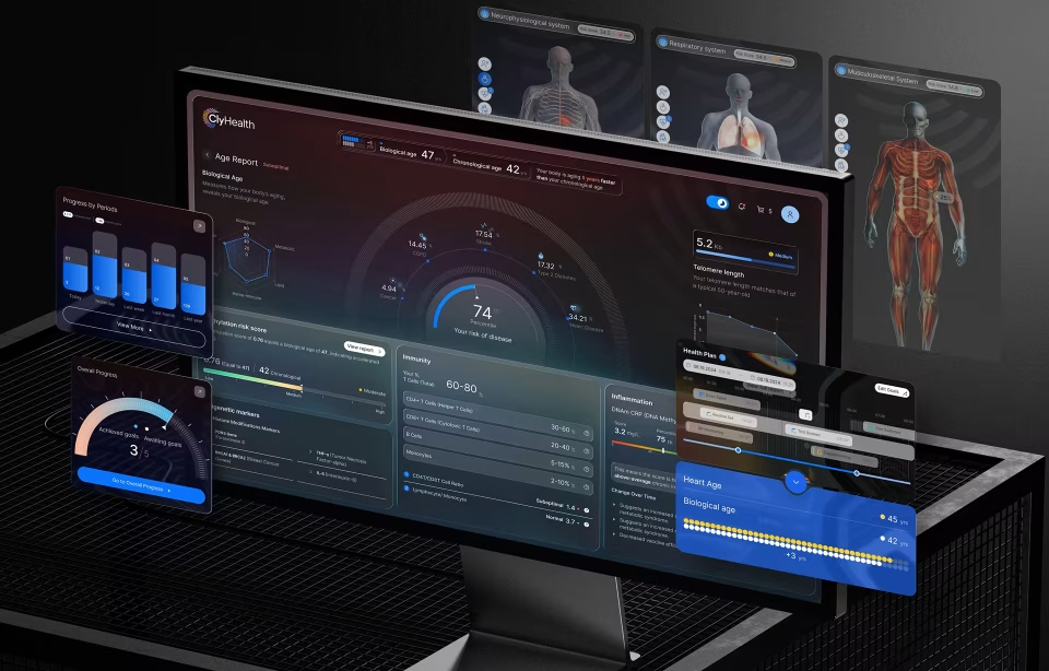
Manufacturing dashboard design for industrial interfaces in 2026

Manufacturing dashboard design involves building operational interfaces for plant floors, production lines, and control rooms, where real-time sensor data, safety-critical alarm systems, and physical operator constraints render general dashboard patterns unusable. These interfaces are governed by ISA-101 and its international equivalent IEC 63303, and these standards are rigorous to say the least. Not to mention, most UX agencies have never encountered anything like this, and the cost of getting them wrong is serious; it’s measured in equipment downtime and operator safety incidents rather than what most of our work attempts to curb, such as user frustration and abandonment.
What makes manufacturing dashboard design a separate discipline
Manufacturing dashboard design differs from general UX work because the operating environment is physically hostile, the data stream is continuous, and an ambiguous alert can culminate in some pretty serious equipment damage. Standard SaaS patterns built for desk workers in air-conditioned offices fail on plant floors, where operators wear gloves, work 24-hour shifts, and, in many cases, have only a few seconds to act before a serious accident can occur.
Most UX teams train on products designed for knowledge workers sitting at desks with full visual attention and precise cursor control. Manufacturing operators have none of those conditions. They work in high-noise environments, wear safety gear that restricts peripheral vision, and split their attention between screens and physical machinery. The interface has to communicate what matters with high contrast and incredible readability, without demanding the kind of focused reading a SaaS dashboard assumes.
The consequences of user errors also scale differently. A missed notification in a project management tool creates a missed deadline. A missed notification on a chemical plant’s control room dashboard triggers a release event. This difference shapes every design decision on a manufacturing interface, from the contrast of typography to the color of alarms to the placement and size of the acknowledge button. Priority shifts from engagement to clarity, and in a good deal of cases, we are shooting for clarity under stressful conditions, which is a whole other animal entirely.
The data environment is also fundamentally different. Industrial systems stream sensor data from Programmable Logic Controllers every second or less, so the data never stops coming in. Handling that refresh rate without making the screen flicker or overwhelming the operator is a core part of the work, and it has no direct equivalent in SaaS dashboard design, where updates are usually paginated or on-demand.
Hardware shapes manufacturing dashboard UX in ways that no SaaS project prepares a team for. Screen selection, mounting location, viewing angle, enclosure rating, and the choice between resistive and capacitive touch affect what the interface can do. A dashboard designed for a specific plant floor must account for the individual challenges presented by physical layout, including lighting, noise and visual obstructions. Software and hardware choices are inseparable in industrial work, which is why UX agencies often consult on both.
The ISA-101 and IEC 63303 standards UX agencies should know
ISA-101 is the American national standard for Human Machine Interface design in process automation, published by the International Society of Automation in 2015. In August 2024, it became the basis for the international standard IEC 63303, which uses more normative language. Together, they define how industrial interfaces should be structured, styled, and maintained across their operational lifecycle.
The ISA-101 standard defines a four-level display hierarchy that organizes a manufacturing dashboard into layered views. Level 1 provides a plant-wide overview for situational awareness; Level 2 narrows to a specific process unit for control actions; Level 3 exposes component-level detail; and Level 4 provides diagnostic data for maintenance and engineering. One data architecture produces four fundamentally different screens.
The grey-background principle is counterintuitive for UX designers coming from consumer or SaaS work. High Performance HMI uses muted grey backgrounds, 2D low-contrast equipment representations, and minimal visual decoration. Color is reserved almost entirely for active alarms and status changes. In a safety-critical environment, decorative color competes with alarm color for operator attention, and the dashboard loses clarity when it matters most.
A common mistake among designers new to industrial work is to digitize a Piping and Instrumentation Diagram as the dashboard layout. ISA-101 explicitly warns against this because physical pipe routing rarely matches the mental model an operator needs for task-based control. The screen should be organized around what the operator needs to do, not how the hardware is physically arranged in the facility.
This is why SaaS-honed UX instincts often backfire in manufacturing dashboard design. A creative director might want to add motion, gradients, or an accent color palette to make the interface feel modern. Industrial HMI strips those elements out because they compete with the alarm layer and introduce ambiguity about the system state. What looks like a design downgrade to a SaaS eye is actually compliance with a tested safety framework.
Seven UX problems unique to manufacturing dashboards
Manufacturing dashboard design has to solve seven recurring problems that rarely appear in general UX work: alarm fatigue, shift handoff continuity, physical environment constraints, the gap between plant-floor Andon boards and workstation panels, role-based information density, real-time refresh cognitive load, and stale-data visibility during network failures. Each one requires a design response that has no SaaS equivalent.
Alarm fatigue is a documented safety risk in which operators become desensitized to a constant barrage of alerts and begin to miss genuine faults. The ISA-18.2 alarm management standard addresses this directly with tiered priority classification. Manufacturing dashboard design must present a visual hierarchy that simultaneously distinguishes advisory, high, and urgent notifications by color, size, and position, so the priority of an alarm is legible even at a glance.
The second design challenge around alarms is rationalization, the process of reviewing every alarm to determine whether it needs to exist. Most legacy manufacturing systems accumulate alarms faster than they retire them, and operators ignore half because the noise-to-signal ratio has collapsed. A UX agency working on a manufacturing dashboard should expect to participate in alarm rationalization, because design can only work with the alarms the system is already sending. And on top of all this, workers may be dealing with extremely loud environments where audible alarms are going off in various areas and vehicles pass by with flashing lights and backup beeping. It would probably be less distracting working in the middle of a highway at rush hour!
Manufacturing runs around the clock, making shift handoff one of the specific design problems for an industrial dashboard. An operator arriving for the 6 am shift needs to understand what happened overnight within two minutes. A handoff view on the dashboard should summarize alarms cleared, setpoints changed, and anomalies observed in the previous eight hours as a readable narrative rather than a raw event log.
The handoff view is also where analytics earn their keep. Overnight anomaly detection can catch trends the departing operator missed, such as a slow temperature drift or a decreasing flow rate across cycles. Showing these in a shift summary, framed as things to watch rather than alarms, gives the incoming operator context without making them dig through logs.
Operators wearing work gloves cannot hit the 44-pixel touch targets that consumer mobile design treats as the floor. Industrial interfaces typically use touch targets of 60 pixels or larger, with generous spacing between adjacent elements to prevent activation of adjacent elements. Hover interactions are ruled out entirely because plant-floor panels are touch-only, and precise cursor movement is ridiculously unreliable for operators who need to act quickly without removing gloves. This is a whole other planet compared to a clean, well-lit office environment.
Roughly 1 in 12 men experience some form of color vision deficiency, according to Prevent Blindness, which makes color-alone status indicators a direct safety issue on plant floors. Industrial dashboard UX must encode status through shape, position, labeling, and color. Lighting is another factor: some floors are in high-glare, sunlit conditions, while others are in dim control rooms, and the screen specification has to match.
Plant-floor Andon boards are overhead displays viewed by shift teams from distances of 3 to 10 meters. The design problem has almost nothing in common with screen work at arm’s length. Andon boards need clutter-free layouts, typography large enough to read at a distance, and a limited set of status states that communicate instantly. Nobody interacts with an Andon board. It exists to be glanced at from across the factory floor.
The same production data often feeds a workstation panel at the operator’s terminal, which requires a completely different design. The detailed touch interface handles interactive control and drill-down analysis, while the Andon board presents the summary. Industrial dashboard UX has to generate both views from a single source of truth, keeping the numbers consistent while the presentation differs by distance, context, and task.
Operators, supervisors, plant managers, and executives each need a different view of the same system. A line operator wants second-by-second data on the specific machine that they attend to. A plant manager typically wants a consolidated Overall Equipment Effectiveness view across the facility, at a minimum. An executive wants throughput trends across multiple sites. Industrial dashboard UX accommodates this through role-based entry points rather than a single dashboard trying to serve every user.
Continuous data streams create their own cognitive load problem. If every numeric field updates every second, the screen becomes visually noisy, and operators stop tracking changes. Progressive update rules, where values refresh only when they exceed a threshold, reduce flicker without obscuring genuine state changes. Refresh rate is a design decision on an industrial dashboard, not a technical default inherited from the data pipeline.
Designers often underestimate how much the refresh strategy depends on the physical task. An operator monitoring a reactor cares about slow drift over minutes, and aggressive updates obscure that pattern. An operator supervising a packaging line cares about per-second cycle completions, and slow updates can feel like a slow death. The correct refresh strategy emerges from research after the designer has observed operators make decisions at the actual speed their work requires.
Stale data displayed at full visual confidence is one of the more dangerous failure modes on an industrial dashboard. An operator acting on a reading that stopped updating five minutes ago can make a decision that caused the original problem. The interface has to degrade visibly when data goes stale, through dimming, timestamps, or explicit offline indicators, so the operator always knows the reliability of what they see.
A complementary pattern is automatic fallback. When primary data stops arriving, the interface can switch to last-known-good values with a clear timestamp, or to an averaged historical band, while a persistent banner indicates the connection state. This stuff can be a game-changer and needs detailed on-site UX research. The dashboard doesn’t pretend that nothing happened. Operators can keep working with stale data as long as they know it’s stale.
What predictive maintenance changes about manufacturing dashboard design
Predictive analytics introduces probabilistic outputs into a dashboard that otherwise shows deterministic sensor data. The design problem is to separate forecasts from facts so that operators do not treat a predicted component failure as a measured one. Manufacturing dashboard design handles this through visual hierarchy and layer separation rather than through probability labels operators rarely read under time pressure.
Fuselab’s work on Automatize, a fleet management platform with predictive analytics, illustrates the pattern. Real-time truck locations, trip progress, and traffic conditions were designed as the primary visual layer, treated as the interface’s ground truth. Predictive insights about fuel inefficiency, route deviations, and cost anomalies sat in a secondary layer that operators deliberately opened via expandable cards and analysis modules.
The separation was structural rather than labeled. Probability percentages were not attached to individual predictions because field testing showed that managers either ignored them or overweighted them, and neither behavior was useful. Keeping predictions in distinct visual containers lets managers act on live data without predictions bleeding into their interpretation of the current state, and lets them explore forecasts as a separate analytical task.
Fuselab has not shipped a plant-floor predictive maintenance interface, but the pattern from Automatize transfers to manufacturing quite nicely to this type of dashboard. Mean Time To Failure forecasts need to look different from live temperature readings, vibration levels, or flow rates. When a predicted failure is visually indistinguishable from a measured fault, operators can blow it by either responding prematurely to forecasts that resolve on their own or by discounting all alerts because the dashboard has lost their trust.
Industrial dashboards increasingly support continuous monitoring of predictive signals rather than periodic review of static reports. The analytical layer must be available without disrupting operational awareness, and the shift from batch reporting to live analytics changes how managers make decisions. Catching an anomaly while it develops is a different task from reading a post-incident summary, and the interface has to support both without confusing them.
Another lesson from Automatize that applies to manufacturing dashboards is how confidence is handled. Predictive models produce confidence scores, and designers have to decide whether to show them and how to do so. Percentages on every forecast encourage false precision. Color-coded bands mapped to action thresholds work better because they align with how operators actually make decisions. Getting this right takes sitting with operators and calibrating what confidence looks like under time pressure.
Operator trust in predictive models takes time to build, and the interface has to earn it rather than demand it. New predictions should appear as advisory information that operators can dismiss easily. Once the operator has seen a few predictions resolve accurately, the system can surface the same predictions more prominently. Designing for trust progression rather than instant credibility is one of the harder problems in manufacturing dashboard UX.
What we learned building the Hyperfab robotics dashboard
Hyperfab is a robotics interface used in live construction environments, combining a desktop dashboard with an augmented-reality layer rendered on goggles worn by on-site operators. Fuselab’s work on the Hyperfab robotics dashboard covered UX research, interface design, and motion design across both layers. The project pushed our team into industrial UX territory, which, in all honesty, we had limited experience in, unless you consider some of the healthcare lab work we had done.
The system supports production planning, real-time monitoring, robotic arm control, and AI-driven simulation of processes like cutting, labeling, and assembly. Operators on the factory floor work primarily through the AR layer, which supports spatial calibration and hand-positioned interaction. Supervisors and production managers work through the desktop dashboard, which aggregates performance data across multiple robotic stations and compares output against predefined production targets.
User research for Hyperfab required on-site observation rather than interviews in a conference room. The team spent shifts watching operators calibrate robotic arms, interviewing them during breaks and testing AR prototypes under the actual conditions in which the product would run. Plant-floor research picks up things no conference-room study catches, from how protective gear restricts the range an operator can reach to how lighting changes what they can actually read.
The central design problem was that the same system had to support two fundamentally different user contexts simultaneously. The AR interface had to handle spatial interaction under physical movement, while the desktop provided oversight across equipment, performance, and output. Managing operator attention across these layers without overwhelming either user became the hardest part of the engagement, with no direct analog in prior SaaS work.
One design feature we are most interested in revisiting is the pre-execution simulation interface. Operators can preview a robotic process, the path of a cutting arm or the trajectory of a labeling head, before the physical action runs. Using prompt-based configuration and motion animation, operators verify the intended path against the physical environment, catching collision risks and positioning errors that would otherwise appear only after the machine had already acted.
The project made us take a step back and, in the end, shifted how we think about clarity. Our previous SaaS work taught us that clarity comes from organization and visual hierarchy on a single screen. Hyperfab broke that assumption. Clarity came from distributing information correctly across surfaces, and from a visual vocabulary consistent enough that the AR layer and desktop felt like one product. Half a second of interpretation delay carries a cost that no SaaS project has ever imposed on us.
What surprised the team most was how much of the design problem lived outside the screens. Physical environment audits, goggle ergonomics, calibration workflows, and the handoff between AR interaction and dashboard oversight consumed more of the engagement than visual design work. Industrial interfaces are systems of interaction across surfaces, and the screen is often the simplest part once you understand the context.
How to evaluate whether a UX agency can handle manufacturing dashboards
A UX agency is qualified for manufacturing dashboard design when it has shipped at least one plant-floor interface used by operators in live production, has conducted user research in the physical environment rather than in meeting rooms, and can speak fluently about the data architecture connecting PLCs, SCADA systems, and the UI. Yes, that’s a lot of work, but all it needs to work flawlessly together, as it can be the difference between life and death, or at least severe accidents. Portfolio claims without these signals rarely survive questioning.
The first question to ask is whether the agency has shipped an actual plant-floor interface rather than a corporate website for a manufacturing client. Many agencies present a marketing dashboard with manufacturing data as proof of industrial capability. This is not the same work. Ask to see a control interface used by operators during production, and ask who those operators are.
The second question covers where the research happened. Authentic manufacturing UX research requires observation under actual operating conditions, including noise (ear-piercing noise), lighting, protective equipment, and workflow pressures that shape operator behavior. Interviews conducted in a plant manager’s office with climate control and gourmet coffee miss everything that matters about the environment. Ask for research artifacts that reference the physical site.
The third question covers data architecture fluency. Manufacturing systems stack Programmable Logic Controllers at the machine layer, SCADA systems for supervisory control, a Manufacturing Execution System above that, and Enterprise Resource Planning above that. A qualified agency does not need to build those systems but needs to understand how data moves between them, and where latency, loss, or format mismatch can introduce bugs that look like design problems.
A fourth question covers research artifacts. Ask for photos from the plant floor, operator interview transcripts, or observational field notes from a past project. An agency that has done this work produces ethnographic research that looks nothing like a standard UX report. Transcripts reference specific machines, named operators, and shift conditions at very different times of day and sometimes even during different weather conditions. Portfolios without these artifacts were produced remotely. Fuselab’s industrial interface design capability applies this approach.
A fifth question, which is particularly useful when the plant is subject to regulatory oversight, addresses documentation, or lack of documentation. Regulated environments require design decisions to be defensible, which means versioned wireframes, alarm rationalization records, and a step-by-step, traceable design rationale. An agency that delivers a Figma link and calls the work complete is not equipped for regulated manufacturing UX. A deliverable package that audits well is within scope.
Manufacturing dashboard design sits in a different territory from SaaS UX work. The standards, plant-floor realities, and consequences of an ambiguous alert push the design in directions that general UX practice does not prepare a team for. If you are evaluating agencies for industrial work, apply the criteria above to your shortlist. Fuselab’s dashboard design service covers this scope.
Frequently asked questions
What is manufacturing dashboard design?
Manufacturing dashboard design is the practice of building operational interfaces for plant floors, production lines, and control rooms where real-time sensor data, safety-critical alarms, and physical environment constraints shape every decision. It prioritizes speed, clarity, and error prevention over the engagement and visual polish that SaaS or consumer UX optimizes for.
How does manufacturing dashboard UX differ from SaaS dashboard design?
Manufacturing interfaces account for physical operator constraints like gloves, noise, and variable lighting, use color almost exclusively for alarms, and handle continuous sensor streams at second-level granularity. SaaS dashboards assume a controlled office environment, use color for engagement and visual identity, and handle data updates that are usually batched or on-demand. The two disciplines share surface vocabulary but require fundamentally different design choices.
What is the difference between an HMI and a dashboard in manufacturing?
HMI stands for Human Machine Interface and refers to a terminal that connects an operator directly to a machine in real time, such as a touchscreen attached to a production line. A manufacturing dashboard is usually a higher-level view that aggregates data from multiple HMIs and systems for supervisory oversight rather than direct control. In practice, the two often overlap at operational levels.
What is ISA-101 and why does it matter for HMI design?
ISA-101 is the American National Standard for Human Machine Interfaces in process automation systems, published by the International Society of Automation in 2015 and adopted internationally as IEC 63303 in 2024. It provides a tested framework for reducing operator error through display hierarchy, high-performance HMI visual conventions, and lifecycle management. Compliance reduces training time and improves alarm response in regulated environments.
How much does a manufacturing dashboard project cost?
Manufacturing dashboard projects with a US-based specialist agency typically cost between $50,000 and $200,000, depending on the number of unique views, integration complexity, and the scope of plant-floor research. Offshore or boutique engagements range from $15,000 to $60,000 but rarely include on-site research or standards compliance work. Hourly rates for specialist agencies in this space run from $100 to $250.
How long does a manufacturing dashboard redesign take?
Manufacturing dashboard redesigns typically take 3 to 9 months, depending on system complexity, integration scope, and the amount of plant-floor research required. A typical engagement starts with operator interviews and on-site observation, moves through wireframes and high-fidelity design, and concludes with engineering handoff, including data pipeline coordination with the control system integrator.
What KPIs should a manufacturing dashboard display?
Manufacturing dashboards usually display Overall Equipment Effectiveness (OEE), cycle time, throughput, and first-pass yield as core production metrics. For maintenance and reliability, dashboards include downtime by cause, Mean Time Between Failures (MTBF), and Mean Time To Repair (MTTR). Executive views add cross-site throughput trends and capacity utilization over longer time windows.