9
min read
9
min read
 Oct 23, 2026
Sports analytics dashboard design for stadiums in 2026
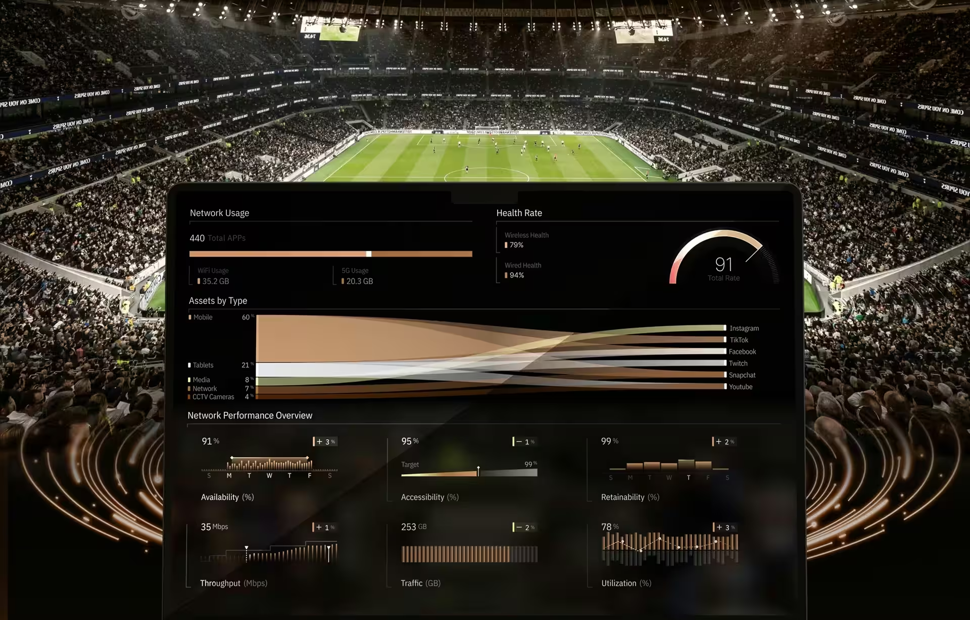
A sports analytics dashboard is the real-time operational interface that pulls a venue’s live systems, from ticketing and crowd tracking to concessions, security, and building controls, into one place where the teams running an event can act while it unfolds. As venues add AI-assisted monitoring and more connected systems each season, the 2026 design problem is no longer collecting data but making the right slice of it legible to those who need and can act on it in seconds.
Who runs a stadium analytics dashboard?
A stadium analytics dashboard is not one screen but several, one per operational team, drawn from a shared data layer. Security and crowd control, guest experience, concessions, facilities, and broadcast each work from their own view, because each owns a distinct decision and reads a different slice of the same live picture.
Security watches crowd density from cameras, computer vision, and people-counting sensors, deciding when to open a relief gate or hold arrivals at a concourse. Guest-experience teams read the mobile app, Wi-Fi, and restroom and parking occupancy, sending stewards to a pinch point before a line becomes a complaint. Concessions managers track point-of-sale volume, stock, and queue length, opening a second register or pausing mobile ordering when a stand backs up.
Facilities teams sit with the building itself, watching the building management system, HVAC, energy, and connected sensors, deciding when to shed load or pre-cool a section before the crowd arrives. Broadcast and event control coordinate clocks, production, and public address so the field, the screens, and the speakers stay in sync. The design question is which of these readings belong on every screen and which belong to one team alone.
What a sports analytics dashboard must show in three seconds
An operator reading a stadium screen has three seconds before the next radio call, so a sports analytics dashboard has to answer three questions at once: where is it happening, is it getting worse, and who acts next. The reliable pattern pairs a live map with an event timeline and a role-specific alert that names the next action.
The map answers where. A heatmap of crowd density or network load moves an operator from a vague sense that something is off to a specific gate in one look, which is why spatial context beats a table of numbers under time pressure. Nielsen Norman Group’s work on dashboards shows why: color, size, and position are preattentive, so the eye finds the hot zone before it reads a single label.
Beside it, the timeline answers whether it is getting worse. A density reading means nothing alone, but the same reading climbing over ten minutes is a decision, so current state and recent history belong side by side. The alert answers who acts. A red state with no owner and no next step is just a color, and operators learn to ignore colors that never resolve.
This clarity-first pattern is also what separates a venue dashboard from the two tools it gets confused with. A sports-performance dashboard studies athletes after the play, and a business intelligence dashboard explains results after the quarter. A venue operations dashboard runs the building live. The table below lays out the difference across users, time horizon, and the decision each one drives.
Network and Wi-Fi analytics: the hardest live data in a venue
Network and Wi-Fi analytics is one of the most demanding data streams in a venue, because much runs on connectivity: the app, mobile ordering, and cashless payment all lean on the same Wi-Fi and 5G capacity. A live venue dashboard tracks throughput, devices, signal strength, and access-point load by zone, so operators see congestion before fans feel it.
The difficulty is that demand is not steady. Tens of thousands of phones sit mostly idle, then hit the network at the same instant: a goal, a halftime rush to order food, a security announcement, a queue of ticket scans at the gates. A single access point saturating in one section can stall cashless payment, slow the venue app, and interfere with the staff radios on the same network.
So the analytics job is triage, not display. The dashboard has to rank zones by how close each is to saturation, correlate that load with crowd density, and separate a normal surge that will clear on its own from congestion that needs a technician or extra capacity. Raw throughput graphs for every access point would bury that signal. A per-zone health view surfaces it.
Inside Spectra Stadium: what the screen actually shows
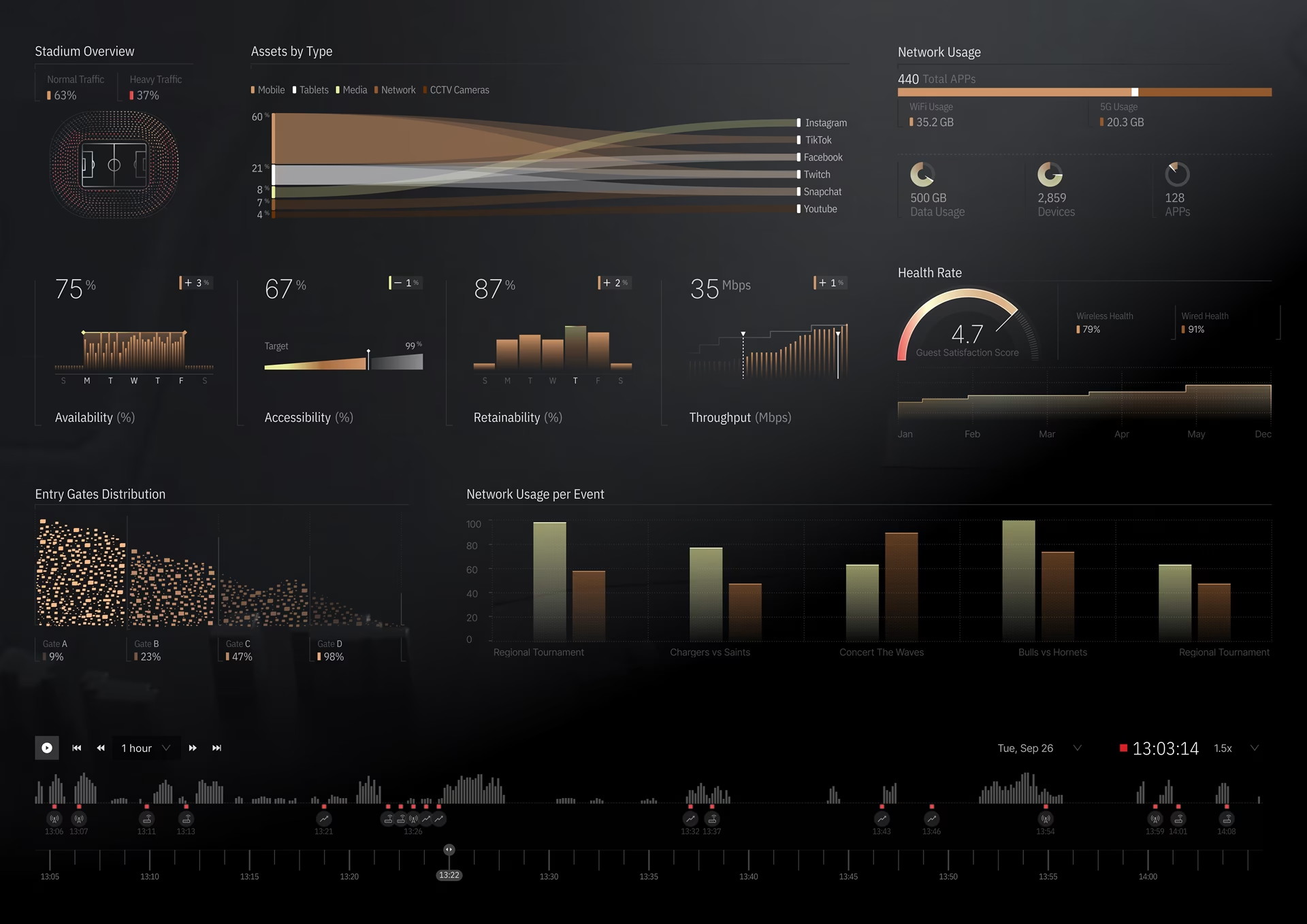
During a sold-out event, a Spectra Stadium operator watches the venue as a map shaded by network health, not a wall of numbers. When one section slides toward red, they check whether the timeline is climbing and send a technician to that concourse before the next radio call. Fuselab built it as a real-time digital twin of the venue’s network.
In our work on Spectra Stadium, we gave each panel a single job and left the rest off the screen entirely. Each view answers one question on its own, and the breakdown below maps every panel to what an operator actually does with it.
What the screen leaves out matters as much as what it shows. Raw device logs, historical trends, and business metrics all exist in the system, but none of them reach the operator’s view during an event, because none of them change the next few seconds of a decision. For more live operations screens, see our UI/UX design inspiration gallery.
What Robodog AGV shows about alert discipline
Robodog AGV, a Fuselab warehouse-automation platform, is the clearest example of alert discipline built into an interface. It shows live robot positions on a map of the production hall, exposes each unit’s sensor confidence, latency, and health, and follows the ISA-18.2 alarm-management standard so a notification fires only when a person actually has to decide something.
The interface detail that matters is honesty. On Robodog AGV, each robot on the hall map carries its own state, so a unit whose sensor confidence drops dims and flags its latency instead of reporting a clean position it no longer has, and one tap hands control back to the operator. The ISA-18.2 standard it follows exists precisely to stop the alarm floods that train operators to mute everything.
A stadium needs the same restraint. Crowd and network alerts that fire on every fluctuation get silenced within an hour, and a silenced alert is worse than none. The lesson we carried from Robodog into venue work is that trust comes from an interface that admits what it does not know and only interrupts when a decision is genuinely required. That is a design choice, not a data-volume problem.
Stale data, dropouts, and fallback behavior
Live venue data is never clean, so a sports analytics dashboard has to be designed for the moment a feed drops, not just when it works. When connectivity degrades inside a bowl of concrete and steel, the interface should hold the last known value with a visible timestamp and a stale flag, and separate missing data from a real zero.
The failure state deserves as much design as the working state. A widget that simply blanks when its feed dies tells an operator nothing and quietly erodes trust in the whole screen. A widget that grays out, stamps the last update, and marks itself stale tells the truth, and truth is what keeps a team acting on the dashboard instead of reaching for a phone.
Access, permissions, and auditability
A sports analytics dashboard runs on sensitive data, from camera and Wi-Fi feeds to ticketing records, so access control is a design requirement, not an afterthought. Role-based permissions should limit each team to the data its job needs, and an audit trail should record who saw and acted on what, because the review after an incident depends on it.
Permissions also shape the interface, not just the back end. A concessions manager and a security supervisor should not see the same screen, partly for clarity and partly because crowd-surveillance data carries real privacy weight. Good venue platforms minimize what personal data reaches a screen at all, mask it where a raw feed is not needed, and make the integration between systems a governed boundary rather than an open pipe.
Where stadium dashboards fail
Most stadium dashboards fail for one of three reasons: they build a single screen for every role to save budget, they design from a desk instead of the concourse, or they assume more data produces better decisions. Each mistake ends the same way, with the reading that matters buried under everything the screen also decided to show.
The one-screen build is the most expensive: a screen that answers every team at once answers none in the second that team needs it. Designing from a desk is the quietest failure, because a layout that reads fine in a conference room falls apart on a handheld in a loud, dim concourse. The only way to catch either is testing on-site during a live event, ideally more than one.
How to evaluate a sports analytics dashboard
A sports analytics dashboard is worth buying when it is built around roles rather than one universal screen, shows location and recent history together, stays honest about data quality, attaches a next action to every alert, and reports success as faster decisions rather than logins. Those five tests separate an operational tool from a repackaged reporting product.
Two of those tests are easy to check in a demo. Ask to see two different roles’ screens side by side; if they are the same, the product is one dashboard wearing five hats. Then ask what happens when a feed drops, and watch whether the interface tells the truth or goes blank. A serious team can also show data visualization and operational work behind the claims.
The other three take a conversation. Ask how alerts escalate, and expect a real path, the person notified and the channel, not a red badge with no owner. Push on how success gets measured, and expect incident resolution and queue times, not adoption. Strong dashboard development also plans for change, with modular components that absorb new sensors and requirements every season.
Conclusion
The strongest sports analytics dashboards show less, not more. What separates them is not the number of feeds they connect but how quickly a real operator can read one and act during a live event. Any venue evaluating a platform in 2026 should judge it on that, and test it under live conditions before committing.
Frequently asked questions
What is a sports analytics dashboard?
A sports analytics dashboard is a real-time interface that combines a venue’s live systems, such as ticketing, crowd monitoring, concessions, and facilities, into one operational view. It helps each team decide what to do while the event is happening, not after.
What is venue operations software?
Venue operations software is a set of systems that run a stadium, including ticketing, security, facilities, parking, and communications. A sports analytics dashboard sits above them and brings their data into one live view.
How is a venue operations dashboard different from a sports performance dashboard?
A sports performance dashboard analyzes athletes and games, using player tracking and biomechanics. A venue operations dashboard runs the building during the event, watching crowd flow, infrastructure, and guest services.
Does a stadium dashboard need to update every second?
No. A real-time sports dashboard should refresh crowd and network data almost instantly, while energy and infrastructure readings can update every minute or two without affecting any decision.
How long does it take to design a venue analytics dashboard?
A single-role venue dashboard commonly takes somewhere around eight to twelve weeks, from role mapping through on-site testing. A multi-role platform more often runs four to six months, largely because testing has to span more than one live event. Scope and the number of integrations move both ends.
What should I look for in a stadium dashboard design agency?
Look for a track record in real-time operational interfaces, not just reporting dashboards: multiple system integrations, role-based workflows, and honest handling of failure states. Ask to see two roles’ screens and what happens when a feed drops.