17
min read
17
min read
 Oct 7, 2026
UX research methods: a guide to UX design research
Pick a UX research method by the decision it has to support, then check how much access you really have to the people who will use the product. Interviews and field observation explain why people act the way they do. Usability tests show where a design breaks. Closed-ended surveys, analytics and A/B tests measure how often something happens, and how much a change moved it.
UX research methods are the structured ways a product team gathers evidence from real or representative users, before, during and after design. Teams often pick one out of habit. This guide maps each method to the question it answers and the project stage it fits, and it covers the substitute to use when the ideal method is out of reach.
It comes from the research practice at Fuselab Creative, a UX and product design team based in McLean, Virginia, working since 2017 with startups, enterprise software companies, healthcare providers and government agencies. The examples come from our published projects. They include interviews and surveys for California’s Department of Health Care Services, patient and provider research for ClyHealth, and user research for the AG.Drone farming platform.
What UX research methods can and cannot tell you
UX research methods differ along three lines, and those lines decide what each method can prove. Attitudinal methods record what people say, behavioral methods record what they do, and the two often disagree. Qualitative methods explain why something happens, while quantitative methods measure how often. Generative research finds problems worth solving, and evaluative research tests whether a design solves them.
The say-versus-do line matters most. Nielsen Norman Group’s landscape of research methods puts it first and notes that what people say about themselves is limited by what they are aware of and willing to report. Ask users how often they export a report and you get an estimate. Watch them work and you see the export, the spreadsheet and the three manual fixes after it.
An interview cannot settle a usability question, and a usability test cannot tell you whether a feature was worth building. Interviews are the right tool for motivations, vocabulary and the jobs people are trying to get done. Behavior needs observation, a task-based test or product analytics. The weak research plans we review usually ask interviews to answer questions about behavior.
Qualitative work answers why and how with a small number of people, so its findings are rich in detail and directional in weight. Quantitative work answers how many and how much, so it needs enough participants for the numbers to hold. A team with only analytics can see exactly where people abandon a flow and still has to guess the reason.
The third line, generative versus evaluative, is really a question of timing. NNGroup maps generative research to the strategy phase of a product, formative research to design, and summative research to launch and after. That splits evaluative work in two. Formative tests find problems while there is still time to fix them, and summative tests measure the finished product against its earlier self or a competitor.
UX research methods by project stage
Once the decision is clear, project stage narrows the choice of UX research methods quickly. Before design starts, interviews, contextual inquiry and diary studies find the problem. While designs are still cheap to change, card sorting, tree testing and moderated usability tests shape them. After launch, analytics, A/B tests and surveys measure what shipped and whether it worked.
Discovery: before anything is designed
Discovery research decides what to build, so it relies on methods that let users surprise you. User interviews come first because they are quick to set up, and they hand the team the users’ own vocabulary for later labels and error messages. Their limit is that an interview records what someone believes about their work, which is often tidier than the work itself.
Contextual inquiry closes that gap by watching people do the real task in the real place and asking questions while they work. Field conditions produce requirements no lab session shows: glare on an outdoor screen, gloves on a touchscreen, a colleague interrupting every few minutes. None of them show up when the same task is tested at a desk.
Diary studies suit behavior that unfolds over days, such as onboarding or a monthly reporting cycle. Ethnographic studies go deeper and earn their cost when environment or culture shapes how a product gets used. Open-ended surveys collect stated opinions from hundreds of people, without the follow-up questions an interview allows. Focus groups are the least reliable discovery tool for behavior, because the most confident voice in the room tends to set everyone else’s opinion.
Design: while changes are still cheap
Before engineering commits to a structure or a flow, design-stage research decides which one to build. Card sorting shows how users group and name content. Tree testing then checks whether they can find items in the proposed menu. Run them in that order. The sort generates a structure, and the tree test tells you whether it works for someone who has never seen it.
Moderated usability testing is the most useful method at this stage, because a facilitator can ask why at the moment a participant hesitates. With specialized professionals, the tasks have to be the ones they do every week. A generic task such as “find a report” tells a team little. A task that asks a researcher to build the query they would run on an ordinary Tuesday shows where the interface slows them down.
Expert users also set a high bar for learnability. Informa’s Datamonitor Healthcare platform serves pharmaceutical manufacturers and researchers who track disease prevalence and treatment results worldwide, and Fuselab’s goal was an interface that needed no explanation or training. A goal that specific gives every test session a pass mark: could this person do the job without help? Research and usability testing were built around that question.
Lighter methods fill the gaps between test rounds. A heuristic evaluation finds obvious usability problems without recruiting anyone. Run by several evaluators working separately, it is a good filter before users see a prototype. Concept tests check whether an idea makes sense before it is designed in detail. Preference tests for visual choices and first-click tests on a clickable prototype cover most of what teams call UI research.
Small rounds beat one large study. Jakob Nielsen’s guidance on testing with five users recommends three studies of five participants each rather than one of fifteen, so each round checks the last round’s fixes. That rule is for finding problems within one user group. Card sorts and quantitative studies need more: about 15 users for a card sort, and 40 for quantitative studies in NNGroup’s 2021 sample-size summary.
After launch: measuring what shipped
After launch, the decision is whether what shipped worked. Analytics show where people go, where they stop and what they never touch. A/B tests compare two versions of a screen or flow against one primary metric, with guardrail metrics so a win on one number cannot hide a loss elsewhere. A/B tests need a specific hypothesis and enough traffic to reach a clear result, which many B2B products never get.
On a product that is already live, the same heuristic evaluation is usually the first step of a UX audit, often run by an outside UX consultant. Reviewers walk through the core tasks against usability principles, rate each problem by severity, and mark which ones need testing with users before anything gets redesigned.
Closed-ended surveys put numbers on perceived ease of use, ideally with a standard instrument such as the System Usability Scale, so scores compare across releases. Unmoderated usability tests run on prototypes or live products and can go either way: task success and time across many participants, or recorded think-aloud sessions without a moderator.
Eye tracking is the specialist tool of the group. It shows where attention goes on a dense screen, but the equipment and analysis make it worth using only when attention itself is the question.
Most methods in this group show what happened, and only think-aloud recordings hint at why. A funnel that loses people at one step is a finding without an explanation. That is the moment to go back to qualitative work, as the section on combining methods shows.
Choosing UX research methods when access to users is limited
When the ideal research method needs access you do not have, swap it for the nearest method that answers the same question, and record what the substitute cannot show. In-person observation becomes a recorded screen-share of real work. A usability study with users you cannot meet becomes a remote unmoderated test, and with users you cannot reach at all it becomes a close read of analytics and support tickets.
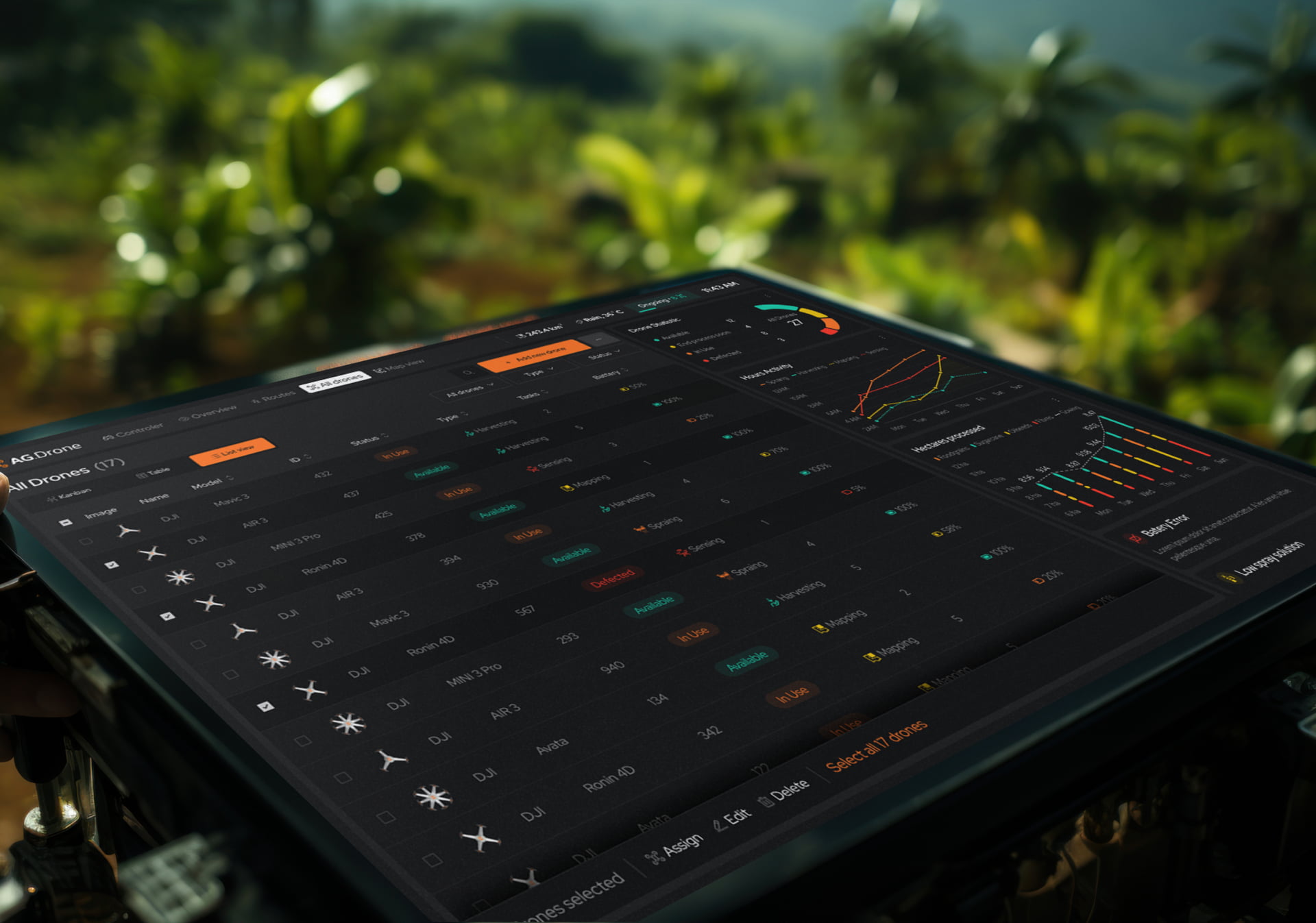
Limited access mostly changes what you ask first. With good access, research can cover the whole workflow. On the AG.Drone farming platform we had access to users, so interviews covered the whole operation, from the most problematic parts of drone management to routine work such as flight patterns. With three hours of a surgeon’s time, the plan has to spend them on the one question that blocks the design.
A startup with no users yet faces the extreme version of the problem. Research then studies the people the product hopes to serve and the workaround they use today, with concept tests standing in for usability tests until something real exists. Label every finding from that phase as a prediction, because nobody in the sample has used the product yet.
Government work limits access differently: many user types, spread across departments, each with little time to give. For California’s Department of Health Care Services, Fuselab’s research mixed in-person, remote and group interviews with online surveys across each stakeholder type, so no group depended on one format or one schedule. One finding shaped the product directly: stakeholders thought about beneficiary distribution by county, so the county view became a map.
Time-poor users need shorter and more frequent contact than one long session allows. A 20-minute remote task test scheduled around a shift, a few asynchronous diary entries and a recorded walkthrough of real work each capture part of what a full contextual inquiry would. Whatever the substitute, the findings should say which method produced each insight, so the team knows how much weight each one can carry.
In regulated products the limit is often what can be recorded. When a screen capture could expose patient or account data, sessions run on test data rather than production records, so the recording carries nothing sensitive. Where even that is not allowed, notes replace video. Consent wording is reviewed before recruiting begins. Sessions with screen-reader users need the audio output recorded too, and those users belong in the plan from the first round.
Combining qualitative and quantitative UX research
Take a hypothetical but common case. A large share of new accounts never finish setup, and the analytics show the drop on one screen. Five moderated sessions on that screen explain it: the form asks for information most users do not have on hand. The fix lets them skip the field and come back later, and the analytics after release show whether completion improved.
That sequence is mixed-methods research, here in its explanatory form: one method measures and a second explains. Checking the same finding from two directions is what researchers call triangulation. It takes more planning than a single study. In return, it stops a team from redesigning around a misread number, or around one memorable story from a single participant.
The order can also start with people. Interviews surface a problem that a handful of users describe in detail. A short closed-ended survey then tells the team whether it affects most customers or only the ones who happened to be interviewed. That second step keeps a good anecdote from quietly becoming the roadmap.
Each approach has its own failure mode. Qualitative findings depend on who ran the sessions and who was recruited, so a skewed sample produces confident and wrong conclusions. Quantitative data can be precise and still misleading when the metric measures activity instead of success. Time on page is the classic case, since a longer visit is usually bad news for a task people want to finish quickly.
How to analyze UX research data
Analyzing UX research data means turning notes, recordings and numbers into patterns a team can trust. Qualitative data is coded and grouped, usually through thematic analysis and affinity mapping, until recurring themes appear. Quantitative data is summarized with descriptive statistics and, when a decision rides on a difference, tested to see whether that difference is larger than chance.
Most product teams run thematic analysis from a short shared codebook, tried on two or three sessions and refined before the rest are coded. Codes are then grouped until themes form. Usability issues get a separate pass with a severity rating, because a theme and a bug list answer different questions. Affinity mapping does the grouping as a team, so the product team sees the evidence itself.
For task time, report the median or the geometric mean rather than the plain average, because a few slow sessions skew it. With small samples, show a range rather than a single success rate. Most A/B testing tools report significance automatically. Unless the tool uses a sequential method built for early checks, set the sample size before the test starts, because stopping early on a good-looking result produces false wins.
UX research synthesis methods and frameworks
UX research synthesis turns analyzed findings into decisions a product team can act on. Insight statements say what was learned and why it matters, and recommendations tie each insight to a specific change. Personas and journey maps carry that evidence into design, while frameworks such as the Double Diamond show when to widen the search and when to narrow it.
The Double Diamond, created by the UK Design Council in 2003, shows where synthesis sits. The first diamond widens and then narrows the problem, and the second does the same for solutions. Synthesis is the narrowing at the end of the first: it turns a wide set of findings into one problem the team agrees to solve. Skip it, and the team designs against a problem nobody agreed on.
A research finding belongs in the report only when it can change a product decision, so synthesis should end with an agreed problem rather than a theme. A theme such as “users do not trust the forecast” describes a feeling. Written as a problem, it becomes “users cannot tell how current a forecast is or where it came from,” and the design options follow directly: a data date and a source beside every forecast.
Personas and journey maps are only as good as the evidence under them. On AG.Drone, the personas came out of research with users and separated farmers monitoring irrigation from ranchers managing grazing herds, two jobs one screen had to serve. A journey map is worth its wall space when it marks where the pain was seen, how often, and which step the team will change first.
Speed matters as much as rigor. A report delivered weeks after the last session describes a design the team has already moved past. On Fuselab’s research engagements, the team shares session recordings and early patterns within 48 hours of each testing round, so designers can change direction while the research is still running.
How AI is changing UX research methods in 2026
AI has sped up the slowest parts of UX research: it now drafts transcripts, suggests tags and groups similar observations into first-pass clusters. Choosing the method, asking the questions and deciding what a finding means still sit with the researcher. Every AI draft also needs a person to check it against the source before anyone acts on it.
Use AI where its output can be traced back to a source. A summary of twelve interviews is useful when every theme links to the timestamps it came from, so a researcher can open the clip and confirm the participant said it. Without that link, a confident summary can merge two people’s opinions or smooth over the one participant who disagreed.
AI-moderated interviews, where a model asks the questions and follows up, let a team reach far more people than a researcher could schedule. They suit broad, low-risk questions. They often miss what a skilled moderator catches, such as a long hesitation or an answer that contradicts what the participant did a minute earlier, so keep human moderation for the sessions that decide direction.
Synthetic users, AI personas that answer questions on demand, are weaker still. Nielsen Norman Group’s review of synthetic users advises against using them in place of real participants.
AI has also made participant fraud easier. Panel respondents can now use AI to pass screeners, write polished open-ended answers and click through unmoderated tests they barely read. The defenses are practical. Run a short live video check before high-value sessions, repeat one screener item in different words to catch inconsistent answers. Look twice at responses that are unusually fluent or nearly identical across participants.
Healthcare and financial products add a vendor question. Before any session recording goes into an AI tool, check where the data is stored and whether the vendor trains models on it. For patient data, confirm the vendor will sign a business associate agreement under HIPAA. Participants should also learn from the consent form that AI will process their session.
Research on AI features needs its own adjustment. A static prototype shows the ideal answer every time, so participants never meet the vague, wrong or overconfident output the real model will produce. Test with live or recorded model outputs, including the bad ones, and count how often participants act on a wrong answer without noticing it.

How research fits UX design methodologies: UCD, design thinking, Lean UX and Agile UX
User-centered design, design thinking, Lean UX and Agile UX are design and delivery frameworks, not research methods. What each one changes is research cadence: when studies run, how long they are allowed to take, and who is waiting for the result. Most teams follow one of them, whether or not anyone wrote it down, and the cadence it sets decides which methods fit.
Of the four, user-centered design is the oldest and broadest: an iterative process that involves users from requirements to release. Design thinking packages a similar idea into five stages, which IxDF traces to Stanford’s d.school: empathize, define, ideate, prototype and test. Both say research should shape every stage but leave the timing open, which works in a workshop and leaves gaps in a delivery plan.
Lean UX is the useful one when budget or time is short. Each design decision is written as a hypothesis, tested with the smallest experiment that could disprove it, and kept or dropped on the result. That makes it a natural fit for a first product version, where the expensive mistake is building a whole feature before anyone has tried a paper sketch of it.
Agile UX is where research most often gets squeezed. The pattern that works is dual-track: a discovery track researches and prototypes the next problem while a delivery track builds the current one. Research runs one or two sprints ahead, with a standing weekly slot for sessions, so recruiting never starts from zero and findings shape what gets built next.

Who should run the research: your design team or a separate firm?
A specialist research firm is the stronger choice for large standalone programs, such as multi-country ethnography or continuous quantitative tracking, where the findings are the deliverable. A research-led design team fits when findings have to become screens. The people who heard users then design the product, so less gets lost in the handoff between researchers and designers.
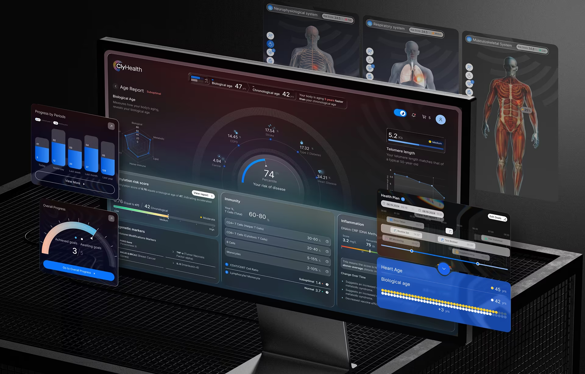
ClyHealth shows the second model. Fuselab’s work on that AI-powered personalized care platform began with patient and provider interviews, and the same team carried the findings through interface design and the data integration behind it. Before launch, the system was user tested with both patients and clinicians, two groups at opposite ends of the technical spectrum reading the same AI output.
A research-led design team does give up some independence. A team testing its own designs has a reason to like them, so the safer setup is for the designer to watch each session while someone else runs it. The findings then come from a person with no stake in the screen being tested.
Before you book the first session
Before choosing among UX research methods, pull together what the team already knows: past studies, support tickets, sales-call notes and product analytics. The cheapest finding is the one already sitting in a folder. Then book the smallest round that could change the next release, and put the readout meeting on the calendar before the first session. The same sequence is how we scope UX research engagements for product teams.
Frequently asked questions
What is the difference between UX research and usability testing?
UX research is the full discipline of understanding users: their goals, behaviors, mental models, and context. Usability testing is one method within that discipline, focused specifically on whether a design allows users to complete tasks efficiently. You can do extensive UX research without ever running a usability test, but you should rarely run a usability test without the broader research context to interpret what you find.
What are the most common UX research methods?
The four methods most product teams rely on are user interviews, usability testing, surveys, and product analytics. Interviews explain motives, usability tests show where a design breaks, surveys show how widespread an opinion is, and analytics show what people do in the live product. The right mix depends on the decision you need to make and where you are in the project.
When should you use qualitative vs. quantitative UX research?
Qualitative UX research fits when the team cannot yet explain a problem, and quantitative research fits when it needs to know how often the problem happens or whether a fix worked. A typical pairing is an analytics drop-off followed by five moderated sessions on that screen. Most research programs use both, in whichever order the question requires.
What is the difference between generative and evaluative research?
Generative research happens before a design exists and looks for problems worth solving: unmet needs, workarounds, and jobs people struggle with. Evaluative research happens once something has been built or prototyped, and tests whether the design works for real users. Skipping generative work is how teams end up carefully testing a feature nobody needed.
How do you run UX research when users are hard to recruit or short on time?
UX research with hard-to-recruit users starts with a narrower screener and a smaller ask: fewer participants who match the exact profile, in sessions of 20 to 30 minutes. Incentives should reflect the value of a specialist’s time, and for niche roles, recruiting through the client’s own customer or staff channels usually works better than a general panel. Findings from a small niche sample should be reported as directional, not as percentages.
How do you create a UX research plan?
A UX research plan starts with the decisions the research needs to support, not the questions you want to ask. From there, choose methods that match your project stage, the type of data you need (attitudinal or behavioral), and the resources available to you. A usable plan includes a clear objective, a defined participant profile, a method rationale, a timeline, and a plan for how findings will be shared with the team.
Can synthetic users replace real participants in UX research?
Synthetic users cannot replace real participants, because an AI persona has never used the product and cannot show how people behave. Nielsen Norman Group’s 2024 review suggests limiting them to desk research, drafting interview guides and generating hypotheses that real users then test. Any finding that comes only from synthetic users should be treated as a guess until real people confirm it.