How an AI-driven design agency ships a screen, step by step
Take an analyst who types a question about a dataset and gets a two-sentence answer with a figure in the second sentence. She will paste that figure into a report before the end of the day. The screen’s job is to show her where the number came from and how far she can rely on it.
Claude Design will draw a working version of that screen in one session, in the product’s own components, and it will look finished. It still needs four changes before anyone builds it. Finding those four is the job an AI-driven design agency is paid for, and the steps below follow this one example from brief to shipped code.
What an AI-driven design agency adds to the tools
An AI-driven design agency drafts interfaces with Claude Design and Claude Code, then makes the decisions those tools leave open. On an AI answer screen, those decisions cover what sits beside the answer, which answers get flagged for checking, what the user sees before the first question, and what happens when the system fails.
Each tool in this pipeline has a narrow job. Claude Design turns a written brief into an interactive prototype inside one conversation, and it can import an existing design system from a repository or from design files. Claude Code writes the production version against the real codebase. Figma stays where many teams keep their components and variables, and Claude Code can read them from there, so nobody has to redraw the library.
On the analyst’s screen, the table holds measured values, and the answer is generated text. Fuselab’s working rule is that a projection never looks as certain as a measurement. Here that means the model’s sentence and the table’s rows never get the same visual weight, so the analyst can always tell which one she is reading.
That rule also gives a buyer a useful test. Any team using the same tools in-house gets the same draft, often the same day. A buyer weighing an AI design agency against an internal team is therefore asking who makes the four decisions below, and whether they have made them on a shipped product before.
Step 1: a short brief and one design system
This screen’s brief is one paragraph, and the design system lives in exactly one place the tools can read. In the Claude Design workflow used here, that place is the product team’s codebase. The team points Claude Design at the components already in the repository, so the prototype uses the product’s own components and types instead of a style the model invented.
The brief states the analyst’s constraint once, then names three elements the product keeps fixed: the data table stays visible, the question history stays reachable, and usage cost stays in the header. It asks for a visible table without saying which rows the analyst needs to see, and it says nothing about failure, so the prototype in step 2 has no failure screens at all.
A brief written by someone who has reviewed screens like this would add two lines: which rows the answer must sit beside, and which failures the screen must survive. The walkthrough leaves both out on purpose, as first briefs usually do. The distance between that thin brief and a screen ready to ship is the distance the review has to cover. It’s also the key to a successful project and one that typically fails.
Teams whose system lives in Figma can still feed Claude Design from their design files. At build time, Claude Code reads the published library through Figma’s MCP server, which pulls variables and components into the coding session, so the prototype and the production code draw on the same source.
Only one direction does not work yet, and it is back into Figma. Claude Design does not export to Figma, so a team that wants the reviewed screen in its Figma file rebuilds it there by hand. The repository route has its own catch: the prototype reuses the components it finds, and it picks the wrong one as readily as the right one.
Step 2: the first draft, and what a reviewer sees in it
The first version comes back with a chat panel on the left, an answer area beside it and the full dataset in a table below both; all in the right colors and spacing. It would pass a design review run on looks alone. Nothing on it is broken, and it still leaves the analyst doing most of the checking work herself.
Visible as the brief asked, the table shows the whole dataset with nothing tying it to the answer. To check the figure in the second sentence, the analyst scrolls and filters until she finds the rows it came from. Under a deadline, that check is the first thing she skips.
Every answer also gets the same visual treatment. An answer the system is sure of looks exactly as settled as one that deserves a second look, so nothing tells the analyst where to spend her attention before the report goes out. Nothing on the screen ranks the answers.
The failure cases are missing entirely. A question the data cannot answer has no state to land on, and a table that loads half its rows looks the same as a complete one. A first-time user meets an empty chat box with no hint of which dataset is active or what the model can draw on.
Before touching anything, the team saves a copy. Claude Design has no version history yet, so the saved draft is the only record of what the review changed. A client who later asks why the built screen differs from the first one gets an answer with evidence behind it.
The four changes that follow come from Fuselab’s published work on Stardog Voicebox and Grid.ai. Both projects predate Claude Design, so this worked example takes decisions already tested on those products and shows where they enter a pipeline built on today’s tools.
Step 3: where an AI-driven design agency’s review changes the screen
Review at this stage compares the generated screen against the brief and against decisions already tested on shipped products, then changes what the screen shows rather than how it looks. Three of the four changes come from Fuselab’s design for Stardog Voicebox, and the fourth, the failure states, comes from the Grid.ai work in the next section.
The source rows sit beside the answer
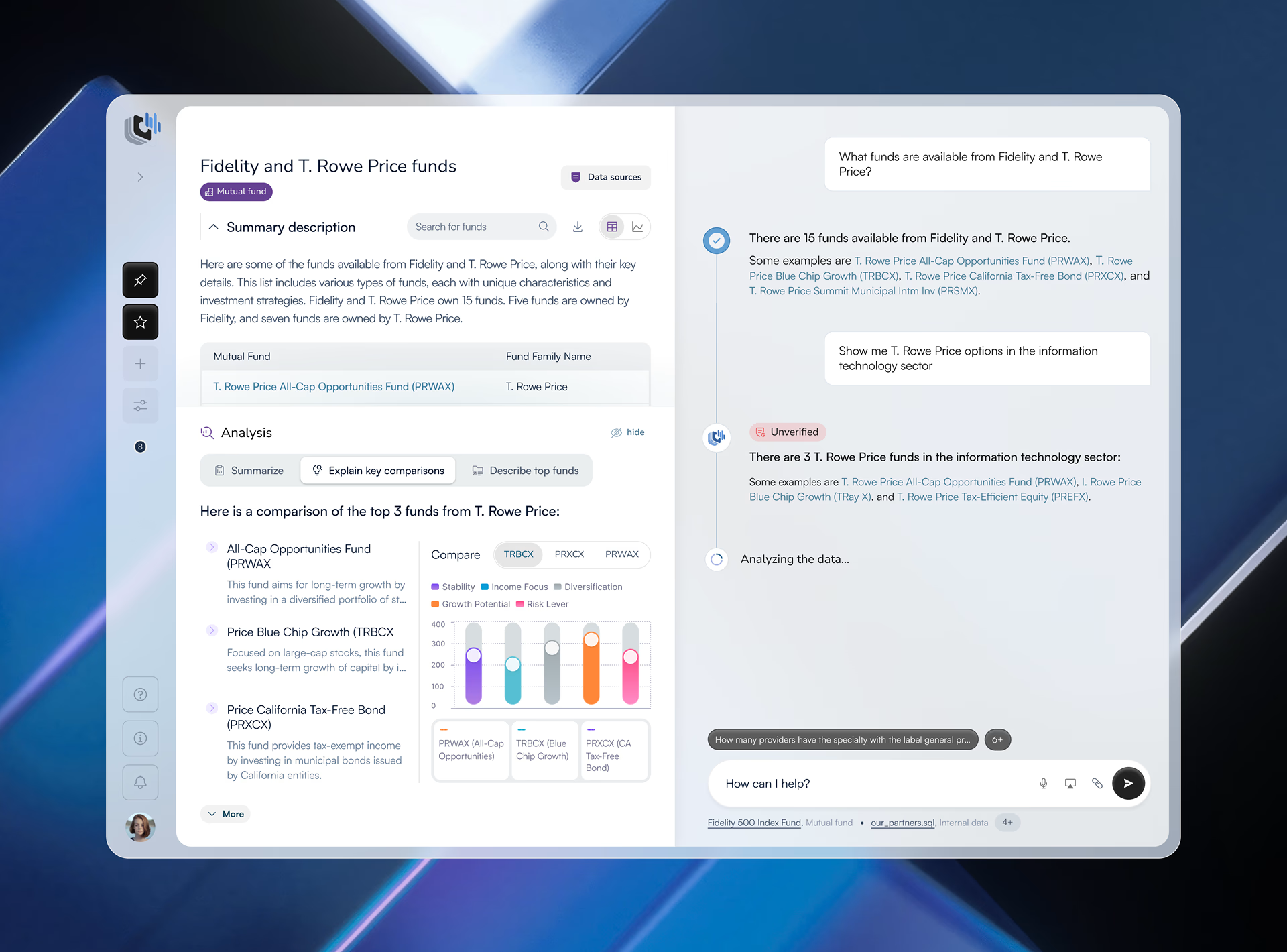
In the Stardog Voicebox project, the design puts a structured fund data table beside the live AI chat in one view. On the analyst’s screen the designer also pins the rows behind the current answer to the top of the table. She reads the sentence and the measured rows behind it without scrolling, and the two keep different styling, so generated text never passes for table data.
Room is the cost. A conversation panel and a table compete for the same width, so the designer decides which columns earn a place beside the answer and what happens on a laptop too narrow for both. A generated draft makes that choice silently, by leaving the table wherever the layout first put it.
A marker on the answers that need checking
Every answer in the draft got the same confidence treatment, which tells the analyst nothing about which one to check. The Voicebox design puts a verification marker on each AI response, and the marker separates answers the system generated with high confidence from those that warrant manual review. Only the second state is built to catch the eye, because a warning on every answer teaches people to ignore warnings.
Where that line sits is the hard decision. A review flag that fires too often fades into the background while one that fires too rarely lets a wrong answer through unflagged. On the analyst’s screen the threshold starts as a design estimate and then moves as the team watches analysts work, noting which answers they check by hand even when no marker asked them to.
That threshold has a ceiling the design cannot raise. The marker can only repeat the system’s own confidence, so a model that is overconfident about a class of answers produces a reassuring screen on exactly the answers that most need a second look.
Dataset context before the first question
The third change covers the moment before anyone types. The Stardog Voicebox case study names this the cold-start problem: a first-time user has no signal about what the system knows. The design answers it by showing which dataset is active and what it contains before the first question. On the analyst’s screen that matters because a question asked of the wrong dataset still gets a fluent answer.
Across the whole redesign, the case study reports a 20% increase in time users spent engaged with the platform and a 27% increase in new-user conversion. It does not break those figures down by feature, so neither number can be credited to the marker or the dataset context alone.
The fourth change: failure states nobody puts in a mockup
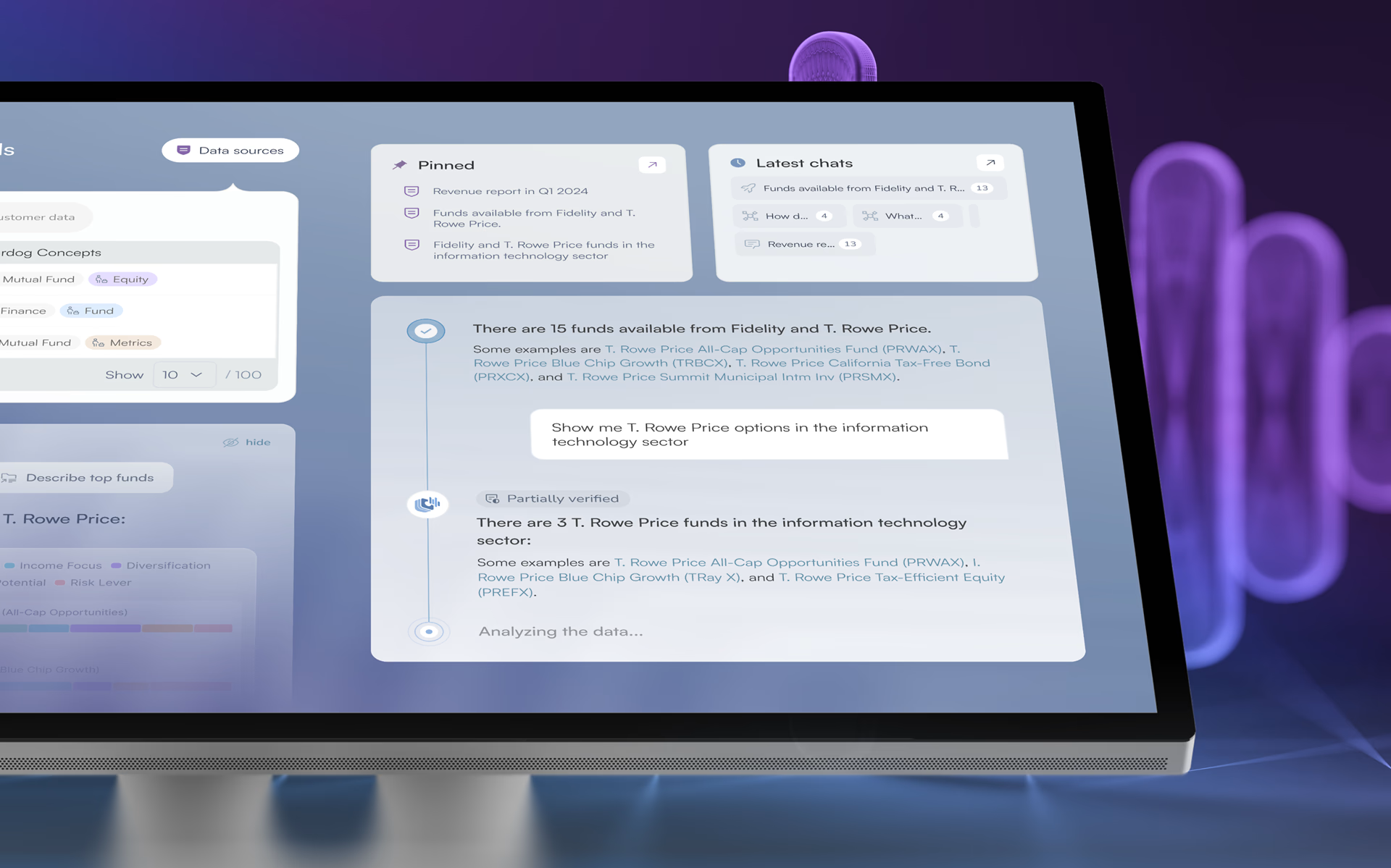
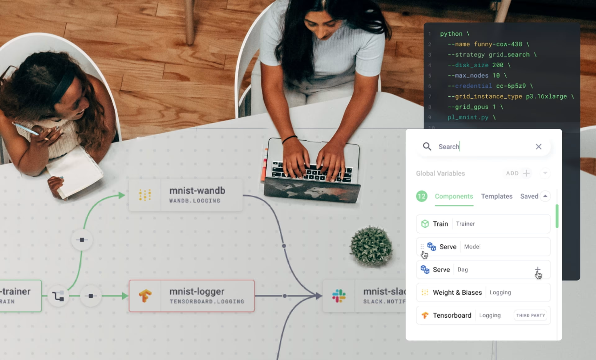
Grid.ai, now part of Lightning AI, is where we worked through this problem. Our Grid.ai platform design gave the Train product a design system that covers what an engineer sees when a run fails, when data arrives incomplete and when results come back partial. Mockups rarely show those screens.
We documented every component so the client’s developers could implement it, failure states included. Documenting a state means writing down its message and the action open to the user, in enough detail to build from without guessing. A design system that stops at the success state leaves its hardest screens to whoever writes the code when the first failure reaches production.
The analyst’s screen needs the same treatment. An empty result should look different from a table that is still loading, and a failed query should never leave the previous answer on screen looking current. When the table loads half its rows, the answer drawn from it says so and offers a choice between retrying and continuing with the gap marked.
Usage cost in the brief’s header follows the same logic as Train, where we made compute cost visible on every view. A cost that only appears on a billing page arrives after the decision it should have shaped, so on the analyst’s screen the readout stays in the header through every state, including the failed ones.
Step 4: from the reviewed screen to Claude Code
Claude Code builds the reviewed version against the real codebase, reading components from the repository or, where the system lives in Figma, pulling variables and components through the MCP server. It works from the reviewed screen, with the saved first draft kept beside it as the record of what changed, so the four changes reach code as decisions rather than as notes.
The designer still checks the build. The states in code have to match the documented ones, so a partial table in the product looks like the partial table in the system. Contrast and reading order need a human pass too, because a screen reader will meet the answer and the table in whatever order the markup puts them.
Marker placement gets its own check. The designer runs a set of real questions through the built screen and confirms the flag lands on the answers that warrant review and stays off the rest. A threshold that looked right on prototype data can behave differently once live data flows through it.
What comes out is code that matches the reviewed screen, with one value still open. That value is the marker threshold. It has not met a real analyst yet, and the first weeks of use will show where it should sit, so it ships as a setting the team can move without a redesign.
Why the review has to happen before code
The tools produce the first screen in one session, and any team with a Claude plan can do the same. What an AI-driven design agency adds is the four changes and the habit of looking for them. The brief asked for a visible table and said nothing about markers, dataset context or failure, and each change came from a decision already tested on a shipped product.
That is also why the review is hard to postpone. Once Claude Code has built the draft as generated, each of the four changes stops being an edit to a prototype. It becomes a change to shipped components, with tests and a release attached. In other words, a whole lot more expensive.
Three checks to run on your own generated screen
These three checks catch most of what a generated screen leaves out, and none of them need a design tool. Run them on the prototype before it goes to Claude Code, while each fix is still a one-line change to the brief.
Start with one figure. Open the generated screen beside the data it describes and try to confirm a single number from an answer. If that takes scrolling, filtering, or a second query, the answer is cut off from its source, and an analyst under deadline will skip the check. The fix is placement: the rows behind the answer belong in the same view.
Markers come next. Take a handful of real answers and mark the ones a person should verify before acting on them. Then see whether the screen can tell them apart, because a confidence treatment that sits on every answer, or on none, gives the analyst no way to choose.
Then break the screen on purpose. Ask it something the dataset cannot answer, cut the table to half its rows, and open it as someone who has never typed into it. Each of those should land on a state a designer drew and documented, and a blank panel or an endless spinner means only the path where everything works was designed.
A screen that passes all three is ready for Claude Code. One that fails any of them goes back to review with the failing case written down. That note becomes the next line of the brief, so the second screen in the product starts closer to right than the first one did.
Frequently asked questions
What is an AI-driven design agency?
An AI-driven design agency produces first drafts with tools such as Claude Design and Claude Code and spends its design hours reviewing those drafts against the brief and the product’s real data. The deliverable is the reviewed screen and the documented decisions behind it, built in the client’s own design system.
How is it different from a design agency that only uses Figma?
A Figma-only agency designs in Figma frames, builds prototypes, and hands developers a design to rebuild in the product’s codebase. An AI-driven agency builds the prototype in the product’s own coded components and hands the reviewed version to Claude Code to build against the real codebase. Design judgment matters in both, and in the AI-driven model the review happens on a screen already close to production.
Does the agency need access to our codebase or our Figma library?
Agency access is needed wherever the design system lives. In the repository path, that means read access to the components in the codebase, and in the Figma path it means the published library. Without that access the tools generate a generic system, and the mismatch surfaces at handoff.
How long does the first working prototype take with Claude Design?
A first Claude Design prototype takes one working session, usually the same day. The reviewed and documented version is part of the full design engagement, which typically runs 8 to 16 weeks from research through engineering handoff.
Who owns the design system after the project?
The client owns the design system. It lives in the client’s repository or Figma library, and every component is documented for the client’s developers, as on Grid.ai.
Why is there a review step between Claude Design and Claude Code?
The review step exists because a generated prototype draws the path where everything works and leaves out the sources, markers, and states a user needs before acting on an answer. The review is not priced as a separate item. It is part of the design engagement and is scoped with the rest of the project.
How do we know the output is not generic?
A generic script doesn’t explain where a figure came from or why one answer carries a marker and the nextn’ts not. Ask the agency for the saved first draft next to the reviewed screen, with each change and the decision behind it documented. The saved draft from step 2 exists for exactly that comparison.