7 healthcare UX design examples worth studying in 2026
On our Health Monitor EHR redesign, one of the first things we considered was touch. The record had to work equally well on a tablet or touchscreen. Its users included primary care doctors, nurses and emergency care providers, and emergency work leaves almost no time to learn new software.
Healthcare UX design examples are documented interface cases that record who uses a screen, in what setting and under what time pressure and which rule, device or data limit shaped it. The seven examples below fall into three groups: a clinical record used during care, automated output that a person checks, and tools that patients or the general public can use with no training at all.
How to read healthcare UX design examples
Read each case for its users and setting first, and its layout second. FDA’s final human factors guidance was first issued in February 2016 and reissued on August 3, 2026. It defines a use environment as the “actual conditions and setting in which users interact with the medical device.” Much clinical software is not a medical device, but the same questions apply to it.
The setting changes what a screen has to do. A patient opening a lab result at home may have time but lack the clinical context to interpret it. An emergency provider has the context and very little time. A patient screen has to supply the missing context, and an emergency screen has to cut the time it takes to find a value.
Health Monitor, Radiology Queue and ClyHealth are Fuselab projects. ClyHealth is described from its published case study. The other four cases come from federal agencies, a technology company and a medical center’s researcher, and this article uses only what those organizations have published.
Seven healthcare UX design examples in three groups
The first group is Health Monitor, an EHR that clinicians use on a tablet during a care session. In the second group, people check automated outputs before it counts: x-ray specialists check Radiology Queue’s automated measurements, clinicians check Abridge drafts, and providers check ClyHealth patient data. The third group covers tools that patients and the public use away from the clinic: patient portal results, CDC activity levels and Medicare Plan Finder.
Health Monitor EHR: a touch-first record for busy clinical settings
A provider reviewing a patient in Health Monitor compares labs, notes, orders and exam findings. Any value on another screen must be held in memory while the provider switches screens. We brought those items into one simplified view. For critical care, we designed a full-body graphic that marks the patient’s problem areas, so a provider can zero in on a specific condition/body part before opening a single panel.
The redesign set out to bring the data held in existing EHR systems into one interactive record. On a tablet, every extra touch costs time. Reducing the number of touches a provider needed was one of our primary goals. Panels slide up or down to reveal more data, and the interface had to be learnable in the limited time emergency staff has to learn new software.
We also designed the interface to work with several third-party applications, with the goal of sparing providers from logging in and out of separate record systems. This is a huge and unresolved issue in the healthcare community; just ask anyone. Connecting those systems was an enormous task for the development team. In our view, that integration work sets the ceiling for design, since a single view can show only what the connected systems supply.
Radiology Queue: annotations that must be clear without a follow-up call
Most of the X-ray specialists using Radiology Queue never spoke with the medical provider who would read their notes. Specialists review each X-ray and annotate it with notes and measurements for providers in many parts of the care workflow. Every annotation therefore had to be clear without a follow-up call.
We gave specialists drawing tools and color. An image settings panel adds highlight, contrast and density controls. Color coding, both automated and added by hand, marks areas of concern for a quick first review, and those labels can be moved into a written list for detailed notes. The provider then works from the same X-ray and can contact the radiology clinic with a question or a request for another image.

Automated measurements gave specialists a starting value. The specialist’s hand-documented measurement remained the final value, because we did not yet trust machine learning to produce it. For the cardiothoracic ratio, used to assess an enlarged cardiac silhouette, the tools let the specialist zoom in and place each measurement as precisely as the image allows.
Abridge ambient documentation: tracing a drafted statement to its source
A clinician using Abridge starts from a draft. The system turns the conversation between patient and clinician into draft documentation, and Abridge states that clinicians are required to review and verify their notes before filing them in the electronic health record. The design problem is therefore the review, and how quickly a clinician can confirm that a statement reflects what was said during the visit.
FDA’s clinical decision support guidance, issued on January 29, 2026, describes automation bias as “the propensity of humans to over-rely on a suggestion from an automated system.” It adds that the bias increases in situations that require urgent action. A documentation tool is a different kind of software, but a fluent draft reviewed under time pressure may invite the same shortcut.
Abridge’s feature for this is Linked Evidence. When a clinician highlights text in the note, the matching transcript passage lights up, and selecting Play starts the original audio. The company also describes a model that detects unsupported claims in draft documentation and an automated system that corrects them. Abridge still calls clinician review essential, which leaves buyers with a practical question: can the reviewer see those corrections?
ClyHealth protocol review: one record, two readers
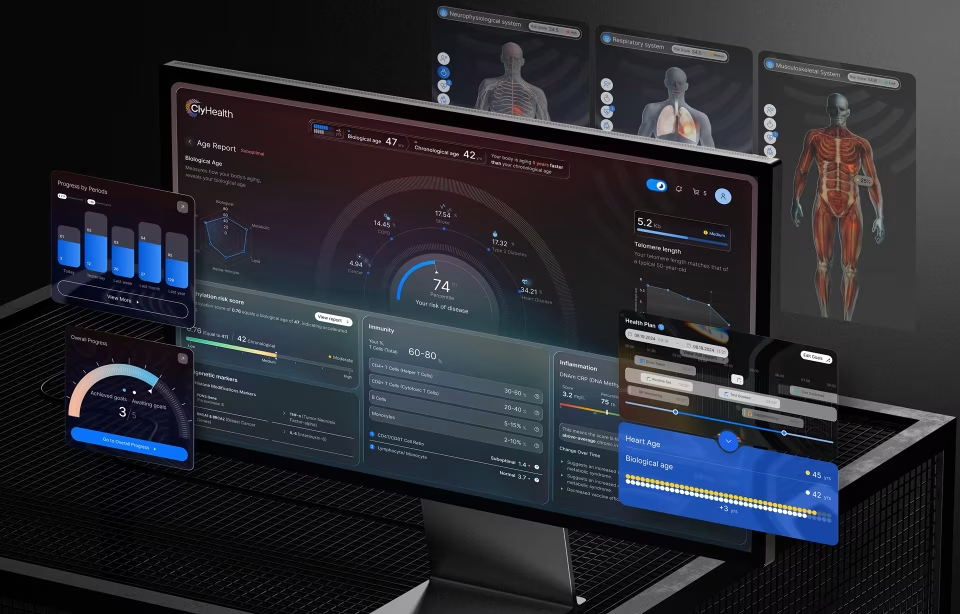
Fuselab designed the interface and custom API layer for ClyHealth, a personalized health platform built as the front end for an existing electronic health record. ClyHealth’s supplement module combines biomarker analysis, lifestyle data, lab results and health goals to propose a daily supplement protocol. The formulation reasoning appears beside that proposal. A provider reviews the logic before approving the protocol for a patient.
Providers and patients both read the record. They bring very different training to it. For patients, a progress view shows how their biomarkers have changed since they started a protocol. The platform’s AI assistant tells both groups that its answers are based on the patient’s own record, to signal that an answer is not general health advice.
The case study reports that the full system was user tested with patients and clinicians before launch. It does not say how those sessions were run or what they found, so this example shows the design intent more clearly than the outcome of that testing.
Patient portal test results: released before the clinician has reviewed them
Federal information blocking rules became applicable on April 5, 2021, and on October 6, 2022, their scope widened from a defined set of data elements to the full definition of electronic health information. Vanderbilt researchers note that many health systems now release test results into patient portals immediately.
The federal health IT office, ASTP/ONC, says in its guidance that a provider policy that delays lab results “for any period of time” so the ordering clinician can review them first would likely be interference. Such a practice would not qualify for the Preventing Harm exception, though each delay is judged on its facts. Notification, which decides whether the patient is prompted to look, is a separate configuration choice.
Consider what happens when a result posts. The portal may notify the patient, who may open the result before the clinician has reviewed it. At Vanderbilt University Medical Center, immediate notifications for all results increased the proportion of patient-before-clinician review fourfold, according to a 2023 study in the Journal of the American Medical Informatics Association. Later opt-in notifications reduced that proportion only slightly, by a reported 2.4%.
A 2025 study in JAMA Network Open, by researchers at the same center, then tested presentation. Over a 2024 study period, the center released results in a patient-friendly educational format for the tests that generated the most patient messages. These included metabolic panels, blood counts and thyroid tests. Across 829,902 results reviewed by 205,139 patients, the authors observed no clinically meaningful change in patient messaging.
Our reading is that portal teams should test notification rules as carefully as result screens. In the 2023 study, a change in notification rules was followed by a fourfold change in who saw a result first. The three Vanderbilt papers cited here come from one academic medical center, so effects elsewhere may differ.
CDC respiratory activity levels: a label that carries its own baseline
CDC publishes its respiratory virus activity levels for a general audience. CDC tracks acute respiratory illness this way “so people can easily compare states and understand how much illness is occurring in their area.” The levels classify the weekly percentage of emergency department visits due to acute respiratory illness. There are five categories, from Very Low to Very High.
The baseline is built into the label. For each HHS region, CDC identifies the weeks with the lowest respiratory activity, and the resulting baseline marks the top of Very Low. A reader can interpret High without knowing the baseline percentage. Because each region’s scale starts from its own low-activity weeks, High can stand for different percentages in different regions.
CDC’s page also marks incomplete data. On its chart of percent positive tests for respiratory viruses, the most recent weeks are shaded gray. Delayed reports can still change those weeks, and the shading shows readers which part of the line is provisional.
Medicare Plan Finder: the gap a 2019 audit found
In 2019, the Government Accountability Office reviewed the Medicare Plan Finder that beneficiaries and caregivers use to compare coverage. GAO found that the site required navigation through multiple pages before plan details appeared, lacked prominent instructions, and used complex terms. In its survey of State Health Insurance Assistance Program (SHIP) directors, 73 percent reported that beneficiaries have difficulty finding information in the tool.
GAO’s second finding concerned the data. The results pages did not integrate information on Medigap plans, so the tool could not fully support a comparison of Original Medicare with Medicare Advantage. Among the SHIP directors GAO surveyed, 75 percent said that gap limits beneficiaries’ ability to make that comparison.
The Centers for Medicare & Medicaid Services relaunched Plan Finder on August 27, 2019. CMS said the new version would let users compare pricing across Original Medicare, drug plans, Medicare Advantage plans and Medigap policies, and that it ran consumer testing throughout development. The case is useful because the audit described the missing data in terms a design team can act on. This article has not reviewed the current tool.
What these examples cannot tell you
A documented case shows a decision and its setting, and it stops short of showing that an interface is safe or that it improved care. None of the three Fuselab case studies cited here publishes outcome measures, as we are often under strict NDA protocols with our healthcare clients. The Vanderbilt research measured patient behavior, such as who read a result first and whether patients sent messages, and it does not report clinical outcomes.
FDA’s human factors guidance separates two kinds of evidence. Formative evaluation explores “user interface design strengths, weaknesses, and unanticipated use errors” and is repeated during development. Human factors validation testing comes at the end of development and looks for use errors that could cause serious harm. The guidance notes that validation testing is sometimes called summative testing, and it warns that some definitions of summative testing omit essential components.
Published cases rarely say which of these evaluations a team ran, with which users, or in which setting. The ClyHealth case study names the two user groups the system was tested with, but not the method. Our own Health Monitor and Radiology Queue case studies describe the design reasoning without describing the testing.
The Fuselab case studies cited here do not state a regulatory pathway for Health Monitor, ClyHealth or Radiology Queue, and this article does not describe the regulatory status of those or any other Fuselab projects. It is also not legal advice on the information blocking rules, which ASTP/ONC says require a fact-based, case-by-case assessment.
Turning healthcare UX design examples into a project brief
Six questions belong in a project brief at the start of discovery. The first three cover people and systems: each role’s setting and time pressure, the record systems users sign into, and the handoffs that happen without a conversation. The other three cover information: who checks an algorithm’s output and against what, which rule controls when users see information, and whether each comparison or label has a findable reference point.
Once each role’s setting and time pressure is written down, list the record systems. On Health Monitor, the goal of removing separate logins depended on working with several third-party applications, so an inventory of those systems belongs next to user research. For each system a provider signs into during a shift, note what data it holds and whether the new interface will read from it or only link to it.
Map the handoffs next. Radiology Queue was designed around specialists and providers who seldom, if ever, talk, so the annotation had to carry the whole message and the provider needed a route back to the clinic. The same gap appears between a lab and an ordering clinic, or a monitoring team and a physician. Each of those handoffs needs content that stands alone and a way to ask a question.
The information questions follow. Name who checks an algorithm’s output and what they check it against: the image in Radiology Queue, the transcript in Abridge, the stated reasoning in ClyHealth. Check which rule governs when a patient sees a result, which may need a case-by-case legal assessment. Where people compare options, confirm that the data covers every option and that each label rests on a reference point readers can find.
If you are planning a clinical dashboard, patient portal, AI-assisted workflow or medical-device interface, start discovery by defining the use environment, the accountable reviewer and the systems the product must connect to. Fuselab’s healthcare UX design best practices guide covers the principles behind clinical products in more depth.
Frequently asked questions
What is a use environment in healthcare UX?
A use environment is the setting and the conditions in which people use an interface. FDA’s human factors guidance gives examples that include clinical and non-clinical settings, community settings and moving vehicles, along with conditions such as lighting and noise. The same idea is useful for clinical software, where the hardware in use, such as a tablet or workstation, and the time available for the task belong in the description.
Are healthcare UX design examples evidence that an interface is safe to use?
Healthcare UX design examples show design decisions and their context, and they do not establish that an interface is safe. For medical devices, FDA’s human factors guidance places validation testing at the end of development, after formative evaluations have shaped the design. A buyer should expect to see which of those evaluations a team ran and which user groups took part.
How does reviewing an AI-drafted note differ from approving an AI recommendation?
Reviewing an AI-drafted note means checking statements against a source, so the screen needs a direct link from a statement to the conversation it came from, as in Abridge’s Linked Evidence. Approving an AI recommendation means judging one proposal, so the screen needs the reasoning placed beside it, as in ClyHealth’s protocol review. Both leave a person responsible for the result.
What should a buyer ask an ambient documentation vendor about automated corrections?
Buyers of ambient documentation should ask whether the clinician can see which statements an automated system changed or removed before the note is filed, and whether those changes are recorded. Abridge, for example, describes automated detection and correction of unsupported claims while calling clinician review essential.
Can a patient portal let patients choose to wait for their clinician before seeing a result?
Patient portals can offer that choice, because ASTP/ONC says following an individual patient’s request to delay release of their results would likely not be interference. The office gives “upon their clinician’s review” as one example of a condition a patient and provider might agree on. It adds that a delay should generally last no longer than necessary to fulfill the patient’s request.
Can a healthcare interface be designed without access to clinicians?
A healthcare interface can be sketched from documents, workflow records and existing systems, but decisions about its setting and clinical workflow need input from the clinicians who work there. What a provider must see before approving an AI proposal cannot be settled from documents alone. Formative sessions with clinicians take time to arrange, so they belong in the project plan from the start.
How can you tell whether a healthcare UX design example came from a shipped project?
Healthcare UX design examples from shipped work usually name the users, the setting and the systems the interface connected to, and they admit at least one limitation. Concept work can include the same details, so the stronger test is whether the team can explain them in its own words when asked. A case study that names no users or setting gives a buyer little to check.