LLM observability: what to monitor and how to show it
LLM observability records what a language model did on each request, including the prompt, context, tool calls, output, token cost and any evaluation results, so a team can trace a bad answer to its cause. It matters because a request can return HTTP 200 in 400 milliseconds, stay inside every latency and error threshold, and still give a customer an answer that is wrong.
What is LLM observability?
LLM observability is the combination of tracing, evaluation and user feedback that shows whether a language model’s answers were right, as well as whether the service responded. Classic application monitoring watches execution, meaning whether the service is up and how fast it answers. A model can pass both checks while inventing a refund policy, which is why output quality needs signals of its own.
The signals fall into four families. System performance covers latency and error rate, the same family any APM tool already tracks. Resource use counts input and output tokens and converts them into dollar cost per model. Model behavior shows up in evaluation scores for faithfulness or relevance, produced by rules, human reviewers or another model acting as a judge. User feedback adds explicit ratings and implicit signals such as retries.
A model monitoring dashboard built for classic machine learning tracks feature drift and prediction distributions across a batch, which suits systems where failure shows up as a population shift. LLM failures are often individual, and one bad answer can trace back to one retrieved document. Catching that takes a record of every request, with each step attached.
The data layer for those records is converging on the OpenTelemetry GenAI semantic conventions, which live in their own repository and are still in development. The standard records the requested model and the responding model separately, because a fallback or an alias can change which model answered. Copy that onto the screen. A trace that shows only the requested one sends an engineer to debug the wrong model.
LLM monitoring vs LLM observability
LLM monitoring tells a team that something is wrong by checking metrics against thresholds: latency, error rate, an average quality score. Observability lets the same team find out why, by keeping the trace behind every metric so an alert opens onto the requests that caused it.
Google’s Site Reliability Engineering book frames the split as two questions every monitoring system has to answer: what’s broken, and why. Its advice is to spend far more effort catching symptoms than causes, and to keep cause-oriented detail as an aid to debugging. That maps cleanly onto LLM products. The symptom is a falling quality score, and the cause sits somewhere inside a trace.
The same book holds that every page should be actionable. An alert that reads “faithfulness below 0.8” fails that test unless it names the route and the time window and opens onto the failing requests. Without them, the engineer on call starts from an empty search box and rebuilds context the alert already had.
Why the screen matters more than the data
Picture an overview with five cards of equal size: quality, cost, latency, error rate and token volume. A jump in unsupported answers and a 40-millisecond latency blip arrive looking identical, one rectangle and one sparkline each, and the reader has to know in advance which one matters. The data on that screen is correct. The order is the problem.
Most LLM observability tools collect the right data, and their documentation explains it well. It says little about the screen: which signal should lead, and how a reader gets from that signal to the evidence behind it. A quality drop and a latency wobble trigger different decisions, so the screen has to weight them differently.
Telecom network operations have a version of this problem. Fuselab designed OptivionAI, an AI-assisted telecom operations platform, around the observation that an alarm list tells an operator something failed without showing where. Its city view sorts by exception. A Failure Band Drop marker and a SINR reading of -14 dB pull the eye to Sector C1, while healthy sites recede into the map.
The supporting numbers stay close without competing. Packet loss, SLA breach risk and latency sit on a KPI rail beside the map, visible at a glance but drawn quieter than the failing sector. An LLM screen needs one signal that pulls the eye and a rail of numbers that explain it.
In the antenna view above, the power amplifier anomaly is marked on the unit where it sits, and the readings that explain it stay around it instead of moving to a separate table. The LLM equivalent is a quality score that opens directly onto its traces, with cost tied to the requests that spent it.
What an LLM observability dashboard should show first
The first screen of an LLM observability dashboard should lead with the route or prompt version whose evaluation results have moved furthest from their own baseline on enough traces to trust. Draw it as the heaviest element on the page. Cost and latency belong on a side rail, visible in one glance but quieter, so a cost jump that arrived with a quality drop is still caught.
Exception sorting decides visual weight. Failing items get color and position at the top. Healthy routes get neither and collapse into a single quiet row, which tells the reader nothing else needs attention. Each item in the top band carries a trend line against its own baseline, since the same failure rate can be alarming on one route and normal on another.
Change markers belong on those trend lines. Prompt releases, model swaps and index rebuilds should appear as ticks on the time axis, because the first question in any regression is what changed. A failure curve that bends upward at the same tick as a prompt release gives the reader a first suspect before any trace is opened, and only the trace can confirm it.
A judged score should never look as certain as a measured latency. Latency and cost are measurements. A faithfulness score is a judgment, usually made by another model on a sample of traffic. A UC Berkeley-led study of LLM judges documented position, verbosity and self-enhancement biases in exactly that setup. A judge can agree with people most of the time and still lean in predictable directions.
The score on screen should therefore show its source. That means the evaluator that produced it and the number of traces behind it. Fuselab’s working rule for AI interfaces is that a projection never looks as certain as a measurement. Judged quality is the observability version of a projection. A failure rate built on 40 sampled traces deserves a lighter mark than one built on 4,000.
A noisy judge wired straight into the top band teaches people to ignore the top band. Alerts on judged scores therefore need a minimum sample and a sustained window before they fire, and the screen should say when a score is too thin to trust. Quality still leads an LLM evaluation dashboard, because a wrong answer is the thing the user acts on.
From alert to failing trace
Take a hypothetical support assistant. On a Tuesday, answer-correctness failures on the refund-policy route climb past that route’s baseline in the top band. Two change markers sit near the bend: an index rebuild at 6 a.m. and prompt version 14 at 9 a.m. Light early traffic hid the damage until mid-morning. Flat cost and latency on the side rail rule out a capacity problem.
One click on that row should open a list of failing traces already filtered to the route, the time window and the failing evaluator. The worst version of this step drops the engineer into an unfiltered log search, where the relevant requests sit among thousands of healthy ones. OptivionAI treats fault isolation as a filtering problem. An operator can hide everything except the affected path.

Opening one trace shows a tree. The request sits at the top, the retrieval span and model call sit beneath it, and normal spans are dimmed so the eye lands on the odd one. Here the retrieval span stands out: its source document carries last year’s date and the index version from 6 a.m. The rebuild had restored an old refund policy. The prompt change was innocent.
That outcome is why the route from alert to trace matters. Without it, the obvious move would have been to roll back prompt version 14, which wastes the morning and fixes nothing. In OptivionAI, whoever opens an incident, whether an operator at the desk or a technician at the tower, reads one incident record instead of two versions of it.
An LLM incident deserves that continuity. The alert, the filtered list, the trace and the engineer’s notes should stay one record, so whoever picks it up next sees the same evidence instead of rebuilding the investigation from a ticket title.
Root cause at a glance
OptivionAI’s Tower Power Flow Analysis shows 685 events across seven days as a Sankey diagram. Paths run from root-cause categories through subcategories to output-voltage outcomes, and path width carries the case count, so the dominant cause is visible before anyone writes a query. The project page names the habit it replaces: root cause analysis usually means a query, an export, and an argument about what the data meant.
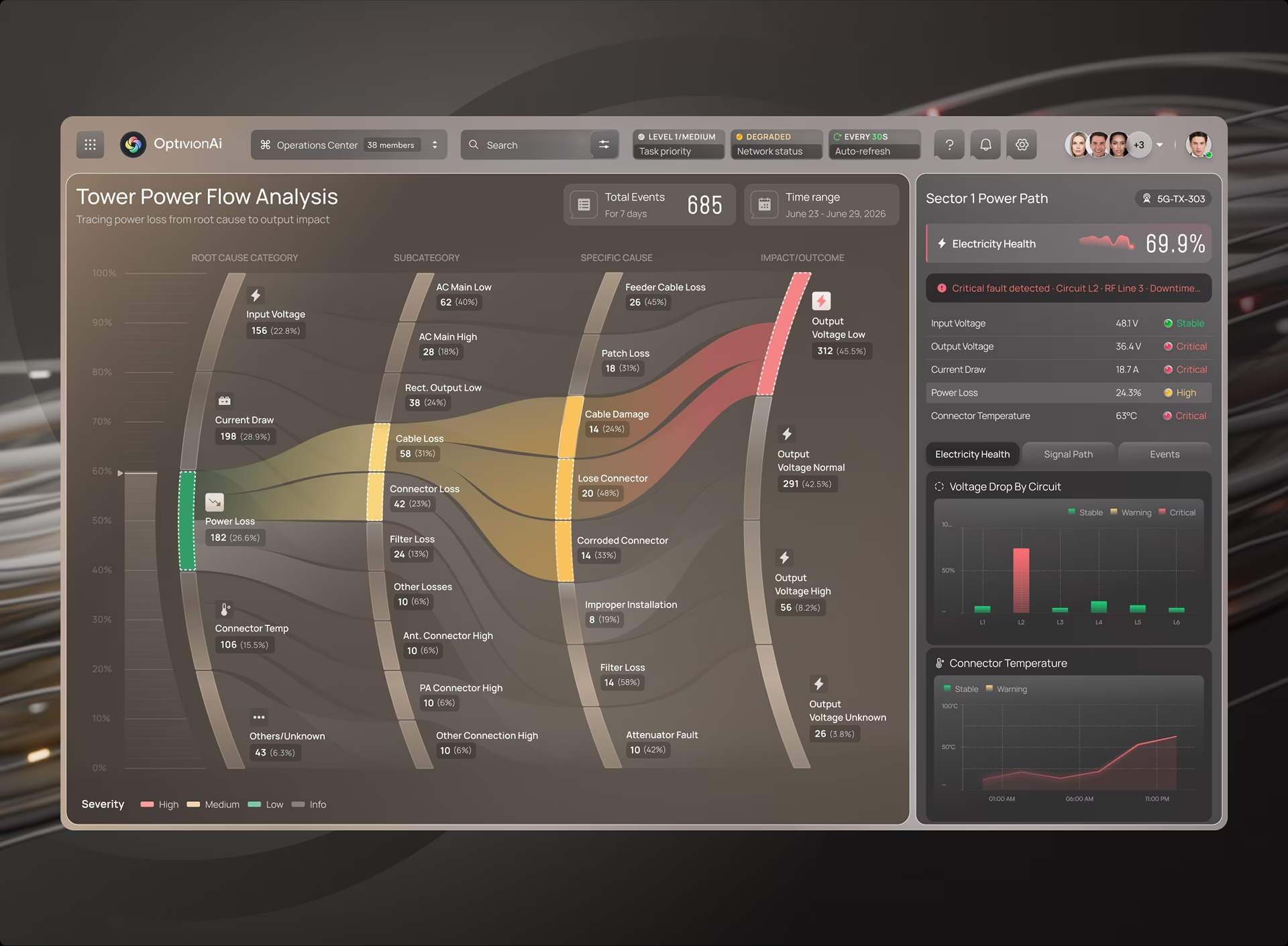
For LLM observability, the categories should come from the trace itself. Grouping failing traces by where the failure started, and by what changed before it, gives four groups most teams will recognize. Most of them map to operations the OpenTelemetry conventions already name, such as retrieval and execute_tool.
A tool timeout needs no judgment, but the line between a retrieval miss and a prompt regression often does, and that label is frequently assigned by another automated classifier with the judging problem described above. OptivionAI’s Sankey keeps an Others/Unknown path on the chart. An LLM root-cause view needs that bucket too, because hiding it makes the chart look more certain than the system behind it.
Sized correctly, the view answers two questions at once. It shows what fails most often, and which request to open first. If, say, 300 failing requests trace to empty retrieval and five to tool timeouts, the team fixes the retrieval pipeline before anyone touches the prompt.
Cost per request as a first-class view
Cost per request belongs on the side rail beside the quality band, and per span inside each trace, because spend in an LLM product moves with behavior. A longer system prompt, a retry loop or a more verbose model can raise the cost of every request without triggering an error. Only a per-request view connects that spend to the change behind it.
One cost number hides too much. The OpenTelemetry conventions report cached input tokens as a subset of input tokens and reasoning tokens as a subset of output tokens, and cached input is usually billed at a lower rate. Reasoning tokens are the sharper case. They are typically billed as output but never appear in the answer, so a request can grow expensive with no visible change in output length.
A useful cost view lets a reader filter by model or prompt version. It should also open the most expensive request inside a trace, with cost shown per span. A team chasing a quality regression may find the same route also doubled its prompt length, which is easy to miss when cost lives on a billing page.
AI agent observability
AI agent observability extends tracing to runs where one model call triggers others, so a single request becomes a tree of decisions, tool calls and handoffs. The screen has to show that tree as one connected chain and mark the step where the run went wrong, because an agent acting across systems can turn one bad step into several.
Agent work has its own operation names in the OpenTelemetry conventions: invoke_agent for the agent and execute_tool for each tool call. An agent can finish its task and still fail in a way worth seeing, because it looped, took an unusual tool path, or spent far more tokens than a normal run. The overview should flag runs whose path length or token count departs from the norm.
The detail view has a narrower job. It should show where the run diverged and what the agent saw at that step, without turning every run into a sprawling flowchart. Fuselab’s guide to designing UI for AI agents covers the controls operators need when they supervise agent autonomy directly.
How to judge the UX of LLM observability tools
The fastest way to judge LLM observability tools is to seed a real failure into a trial and time how long an engineer takes to reach the failing span. A tool that collects every signal but makes that route long will be slow during an incident, whatever its feature list says.
Langfuse’s documentation describes cost and latency broken down by user, session, model and prompt version, with threshold alerts. Arize Phoenix is built on OpenTelemetry and OpenInference and adds span replay, which reruns an LLM call with different inputs. For either one, the trial question is how fast the screen gets a person to the answer.
A trial built around one seeded incident tells a team more than a feature comparison. Run these five checks with the engineers who will be on call:
- What leads the first screen. Seed a quality failure and a latency blip at the same time and note which one draws the eye first.
- Clicks from score to span. Count the clicks from a failing score or alert to the span that caused it, and check whether filters carry over at each step.
- Where cost appears. Ask for the most expensive step of one failed request. Cost should sit on the side rail beside quality, and per span inside the trace.
- How judged scores are labeled. Check whether each score shows its evaluator and sample size, or appears as a bare number.
- What happens to unknowns. Look for failures the tool cannot classify, and check whether they stay visible or quietly drop out of the root-cause view.
Where to start
Start with the LLM observability screen your team opens during an incident and ask one question of it: does the failing signal outweigh the healthy ones? If a quality drop and a latency blip still look the same, the hierarchy is wrong. Fix it before adding another metric. Teams redesigning that screen, or building their own tool, can see how Fuselab approaches the ordering in its AI dashboard design work.
Frequently asked questions
What is LLM observability?
LLM observability connects every request in a language model application to its trace, evaluation results, user feedback and token cost, so a team can see why an answer went wrong. It differs from uptime and latency monitoring because it checks the quality of the output as well as the health of the service.
What should an LLM observability dashboard track?
An LLM observability dashboard should track traces and spans, latency and error rate, token usage and cost per request, evaluation scores, user feedback, and the prompt and model versions behind each request. The first screen should lead with whichever route or prompt version has moved furthest from its quality baseline, with cost and latency on a side rail.
What is the difference between LLM monitoring and LLM observability?
LLM monitoring checks metrics against thresholds and tells a team that something is wrong. LLM observability keeps the trace behind each metric, so the team can open an alert onto the specific requests and spans that caused it.
How is LLM observability different from traditional APM?
Traditional application performance monitoring tracks system behavior such as response time, errors and infrastructure load. LLM observability adds signals APM has no field for, including evaluation scores, prompt versions, retrieved context and the model that responded, because an LLM request can succeed technically and still return a wrong answer.
How do you evaluate the UX of an LLM observability tool?
LLM observability tool UX is best evaluated by seeding a real failure into a trial and timing how long an engineer takes to reach the failing span. Check what leads the first screen, whether filters carry over from alert to trace, and whether judged scores show their evaluator and sample size.
How much does it cost to design an LLM observability dashboard?
An LLM observability dashboard design project with Fuselab starts at $25,000, with design work billed at $100 to $149 per hour according to Fuselab’s Clutch profile. The final cost depends on the number of workflows and user roles, whether research with on-call engineers is in scope, and whether the work includes a full design system.
How long does an LLM observability dashboard design project take?
An LLM observability dashboard design project typically takes eight to twelve weeks, depending on scope. The first screen and the alert-to-trace route are designed first, with root-cause and cost views following once those are settled.