Chatbot UI design patterns and best practices for 2026
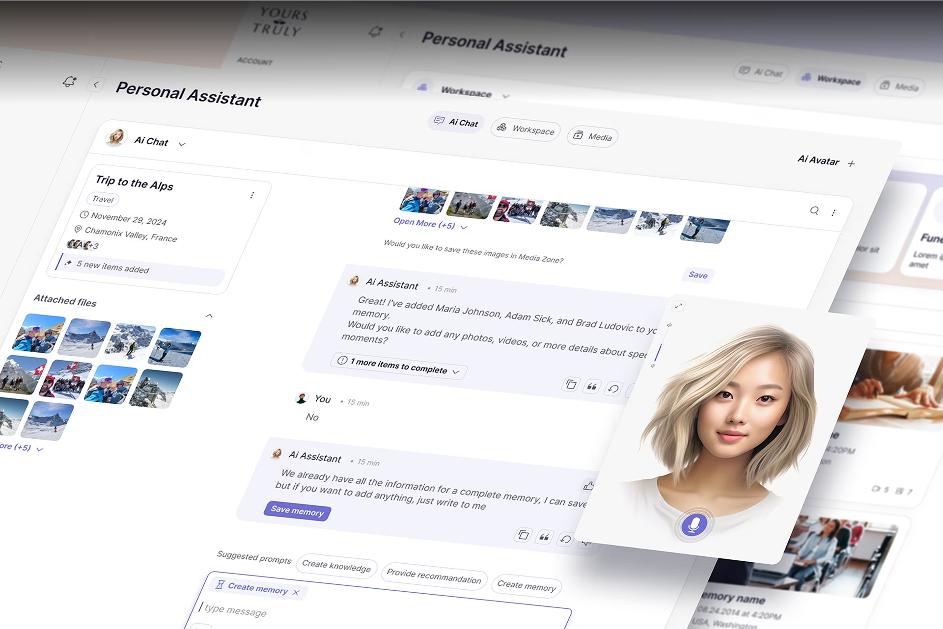
Chatbot UI design is the discipline of building the visual and conversational surface through which users interact with an AI-powered messaging system. Strong chatbot interface design is evaluated on four properties: capability transparency, recovery patterns, confidence display, and accessibility. Within Fuselab’s broader AI UX/UI design agency practice, chatbot work focuses on the conversation patterns, chatbot UI examples, and best practices that hold adoption across enterprise, government, and consumer products in 2026.
What separates a strong chatbot UI from a weak one
A strong chatbot UI is judged on four properties: capability transparency, recovery patterns, confidence display, and accessibility. Capability transparency means users can tell what the bot can and cannot do before they type. Recovery patterns determine what happens when generation fails. Confidence display signals when the bot is uncertain. Accessibility ensures the interface works for users on mobile, with screen readers, and in noisy environments.
Capability transparency is the property users notice first. When a chatbot opens with a vague “How can I help?” prompt, users have no signal about what the system can answer. When it opens with three named example queries scoped to its domain, users can tell within five seconds whether the tool will work for them. Nielsen Norman Group’s research on mental models explains why this expectation-setting happens in the first seconds of an interaction.
Recovery patterns are where most chatbot UIs fail, and where practitioners spend the least design time. Every chatbot misunderstands queries, returns wrong answers, or hits the edge of its capability scope. The question is what happens next. Strong recovery patterns include human handoff with queue visibility, clarifying-question prompts that scope the ambiguity, and related-question suggestions that give the user a forward path. In our work on Stardog Voicebox, the recovery pattern redirected unclear queries to structured query suggestions rather than a generic “I didn’t understand,” and that single choice reduced abandonment significantly. Bots that ship with a polished happy path and no failure path break on the first unexpected user input.
Confidence display covers whether the bot signals when it is uncertain. Strong patterns include inline confidence indicators on individual responses, source citations on factual claims, and hedging language calibrated to the model’s actual reliability. A bot that returns every answer with equal confidence loses user trust the first time it confidently delivers wrong information. The goal is calibration, not concealment.
Accessibility is the property most often skipped on the first ship, then patched after a compliance audit. Chatbot interfaces accumulate dozens of messages in a session, and low color contrast on chat bubbles becomes a readability problem long before a user reports it. Mobile context matters too: most chatbot interactions happen on a phone while the user is doing something else, so message density, tap target sizing, and gesture behavior decide whether the conversation works in real-world conditions.
Core chatbot UI design patterns
Four core chatbot UI design patterns appear in nearly every functioning chatbot interface: structured message formatting that breaks long responses into readable chunks, typing indicators that signal the system is still working, quick reply buttons that scope ambiguous queries, and fallback states that recover gracefully when the bot cannot answer. Each pattern addresses a specific failure mode, and consistent use across the chatbot interface creates the predictability that users feel, even when they cannot name it.
Message formatting ensures that long blocks of text are broken into readable chunks, so the user does not feel overwhelmed by the information density. It leans into clear spacing, readable text blocks, and structured responses to prevent the interface from turning into a wall of text. In other words, we want these tools to feel as human as possible.
Without typing indicators, users often assume the system has crashed and either resubmit queries or leave entirely. A typing indicator is a small animation that signals the conversation is still moving. Quick reply buttons serve a related purpose by steering users toward supported tasks. Without them, users are left guessing at what the system understands, and that guessing leads directly to abandoned chats.
Fallback states come into play when a chatbot cannot handle an unexpected question and must clearly acknowledge the limitation. The key for UI designers is to avoid generic apologies that offer no path forward and instead build a system that provides suggestions or alternatives, such as a handoff to a human agent.
Consistent use of these patterns creates an interaction design visual language that users learn implicitly. Once that language is in place, the chatbot UI feels guided rather than random, even when the user cannot articulate why.
Best practices for chatbot UI design in 2026
Three best practices separate chatbot UIs that hold adoption from those abandoned in the first week: lead with capability transparency, build the recovery path before polishing the happy path, and keep messages under 60 words for mobile context. These chatbot design best practices have surfaced repeatedly across enterprise, government, and consumer chatbot UI design work, regardless of model architecture or use case.
Lead with capability transparency, not personality
Personality without capability transparency creates false expectations the system cannot meet. Chatbots named Sparky who tell jokes signal “I am a fun bot” before they signal “I can answer questions about X, Y, and Z.” Disappointment compounds the first time the bot fails to understand a basic query. Strong chatbots show capability scope in the first ten seconds and let personality emerge through the work, not through the opening line.
Build the recovery path before the happy path
Every chatbot fails. Production chatbots ship the fallback layer first: handoff to a human agent, clarifying questions when the user’s intent is unclear, and related-question suggestions that give a forward path. Teams that polish the success demo first and add recovery patterns later end up with a chatbot UI that looks good in demos and breaks the first time a real user phrases a query the team did not anticipate. This is the single most consistent failure mode across the chatbot interface design work we have audited.
Keep messages under 60 words for mobile context
Most chatbot interactions happen on mobile while the user is doing something else. Long messages fragment under multitasking and the user loses the thread before reaching the end. Splitting a complex answer into two short messages of 40 words works better than one 80-word block. Tight messages respect the context where most chatbot conversations actually happen, not the model’s tendency to over-explain. This applies even when the model is technically capable of summarizing concisely on request.
Designing for AI uncertainty in chatbot interfaces
Designing for AI uncertainty in chatbot interfaces means making the model’s confidence visible before the user acts on the output. Strong patterns include inline confidence indicators on individual responses, clarifying-question prompts when the bot is unsure of the user’s intent, source citations on factual claims, and progressive disclosure of reasoning steps. Chatbot interface design that hides uncertainty feels confident when the model is not, and users lose trust at the first wrong answer.
Clarifying-question prompts and inline confidence indicators work together. When the bot is uncertain about user intent, the interface should ask a focused clarifying question or offer two to four scoped options rather than guessing. When the bot is confident in its interpretation but uncertain about the underlying answer, an inline confidence indicator on the response (a small visual cue, a percentage, or hedging language calibrated to model reliability) tells the user whether to act on the answer or verify it independently. Nielsen Norman Group’s research on usability testing shows that ambiguity in AI-driven interfaces erodes trust faster than visible uncertainty does.
Source citations for factual claims are required whenever the chatbot provides verifiable information, particularly in regulated contexts such as healthcare, finance, or government services. Without source attribution, users cannot independently verify a bot-generated claim, creating compliance exposure in regulated industries and trust failures in consumer products. The design challenge is presentation: inline citations should be scannable without cluttering the response, expandable for users who want to verify, and visually distinct from the bot’s own text. Bots that cite without showing the citation, or show citations without making them clickable, fail the verification task users actually came for.
Progressive disclosure surfaces reasoning at each step rather than presenting the entire decision tree upfront. A confidence indicator on the response is the first layer. An expandable explanation of why the bot reached that response is the second layer. A full reasoning trace, often pulled from the model’s chain of thought, is the third. Each layer is available on demand but hidden by default, so users who trust the answer move forward and users who want to verify drill down. This layering is what separates chatbot UIs that handle uncertainty cleanly from those that either over-explain on every response or hide the model’s reasoning entirely.
Accessibility and mobile considerations
Accessibility in chatbot interface design is not optional, because chatbots often become the primary support channel for users who cannot easily reach alternatives. Strong patterns include high-contrast chat bubbles for sustained readability across long sessions, large tap targets for mobile interaction, full keyboard navigation, screen-reader compatibility, and voice-to-text input support. Section 508 compliance is required for US government-facing deployments and is a credibility signal for any regulated industry buyer evaluating a chatbot UX design partner.
The Interaction Design Foundation guide on accessibility makes the case that inclusive design benefits all users, not just those with permanent disabilities. Visual contrast matters more than most teams expect: long chatbot conversations accumulate dozens of messages, and weak contrast reduces readability as they grow. Voice interaction extends this reach further: users with visual impairments or mobility limitations often rely on voice input as their primary channel. Buttons placed too close together or sized too small create accidental inputs on mobile, which is where most chatbot conversations happen. Government institutions face additional requirements, since Section 508 standards in the United States require conversational interfaces to remain accessible via keyboard and assistive technologies.
The mobile context also shapes conversation length. People often interact with chatbots while multitasking. Short responses and clear prompts respect that environment and keep the conversation manageable.
The most common chatbot UX mistakes
Four common UX mistakes account for most chatbot UI design failures: walls of text that ignore the one-concept-per-message principle, no escape route to a human or to alternative help paths, over-humanized bot personality that creates expectations the system cannot meet, and capability ambiguity where users cannot tell what the bot can do. Each mistake breaks a specific user expectation, and each is preventable with structural design choices made before launch.
Walls of text are the most common visual failure in chatbot UIs. When a bot responds to a single user question with a paragraph of 100 words or more, the user has to read the entire block to extract the answer. On mobile, that wall fragments across multiple screens and the user loses the thread before reaching the end. The fix is structural: cap individual messages at 60 words, split long answers across multiple short messages, and use spacing to chunk information so the user can scan rather than read.
Failing to provide an escape route is the second most common mistake. A chatbot conversation should never trap the user in a loop of “I didn’t understand” without offering a clear next step. The escape route is either a handoff to a human agent, a list of related questions the bot can answer, or a clearly labeled exit to alternative help paths like documentation or a contact form. Bots without an escape route turn user frustration into abandonment within two or three failed exchanges.
Over-humanizing the bot sets up a reliability problem that visual design cannot fix. It builds false expectations about intelligence and leads to real disappointment when the system fails to understand basic nuances. Conversation history compounds this: users expect to scroll back and review earlier responses, and systems that reset after each interaction force users to repeat themselves and lose the thread entirely.
Capability ambiguity is the last failure point. Users cannot see what the chatbot understands, so without visible examples or prompts the conversation starts with guesswork. Strong chatbot UI patterns fix this by surfacing supported tasks through suggestion prompts, onboarding questions, or example queries. When any of these issues start affecting conversion rates or satisfaction scores, a chatbot UX redesign is the right next step.
These four mistakes account for the majority of chatbot UX failures we see in audits. When a chatbot ships with two or more of them visible, a structural redesign is usually the right intervention rather than a series of patches.
When a chatbot UI needs a redesign
A chatbot UI needs a redesign when users start abandoning conversations, repeating themselves, or escalating to human agents at higher rates than the previous quarter. These chatbot UX patterns signal that the interface is no longer carrying the load it was built for. Four specific signals separate routine maintenance from a redesign-level intervention.
Conversation transcripts show repeated user confusion on the same questions. When the same phrasings or intents trigger fallback responses week after week, the chatbot interface design has not adapted to how users actually talk. This is usually the easiest signal to act on, because the transcripts themselves point to the queries that need new flows.
Abandonment rates spike after a version update. A spike in mid-conversation drop-off after a release usually means a design change broke a chatbot UI pattern users had learned. Reverting visual changes while keeping the underlying model often resolves it. If reversion does not help, the deeper issue is structural and a fuller chatbot UX design intervention is warranted.
The visual style fails accessibility audits or feels dated. Chatbot interfaces accumulate years of design debt faster than other product surfaces because they are usually shipped fast and updated rarely. An interface that worked in 2022 often fails contrast checks in 2026. This is a redesign trigger even if users have not complained.
Compliance requirements changed and the bot is now out of step. New regulatory frameworks (HIPAA updates, Section 508 revisions, state-level privacy laws) often require chatbot interface design changes the original deployment did not anticipate. Bots running on the old design pattern start carrying compliance risk even if they are functioning correctly.
Fuselab has shipped chatbot redesigns across enterprise, government, and clinical contexts including Stardog Voicebox conversational AI, NASA data interfaces, and California DHCS public health systems. Teams ready to scope a chatbot redesign engagement or to review more chatbot UI examples from our portfolio can reach us through our AI chat interface design service page.
Frequently Asked Questions
What is chatbot UI design?
Chatbot UI design is the practice of structuring the visual and conversational elements that allow users to interact with an AI-powered messaging system. It combines conversation flows, message presentation, prompts, and interaction cues so users can communicate through natural language. Strong chatbot UI design fades into the background and lets the task get done without the user thinking about the interface.
What makes a chatbot UI good or bad?
A good chatbot UI is judged on four properties: capability transparency, recovery patterns, confidence display, and accessibility. Bad chatbot UIs miss on at least one of these. Most commonly the failure is recovery patterns, where the bot has no graceful path when generation fails. The user experience breaks at the first misunderstood query and the user does not come back.
How is chatbot UI design different from chatbot UX design?
Chatbot UI design covers the visual and structural elements: message bubbles, typing indicators, quick reply buttons, conversation history. Chatbot UX design covers the broader interaction logic: conversation flows, fallback patterns, error recovery, mental models. The two disciplines overlap, but UI is the visible surface and UX is the system underneath that determines whether the surface works.
How is a chatbot UI different from an AI agent UI?
A chatbot UI is built for conversational interaction within a defined scope, like customer support or product Q&A. An AI agent UI is built for an autonomous system that takes actions across tools and platforms. The agent interface surfaces tool calls, decision steps, and execution status, while a chatbot interface surfaces dialogue and turn-taking. Teams building agent interfaces should see our AI agent UX design page for the distinction in more detail.
How much does a chatbot UI redesign cost?
A chatbot UI redesign at a US-based specialist agency typically costs $15,000 to $60,000 depending on whether the scope includes design system work, conversation flow remapping, and accessibility audit. Hourly rates range from $100 to $200, with most engagements completing in 4 to 8 weeks. A pure chatbot UI refresh on existing flows runs at the lower end of this range.
How long does a chatbot UI redesign take?
A chatbot UI redesign typically takes 4 to 8 weeks. A pure UI refresh on existing conversation flows runs 4 weeks. A full redesign that includes conversation modeling, accessibility audit, and a design system update runs 8 weeks or more. Multi-language or regulated-industry chatbot interface design projects extend further.
What should I look for in a chatbot UX designer?
A strong chatbot UX designer has documented experience in both conversation modeling and visual chatbot UI design. They should be able to walk through dialogue flows, anticipate user misunderstandings, and design recovery paths when the AI produces incorrect responses. Look for portfolios that show shipped enterprise chatbot work with named clients, not only general UI projects. Section 508 or HIPAA experience is a strong credibility signal for regulated-industry projects.