Color blind friendly palette: what Section 508 does not check
A federal dashboard can pass its Section 508 audit with two chart lines that a color blind reader sees as one. A color blind friendly palette prevents that: chart colors are chosen so every series stays distinguishable to someone with red-green color vision deficiency, separated by lightness as well as hue and backed by labels or shapes. Section 508 references WCAG 2.0, which sets no contrast requirement for graphics.
What is a color blind friendly palette?
A color-blind-friendly palette separates every series by lightness as well as hue, avoids pairs that sit on the same confusion line, and never lets color be the only carrier of meaning. It is tested in the rendered chart at production size, not as a row of swatches inside a palette generator.
Adjacency is the property teams get wrong most often, because a series has to separate from the series beside it and not only from the background behind it. Two colors that each pass against white can still merge where they meet. Beyond that, any distinction carrying meaning needs a second signal, and the whole set has to survive being rendered small.
It is not a fixed list of approved hex codes. A set that works cleanly on a four-series line chart can fail on a choropleth map where regions touch, and colors that read well on a wide monitor can collapse inside a small dashboard card. Chart context decides whether a palette works, not the swatch row it came from.
Why Section 508 compliance does not make a chart readable
Section 508 incorporates WCAG 2.0, which has no criterion for non-text contrast, so a federal dashboard can pass a full accessibility review with chart series nobody can tell apart. The audit checks text and interface elements against a ratio. It never checks the contrast between one plotted line and the line running next to it.
Picture an unemployment dashboard with six lines, most of them shades of blue and green. A caseworker with red-green color vision deficiency cannot separate the backlog line from the wait-time line, because the two colors land in the same place. Over time, that person stops reading the chart and scrolls to the data table, which is the workaround the chart was meant to eliminate.
Federal agencies and their vendors must follow Section 508 so electronic information technology is accessible to people with disabilities. The standard incorporates WCAG 2.0 Level A and AA, published in 2008. WCAG 2.0 contains no criterion for non-text contrast, so a compliance check can pass while the charts remain unreadable.
WCAG 2.1 added that requirement as success criterion 1.4.11 in 2018, ten years after the version Section 508 still points to. The gap is not a technicality for a procurement team. It is the difference between a dashboard that has been reviewed and a dashboard whose charts have actually been tested against the people using them.
The two rules cover different buyers, which is where most of the confusion sits. Section 508 governs federal agencies and their vendors, and it hasn’t been updated beyond WCAG 2.0. ADA Title II governs state and local entities, and it does require 2.1. On federal work, there is no regulatory fix available yet, only a contractual one.
The Department of Justice’s 2024 ADA Title II rule closes that gap, setting WCAG 2.1 Level AA as the standard for state and local government websites and mobile apps. Four days before the original deadline, the Department issued an interim final rule moving compliance to April 26, 2027 for entities serving 50,000 or more people, and April 26, 2028 for everyone smaller.
The extension moved the date and left the requirement alone. Non-text contrast at 3:1 is still the standard a state dashboard will be measured against, and charts built this year against WCAG 2.0 will need rework before that date arrives. Specifications written now should name 2.1, not the version Section 508 still references.
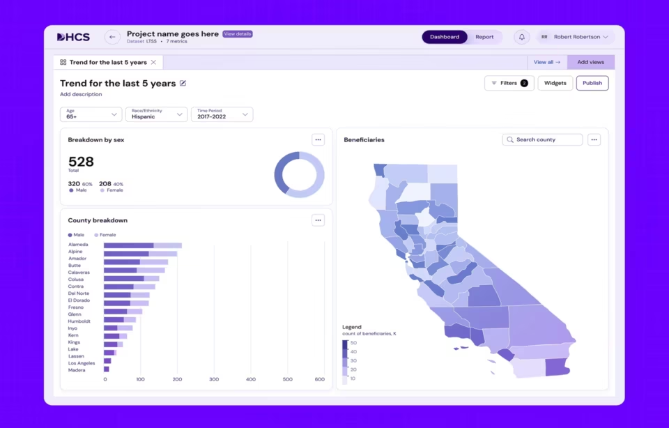
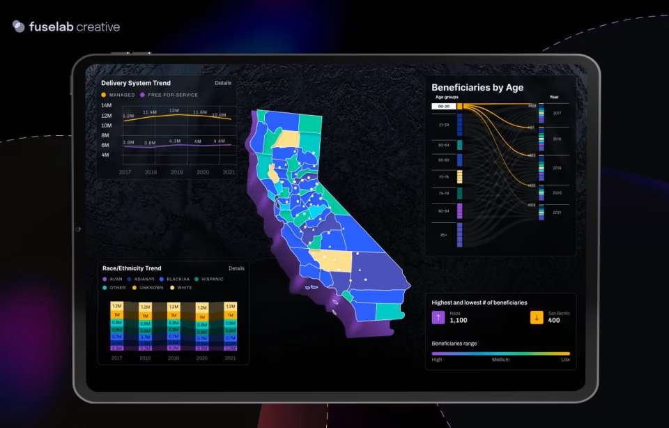
For a buyer comparing agencies, the useful question is not whether a vendor claims accessibility. It is which standard was applied and which chart elements were tested against it. On the Medi-Cal work we did for California’s Department of Health Care Services, our team evaluated dashboards against WCAG 2.1 AA and treated color as part of how information was communicated, not as a list of approved values. It’s worth noting, though not typically part of an agency’s requirements, that the target audience’s access to high-end or high-resolution monitors can greatly affect even the most perfectly constructed designs.
WCAG contrast ratios for charts: 3:1, not 4.5:1
Chart marks are governed by a 3:1 contrast ratio, not the 4.5:1 ratio that applies to body text. Success criterion 1.4.3 sets 4.5:1 for normal text and 3:1 for large text. Success criterion 1.4.11 sets 3:1 for graphical objects and interface components, which is what a bar, a line, or a marker is.
The 4.5:1 figure comes from criterion 1.4.3, contrast minimum, which has been in WCAG since version 2.0 and has not changed since. The ratio that governs chart marks is a separate criterion. W3C criterion 1.4.11, non-text contrast, arrived only in WCAG 2.1 and covers graphics required to understand the content.
A team that applies 4.5:1 to every bar in a chart is solving a text problem on a graphic element. The result is a palette compressed to three or four usable colors and a chart that looks muddy for no standards-based reason. Over-compliance costs real distinctions between series and buys nothing back in return.
Agency RFPs are usually where the confusion starts, because many cite WCAG AA as a single number rather than two ratios serving two purposes. Naming the criterion, the ratio, and the WCAG version during scoping removes an argument that otherwise surfaces during acceptance testing, at the point where changing a color system is most expensive.
Testing adjacent colors, not just color against the background
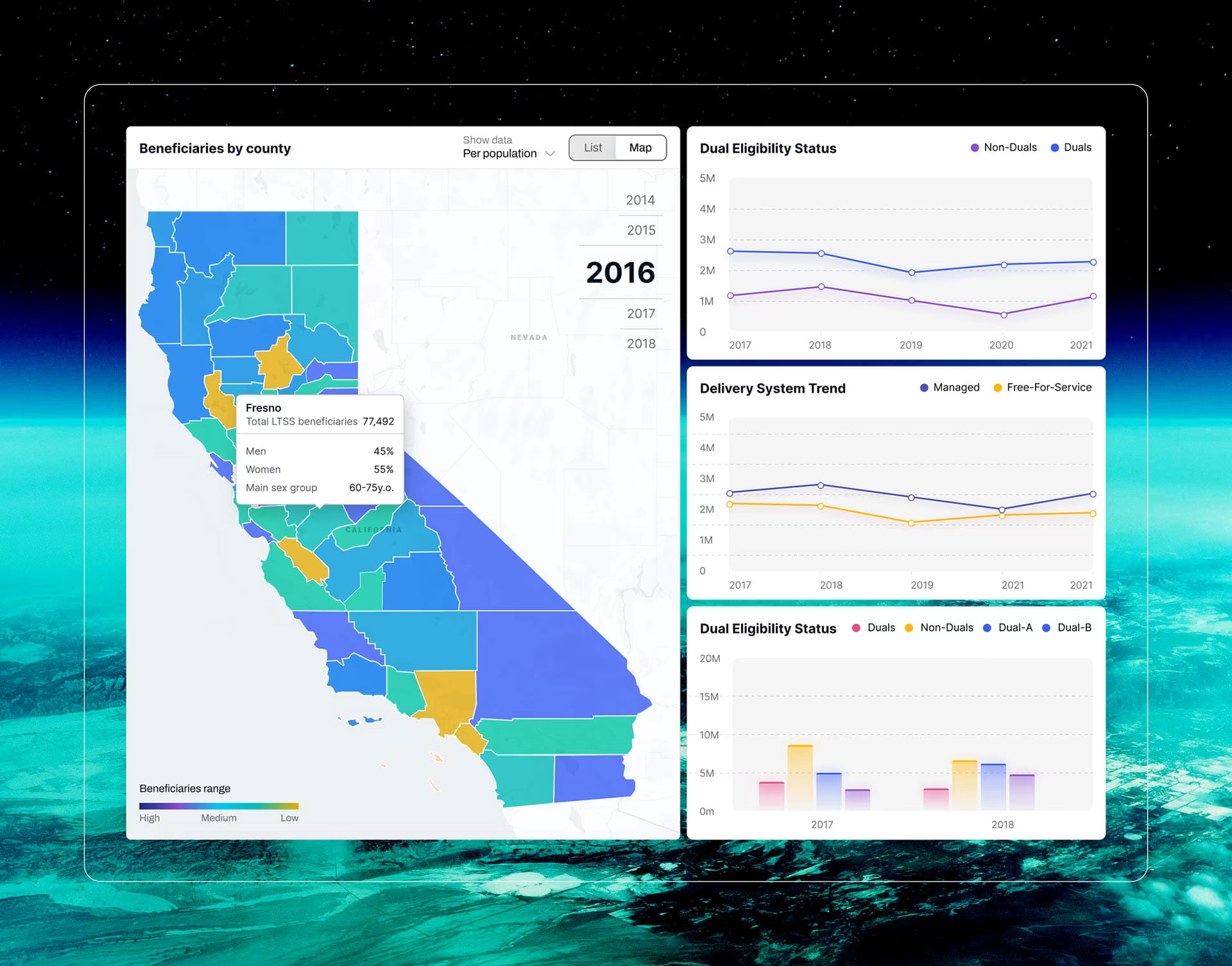
A designer checks blue against the white chart background, and it passes at 3:1. Purple against white passes too. Put the blue and purple lines on the same axis, and the two series read as one, because neither test measured the relationship that actually matters to the person reading the chart.
Adjacent chart elements have to be tested against each other, not only against the plotting area. Two colors can each clear 3:1 against a white background and still be indistinguishable where they meet, which is the case wherever lines cross, map regions share a border, or segments stack inside the same bar.
The fix is a different test, not a stricter one. Run every pair that can appear in the same chart through a contrast checker before the palette is locked, and pay particular attention to overlap regions, stacked segments, and shared borders on maps. Pair testing catches failures that background testing can’t structurally see.
Redundant encoding: what to add when color carries status
Redundant encoding means every distinction that matters is carried by a second signal alongside color: a direct label, an icon, a shape, a position, or a pattern. Red, amber, and green can reinforce a status, but a reader should be able to name the state correctly with the colors removed entirely.
A label such as Needs Review does more than serve color blind readers. It survives printing, export to a black and white PDF, projection in a bright room, and the low-quality screenshot that ends up pasted into a status email. Each is an ordinary condition for a government or clinical dashboard, not an edge case.
Prevalence makes this routine rather than exceptional. MedlinePlus Genetics puts red-green color vision deficiency at about 1 in 12 men and 1 in 200 women among populations of Northern European ancestry. On a clinical dashboard with forty regular users, the design should assume somebody in that group reads status colors differently.
There is a quick way to check the design. Hide the colors and ask someone to identify each status from what remains on screen. If they cannot, color is carrying the entire message, and the correction is a label, an icon, a shape, or a position rather than a different set of hues layered over the same problem.
Redundant encoding sits on top of a color blind friendly palette rather than replacing it. Most teams add it only after somebody reports they cannot read a legend they have been using for months, which is the expensive moment to discover it. Writing it into the data visualization specification costs nothing at that stage.
Why color blindness simulators miss the most common deficiency
Most color blindness simulators model dichromacy, the complete absence of one cone type, while the most common form of red-green deficiency is a partial reduction in sensitivity. A palette that passes a dichromacy simulator can still contain two low-saturation colors that a person with the more common condition cannot reliably separate.
The National Eye Institute identifies deuteranomaly, a reduced sensitivity to green light rather than a total loss of it, as the most common type of red-green color vision deficiency. Testing only against total loss tests the rarer case and skips the population the palette was actually built to serve.
Grayscale rendering is a useful second pass. Remove color entirely and check whether two series, statuses, or categories still separate. If they do not, look at what else could carry the difference: a lightness step, a dash pattern, a point shape, a direct label, or simple position along the axis.
The last check belongs on the chart itself. Test representative charts at production size with real labels, gridlines, hover states, and the number of series that will actually appear. A palette that looks clearly separated as a row of swatches can still fail once you pack six categories into a small dashboard card.
Which color combinations to avoid in a color blind friendly palette
The combinations to avoid are the ones sitting on the same confusion line, the path through color space along which someone with color vision deficiency cannot separate two hues. Red and green is the familiar case, and green and brown, red and orange, and blue and purple fail for exactly the same reason.
Colors that hold up are separated on two dimensions at once. Blue, orange, vermillion, bluish green, and reddish purple are reliable starting points because they differ in lightness as well as hue, which is what keeps them apart when the hue signal is weakened, reduced, or removed altogether.
Building a custom set from scratch is rarely worth the risk when three published systems have already been tested against color vision deficiency. Each was designed for a different job, and choosing between them mostly comes down to how many categories must stay distinguishable in one chart.
Okabe-Ito Color Universal Design, built by Masataka Okabe and Kei Ito, gives you eight colors that stay distinguishable across the most common forms of color vision deficiency. It is the strongest default for multi-series line and bar charts in scientific and enterprise reporting, where a reader needs to tell four or five series apart without checking the legend on every data point.
IBM Carbon categorical, built by the IBM design team, offers fourteen colors applied in a fixed sequence rather than picked at will. The sequencing is what makes it work for executive dashboards, KPI monitors, and interactive interface components, because the same series keeps the same color across every chart on the screen and across every screen in the product.
Paul Tol qualitative schemes, built by Paul Tol at SRON, run to seven colors in the bright scheme and were designed to survive conversion to grayscale. That makes them the right choice for many-category charts and thematic maps that also print in monochrome, a constraint that eliminates most palettes built for screen display alone.
The Okabe-Ito set is the most widely used of the three, and it is worth reading how its authors describe it. The authors chose the colors empirically rather than deriving them from a formula, and they recommend combining them with different shapes, line types, and positions instead of relying on hue alone.

How to choose a color blind friendly palette for a production dashboard
A production palette starts from what the colors have to communicate, not from the largest available set of safe hues. Define the semantic roles first, pick a published base palette rather than building one, separate on lightness before reaching for another hue, and record which criterion was applied to which element.
Start with meaning rather than brand. List the categories, comparisons, and statuses that need distinct treatment before opening the brand guidelines. Three close shades of blue in a brand palette are three brand colors, not three chart colors, and treating them as though they were is the most common source of unreadable series.
Lightness does more work than most teams expect it to. Two colors with different names can still read as the same mark when their lightness values sit close together, and adjusting lightness often creates separation without introducing another hue. Adding hues to solve a separation problem usually makes the next chart in the system harder.
On regulated projects the palette decision is also a documentation decision. Our government design work starts by recording which criterion applies to which element, so the color system can be defended during acceptance testing rather than reconstructed from memory when a reviewer asks how it was tested.
Conclusion
Color is the part of a dashboard reviewed last and audited least, which is why it fails quietly. A color-blind-friendly palette costs nothing extra when you decide it during design, while retesting a live system across every chart type, state, and map is a separate project with its own budget.
Frequently asked questions
What is a color-blind-friendly palette?
A color blind friendly palette uses chart colors that stay distinguishable for people with color vision deficiency, separated by lightness as well as hue. It also assumes color is never the only carrier of meaning, so labels, shapes, patterns, or position support important distinctions.
What are color-blind-safe colors for charts?
Color blind safe colors are hues that do not sit on the same confusion line, which is why blue and orange is the most dependable pairing in data visualization. Published sets such as Okabe-Ito, IBM Carbon, and Paul Tol’s schemes were tested against common forms of color vision deficiency and are safer starting points than a custom palette.
What is the difference between WCAG's 3:1 and 4.5:1 contrast ratios?
The 4.5:1 ratio applies to normal text under success criterion 1.4.3, while 3:1 applies to graphical objects and interface components, including bars, lines, and markers, under criterion 1.4.11. Applying the text ratio to chart series is stricter than the standard requires and removes usable colors without any compliance benefit.
What is the difference between Section 508 and ADA Title II for chart accessibility?
Section 508 incorporates WCAG 2.0, which contains no non-text contrast requirement, so a federal dashboard can pass review with chart series that fail contrast against each other. The ADA Title II rule requires WCAG 2.1, which includes criterion 1.4.11, and applies to state and local government entities by April 26, 2027 or April 26, 2028 depending on population served.
How much does it cost to make an existing dashboard's charts color accessible?
Cost is driven by how much is already built. Deciding the palette during design adds hours rather than a line item, because the work happens alongside the rest of the visual system. Retrofitting a live dashboard means retesting every chart type, legend, map, and interaction state, which runs as a scoped review at US specialist agency rates of $100 to $150 per hour.
How long does chart color accessibility testing take?
A palette review and grayscale pass on a defined color set is usually a matter of days. Testing a production dashboard takes one to two weeks, because every chart type, hover and selection state, legend, and map layer has to be checked at production size rather than reviewed from a single screenshot.
How do you check whether a design vendor actually tested chart contrast?
Choosing an agency to design trustworthy AI products means looking for evidence they design around real user decisions, not just AI visuals. Ask how they handle uncertainty, how they explain recommendations, where they build in human oversight, and how they support disagreement. Look for shipped examples where those mechanisms are visible in the product.