Data Visualization Trends for 2026 That Will Shape Business Decisions
Once considered a haven for only expert analysts and scientists, data visualization has now evolved into a powerful asset for businesses across industries. Why? Because of its potential to transform raw data into compelling narratives. From the simplest charts and graphs to the most interactive dashboards and immersive experiences, data visualization has come a long way.
While data visualization was primarily used to explore and understand data in the past, it has become a tool businesses cannot do without today. Data visualization trends show its increasing importance for communicating insights, making decisions, and driving innovation. As we enter 2026, this potent tool will become even more significant in shaping the business world.
Why? Consider this: data around us is becoming increasingly complex, with so much to extract, assess, and deliver. Data-driven insights have thus become the backbone of every successful business, making data visualization more crucial than ever. From uncovering hidden insights to
The increasing complexity of data and the growing demand for data-driven insights have made data visualization more crucial than ever. In 2026, we can expect an advanced era characterized by the latest trends in data visualization and exciting new possibilities.
Trends in Data Visualization Guiding Business Decision-Making
No matter how often you hear it, it is always true; ours is a data-driven world, with data taking center stage in every aspect of work and life. The latest visualization trends show that data visualization is no longer an outlier; it has become indispensable, especially for businesses that want to compete and remain relevant in the future.
By converting complex data into easy-to-understand visual representations, businesses gain a tool to uncover valuable insights, make informed decisions, and gain a competitive edge. Data visualization will continue to do all this in 2026 while pushing the boundaries of innovation with some exciting data visualization future trends.
#1 AI-Powered Data Storytelling
Artificial Intelligence could very much be the buzzword for the century. There is no field, no niche, and even no business that will be able to hold out from using artificial intelligence in the future. The same goes for the field of data visualization.
In 2026, we can expect AI to automate the creation of stunning visualizations from raw data. Machine learning algorithms will analyze large datasets, identify patterns, and generate visually appealing charts, graphs, and infographics. This automation will save time and effort while leading to more sophisticated and insightful visualizations. AI could generate creative visualizations, such as data art and data poetry, taking interactive insights to the next level.
AI-powered visualization tools will also tailor visualizations to individual user preferences and needs. Since AI can analyze user behavior, produce predictive analytics, utilize natural language processing, demographics, and cognitive styles seamlessly, it can customize visualizations based on the user’s level of expertise or highlight the most relevant information for them, while also offering a variety of visual styles if the user prefers a different style. This personalized approach will elevate user experience and decision-making by several notches, saving us time, money, and the anxiety we have all felt from making uninformed decisions.
#2 Immersive Data Experiences
Much like other fields, virtual reality and augmented reality (VR/AR) technologies have much to offer in making data visualization more immersive. Using VR and AR, users can interact with data in new ways altogether. Let’s see how.
For one, VR interactive visualizations can transport users into virtual worlds to explore datasets from different perspectives. AR visualizations, on the other hand, can overlay data onto the real world for context and insights. Such immersive experiences improve understanding, memory retention, and decision-making.
Next, 3D and interactive data visualization services can bring data to life by adding depth and interactivity to charts and graphs. Imagine being able to rotate, zoom, and pan 3D visualizations to explore data from different angles – exciting, isn’t it? Interactive visualizations allow the user to drill down into data, filter data, and uncover hidden insights. These dynamic and engaging visualizations make data more accessible and understandable, especially for complex datasets, making for a most engaging data visualization trend.
#3 Ethical Data Visualization
As data visualization grows in influence and application, it becomes even more important to assess its ethical aspects. For instance, addressing potential biases and ensuring fairness in data representations is a must.
But why?
For one, biased data can lead to misleading conclusions and discriminatory outcomes. Being aware of potential biases in data collection, analysis, and visualization is, therefore, a must to mitigate these issues and create data democratization. The key lies in using diverse datasets, transparent methodologies, and critical thinking.
Besides, transparency and accountability are two essentials when building trust. Data sources, methodologies used, and any limitations or uncertainties must be disclosed to make the process even more streamlined. The accountability lies with data visual representation professionals to make sure they follow ethical principles when working around such data. Read more about how data is changing the world.
#4 Data Visualization for the Internet of Things (IoT)
Another powerful technology sector that can be successfully used in conjunction with data visualization is the Internet of Things (IoT). Think of it this way: what IoT basically does is generate real-time data (lots of it) from various connected devices. But how we do make sense of these huge chunks of data?
The answer is simple, use data visualization to extract meaning and guidance.
Emerging trends in data visualization point to its inter-dependence on IoT technology. Real-time data visualization tools can monitor and analyze data streams as generated, so decision-making and problem-solving are both timely and effective.
Interactive dashboards, live maps, and real-time charts and edge computing, are some tools now commonly found throughout the supply chain and manufacturing sectors.
Another interesting integration is with predictive analytics to analyze historical data, identify patterns, and forecast future trends. Data visualization is paramount here to understand and communicate these predictions.
Imagine being able to visualize predicted outcomes for your startup – you could easily grasp the potential implications of different scenarios, optimize supply chain operations, forecast energy consumption, predict customer behavior, and so much more. The Robodog AGV project, for instance, uses real-time insights and powerful analytics to optimize workflows, reduce downtime, and drive productivity.
#5 Data Visualization for Climate Change
One up-and-coming trend that’s here to stay revolves around environment-centric practices. Climate change, for instance, is a complex challenge with global stakeholders, cross-connected factors, and ever-changing dynamics. Data is again at the center of the crisis, and data-driven solutions are the only way forward.
Understanding the critical state of our climate is a prime candidate for the utilization of the latest data visualization trends. Making use of data in this way can help people around the world understand and communicate the impacts of climate change. For instance, visualizing complex climate models, temperature trends, and sea-level rise projections can help extract patterns, assess risks, and inform policy decisions. Researchers, policymakers, and even the public can use data visualization tools to grasp the scale and urgency of climate change.
Another aspect is effective communication and data visualization in enabling it for a broad audience. Clear and concise visualizations could turn out to be powerful tools for making climate data more accessible and understandable. For example, interactive maps, charts, and infographics can help people visualize the impacts of climate change on their local communities. The public can be better engaged with compelling data visualizations, fostering a deeper understanding of climate science and inspiring action.
#6 Data Visualization for Social Impact
Data visualization can also drive social change better than we know. With social and economic data visualized, it becomes easier to identify disparities, inequalities, and areas of need. Such data-driven insights can inform policy decisions, mobilize resources, and empower communities.
For example, visualizing poverty rates, healthcare access, and education outcomes can help policymakers target interventions and allocate resources effectively. Data visualization health trends have, in fact, never seen quicker and wider adoption than the COVID-19 pandemic, when entire response rooms assumed the shape of data centers, relying on interactive maps, dynamic dashboards, and easy-to-grasp insights.
Another exciting take is the confluence of data journalism and storytelling. Journalists use data-driven narratives to uncover hidden truths, expose social injustices, and hold power to account. Just check out any data-rich New York Times article and you will see data visualizations for miles. Powerful data visualization can illustrate key points, highlight trends, and provide context for complex issues. Journalists can thus raise awareness, spark conversations, and drive social change.
#7 Low-Code and No-Code Data Visualization Tools
Low-code and no-code data visualization tools are other interesting practices making their way into 2026. One of the biggest reasons these tools are gaining popularity is that they enable even non-technical users to analyze data and create powerful visualizations. Tableau, Power BI and other self-service analytics tools have made much of this progress possible for non-techy workers, while also producing quick results without a need for cloud access.
How do they make this possible?
For one, these tools have a friendly UX/UI design so users can drag and drop data sources, select visualizations, and customize how their charts and graphs will look. A wider range of users can thus leverage the power of immersive data visualization trends, creating an example of data democratization.
Another point is that low-code and no-code tools significantly improve the visualization software processes. Users can quickly prototype and iterate on visualizations, explore different data perspectives, and refine their insights. This rapid prototyping capability enables businesses to make data-driven decisions faster and more efficiently.
Besides, the user gets to experiment with different visualizations on the go. This creates more room for creativity and innovation.
Also read about Qgen Health Lab – an intuitive interface with the future of cancer treatment in mind.
#8 Micro Animations in Data Visualization
With user experience taking center stage across industries and products, micro animations are set to be another explosive trend this year. These features make products more intuitive and responsive while also facilitating more personalization options across countless user journeys.
Small and subtle micro animations typically appear as data point highlights, animated transitions, and progress indicators. For instance, a subtle animation, such as a gentle pulse or slight enlargement when hovering over a data point on a chart, can make it stand out. Users can easily identify and focus on specific data points of interest.
Smooth transitions between different views or filters within a dashboard could make the experience more engaging and fluid. For example, animating data filters or new data points on the screen can add to the dashboard’s appeal.
Designers can also add subtle animations to indicate loading states or the progress of data queries. While this has nothing to do with technical analysis or data representation, it can provide visual cues for the user, reduce perceived wait times, and improve the overall user experience.
Future Trends in Data Visualization
Data visualization in 2026 is moving beyond static charts and dashboards into dynamic, context-aware systems that adapt in real time to user behavior, organizational goals, and incoming data streams. The exciting future of data visualization involves the convergence of AI, spatial computing, and behavioral design to produce experiences that don’t just display information; they guide timely, critical decision-making across a wide range of industries and organizational needs. Organizations that treat visualization as a strategic layer rather than a reporting afterthought will hold a measurable advantage in speed-to-insight.
Emerging and Latest Visualization Trends
The latest trend reshaping visualization in 2026 is the shift from descriptive to prescriptive displays. These interfaces not only show what happened but also surface next steps via trend data visualizations. Alongside this, scrollytelling formats borrowed from digital journalism are making their way into enterprise dashboards, turning complex data narratives into guided, annotated experiences that reduce cognitive load. Sankey diagrams, network graphs, and geospatial layering are also seeing renewed investment as organizations grapple with increasingly interconnected data ecosystems.
AI-Powered Data Storytelling and Machine Learning Visualization
AI is fundamentally changing who can tell a data story, compressing the gap between raw model output and human-readable insights by automatically generating narrative annotations, contextual callouts, and anomaly flags. In 2026, ML visualization tools are tackling one of the field’s hardest problems: explainability, by rendering model confidence, feature weight, and prediction drift in interfaces accessible to non-technical stakeholders. In other words, these features are for everyone. The practical effect is that decision-makers can now interrogate AI recommendations directly within the dashboard rather than waiting for a data scientist to translate the output. Let that sink in.
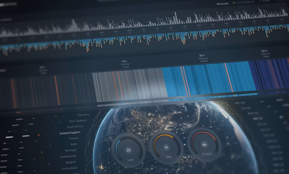
Immersive and Interactive Data Visualization Experiences
Spatial computing platforms are pushing data visualization into three-dimensional environments where analysts can physically navigate datasets, isolating variables and rotating dimensional views in ways a flat monitor simply cannot support. In 2026, immersive visualization is finding its most immediate traction in industries with inherently spatial data, such as logistics, infrastructure, and healthcare, where depth and proximity carry analytical meaning. Interactivity is also deepening at the 2D level, with gesture-based filtering, voice-triggered drill-downs, and collaborative annotation layers becoming baseline expectations rather than premium features. This is blowing up right before our eyes, and in a way that benefits us all.
Low-Code and No-Code Visualization Tools for Self-Service Analytics
The proliferation of low-code and no-code visualization platforms in 2026 is democratizing data literacy at a pace that outstrips the supply of trained analysts, allowing domain experts in operations, marketing, and finance to build production-quality dashboards without writing a single query. This shift is compressing the feedback loop between data collection and insight generation, but it is also surfacing a new risk: visualizations built without design or statistical oversight that mislead as often as they inform. The organizations managing this transition most effectively are those investing in visualization governance frameworks alongside the tools themselves; establishing standards for chart selection, color semantics, and data sourcing that self-service users inherit by default.
Data Visualization Tools and Software to Watch in 2026
The visualization software landscape in 2026 is defined by three converging forces: cloud-native architecture, AI-assisted insight generation, and embedded analytics that push data directly into the workflows where decisions are made. Tableau continues to lead when it comes to enterprise deployments, with its AI-powered “Pulse” features surfacing proactive insights without requiring users to build a view from scratch.
Power BI remains the dominant choice within Microsoft-centric organizations, with deep Copilot integration enabling natural language querying across connected data sources. Looker’s semantic layer approach is gaining a lot of traction with data engineering teams that need a governed, reusable definition of metrics across the organization. For developers building custom, high-fidelity visualizations, D3.js remains the standard for precision and flexibility, though its learning curve keeps it firmly in the hands of highly experienced design and development teams.
Flourish has carved a strong niche for those looking for narrative and editorial visualization, particularly for teams producing public-facing reports and scrollytelling content. You’ll find lost examples in publications like The New York Times and Time magazine. Luzmo is emerging as a go-to for SaaS companies embedding analytics directly into their products, offering a low-code SDK that dramatically reduces time-to-deployment. Across all of these platforms, the clearest shared trajectory is accessibility; vendors are racing to lower the technical floor so that analysts, operators, and business users can build and interpret visualizations without writing code or filing requests to a data team.
Industry Use Cases for Data Visualization in 2026
Data visualization is no longer a back-office reporting function; it’s embedded in the operational core of industries that move fast and carry high stakes. The following sectors illustrate where visualization trends are translating into measurable business impact and changing the way people use the tools listed above.
Finance and Banking
Real-time risk dashboards and regulatory reporting interfaces are evolving from static summaries into dynamic, drill-capable environments where portfolio managers can interrogate exposure by asset class, geography, or counterparty in seconds. Predictive visualization is also reshaping fraud detection, with anomaly flagging surfaced visually at the transaction level rather than buried in model logs.
Healthcare
Clinical decision support tools are integrating patient data visualizations directly into EHR workflows, allowing physicians to see longitudinal trends, lab trajectories, and population benchmarks without switching systems. This has had an enormous time-saving impact for providers across medical fields. Operational teams are using geospatial and capacity dashboards to manage resource allocation across facility networks in real time, saving their organizations time and money through improved scheduling and shortage prevention.
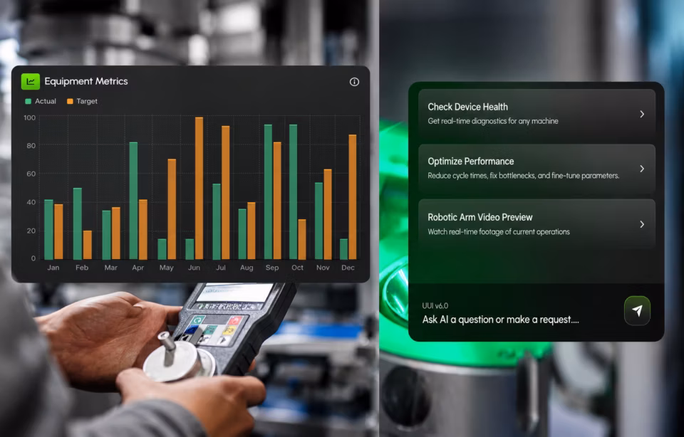
Manufacturing and Supply Chain
Digital twin environments are making supply chain visualization genuinely three-dimensional, allowing operations teams to simulate disruption scenarios and reroute logistics before a bottleneck becomes a stoppage. On the plant floor, sensor-driven dashboards are surfacing equipment performance and predictive maintenance windows in formats accessible to technicians, not just analysts.
Retail and E-Commerce
Retailers are deploying customer journey visualizations that stitch together behavioral signals across channels, including in-store, application, and web, to surface conversion friction and personalization opportunities in near real-time. Inventory and demand forecasting dashboards are increasingly prescriptive, moving beyond showing stock levels to recommending reorder actions with confidence intervals attached.
Education and Government
Public sector agencies are investing in accessible, plain-language data visualization for constituent-facing reporting, translating budget allocations, program outcomes, and infrastructure status into formats that non-expert audiences can interpret and trust. Educational institutions are using learning analytics dashboards to give instructors and administrators a unified view of student engagement, performance trends, and at-risk indicators across entire cohorts. Professors are now equipped with verifiable indicators of educational fatigue and can provide extra instruction to those who need it before they fall too far behind.
How to Choose the Right Data Visualization Approach
Selecting the right visualization approach is a design decision before it is a technical one, and it starts with three questions: What type of data are you working with? Who is reading it? And what action or understanding are you looking for in the result?
Data type shapes the chart form. Temporal data calls for line charts or area charts that preserve sequence and rate of change. Comparisons across categories favor bar charts. Relationships between variables belong in scatter plots or network graphs. Part-to-whole stories work best as treemaps or proportional area charts, and definitely not pie charts, as they become unreliable the moment a dataset has more than four or five segments.
Audience determines complexity tolerance. A data science team can navigate a multi-axis dashboard with dynamic filters and confidence intervals. An executive audience needs a single headline metric with a single level of drill-down. A public-facing report requires plain labels, an accessible color palette, and no assumed context.
Something worth noting here is that across all data visualization projects, you need to ask yourself if interactivity adds value or noise. Static visualizations are the right call when the insight is singular, the audience is passive, or the medium doesn’t support interaction. Print reports, slide decks, and email summaries all fall into this category. Interactive visualizations earn their complexity when the audience needs to explore the data from multiple angles, filter by their own variables, or compare subsets that vary by user role or interest. When in doubt, build static first and layer interactivity only where a specific analytical question cannot be answered without it.
What Users Are Asking About Data Visualization in 2026
Data visualization in 2026 is being reshaped by AI-powered insight generation, real-time and immersive experiences, and self-service platforms that are making data-driven decision-making accessible across entire organizations, and not just for data teams. Leading tools like Tableau and Power BI are evolving alongside emerging platforms to deliver personalized, adaptive, and embedded analytics that close the gap between raw data and the decisions that depend on it.
What are the biggest data visualization trends in 2026?
The defining trends in 2026 are AI-powered insight generation, immersive and spatial data experiences, and the rapid expansion of self-service analytics through low-code platforms. Prescriptive dashboards — interfaces that recommend action rather than simply reporting status — are replacing passive charts across enterprise environments. Real-time interactivity, embedded analytics, and explainable AI visualization are also reshaping how organizations expect data to be presented and consumed.
What is the future of data visualization?
The future of data visualization is adaptive, context-aware, and increasingly embedded in the tools and workflows where decisions already happen — rather than living in separate reporting environments. Visualization will become less about building charts and more about designing intelligent data experiences that respond to user behavior, organizational goals, and live data streams. The discipline is converging with AI, spatial computing, and behavioral design in ways that will make today’s dashboard conventions look as dated as spreadsheet printouts.
How is AI changing data visualization?
AI is automating the most time-consuming parts of visualization work — anomaly detection, narrative annotation, and insight prioritization — so analysts can focus on interpretation rather than construction. Natural language interfaces are allowing non-technical users to query data and receive visual responses without writing a single formula or configuring a chart manually. Perhaps most significantly, AI is making machine learning outputs interpretable to business audiences by rendering model confidence, feature importance, and prediction drift in accessible visual formats.
What are the best data visualization tools for 2026?
Tableau and Power BI remain the dominant enterprise visualization tools in 2026, with both platforms deepening AI-assisted features that surface insights proactively rather than waiting for users to ask the right question. Looker, Flourish, and Luzmo are strong choices for teams with specific needs around governed metrics, narrative publishing, and embedded analytics respectively. For developers requiring maximum flexibility and precision, D3.js continues to set the standard — though organizations prioritizing speed and accessibility will find the low-code platforms better suited to their scale.
How do data visualization trends affect business intelligence?
The current wave of visualization trends is collapsing the traditional distance between data teams and business users, making BI a shared capability rather than a centralized service. AI-powered features and self-service platforms are enabling domain experts in finance, operations, and marketing to answer their own analytical questions without routing requests through an analyst queue. The net effect is faster decision cycles, broader data literacy across organizations, and a redefinition of what BI infrastructure needs to support.
What is real-time data visualization and why does it matter?
Real-time data visualization refers to dashboards and displays that update continuously as new data arrives, giving operators, analysts, and executives a live picture of conditions rather than a historical snapshot. The expansion of edge computing is accelerating this capability by processing data closer to its source — on factory floors, in clinical settings, and across logistics networks — reducing the latency between an event occurring and a decision being made. In high-stakes environments where conditions change faster than reporting cycles, real-time visualization is not a feature preference; it is an operational requirement.
How can businesses use data visualization for better decision-making?
Businesses that embed visualization into their decision-making workflows — rather than treating it as a post-analysis reporting step — consistently move from question to action faster than those relying on static reports. Effective data-driven decision-making requires visualizations designed around specific decisions, not general data overviews, which means matching chart type, interactivity level, and detail depth to the actual choice being made. Organizations that invest in visualization standards alongside their analytics tools ensure that the data informing decisions is interpreted consistently, reducing the risk of the same dataset driving contradictory conclusions across teams.
What role does personalization play in modern data visualization?
Personalization in data visualization means surfacing the metrics, views, and alert thresholds most relevant to each user’s role, rather than presenting everyone with the same default dashboard. Modern platforms are increasingly using behavioral signals and role-based profiles to adapt what users see when they open a visualization environment, reducing the time spent filtering out irrelevant information. As AI capabilities mature, personalization will extend beyond layout preferences to proactive insight delivery — systems that learn what questions a user typically asks and surface answers before they are requested.
Conclusion
The world is embracing emerging technologies and innovative techniques in every field, and the same can be said for all of the data visualization trends we have discussed. Future data visualization trends lie in unlocking data’s full potential to drive insights, inform decisions, inspire action, and quite possibly to entertain.
Data visualization is evolving faster than ever before, making it all the more important to prioritize the human element and create visualizations that are informative, engaging, and inspiring. The time is ripe to combine creativity, technology, and human insight to shape the future of data visualization.
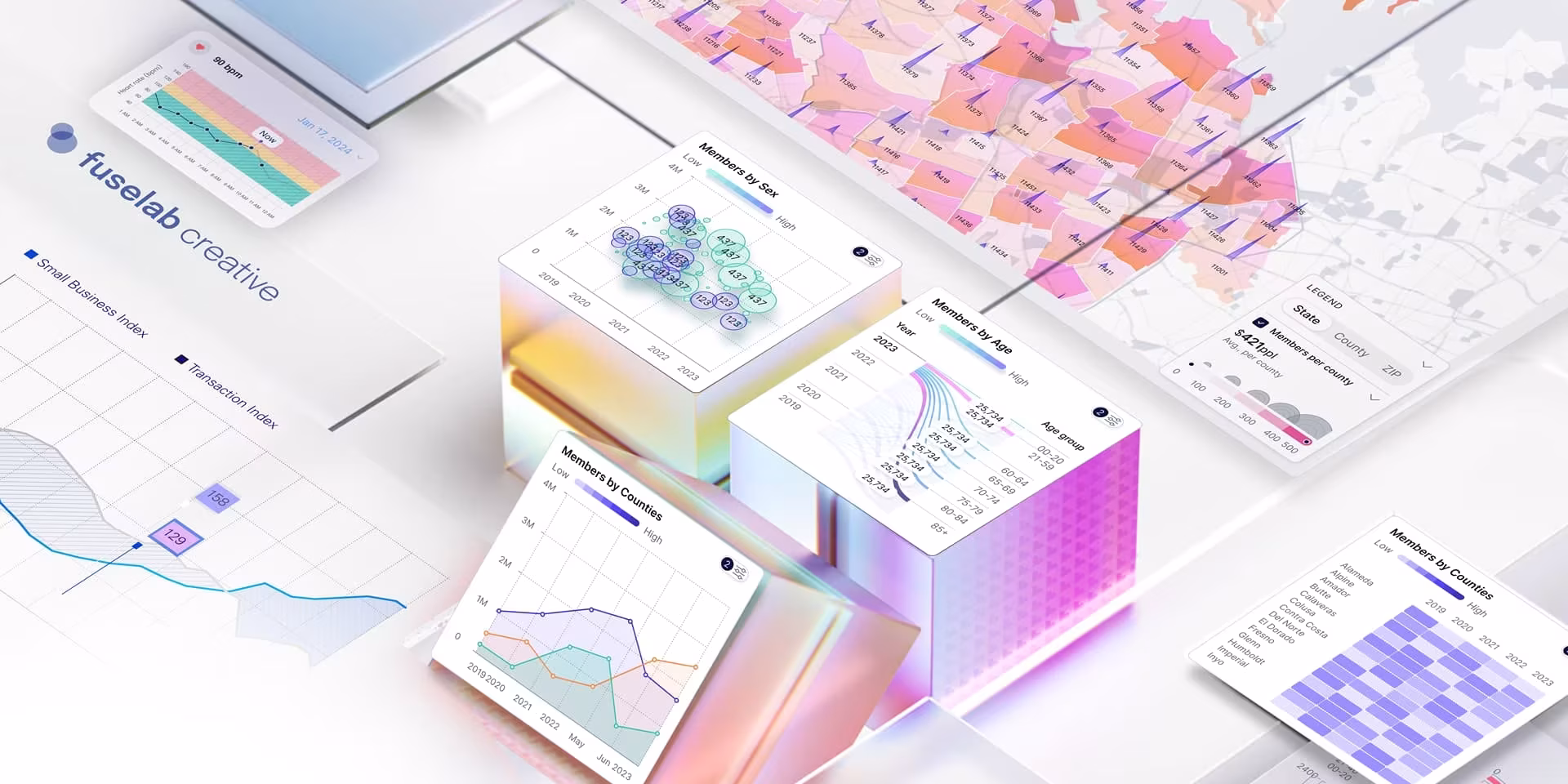
If you are looking to leverage the power of data visualization for your business, all you need is an expert partner like Fuselab to bring your insights to life. With our dashboard development and digital product development services, you can drive business decision-making with insights that are immediately actionable for staff from every level. Reach out to our experienced team and let us help you design a product that meets your goals.